
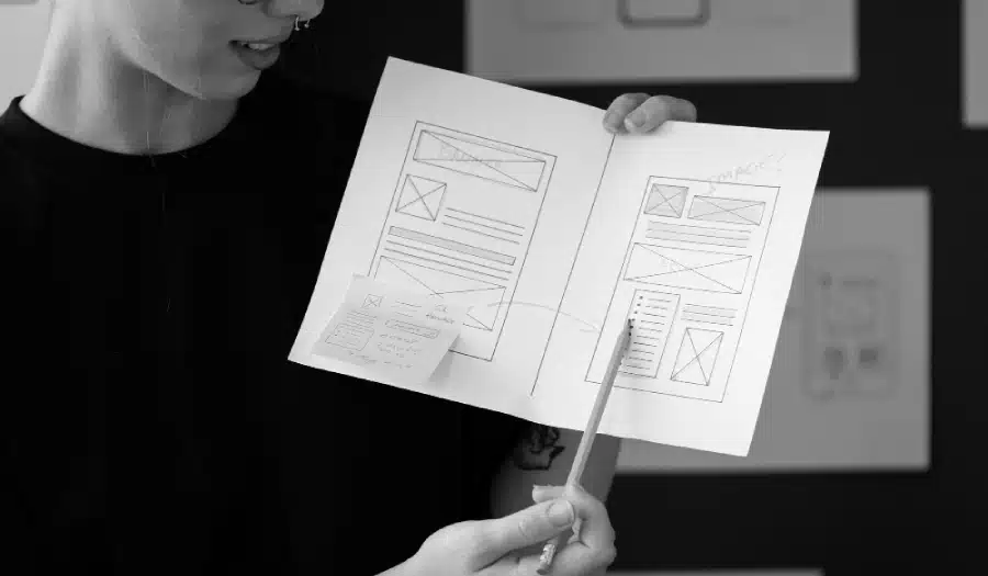
Are you in the process of creating a new website for your business? Want to know the rules you should follow to ensure your web design project is as success?
We share 10 web design principles to abide by in this infographic.
Here’s a quick summary:
- Hick’s law
- The rule of thirds
- Respect users’ patience
- Use negative space
- Consider f-layout
- Colour matters
- Remember to KISS
- The 8-second rule
- Use faces to increase familiarity
- Source high quality images
Check out the infographic for more detail.
![10 Web Design Laws to Help You Create a More Effective Website [Infographic]](https://red-website-design.co.uk/wp-content/uploads/2019/07/10-Web-Design-Laws-to-Help-You-Create-a-More-Effective-Website.jpg)
In the ever-evolving landscape of web design, it’s essential to keep up with the latest trends and technologies. However, some timeless principles remain as relevant as ever. These principles, often referred to as “web design laws,” can significantly impact the effectiveness of your website.
In this blog post, we’ll explore the essential web design laws that can help you create a more user-friendly and engaging website.
Hick’s Law: Simplify Decision-Making
Hick’s Law, named after British psychologist William Edmund Hick, states that the time it takes for a person to make a decision is directly proportional to the number of choices they have. In the context of web design, this law emphasizes the importance of simplifying the decision-making process for your users.
How to Apply Hick’s Law in Web Design
- Streamline Navigation: Reduce the number of menu items and options in your website’s navigation menu. A cluttered menu can overwhelm users and make it difficult for them to find what they’re looking for. Aim for a clear and concise menu structure that guides users to the most important sections of your site.
- Limit Choices: When designing forms, such as signup or checkout pages, limit the number of fields and options. Fewer choices can lead to faster form completion and increased user satisfaction.
- Progressive Disclosure: Instead of bombarding users with a long list of information, consider using progressive disclosure. Show essential information first and provide links or buttons for users to access more details if they wish. This approach keeps the initial interface clean and uncluttered.
- Call-to-Action (CTA) Buttons: Use clear and action-oriented CTA buttons. Avoid overwhelming users with multiple competing CTAs on the same page. Each page should have a primary action you want users to take.
- Content Organization: Organize your content logically. Use headings, subheadings, and bullet points to break up text and make it easier for users to scan and find information quickly.
By adhering to Hick’s Law, you can create a website that guides users through their journey with clarity and efficiency.
The Rule of Thirds: Achieving Visual Harmony
The Rule of Thirds is a fundamental principle in visual design that dates back to the Renaissance period. It divides an image or screen into nine equal parts by creating two equally spaced horizontal and vertical lines. The intersections of these lines are called “power points,” and they serve as focal points for visual composition.
How to Apply the Rule of Thirds in Web Design
- Grid-Based Layouts: Design your website layout based on a grid system that incorporates the Rule of Thirds. This approach helps you place key elements, such as images, text blocks, and CTAs, at the power points or along the lines for a visually pleasing composition.
- Balanced Design: When placing images or other visual elements on your web pages, consider positioning them at one of the intersections created by the Rule of Thirds. This can draw users’ attention to important content and create a sense of balance and harmony.
- Typography: Apply the Rule of Thirds to typography by aligning text blocks and headings with the grid lines. This ensures a consistent and visually appealing text layout.
- Whitespace: Utilize whitespace strategically to separate and emphasize different sections of your web pages. The Rule of Thirds can guide you in creating balanced whitespace distribution.
- Responsive Design: When designing for different screen sizes, remember to maintain the Rule of Thirds principles to ensure that your website looks visually appealing on various devices.
The Rule of Thirds is a timeless guideline that can help you create visually pleasing web designs that engage and captivate your audience.
Respect Users’ Patience: Page Load Speed Matters
In today’s fast-paced digital world, users have little patience for slow-loading websites. Research has shown that users are more likely to abandon a webpage if it takes too long to load. Therefore, optimizing your website’s speed is crucial for retaining visitors and keeping them engaged.
How to Respect Users’ Patience in Web Design
- Image Optimization: Compress images and use appropriate file formats to reduce their size without sacrificing quality. Large images can significantly slow down page load times.
- Minimize HTTP Requests: Reduce the number of HTTP requests by combining CSS and JavaScript files. Also, consider utilizing browser caching to store frequently accessed resources locally.
- Content Delivery Network (CDN): Implement a CDN to distribute your website’s content across multiple servers worldwide. CDNs can deliver content faster by serving it from a server geographically closer to the user.
- Mobile Optimization: Ensure that your website is mobile-friendly and loads quickly on smartphones and tablets. Mobile users are even less patient when it comes to slow-loading websites.
- Lazy Loading: Implement lazy loading for images and videos. This technique delays the loading of offscreen content until the user scrolls down to it, improving initial page load times.
- Server Performance: Choose a reliable hosting provider and plan that can handle your website’s traffic and resource demands. Slow server response times can have a significant impact on page load speed.
- Regular Testing: Use tools like Google PageSpeed Insights or GTmetrix to regularly test your website’s performance. Identify and address issues that may be slowing down your site.
By respecting users’ patience and optimizing your website for speed, you can provide a seamless and enjoyable browsing experience, reducing bounce rates and improving user satisfaction.
Use Negative Space: Embrace Simplicity and Clarity
Negative space, often referred to as “white space,” is the empty or unmarked area in a design composition. It plays a crucial role in enhancing readability, focus, and overall aesthetics. Effective use of negative space can make your website more visually appealing and user-friendly.
How to Use Negative Space in Web Design
- Improve Readability: Adequate negative space around text elements ensures that users can read content comfortably. Avoid cluttered layouts that make it challenging to distinguish between text and surrounding elements.
- Highlight Key Elements: Negative space can be used to draw attention to essential elements, such as CTAs or product images. When these elements have ample breathing room, they become more noticeable and inviting.
- Simplify Navigation: Use negative space to create clear and distinct navigation menus. It helps users quickly identify and access different sections of your website.
- Reduce Cognitive Load: Cluttered and crowded designs can overwhelm users with information. Negative space reduces cognitive load by providing visual breaks and separating content into manageable chunks.
- Mobile-Friendly Design: Negative space is even more critical in mobile web design, where screen real estate is limited. Maintain a clean and uncluttered layout to ensure a seamless mobile browsing experience.
- Consistency: Maintain consistent spacing throughout your website to create a sense of unity and coherence. Inconsistent use of negative space can lead to a disjointed and confusing user experience.
- Aesthetic Appeal: Embrace negative space as a design element itself. Sometimes, the strategic use of empty space can create a sense of elegance and sophistication in your web design.
By incorporating negative space effectively, you can create a more visually appealing and user-friendly website that keeps visitors engaged and encourages exploration.
Consider F-Layout: Aligning with User Scanning Patterns
The F-layout is a web design principle that aligns with how users typically scan and read content on a webpage. Research has shown that users tend to scan content in an “F” pattern, starting with a horizontal movement across the top of the page, followed by a vertical movement down the left side.
How to Apply the F-Layout in Web Design
- Place Important Content at the Top: Since users initially focus on the top of the page, ensure that critical information, headlines, and CTAs are located there. This increases the chances of users engaging with your content.
- Left-Aligned Content: Align text content and key elements to the left side of the page, as this is where users tend to focus during their vertical scanning. This aligns with their natural reading pattern.
- Hierarchy of Information: Organize your content with a clear hierarchy, using headings, subheadings, and bullet points. This helps users quickly identify the most relevant information as they scan.
- Visuals and Images: Incorporate visuals, images, and infographics to break up text and capture users’ attention. Place images strategically along the left side of the content area to guide users’ eyes.
- Mobile Considerations: Keep in mind that the F-layout concept applies to both desktop and mobile design. Adapt your content layout to suit the screen size and orientation for a consistent scanning experience.
- Responsive Design: Ensure that your website maintains the F-layout principles when viewed on different devices. Responsiveness is crucial for delivering a user-friendly experience across various screen sizes.
By designing your web pages according to the F-layout, you can align with users’ natural scanning patterns, making it easier for them to find and engage with your content.
Colour Matters: Harnessing the Power of Color in Web Design
Color is one of the most potent tools in a web designer’s toolkit. It can evoke emotions, convey messages, and influence user behavior. Understanding the psychology of color and using it effectively can significantly impact the overall appeal and usability of your website.
How to Harness the Power of Color in Web Design
- Branding Consistency: Use your brand’s color palette consistently across your website. This helps reinforce brand identity and makes your site instantly recognizable to visitors.
- Emotional Impact: Different colors can evoke specific emotions and associations. For example, blue is often associated with trust and professionalism, while red can convey urgency or excitement. Consider the emotions you want to elicit and choose your color scheme accordingly.
- Contrast and Readability: Ensure that text is easily readable against the background color. High contrast between text and background improves readability and user experience.
- Call-to-Action (CTA) Buttons: Use attention-grabbing colors for CTA buttons to make them stand out. A well-chosen CTA color can encourage users to take the desired action, such as making a purchase or signing up.
- Color Accessibility: Pay attention to color accessibility standards, such as the Web Content Accessibility Guidelines (WCAG). Ensure that your color choices are accessible to all users, including those with visual impairments.
- A/B Testing: Experiment with different color combinations and monitor user engagement and conversion rates. A/B testing can help you determine which color schemes are most effective for your specific audience.
- Cultural Considerations: Be aware of cultural differences in color symbolism. Colors can have different meanings in various cultures, so research and adapt your color choices accordingly, especially if your website has a global audience.
By carefully selecting and implementing colors in your web design, you can create a visually appealing and emotionally resonant user experience that leaves a lasting impression.
Remember to KISS: Keeping It Simple for Better User Experience
The acronym KISS, which stands for “Keep It Simple, Stupid,” is a timeless principle that applies to various fields, including web design. Simplifying your website’s design and functionality can lead to better user comprehension, engagement, and satisfaction.
How to Keep It Simple for Better User Experience
- Minimalist Design: Embrace a minimalist design approach by removing unnecessary elements and focusing on the essentials. Clutter-free layouts make it easier for users to navigate and find what they’re looking for.
- Clear Navigation: Ensure that your website’s navigation is straightforward and intuitive. Use descriptive labels for menu items and organize content logically.
- Consistent Design Elements: Maintain consistency in design elements such as fonts, colors, and spacing. A cohesive design helps users understand the structure of your website.
- Whitespace: Use whitespace effectively to separate and prioritize content. It provides visual breathing room and makes the website more digestible.
- Mobile Responsiveness: Keep mobile users in mind and optimize your design for smaller screens. Mobile-friendly websites often feature simpler and more compact layouts.
- Progressive Disclosure: Present information in a way that gradually reveals more details as users delve deeper into your content. This approach prevents overwhelming users with too much information at once.
- User-Focused Content: Craft clear and concise content that addresses users’ needs and questions. Avoid jargon and unnecessary complexity.
- Testing and Feedback: Continuously test your website’s usability and gather feedback from users. Identify areas where simplification can enhance the user experience.
By adhering to the KISS principle, you can create a user-friendly website that offers a straightforward and enjoyable browsing experience, ultimately leading to higher user satisfaction and engagement.
The 8-Second Rule: Capturing Users’ Attention
In today’s fast-paced digital world, users have limited patience and attention spans. Research suggests that you have approximately eight seconds to capture a visitor’s attention and convince them to stay on your website. Therefore, it’s crucial to make those precious seconds count.
How to Capture Users’ Attention with the 8-Second Rule
- Compelling Hero Section: Your website’s hero section, the top part of the homepage, should immediately communicate your value proposition and engage users. Use attention-grabbing visuals, concise headlines, and clear CTAs.
- Loading Speed: As mentioned earlier, optimize your website’s loading speed. A fast-loading website ensures that users don’t abandon your site out of frustration.
- Clear Navigation: Make it easy for users to find what they’re looking for. A well-organized and intuitive navigation menu helps users quickly access the content or products they need.
- Engaging Visuals: Use high-quality images and videos to capture users’ attention. Visual content is more likely to engage users than text alone.
- Headlines and Subheadings: Craft compelling and descriptive headlines and subheadings that give users a clear understanding of your content. Use power words and be concise.
- Intriguing Content Teasers: On your homepage or landing pages, provide teasers or snippets of your most engaging content to entice users to explore further.
- Mobile Optimization: Ensure that your website is mobile-responsive. Many users access websites on mobile devices, so a mobile-friendly design is crucial for retaining their attention.
- Unique Selling Proposition (USP): Clearly communicate what sets your website or products apart from the competition. Highlight your USP prominently to pique users’ interest.
By adhering to the 8-second rule and focusing on capturing users’ attention quickly, you can reduce bounce rates, increase engagement, and encourage visitors to explore your website further.
Use Faces to Increase Familiarity: The Power of Human Connection
Human faces are incredibly powerful visual elements that can establish a sense of familiarity and connection with your website’s users. Incorporating faces into your web design can help create a more relatable and engaging user experience.
How to Use Faces to Increase Familiarity in Web Design
- Hero Images: Consider using a friendly and relatable human face as the hero image on your homepage. This can establish an immediate connection with visitors and make your website feel more welcoming.
- Team and About Pages: If your website represents a brand or organization, include photos of your team members on the “About Us” or “Team” page. This adds a personal touch and builds trust.
- Testimonials and Reviews: Display customer testimonials or reviews with accompanying photos of satisfied customers. Real faces add authenticity and credibility to the feedback.
- User Profile Pictures: If your website involves user profiles or accounts, encourage users to upload profile pictures. This not only enhances personalization but also fosters a sense of community.
- Emotional Expressions: Choose images of people with appropriate emotional expressions that align with your website’s messaging. Smiling faces can create a positive and welcoming atmosphere.
- Eye Contact: When using images with people, ensure that the subjects make eye contact with the viewer. Eye contact can establish a direct connection and engagement.
- Cultural Sensitivity: Be mindful of cultural diversity and sensitivities when using faces in your design. Ensure that your visuals are inclusive and respectful of various backgrounds.
By incorporating human faces strategically into your web design, you can tap into the innate human desire for connection and familiarity, making your website more relatable and engaging.
Source High-Quality Images: Elevating Visual Appeal
Images play a crucial role in web design, as they can convey information, evoke emotions, and enhance the overall visual appeal of your website. However, the quality of the images you use can make a significant difference in the user experience.
How to Source High-Quality Images for Web Design
- Use Professional Photography: Whenever possible, invest in professional photography or hire a photographer to create custom images for your website. Original visuals can set your website apart and convey authenticity.
- Stock Photo Selection: If you rely on stock photos, choose high-quality and unique images that align with your brand and message. Avoid overused or clichéd stock photos that can make your website appear generic.
- Image Resolution: Ensure that the images you use are of high resolution. Low-resolution images can appear pixelated and detract from the overall visual appeal.
- Optimize for Web: Optimize images for the web by compressing them without compromising quality. This helps maintain fast page load times.
- Image Consistency: Maintain consistency in image style and tone throughout your website. Consistent visuals create a cohesive and professional look.
- Attribution and Licensing: Respect copyright laws and licensing agreements when using images. Give proper attribution if required, and only use images for which you have the necessary rights.
- Image Accessibility: Provide alternative text (alt text) for images to ensure accessibility for users with visual impairments. Alt text describes the content and purpose of each image.
- Responsive Images: Ensure that images adapt and display correctly on different devices and screen sizes. Responsive design includes optimizing image sizes for mobile users.
By sourcing and using high-quality images in your web design, you can elevate the visual appeal of your website, engage users with compelling visuals, and convey your brand’s message effectively. High-quality visuals contribute to a more memorable and immersive user experience.
Conclusion
In the world of web design, adhering to timeless principles can make a significant difference in creating effective and user-friendly websites. By incorporating these web design laws into your projects, you can improve the overall user experience, increase engagement, and ultimately achieve your website’s goals.
Keep in mind that while these principles provide a solid foundation, web design is also a creative endeavor, and it’s essential to adapt and innovate to meet the ever-changing needs and expectations of your audience.

Author:
Mark Ford



