In the digital age, blogging remains one of the most powerful ways to share your thoughts, knowledge, and expertise with the world.
Whether you’re a seasoned blogger or just starting out, your blog’s design plays a crucial role in attracting and retaining readers. Unfortunately, many bloggers unintentionally make design mistakes that can annoy and drive visitors away.
In this post, we’ll explore 12 seriously annoying blog design mistakes you need to fix immediately to create a better user experience and keep your audience engaged.
Infographic by Twelveskip.
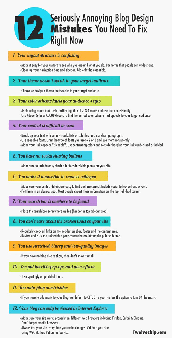
1. Cluttered Layouts
One of the most common design mistakes bloggers make is cramming too much content onto a single page. A cluttered layout can overwhelm your readers, making it difficult for them to focus on your content. To fix this mistake, consider a clean and minimalist design. Use white space effectively to give your content room to breathe, and prioritize a clear and easy-to-navigate layout.
2. Slow Loading Times
In today’s fast-paced world, people expect websites to load quickly. If your blog takes too long to load, you risk losing impatient readers. Slow loading times can be caused by large images, excessive plugins, or poor hosting. To address this issue, optimize your images, reduce the number of plugins, and consider upgrading your hosting plan for faster performance.
3. Poor Mobile Responsiveness
With the majority of internet traffic coming from mobile devices, having a mobile-responsive blog is non-negotiable. Annoying design mistakes include text that’s too small to read on mobile screens, images that don’t resize properly, and buttons that are hard to click. Ensure your blog is responsive and looks great on all screen sizes to cater to a wider audience.
4. Unreadable Fonts and Colors
Your blog’s text should be easy to read. Using tiny fonts, overly decorative fonts, or poor color choices can make your content difficult to decipher. Stick to legible fonts and high-contrast color combinations to ensure your readers can consume your content without straining their eyes.
5. Autoplay Videos and Audio
Few things are more irritating than visiting a blog and having a video or audio clip start playing automatically. Not only can this startle your visitors, but it can also disrupt their experience. If you must include multimedia content, give your readers the option to play it themselves rather than forcing it upon them.
6. Pop-Up Overload
While pop-ups can be effective for capturing email addresses or promoting content, using too many of them can be incredibly annoying. Multiple pop-ups that appear as soon as a visitor lands on your blog can drive people away. Use pop-ups sparingly and strategically, giving your readers a chance to engage with your content before bombarding them with requests.
7. Lack of Visual Hierarchy
A well-structured blog should have a clear visual hierarchy. This means that readers should easily identify the most important elements, such as headlines, subheadings, and call-to-action buttons. Consistent typography, sizing, and color choices can help create this hierarchy and guide your readers through your content.
8. Neglecting Readability
Readability is a critical aspect of blog design. Long paragraphs without breaks, poor line spacing, and text that spans the entire width of the screen can make your content difficult to read. Break up your content with subheadings, bullet points, and shorter paragraphs to improve readability and make your blog posts more reader-friendly.
9. Distracting Ads
Monetizing your blog through ads is a common practice, but it’s essential to strike a balance between earning revenue and providing a pleasant user experience. Too many ads, especially intrusive ones, can overwhelm your readers and detract from your content. Ensure that your ad placements are tasteful and not obtrusive.
10. Inconsistent Branding
Your blog should reflect your brand consistently. Inconsistent colors, fonts, and imagery can confuse visitors and make your blog look unprofessional. Create a style guide for your blog and stick to it across all pages and posts to maintain a cohesive and recognizable brand identity.
11. Broken Links
Few things are more frustrating than clicking on a link in a blog post and landing on a 404 error page. Broken links not only annoy readers but also harm your blog’s SEO. Regularly check and update your internal and external links to ensure a smooth browsing experience for your visitors.
12. Lack of Contact Information
If your readers want to get in touch with you, they should be able to do so easily. Failing to provide clear contact information is a common blog design mistake. Include a “Contact” page with your email address or a contact form, and consider adding social media links to make it simple for your audience to connect with you.
Conclusion
Your blog’s design is a critical factor in attracting and retaining readers. By addressing these 12 seriously annoying blog design mistakes, you can create a more user-friendly and enjoyable experience for your audience. Remember that a clean layout, fast loading times, mobile responsiveness, and readable fonts are just the beginning. Continuously evaluate and improve your blog’s design to keep your readers engaged and coming back for more.

Author:
Mark Ford