

Are you considering redesigning your company logo in 2017? Want to know the trends that are taking this year by storm?
In the fast-paced world of graphic design, staying up-to-date with the latest trends and techniques is crucial. Logo design, in particular, is a dynamic field where trends come and go, reflecting changes in design aesthetics, technology, and cultural influences.
In 2017, several exciting logo design trends emerged, captivating both designers and businesses alike. In this blog post, we’ll explore five logo design trends that took charge in 2017, providing insights and inspiration for designers and business owners looking to create or revamp their brand identities.
Creato share 5 trends to consider in this infographic.
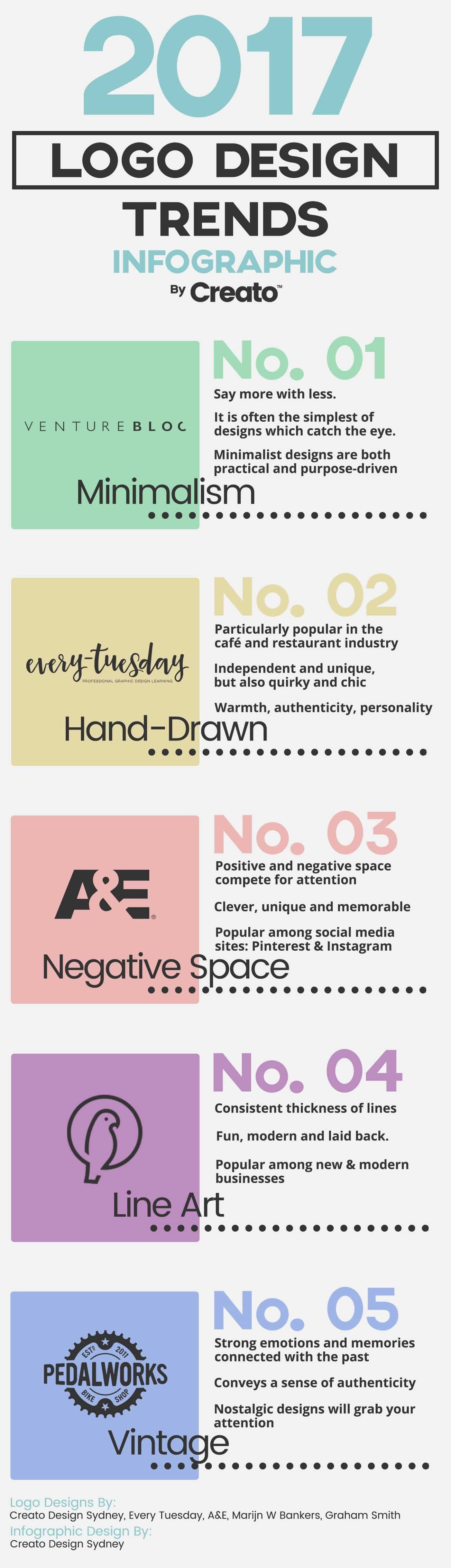
Minimalism: Less Is More
One of the prominent logo design trends of 2017 was minimalism. This design philosophy emphasizes simplicity, clarity, and the removal of unnecessary elements. Minimalist logos are characterized by their clean lines, uncluttered layouts, and a focus on essential elements. They often employ monochromatic color schemes and straightforward typography.
Why Minimalism?
Minimalist logos offer several advantages for businesses:
- Memorable: Simplicity makes logos easier to remember, increasing brand recognition.
- Versatile: Minimalist logos look great on various mediums, from business cards to billboards.
- Timeless: These designs tend to age well, remaining relevant for years to come.
- Scalable: Minimalist logos scale down or up without losing clarity, ensuring consistency.
Example: The Nike Swoosh
Perhaps the most iconic minimalist logo, the Nike Swoosh, represents speed, movement, and motivation. This logo has remained virtually unchanged since its creation in 1971, proving the timelessness of minimalist design.
Geometric Shapes and Patterns
2017 saw a resurgence of geometric shapes and patterns in logo design. Geometric logos use simple, symmetrical shapes like circles, triangles, and squares to create visually appealing and balanced designs. These logos often convey a sense of stability, order, and precision.
Why Geometric Shapes and Patterns?
- Visual Impact: Geometric logos draw the viewer’s eye and create a strong visual impact.
- Symbolism: Different shapes can convey various meanings; for example, circles often represent unity and infinity.
- Flexibility: Geometric patterns can be adapted to suit various industries and design aesthetics.
- Uniqueness: Combining geometric shapes allows for endless creative possibilities.
Example: Mastercard
Mastercard’s logo, redesigned in 2017, features two overlapping circles. The simplicity of this geometric design communicates the brand’s commitment to connectivity and partnership.
Handcrafted and Custom Lettering
In 2017, handcrafted and custom lettering gained popularity as logo design trends. These logos involve the creation of unique typefaces or letterforms, often by skilled calligraphers or lettering artists. Custom lettering adds a personal and distinctive touch to a brand’s identity.
Why Handcrafted and Custom Lettering?
- Authenticity: Custom lettering sets a brand apart, emphasizing its individuality.
- Artistry: Handcrafted lettering showcases the skill and creativity of the designer.
- Storytelling: The unique style of custom lettering can help convey a brand’s history or values.
- Flexibility: Custom fonts can be tailored to fit specific design requirements.
Example: Coca-Cola
Coca-Cola’s distinctive script logo has been a hallmark of the brand since the late 1800s. The custom lettering, with its flowing lines and elegant curves, has become synonymous with the Coca-Cola experience.
Negative Space
Negative space logo design was a trend that gained momentum in 2017. This technique involves using the space around and between elements in a logo to create additional visual elements or symbolism. Effective use of negative space can add depth, hidden meanings, and clever surprises to a logo.
Why Negative Space?
- Cleverness: Negative space logos often engage viewers by hiding subtle messages or images within the design.
- Storytelling: This technique can convey multiple layers of meaning, making the logo more memorable.
- Uniqueness: Negative space logos stand out in a crowded marketplace due to their creative approach.
- Versatility: These logos work well in various contexts, from digital screens to print materials.
Example: FedEx
FedEx’s logo is a classic example of negative space design. The hidden arrow between the letters “E” and “x” symbolizes speed and efficiency, reinforcing the company’s core values.
Gradient and Color Transitions
In 2017, gradients and color transitions made a strong comeback in logo design. These techniques involve the gradual blending of colors, creating smooth transitions and vibrant visual effects. Gradients can add depth, dimension, and a modern touch to a logo.
Why Gradients and Color Transitions?
- Modernity: Gradients give logos a contemporary look, appealing to younger audiences.
- Vibrancy: Color transitions can make a logo more visually striking and memorable.
- Depth: Gradients can create a sense of depth and three-dimensionality, making the logo pop.
- Versatility: These techniques can be applied to various design styles and industries.
Example: Instagram
Instagram’s iconic logo redesign in 2016 featured a vibrant gradient of colors, symbolizing the diversity and creativity of its user-generated content platform. This bold choice helped the brand stay relevant and fresh.
Conclusion
In 2017, logo design embraced a variety of trends that reflected the ever-evolving landscape of graphic design. Minimalism, geometric shapes, handcrafted lettering, negative space, and gradients each offered unique opportunities for designers to create memorable and effective brand identities. While these trends may have peaked in 2017, their influence continues to shape logo design today. As we move forward, it’s essential to remember that effective logo design goes beyond following trends; it should always reflect the core values, personality, and goals of the brand it represents. By understanding and leveraging these trends wisely, designers and businesses can create logos that stand the test of time while remaining fresh and relevant.

Author:
Mark Ford


