
Are you looking for ways to improve the design of your blog? Want to identify any blog design errors that could be costing you readers?
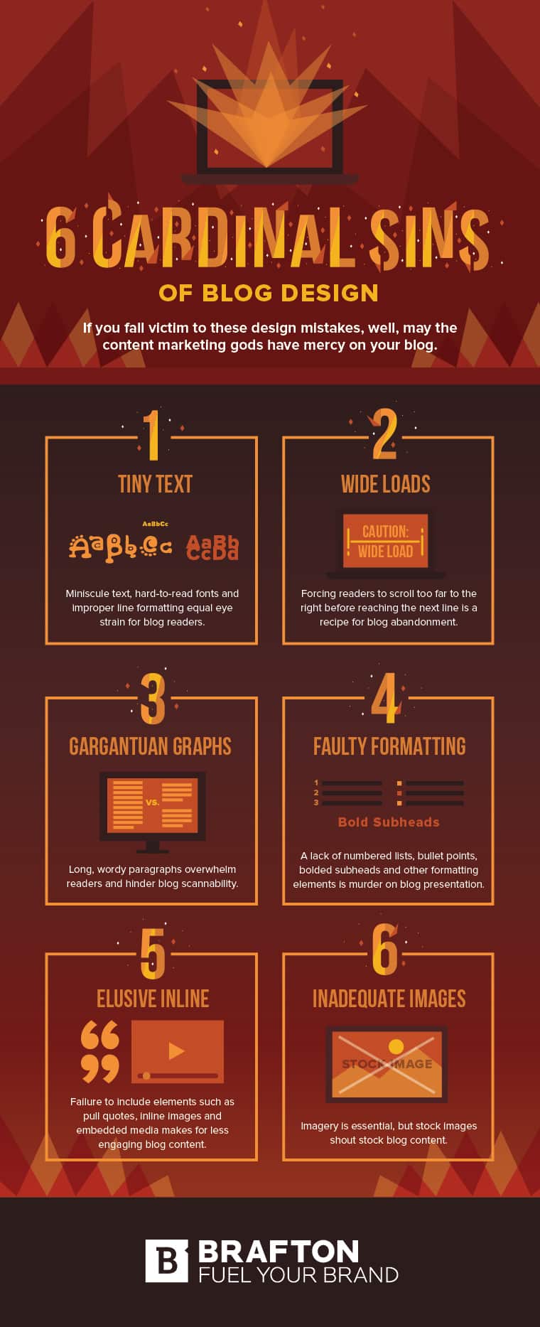
Brafton share the blog design mistakes to avoid in this infographic.
Here’s a quick summary:
- Tiny text
- Wide loads
- Gargantuan graphs
- Faulty formatting
- Elusive inline
- Inadequate images
Check out the infographic for more detail.
When it comes to content marketing, creating high-quality, engaging content is crucial. However, the design of your blog can make or break the success of your content.
A well-designed blog not only enhances readability but also keeps readers engaged and encourages them to share your content. Unfortunately, many bloggers make design mistakes that can undermine their efforts and harm their content marketing strategy.
In this post, we’ll explore six common blog design mistakes and how to fix them.
Tiny Text
Tiny text is a common design flaw that can significantly impact the user experience on your blog. When the font size is too small, it forces readers to squint or zoom in, which can lead to frustration and prompt them to leave your site.
This is particularly problematic for mobile users, who may find it even more challenging to read small text on their devices. Tiny text not only hampers readability but can also create accessibility issues for users with visual impairments.
Choose the Right Font Size
Selecting an appropriate font size is the first step to addressing the issue of tiny text.
- General Guidelines: Aim for a body text size of at least 16 pixels for standard web fonts. This size is generally recognized as the minimum for comfortable reading across devices. For headings, consider using sizes ranging from 24 to 32 pixels, depending on the hierarchy and importance of the heading.
- Responsive Design: Use responsive design techniques to ensure that text size adapts to various screen sizes. Tools like CSS media queries allow you to set different font sizes for mobile, tablet, and desktop views. This ensures that users have a comfortable reading experience no matter what device they are using.
Select a Legible Font Family
The choice of font family can also impact readability.
- Opt for Sans-Serif Fonts: Sans-serif fonts, like Arial, Helvetica, or Open Sans, are typically easier to read on screens compared to serif fonts. They provide a cleaner and more modern appearance, especially at smaller sizes.
- Avoid Decorative Fonts: While decorative fonts can add personality to your blog, they often sacrifice readability. Use them sparingly for headings or accents, but stick to simple, clear fonts for body text.
Ensure Proper Contrast
Text color and background color can dramatically affect readability.
- High Contrast: Ensure a high contrast between your text and background. For example, black text on a white background is highly readable, while light gray text on a white background can be difficult to read.
- Accessibility Considerations: Use tools like the WebAIM Color Contrast Checker to ensure that your text color meets accessibility standards (AA or AAA) for all users, including those with color blindness or visual impairments.
Utilize Line Height and Letter Spacing
Line height and letter spacing can enhance readability even further.
- Line Height: Set a line height (or leading) of 1.5 times the font size. This extra space helps to distinguish between lines of text, making it easier for readers to follow along. For example, if your font size is 16 pixels, your line height should be around 24 pixels.
- Letter Spacing: Adjust letter spacing (or tracking) to improve legibility. A small increase in letter spacing can make a significant difference in readability, especially for smaller font sizes.
Create Visual Hierarchy
Creating a visual hierarchy helps guide readers through your content.
- Use Headings and Subheadings: Break your content into sections with clear headings and subheadings. This not only enhances readability but also makes it easier for readers to scan your content. Use larger font sizes and bold formatting for headings to make them stand out.
- Short Paragraphs: Keep paragraphs short, ideally 2-3 sentences. This prevents overwhelming readers with large blocks of text and improves the overall visual appeal of your blog.
Test Readability Across Devices
It’s crucial to ensure that your text is readable on all devices.
- Mobile Responsiveness: Test your blog on various mobile devices and browsers to ensure that the text is readable without zooming. Use Google’s Mobile-Friendly Test tool to identify any potential issues with text size or layout.
- Gather User Feedback: Ask friends, colleagues, or even some of your readers to provide feedback on the readability of your blog. Their insights can help you make informed decisions about font size and overall design.
Implement Accessibility Best Practices
Making your blog accessible is not only good practice but also a legal requirement in many places.
- Use ARIA Labels: Implement Accessible Rich Internet Applications (ARIA) labels for any interactive elements. This helps screen readers understand and navigate your content better.
- Alt Text for Images: Always use descriptive alt text for images, ensuring that visually impaired users understand the content of your visuals.
Conclusion
Tiny text is a design mistake that can alienate readers and hurt your content marketing strategy. By prioritizing readability through appropriate font size, font choice, contrast, and formatting, you can create a user-friendly blog that enhances the reading experience for all users.
Remember that your goal is to engage readers and encourage them to interact with your content, and addressing the tiny text issue is a crucial step in achieving that. By taking the time to implement these tips, small businesses can create a more accessible, appealing, and effective blog that contributes positively to their overall marketing efforts.
Wide Loads
Wide loads, or excessively wide columns of text, can severely hinder the readability of your blog. When lines of text stretch too far across the screen, it becomes difficult for readers to follow along. They may lose their place, which can lead to frustration and a higher likelihood of abandoning the page.
This is especially problematic for mobile users, who have limited screen real estate and may find it even more challenging to read long lines of text. A cluttered and disorganized layout can negatively impact user experience, making it crucial to address the issue of wide loads in your blog design.
Optimize Column Width
Finding the right column width is essential for enhancing readability.
- Ideal Line Length: Aim for a line length of 50 to 75 characters per line. This range has been shown to be the most comfortable for reading, allowing users to scan text easily without losing their place. You can measure character count including spaces to ensure your text stays within this ideal range.
- Use CSS for Control: Utilize CSS (Cascading Style Sheets) to define the maximum width of your content area. For example, you can set the max-width property to a certain number of pixels (e.g., max-width: 800px;) to keep your text columns narrow enough for optimal readability.
Employ Responsive Design
Responsive design ensures that your blog adapts to different screen sizes, improving readability on all devices.
- Fluid Layouts: Consider using a fluid layout that adjusts the width of your columns based on the user’s screen size. This allows the text to be comfortably readable whether viewed on a mobile device, tablet, or desktop.
- Media Queries: Utilize CSS media queries to define different styles for various screen sizes. For instance, you might choose a narrower column width for mobile devices compared to larger screens, enhancing the reading experience for users regardless of their device.
Implement Proper White Space
White space, or negative space, plays a crucial role in readability and overall design.
- Balance Text and Space: Incorporate sufficient white space around your text blocks. This separation helps guide the reader’s eye, making the content easier to digest. Aim for at least 15-20% of the total area surrounding text to be white space, which can help reduce visual clutter.
- Spacing Between Paragraphs: Use proper spacing between paragraphs to avoid a cramped appearance. A line height of 1.5 times the font size is a good rule of thumb, while ensuring there’s sufficient space between paragraphs to create a clean look.
Break Up Long Text Blocks
Long paragraphs can be overwhelming and contribute to the feeling of a wide load.
- Use Short Paragraphs: Keep paragraphs short and concise, ideally no more than 2-3 sentences. This not only prevents the text from appearing as a wide block but also makes it easier for readers to scan and digest the content.
- Incorporate Subheadings: Use subheadings to break up sections of text. This helps create a clear hierarchy and guides readers through your content. Subheadings also allow users to quickly locate the information they’re interested in.
Utilize Lists and Bullet Points
Lists and bullet points can enhance the readability of your blog.
- Highlight Key Information: Whenever possible, convert dense information into lists. Bullet points make it easier for readers to scan key points quickly, providing a break from the standard paragraph format.
- Use Numbered Lists for Steps: If you’re providing a process or a set of instructions, use numbered lists. This organization helps guide readers through the steps in a clear, digestible manner.
Consider the Reading Environment
Think about where your readers are accessing your content and how that affects their experience.
- Lighting and Distractions: Consider that many readers may be accessing your blog in less-than-ideal lighting or while multitasking. A cluttered or wide layout can add to distractions, making it harder for them to concentrate.
- Use Mobile-First Design Principles: Since many users access blogs on mobile devices, consider adopting a mobile-first design approach. This means designing your blog for smaller screens first and then scaling up for larger screens. By doing so, you prioritize readability and usability for a significant portion of your audience.
Conduct User Testing
Testing your blog’s layout with real users can provide invaluable insights.
- Gather Feedback: Ask colleagues, friends, or even loyal readers to review your blog. Encourage them to provide feedback on the readability of your content and their overall experience. This can help identify specific areas that may need improvement.
- Analyze Bounce Rates: Utilize analytics tools to monitor bounce rates and user engagement metrics. A high bounce rate might indicate that readers are struggling with the layout, which could prompt you to reconsider your column width and overall design.
Use Visual Elements Wisely
Incorporating visuals can enhance your blog design and counteract the impact of wide loads.
- Include Images: Break up large blocks of text with relevant images, infographics, or charts. Visual elements help keep readers engaged and provide context to your content.
- Videos and Embeds: Consider using videos or embedded media when appropriate. These can provide an alternative way for users to engage with your content without overwhelming them with text.
Conclusion
Wide loads can detract from the overall user experience of your blog and undermine your content marketing strategy. By optimizing column width, employing responsive design, and creating sufficient white space, you can enhance readability and keep readers engaged.
Utilize lists, break up long text blocks, and incorporate visual elements to create a balanced layout that guides users through your content smoothly. Additionally, consider user feedback and test your design across various devices to ensure a seamless reading experience.
By taking the time to address the issue of wide loads, small businesses can create a blog that is not only visually appealing but also effective in engaging their target audience.
Gargantuan Graphs
Gargantuan graphs—those oversized charts and graphs that occupy excessive screen space—can overwhelm readers and distort the intended message of your data.
While visual data representation can enhance your content by providing insights and clarity, when graphs are too large or poorly designed, they can lead to confusion rather than understanding. Readers may struggle to extract meaningful information, resulting in frustration and disengagement.
It’s crucial for small businesses to present data visually in a way that is both informative and user-friendly.
Choose the Right Size
Selecting the appropriate size for your graphs is essential for clarity.
- Optimize Dimensions: Ensure your graphs fit comfortably within the content area without taking up excessive space. A good rule of thumb is to keep graphs at a maximum width of 600-800 pixels. This allows for easy viewing while maintaining readability and context.
- Mobile Responsiveness: Use responsive design to adjust the size of your graphs based on the device being used. Ensure that graphs resize appropriately on mobile devices, avoiding the need for users to scroll horizontally.
Simplify Data Presentation
Complex graphs can confuse rather than clarify. Simplifying data can enhance comprehension.
- Limit Data Points: Avoid overcrowding your graph with too much information. Focus on the key data points that you want to convey, and consider breaking complex data sets into multiple, simpler graphs if necessary.
- Use Clear Labels: Ensure that all axes, legends, and data points are clearly labeled. Avoid jargon or overly technical terms that might alienate your audience. Use straightforward language that resonates with your readers.
Select Appropriate Graph Types
Different types of data are best represented by different types of graphs.
- Bar vs. Line Charts: For comparing quantities, bar charts are often more effective than line charts, especially when dealing with discrete categories. Line charts work better for showing trends over time. Choose the type that best represents your data’s story.
- Pie Charts: While pie charts can be useful for displaying parts of a whole, avoid using them for datasets with many categories. Stick to a maximum of 3-5 slices to prevent overcrowding and maintain clarity.
Utilize Color Wisely
Color can enhance the effectiveness of your graphs but can also confuse if used improperly.
- Limit Color Palette: Use a limited color palette to maintain visual coherence. Stick to 2-4 colors that work well together and avoid overwhelming readers with a rainbow of hues.
- Accessibility Considerations: Ensure that your color choices are accessible to users with color blindness. Tools like Color Oracle can help you test how your graphs appear to individuals with different types of color vision deficiencies.
Provide Context and Explanation
Graphs should never stand alone without context.
- Include Descriptions: Accompany your graphs with brief descriptions explaining what the data represents and why it matters. This helps readers grasp the significance of the information quickly.
- Add Source Citations: If your data is sourced from external research or databases, be sure to cite these sources. Providing credible references enhances the trustworthiness of your information.
Optimize Graph Design for Clarity
Graph design plays a crucial role in the effectiveness of data presentation.
- Avoid 3D Effects: While 3D graphs may look appealing, they often distort the perception of data. Stick to 2D graphs for clearer representation of data points.
- Use Gridlines Sparingly: Excessive gridlines can clutter a graph. Use them minimally to provide context, ensuring that they do not detract from the data itself.
Test for Readability
Before finalizing your graphs, conduct readability tests.
- Seek Feedback: Share your graphs with colleagues or friends to gather feedback. Ask them if the graphs are easy to understand and if the key points are clear.
- Adjust Based on Feedback: Use the feedback received to make necessary adjustments. Consider creating multiple versions of a graph and testing which version resonates best with your audience.
Leverage Interactive Graphs
Interactive graphs can enhance engagement and understanding.
- Use Data Visualization Tools: Consider using tools like Tableau, Google Data Studio, or Infogram that allow you to create interactive graphs. Users can hover over data points for more information, zoom in, and filter data based on their interests.
- Incorporate Hover Effects: If you’re sharing graphs in a digital format, consider incorporating hover effects that reveal additional data or context. This can engage readers and encourage them to explore the data further.
Maintain Consistency Across Your Blog
Consistency in design helps build a cohesive brand identity.
- Uniform Graph Style: Maintain a uniform style for all graphs used in your blog. This includes consistent color schemes, fonts, and layouts. A cohesive design helps create a professional appearance.
- Establish a Graph Template: If your blog features multiple graphs, create a template that you can use for all future data visualizations. This saves time and ensures consistency in design.
Conclusion
Gargantuan graphs can undermine the effectiveness of your blog content and confuse readers rather than clarifying your message. By optimizing the size of your graphs, simplifying data presentation, selecting appropriate graph types, and utilizing color wisely, small businesses can enhance the readability and impact of their data.
Providing context and explanation, testing for readability, and leveraging interactive graphs can further elevate the user experience. By maintaining consistency across your blog, you create a polished and professional look that helps convey your brand’s message effectively.
Addressing the issue of gargantuan graphs will not only improve reader engagement but also contribute positively to your overall content marketing strategy.
Faulty Formatting
Faulty formatting refers to inconsistencies or errors in how content is presented on a blog. This can include misaligned text, improper use of headers, inconsistent font styles, or erratic spacing. Such issues can distract readers, making it difficult for them to focus on the content itself.
Poor formatting can also diminish your brand’s credibility and professionalism, leading potential customers to question the quality of your products or services. To effectively communicate your message and engage your audience, it’s crucial to maintain a high standard of formatting across all blog posts.
Establish a Consistent Style Guide
Creating a style guide helps ensure consistency across all your blog posts.
- Define Fonts and Sizes: Choose a primary font for headings and a complementary font for body text. Specify font sizes for headers (H1, H2, H3, etc.) and body text. For instance, you might opt for 24px for H1, 20px for H2, and 16px for body text.
- Specify Color Schemes: Document your brand colors and specify how they should be used in text, headings, and backgrounds. This will help maintain brand identity across your blog.
- Include Formatting Rules: Outline rules for using bold, italics, lists, and blockquotes. For example, use bold text for emphasis on key points and italics for titles of books or articles.
Use Heading Tags Appropriately
Proper use of heading tags (H1, H2, H3, etc.) is crucial for organization and SEO.
- Hierarchy Matters: Use H1 for your main title, H2 for main section titles, and H3 for subsections. This hierarchy helps readers easily navigate through your content and improves SEO by indicating the structure of your content to search engines.
- Limit the Number of Headings: Avoid overusing headings. Too many H2s or H3s can create confusion. Stick to a logical structure that enhances readability.
Maintain Consistent Spacing and Alignment
Spacing and alignment significantly impact the visual appeal of your blog.
- Set Margins and Padding: Consistently apply margins and padding throughout your posts. For instance, use 20px of padding around images and 10px of margin between paragraphs to ensure consistent white space.
- Align Text Properly: Choose a consistent alignment style (left-aligned is often the most readable) and stick to it. Avoid mixing left, center, and right alignments in a single post to prevent visual clutter.
Avoid Over-Formatting Text
While formatting can enhance readability, overdoing it can create confusion.
- Limit Bold and Italics: Use bold and italics sparingly to emphasize key points. Overuse can make text appear chaotic and can distract from the main message.
- Be Cautious with Colors: Avoid using too many colors or high-contrast backgrounds and text combinations. Stick to your brand color scheme for a cohesive look.
Optimize Images and Graphics
Images play a crucial role in blog formatting and can affect load times.
- Size and Compression: Ensure images are appropriately sized and compressed for web use. Large images can slow down your page load time. Use tools like TinyPNG or ImageOptim to reduce file sizes without sacrificing quality.
- Use Alt Text: Always include descriptive alt text for images. This not only improves accessibility for visually impaired users but also provides context for search engines.
Check for Broken Links and Errors
Regularly check your blog for broken links and formatting errors.
- Utilize Tools: Use tools like Broken Link Checker or Screaming Frog to identify broken links. Regularly auditing your blog for errors ensures that all links lead to the correct destinations and enhances user experience.
- Proofread Content: Before publishing, thoroughly proofread your content for grammatical errors and formatting inconsistencies. Consider using tools like Grammarly or Hemingway to aid in this process.
Make Use of Lists and Bullets
Using lists and bullet points can significantly enhance readability.
- Highlight Key Points: Break down complex information into digestible bullet points. This allows readers to quickly grasp essential information without wading through lengthy paragraphs.
- Numbered Lists for Sequences: Use numbered lists for steps or sequences, making it easy for readers to follow a specific order or process.
Ensure Mobile Optimization
With many users accessing blogs via mobile devices, ensure your formatting translates well across screens.
- Responsive Design: Use a responsive design that automatically adjusts the layout based on the device being used. This includes ensuring text is legible without excessive zooming and that images and graphs resize appropriately.
- Test on Multiple Devices: Regularly test your blog on different devices and screen sizes to identify and rectify formatting issues. Ensure that the content is easy to read and navigate on mobile phones and tablets.
Utilize Visual Breaks
Incorporate visual breaks to prevent content from appearing too dense.
- Add Horizontal Lines or Dividers: Use horizontal lines to separate sections of your content. This can help readers visually distinguish between topics and enhance overall readability.
- Include White Space: Allow for ample white space around text blocks and images. This separation gives the eyes a break and helps maintain focus.
Solicit Feedback and Make Adjustments
Getting feedback from users can provide valuable insights into your blog’s formatting.
- Conduct Surveys: Consider using surveys or polls to ask readers about their experience with your blog’s formatting. Ask questions like, “Was the text easy to read?” or “Did you find the layout intuitive?”
- Implement Changes: Use the feedback received to make necessary adjustments to your formatting. Regular updates based on user preferences can enhance the overall reading experience.
Conclusion
Faulty formatting can undermine the effectiveness of your blog and deter readers from engaging with your content. By establishing a consistent style guide, using headings appropriately, maintaining proper spacing and alignment, and optimizing images, small businesses can create a visually appealing and easy-to-navigate blog.
Avoiding over-formatting, regularly checking for broken links, and ensuring mobile optimization will further enhance the user experience. By actively seeking feedback and making adjustments, businesses can continuously improve their blog’s formatting and overall quality.
Addressing faulty formatting is key to creating a professional and credible online presence that resonates with your target audience and supports your content marketing strategy.
Elusive Inline
“Elusive inline” refers to the improper placement of inline elements—such as links, buttons, or embedded media—within your blog content.
These elements should enhance user engagement, provide additional context, or direct readers to related content. However, when they are poorly integrated, they can disrupt the flow of your writing, confuse readers, or even lead to missed opportunities for further engagement.
Ensuring that inline elements are strategically placed and effectively utilized is crucial for maximizing user interaction and maintaining a cohesive reading experience.
Understand the Purpose of Inline Elements
Before incorporating inline elements into your content, it’s essential to understand their purpose.
- Enhance User Experience: Inline elements should serve a specific purpose—whether it’s providing additional information, guiding readers to related content, or prompting an action. Ask yourself what value the inline element adds to the reader’s experience.
- Encourage Engagement: Use inline elements to encourage interaction, whether through links to related articles, social media shares, or calls to action (CTAs). Make sure these elements contribute to keeping the reader engaged with your content.
Strategically Place Inline Links
When it comes to links, placement can significantly impact click-through rates and reader experience.
- Contextual Placement: Integrate inline links naturally within the text where they make sense contextually. For example, if you mention a specific product, link to its dedicated page within your site, allowing readers to explore further without losing the narrative flow.
- Avoid Overloading with Links: While it’s important to provide resources, avoid excessive linking in a single paragraph, as this can distract and overwhelm readers. Aim for one or two relevant links per section to maintain clarity.
Use Clear and Descriptive Anchor Text
The anchor text is the clickable part of a hyperlink, and it should be clear and descriptive.
- Be Specific: Instead of generic phrases like “click here,” use descriptive text that tells the reader what to expect when they click the link. For example, use “Learn more about our pricing plans” instead of “click here.”
- Maintain Consistency: Use a consistent style for links throughout your blog, such as a specific color or underline style, to make them easily recognizable. This consistency helps readers identify clickable elements quickly.
Leverage Inline Calls to Action (CTAs)
CTAs are crucial for guiding readers toward specific actions you want them to take.
- Positioning CTAs Wisely: Place inline CTAs at strategic points in your content, such as at the end of a section or just before a major point of interest. For example, after a discussion on the benefits of a product, you might include an inline CTA saying, “Check out our product page to see how it can help you.”
- Create a Sense of Urgency: Use language that creates urgency in your CTAs, such as “Limited time offer” or “Join our newsletter for exclusive tips.” This encourages immediate action from readers.
Optimize Inline Media for Clarity
Incorporating media like images, videos, or infographics inline can enrich your content.
- Choose Relevant Media: Ensure that any embedded media directly relates to the surrounding text. For example, if you’re discussing a specific topic, include an infographic that visually summarizes that topic to provide immediate context.
- Maintain Visual Flow: Ensure that media elements do not disrupt the reading experience. For instance, if an image appears inline, ensure it’s appropriately sized and aligned to complement the text rather than crowding it.
Ensure Accessibility for Inline Elements
Accessibility is crucial for ensuring that all readers, including those with disabilities, can engage with your content.
- Use Alt Text for Images: Always provide descriptive alt text for inline images. This text is essential for visually impaired readers who use screen readers, allowing them to understand the content’s context.
- Consider Keyboard Navigation: Ensure that inline links and buttons can be easily navigated using a keyboard. This accessibility allows users with mobility impairments to engage with your content without difficulty.
Maintain a Clean Layout
A cluttered layout can make inline elements seem elusive or uninviting.
- Keep White Space in Mind: Ensure sufficient white space around inline elements to prevent overcrowding. This gives readers room to breathe and helps draw attention to important links or CTAs.
- Use Formatting Wisely: Use bullet points or lists to present information succinctly, allowing for easy scanning. Inline elements can be placed within these lists to encourage interaction without overwhelming the reader.
Test and Analyze Engagement
Regularly testing and analyzing the performance of your inline elements can help you understand what works best.
- Use Analytics Tools: Utilize tools like Google Analytics to track click-through rates for your inline links and CTAs. Identify which links are performing well and which need adjustment.
- A/B Testing: Conduct A/B tests to determine the effectiveness of different inline element placements or wording. For example, you can compare two versions of a blog post with different CTAs to see which one drives more engagement.
Consider the User Journey
Think about where readers are in their journey when they encounter your inline elements.
- Guide Readers Based on Their Needs: Place inline elements strategically based on the reader’s knowledge and interest level. For example, if you’re writing for beginners, provide links to introductory resources before linking to more advanced topics.
- Provide Clear Next Steps: Make it easy for readers to know what to do next. If they read a post about social media marketing, consider linking to a related post about creating effective social media campaigns to guide them further.
Regularly Update Inline Elements
As your content and offerings evolve, so should your inline elements.
- Review and Refresh Links: Regularly audit your blog for outdated links or information. If a linked resource is no longer relevant or available, replace it with a current one.
- Adapt CTAs for Relevance: Update your inline CTAs to reflect seasonal promotions or new offerings. Keeping them fresh ensures they remain compelling and relevant to your audience.
Conclusion
Elusive inline elements can diminish the effectiveness of your blog and hinder reader engagement. By understanding their purpose, strategically placing links and CTAs, using clear and descriptive anchor text, and ensuring accessibility, small businesses can enhance the user experience and encourage interaction with their content.
Optimizing the layout and regularly analyzing engagement metrics will further improve the effectiveness of inline elements. Ultimately, a well-integrated approach to inline elements can create a seamless reading experience that guides readers through your content and drives them toward desired actions.
Addressing the issue of elusive inline elements will contribute positively to your overall content marketing strategy and help you achieve your business goals.
Inadequate Images
“Inadequate images” refer to the use of poor-quality, irrelevant, or improperly sized images within your blog content.
Images are a crucial part of any blog, as they can significantly impact reader engagement, comprehension, and the overall aesthetic appeal of your content. When images fail to enhance your message or distract from it, they can undermine your content marketing strategy.
Therefore, understanding how to effectively use images is essential for small businesses looking to create a compelling and visually appealing blog.
Choose Relevant and High-Quality Images
The quality and relevance of your images play a crucial role in how readers perceive your content.
- Use High-Resolution Images: Always select images that are high resolution and visually appealing. Blurry or pixelated images can make your blog appear unprofessional. Aim for images that are at least 72 DPI (dots per inch) for web use, with a minimum width of 1200 pixels for better clarity on larger screens.
- Ensure Relevance: Images should directly relate to your content. A relevant image can reinforce your message and help convey information more effectively. For example, if you’re writing about healthy eating, include images of fresh fruits and vegetables, not unrelated stock photos.
Optimize Image Size for Faster Loading
Website speed is crucial for retaining visitors and improving SEO rankings. Large image files can slow down your page loading time.
- Compress Images: Use tools like TinyPNG or JPEGmini to compress images without losing quality. Compressing images reduces their file size, which helps improve loading speed and user experience.
- Choose Appropriate File Formats: Select the right file format for your images. JPEGs are ideal for photographs, while PNGs are better for graphics with transparent backgrounds or when you need high-quality text overlays. WebP format is another great option for high-quality images with smaller file sizes.
Implement Descriptive Alt Text
Alt text (alternative text) is a crucial aspect of image accessibility and SEO.
- Be Descriptive and Specific: Write clear and concise alt text that describes the image’s content and its relevance to the post. For example, instead of using “image1.jpg,” you could use “fresh vegetables in a wooden basket on a kitchen counter.”
- Include Keywords Naturally: If applicable, include relevant keywords in your alt text to improve SEO. However, avoid keyword stuffing—ensure the text still accurately describes the image.
Utilize Visual Hierarchy and Composition
Proper image placement and composition can greatly enhance readability and user engagement.
- Follow the Rule of Thirds: When creating or selecting images, consider using the rule of thirds. This design principle involves dividing an image into three equal parts both horizontally and vertically, creating nine sections. Place key elements along these lines or intersections to create balance and interest.
- Integrate Images Seamlessly: Ensure that images are integrated into the text in a way that flows naturally. They should complement the content rather than disrupt the reading experience. For example, use images to break up large blocks of text, making your content more digestible.
Incorporate Infographics and Visual Data
Infographics and charts can simplify complex information and engage readers.
- Create Infographics: Use tools like Canva or Piktochart to create visually appealing infographics that summarize key points or data in your content. Infographics are often shared on social media and can help increase your content’s reach.
- Use Charts and Graphs Wisely: When presenting data, use charts and graphs that are easy to read and interpret. Ensure that they are well-labeled and use contrasting colors to highlight key information. Avoid overcrowding them with too much data, which can confuse readers.
Maintain a Consistent Visual Style
Consistency in your blog’s visual style helps to establish brand identity and improves the overall aesthetic.
- Choose a Color Palette: Select a color palette that aligns with your brand and use it consistently throughout your blog images. This can help create a cohesive look and feel.
- Use Similar Image Styles: If you’re using stock photos, try to select images that have a similar style or tone (e.g., bright, warm colors or muted tones) to maintain visual consistency. This approach helps create a harmonious visual experience for readers.
Test and Adapt Image Use
Understanding how your audience interacts with images can help you refine your approach.
- Analyze Engagement Metrics: Use analytics tools to track how readers interact with your images. Look for patterns in engagement with different types of images (e.g., infographics vs. photographs) to understand what resonates most with your audience.
- A/B Testing: Consider conducting A/B tests with different images or formats to determine which ones drive higher engagement. For example, try using different infographics or photographs for the same content and analyze which performs better in terms of clicks and shares.
Ensure Accessibility for All Users
Making your images accessible is important for reaching a broader audience, including individuals with disabilities.
- Provide Alt Text for All Images: Ensure that every image on your blog includes appropriate alt text, which allows screen readers to describe the images to visually impaired users.
- Avoid Text Over Images: If you’re adding text to an image, ensure that it’s easily readable against the background. High contrast between text and background colors enhances readability. Also, provide a text alternative for any crucial information conveyed through images.
Regularly Update Your Images
As your content evolves, it’s important to keep your visuals current and relevant.
- Audit and Refresh Images: Periodically review your blog posts to ensure that the images remain relevant and of high quality. Replace outdated images with fresh ones that align with your current branding or messaging.
- Seasonal Updates: Consider updating images to reflect seasonal changes or new offerings. For example, if you’re a retailer, showcase products in seasonal settings to make your content timely and engaging.
Use Images to Tell a Story
Images can evoke emotions and tell a story that complements your written content.
- Choose Storytelling Images: Select images that convey emotions or tell a story related to your content. For instance, if you’re writing a case study about a successful client project, consider using before-and-after images or customer testimonials alongside relevant visuals.
- Create a Narrative Flow: Use images throughout your blog to create a narrative flow that enhances the reader’s understanding and engagement with the content. Consider how each image contributes to the overall message you want to convey.
Conclusion
Inadequate images can detract from the overall impact of your blog and hinder engagement with your content. By prioritizing high-quality, relevant visuals and optimizing their use, small businesses can create a more compelling and visually appealing blog experience.
From selecting appropriate images and incorporating alt text to maintaining a consistent visual style and ensuring accessibility, every aspect contributes to the effectiveness of your content marketing strategy.
Regularly analyzing engagement metrics and updating visuals will further enhance your approach, allowing you to effectively reach and resonate with your audience. By addressing the issue of inadequate images, small businesses can significantly improve their blogging efforts and overall content marketing success.
Conclusion
The design of your blog plays a vital role in the effectiveness of your content marketing strategy. By avoiding these six common design mistakes—tiny text, wide loads, gargantuan graphs, faulty formatting, elusive inline elements, and inadequate images—you can create a more engaging and user-friendly experience for your readers.
A well-designed blog not only enhances readability but also encourages visitors to interact with your content and share it with others. Take the time to assess your blog’s design and make necessary adjustments to ensure you’re maximizing the impact of your content marketing efforts. By prioritizing design, you can create a blog that stands out and keeps readers coming back for more.

Author:
Mark Ford

Mastering the Art of the Landing Page: Design, Copy, and Conversion in Harmony
Are you trying to design a landing page that not only looks great but actually converts visitors into customers? Want to learn how to balance design, copy, and strategy to create landing pages that work in perfect harmony? […]