

What colours do you use on your company website and logo? How do those colours make your customers feel about you?
The colours you use as part of your branding and marketing can have an immediate and lasting impact on the impression you give to new and existing clients, which in turn could affect your ability to build your business.
Have you chosen the right colours? Take a look at the infographic below from The Logo Company to see what they say about you.
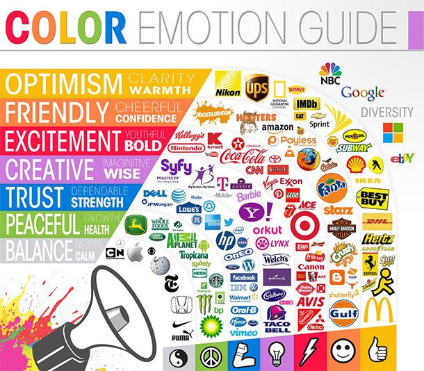
In the world of design and marketing, colors play a pivotal role in conveying emotions, setting the tone, and influencing people’s perceptions. From the moment a potential customer visits your website or encounters your logo, the colors you choose can profoundly impact how they feel and ultimately, their decision to engage with your brand. In this comprehensive guide, we’ll explore the psychology of colors, their emotional impact, and how to strategically use color in your website and logo design to connect with your audience on a deeper level.
The Psychology of Color
Color psychology is the study of how different colors affect human behavior, emotions, and perceptions. It’s a powerful tool for designers and marketers because it helps them create visual experiences that resonate with their target audience. Here’s a breakdown of some common colors and the emotions they typically evoke:
1. Red: Passion and Energy
Red is a color associated with strong emotions like love, passion, and anger. It’s attention-grabbing and can create a sense of urgency. Brands like Coca-Cola and Target use red to convey excitement and energy.
2. Blue: Trust and Stability
Blue is often associated with trust, reliability, and calmness. It’s a popular choice for financial and tech companies like IBM and Facebook. Blue can also evoke feelings of sadness, so it’s essential to use it appropriately.
3. Green: Nature and Growth
Green symbolizes nature, health, and growth. It’s often used by eco-friendly brands and businesses focused on sustainability. Companies like Starbucks and Whole Foods use green to convey a sense of freshness and well-being.
4. Yellow: Optimism and Happiness
Yellow is the color of sunshine, optimism, and happiness. It can grab attention and create a sense of positivity. Brands like McDonald’s and IKEA use yellow to evoke a cheerful and friendly vibe.
5. Purple: Creativity and Luxury
Purple is often associated with creativity, luxury, and royalty. It’s used by brands like Cadbury and Hallmark to convey a sense of elegance and sophistication.
6. Orange: Energy and Playfulness
Orange is a vibrant color that represents energy and playfulness. It’s commonly used by brands like Nickelodeon and Fanta to create a sense of fun and excitement.
7. Black: Sophistication and Elegance
Black is a versatile color that can convey sophistication, elegance, and luxury. It’s often used by high-end fashion brands like Chanel and Prada.
8. White: Purity and Simplicity
White symbolizes purity, simplicity, and cleanliness. It’s commonly used in minimalist designs and by healthcare brands to convey a sense of cleanliness and trust.
The Impact of Color in Web Design
Now that we’ve explored the emotional associations of different colors, let’s dive into how color choices can impact your website design and user experience.
1. First Impressions Matter
When visitors land on your website, they form an initial impression within seconds. Color is a significant factor in this impression. The right color scheme can make your site feel welcoming and trustworthy, while the wrong one can be off-putting.
2. Establishing Brand Identity
Consistency in color usage across your website is essential for brand recognition. The colors you choose should align with your brand’s values, mission, and personality. This consistency helps reinforce your brand identity and make your website memorable.
3. Highlighting Calls to Action (CTAs)
Effective CTAs are crucial for driving user engagement. The color of your CTAs can influence whether visitors click or not. For example, using a contrasting color for your “Buy Now” button can make it stand out and encourage conversions.
4. Creating a Mood
Your website’s color scheme can set the mood for your content. For example, if you’re a wellness brand, using calming and natural colors like greens and blues can help convey a sense of relaxation and well-being.
5. Improving Readability
Color choices also affect the readability of your website. The text should contrast well with the background to ensure easy reading. Black text on a white background is a classic choice for readability, but you can experiment with other combinations as long as they don’t compromise legibility.
Case Studies: Effective Use of Color in Web Design
To illustrate the impact of color in web design, let’s take a look at some real-world case studies:
1. Airbnb: Trust and Inclusivity
Airbnb’s website uses a calming combination of blue and white, which conveys trust and inclusivity. The use of white space creates a clean and inviting feel. This color scheme aligns with their brand promise of providing safe and comfortable accommodations.
2. Spotify: Energetic and Creative
Spotify uses a vibrant combination of green and black. Green represents growth and creativity, while the black background adds a touch of sophistication. This color scheme matches Spotify’s mission of empowering artists and promoting creative expression.
3. Apple: Minimalistic Elegance
Apple’s website is a prime example of minimalistic elegance, predominantly using white and black. This color scheme reflects the brand’s commitment to simplicity, sophistication, and cutting-edge technology.
4. Patagonia: Sustainability and Nature
Patagonia, an outdoor clothing company, uses earthy tones like green and brown to convey a sense of sustainability and a connection to nature. These colors align with their environmentally conscious mission.
Using Color in Logo Design
Your logo is a visual representation of your brand, and its colors play a significant role in shaping how people perceive your business. Here are some key considerations when using color in logo design:
1. Color Symbolism
Consider the emotions and associations associated with each color when designing your logo. Ensure that the colors you choose align with your brand’s values and messaging.
2. Versatility
Your logo should look good in various contexts, from digital screens to print materials. Test your logo in different color modes (RGB for digital, CMYK for print) to ensure it remains effective in all mediums.
3. Scalability
A good logo should be scalable without losing its impact. Ensure that your logo looks clear and recognizable in both small and large sizes.
4. Color Harmony
Pay attention to the harmony of colors in your logo. Choose a color palette that balances well and creates a pleasing visual experience.
Case Studies: The Power of Color in Logos
Let’s examine some well-known logos and how their color choices contribute to their brand identity:
1. McDonald’s: Yellow and Red
McDonald’s iconic golden arches are synonymous with fast food and happiness. The use of yellow and red in their logo conveys a sense of energy, excitement, and optimism. These colors encourage customers to associate McDonald’s with a fun and enjoyable dining experience.
2. Coca-Cola: Red
Coca-Cola’s red logo is instantly recognizable and represents passion, excitement, and the joy of sharing a refreshing beverage with friends. The red color also creates a sense of urgency, making customers crave a Coca-Cola.
3. Starbucks: Green and Black
Starbucks’ green and black logo exudes a sense of nature, freshness, and sophistication. The green color represents their commitment to ethically sourced coffee and sustainable practices, while the black adds a touch of elegance.
4. Nike: Black and White
Nike’s simple black swoosh on a white background is a prime example of minimalist design. The black swoosh symbolizes motion and athleticism, while the white background represents purity and simplicity. This combination perfectly aligns with Nike’s message of “Just Do It.”
Tips for Choosing the Right Colors for Your Brand
Now that you understand the importance of color in web design and logo creation, here are some practical tips for choosing the right colors for your brand:
1. Know Your Audience
Consider the demographics and psychographics of your target audience. What colors resonate with them? Conduct research and surveys if necessary to gain insights into their preferences.
2. Analyze Your Competition
Study your competitors’ color choices. You don’t want to blend in, but you also don’t want to use colors that are jarringly different from industry norms. Find a balance that allows you to stand out while staying relevant.
3. Consider Color Combinations
Think about how colors work together. Complementary colors, analogous colors, and monochromatic color schemes all create different visual effects. Choose a combination that suits your brand’s personality.
4. Test Your Choices
Before finalizing your color scheme, test it with a focus group or through A/B testing on your website. This can help you gauge the emotional responses your colors evoke and make necessary adjustments.
5. Stay Consistent
Once you’ve chosen your brand colors, use them consistently across all marketing materials, from your website to social media profiles to print materials. This consistency reinforces your brand identity.
Conclusion
In the world of design and marketing, color is a powerful tool that can evoke emotions, convey messages, and leave a lasting impression. Your website and logo are often the first touchpoints for potential customers, so it’s crucial to choose your colors strategically. By understanding the psychology of colors, considering their impact on web design and logo creation, and following best practices for color selection, you can create a visual identity that resonates with your target audience and builds a strong and memorable brand. Remember that the right colors can speak louder than words and leave a lasting imprint on your customers’ hearts and minds.

Author:
Mark Ford

Mastering the Art of the Landing Page: Design, Copy, and Conversion in Harmony
Are you trying to design a landing page that not only looks great but actually converts visitors into customers? Want to learn how to balance design, copy, and strategy to create landing pages that work in perfect harmony? […]


