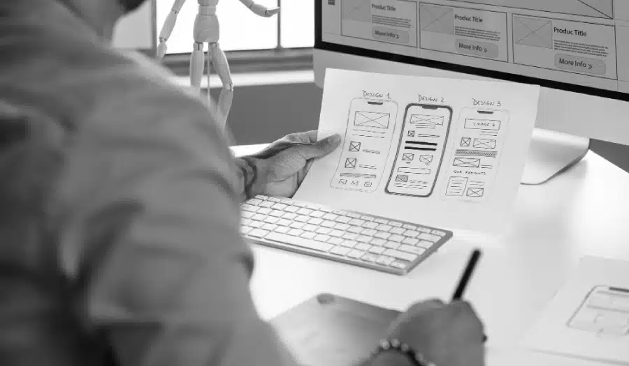
Is your website failing to generate the results you hoped for? Want to learn the most common website design mistakes small businesses make?
Studio1Design shares its website mistakes to avoid in this infographic.
Here are a few that make their list:
- Outdated look and feel
- Not leading with value first
- No lead magnet
- No marketing funnel
- Not displaying enough social proof
Check out the infographic for more.
![21 Common Website Design Mistakes Small Businesses Should Avoid [Infographic]](https://red-website-design.co.uk/wp-content/uploads/21-Common-Website-Design-Mistakes-Small-Businesses-Should-Avoid-1.jpg)
When it comes to running a successful small business, your website plays a crucial role in attracting and converting visitors. It’s often the first impression potential customers have of your brand, and a poorly designed site can drive them away before they even consider your products or services.
Many small business owners fall into common website design traps that hurt their credibility, frustrate users, and ultimately lead to lost revenue. From outdated aesthetics to a lack of clear calls to action, these mistakes can make your site less effective and prevent it from working as a powerful marketing tool.
In this guide, we’ll explore 21 common website design mistakes small businesses should avoid, helping you create a site that not only looks great but also converts visitors into loyal customers.
Outdated Look and Feel
An outdated website design can harm your business’s credibility and make your brand appear out of touch with current trends and technologies. A site that looks like it hasn’t been updated in years may give visitors the impression that your business isn’t active or trustworthy, even if that’s far from the case. In today’s digital age, aesthetics matter just as much as functionality, and if your website feels old-fashioned, it can turn potential customers away.
To avoid this mistake, focus on giving your website a modern and professional appearance. Ensure that the design aligns with your brand identity and appeals to your target audience. Here are a few tips to refresh your website:
- Update the colour scheme and typography: Choose colours and fonts that are clean, easy to read, and on-brand. Consider using trendy design elements, but avoid going overboard to ensure your site doesn’t look too “faddish.”
- Invest in high-quality visuals: Use up-to-date images that represent your brand well, and make sure they are high resolution. Avoid using outdated graphics or poor-quality stock images.
- Ensure responsive design: A modern website must be mobile-friendly. More than half of web traffic now comes from mobile devices, so ensure your site adapts to various screen sizes seamlessly.
- Simplify the layout: Modern design is often about minimalism. Remove clutter and focus on clean lines and an intuitive user experience to make navigation easy.
By giving your website a fresh, contemporary look, you’ll not only improve user experience but also convey that your business is innovative and reliable.
Not Leading with Value First
One of the biggest mistakes small businesses make is not leading with value on their website. When visitors land on your site, they want to know right away what benefits they’ll get from engaging with your business. If your site doesn’t clearly communicate its value proposition within the first few seconds, visitors are likely to leave and seek out competitors who make it easier to understand what they offer.
To fix this, you need to ensure your website immediately conveys the value of your product or service and answers the question: Why should visitors care? Here’s how you can make sure your value comes through clearly:
- Craft a compelling headline: Your homepage should have a strong, concise headline that explains the primary benefit of your offering. Avoid jargon or vague terms and focus on what your product or service can solve or improve for your customers.
- Use a clear subheading: Complement the headline with a subheading that elaborates on the specific benefits, offering a bit more context while still keeping it focused on the visitor’s needs.
- Highlight key benefits early on: Include a section that succinctly outlines the top benefits your product or service provides. This should be one of the first things visitors see when they arrive on your homepage.
- Incorporate customer testimonials or social proof: Showing evidence that others have benefited from your offering can immediately build trust and showcase your value in action.
By focusing on value right from the start, you’ll grab visitors’ attention, keep them engaged, and increase the likelihood of conversion. Make it clear how your business can solve their problems and meet their needs, and you’ll see better results from your website.
No Lead Magnet
Not offering a lead magnet is a missed opportunity to build your email list and nurture potential customers. A lead magnet is something of value, such as an eBook, free guide, or discount, that you offer in exchange for visitors’ contact information. Without one, you’re likely leaving money on the table, as you might drive traffic to your website but have little means to follow up with interested leads who aren’t ready to make a purchase immediately.
To fix this, implement a lead magnet strategy to capture the contact details of visitors who are interested in what you have to offer but may not be ready to commit. Here’s how you can create and position a lead magnet effectively:
- Identify your audience’s pain points: The best lead magnets solve a problem or address a need. Understand your target audience and create something that offers them a solution, such as a checklist, template, case study, or informative guide.
- Place it in prominent positions: Make sure your lead magnet is visible without being intrusive. Common spots include the homepage, landing pages, blog posts, and as a pop-up after a visitor has been on your site for a while.
- Offer instant gratification: Visitors appreciate being able to access their lead magnet immediately. Make it simple for them to download or receive it, and ensure your opt-in form is easy to complete.
- Create multiple types of lead magnets: Different customers might prefer different kinds of offers. For example, some might be attracted to free resources like webinars or eBooks, while others may prefer discounts or exclusive access.
By providing a lead magnet, you can start building a relationship with potential customers and guide them through your sales funnel, ultimately increasing your chances of conversion.
No Marketing Funnel
Not having a marketing funnel is a critical mistake that many small businesses make when designing their websites. A marketing funnel is a step-by-step process that guides visitors from their initial interaction with your site all the way to becoming a customer. Without a clear funnel, your website is essentially a dead end for many visitors — they may arrive, browse for a bit, and then leave without taking meaningful action.
A well-structured marketing funnel helps you nurture potential customers through each stage of their decision-making process, from awareness to consideration to conversion. Here’s how to build an effective marketing funnel on your website:
- Top of the Funnel (Awareness): This is where potential customers first learn about your business. Ensure your homepage, blog, and social proof offer valuable content that educates visitors and answers their questions. Think of this as attracting traffic through organic SEO, paid ads, or social media.
- Middle of the Funnel (Consideration): Once visitors are aware of your brand, the next step is engaging them deeper. This is where you introduce lead magnets, such as free guides or case studies, to keep them interested and collect their contact details. Nurture these leads with targeted email campaigns or follow-up content.
- Bottom of the Funnel (Conversion): At this stage, your leads are considering a purchase. Your site should have clear calls to action, such as “Buy Now” buttons, consultation forms, or product pages with easy checkout options. Additionally, having a strong value proposition and testimonials can help seal the deal.
By creating a well-defined marketing funnel, you’ll ensure that your website isn’t just a passive tool, but an active part of your sales process that nurtures visitors through every step of their journey to becoming a customer.
No Thank You Page Offer
Neglecting to include an offer on your thank you page is a missed opportunity to further engage visitors after they’ve taken an action on your site, such as signing up for a newsletter, downloading a lead magnet, or making a purchase. A thank you page is often seen as a final step in the process, but it’s actually one of the most valuable parts of the customer journey. Without a follow-up offer, you’re missing a chance to keep the momentum going and potentially increase customer retention or generate more sales.
To fix this, take advantage of your thank you page by offering an additional incentive or action that keeps visitors engaged with your brand. Here’s how to turn your thank you page into a powerful marketing tool:
- Provide an upsell or cross-sell: After someone completes an action, offer them a related product or service at a discounted rate. For example, if a visitor downloads an eBook, offer them a discount on a service or product they might be interested in.
- Encourage social sharing: Make it easy for users to share their recent action (such as downloading content or making a purchase) on social media. Adding social sharing buttons or an incentive for referrals can help expand your reach.
- Invite further engagement: Include a call to action (CTA) that invites visitors to explore more content or follow your brand on social media. For example, you could recommend a blog post or a video that aligns with their interest or provide a link to a webinar or free trial.
- Ask for feedback or reviews: Encourage visitors to leave feedback on their experience or share a review of a product/service they’ve just engaged with. This can help build trust and provide valuable insights.
By adding a thoughtful offer on your thank you page, you can capitalize on the positive emotions visitors are experiencing after completing an action, increasing the likelihood of continued engagement and conversions.
Not Displaying Enough Social Proof
Social proof is one of the most powerful psychological triggers that influences purchasing decisions. When potential customers see that others have had a positive experience with your brand, it builds trust and credibility. Without enough social proof on your website, visitors may feel uncertain about your business and hesitate to make a purchase or engage further. Not displaying testimonials, reviews, case studies, or trust signals can make your site seem less trustworthy, ultimately leading to lower conversions.
To fix this, incorporate various forms of social proof throughout your website to show visitors that others have already benefited from your products or services. Here’s how to do it effectively:
- Customer testimonials: Feature glowing reviews from satisfied customers directly on your homepage or product pages. A personal, authentic testimonial from someone who has used your product can greatly enhance your credibility.
- Case studies and success stories: Showcase real-life examples of how your product or service has solved problems for clients. Provide detailed accounts that highlight the before-and-after scenarios, which can help potential customers visualize the value they’ll get.
- Product reviews and ratings: If you sell physical products, include customer reviews and ratings on product pages. Positive feedback increases the likelihood that visitors will trust your offerings and feel confident making a purchase.
- Trust badges and certifications: Display any relevant certifications, awards, or trust badges (such as secure payment options) to reassure visitors that your site is secure and your business is reputable.
- Social media mentions: If customers have shared positive experiences on social media, embed their posts or highlight them on your site to demonstrate real-time interactions with your brand.
By integrating social proof into your website, you’ll show visitors that your business is trusted by others, which can greatly increase confidence and push them further down the conversion funnel.
Not Using Videos
In today’s digital world, video is one of the most engaging and effective ways to communicate your message. If your website doesn’t incorporate video, you’re missing a powerful tool that can help increase user engagement, improve conversions, and build a deeper connection with your audience. Videos allow you to explain complex concepts more easily, showcase your products or services in action, and convey your brand’s personality in a way text and images simply can’t.
Not using videos on your website is a mistake because visitors are more likely to engage with and remember video content compared to other forms of media. Without it, your site may feel static and fail to capture visitors’ attention.
To fix this, consider incorporating videos throughout your site to make it more dynamic and interactive. Here’s how to do it effectively:
- Product demos and tutorials: Show visitors exactly how your product works or demonstrate its benefits in real-time. A product demo video can give potential customers a better understanding of your offering and help them make more informed decisions.
- Customer testimonials: Video testimonials are more personal and authentic than written ones. Encourage satisfied customers to share their positive experiences on video, which will resonate more with visitors than a simple text-based review.
- Explainer videos: Use a short explainer video on your homepage or landing pages to quickly outline what your business does and why visitors should care. Keep it concise and focus on the benefits of your product or service.
- Behind-the-scenes content: Share videos that give visitors an inside look into your business, whether it’s a tour of your workspace, introductions to team members, or a look at your company’s values in action. This adds a personal touch and builds trust with your audience.
- Video calls to action: Instead of a traditional static CTA, use video to lead visitors to the next step in your funnel. A short, engaging video can be a compelling call to action that invites users to sign up, buy now, or learn more.
By adding video content to your website, you’ll provide a more engaging experience for your visitors, making it easier to hold their attention, build trust, and drive conversions.
Terrible Copywriting
Poor copywriting can make or break the success of your website. When your copy doesn’t effectively communicate your message, it can confuse visitors, fail to grab their attention, and ultimately drive them away. Visitors expect your website to speak directly to their needs and emotions, and if your copy is unclear, overly complex, or lacks a compelling call to action, it’s likely to result in lost opportunities and lower conversions.
To fix this, focus on improving your website copy to ensure it’s clear, engaging, and persuasive. Here’s how to get your copywriting on track:
- Know your audience: Before writing anything, understand your target audience and their pain points. Tailor your language to speak directly to their needs, desires, and challenges, making sure your message resonates with them.
- Use clear, concise language: Avoid jargon, long-winded sentences, or overly technical terms unless your audience is familiar with them. Keep your message simple and to the point, focusing on how your product or service can benefit the customer.
- Focus on benefits, not features: Instead of listing technical features or specs, highlight the benefits your customers will experience. Show them how your product or service will solve their problems or make their lives better.
- Craft compelling headlines and CTAs: Your headlines should immediately capture attention and convey the value of your offer. Similarly, your calls to action (CTAs) should be clear and motivating, encouraging visitors to take the next step, whether it’s signing up, contacting you, or making a purchase.
- Write with personality: Your brand’s voice should be consistent throughout your site. Whether it’s friendly, professional, or quirky, make sure it matches the tone and style your audience expects and feels comfortable with.
- Proofread and edit: Bad grammar or spelling mistakes can erode trust in your brand. Always proofread your copy and ensure it’s polished and error-free.
By improving your website copy, you’ll create a more persuasive, engaging experience for visitors that speaks to their needs and encourages them to take action. Clear, compelling copywriting is a key factor in building trust, guiding visitors through your site, and increasing conversions.
Not Displaying Your Authority
Failing to display your authority on your website is a missed opportunity to establish trust and credibility with potential customers. In a competitive digital world, people are more likely to engage with businesses that appear knowledgeable, trustworthy, and experienced. Without showcasing your expertise or industry authority, visitors may hesitate to purchase from you, unsure if they can rely on your products or services.
To fix this, make sure your website highlights your authority and expertise in a way that builds trust with your audience. Here’s how to do it effectively:
- Highlight your credentials and experience: If you have any certifications, qualifications, or industry recognition, make them visible on your website. Displaying these helps demonstrate that you’re a trusted expert in your field.
- Feature industry-related awards: If your business has won any awards or accolades, prominently showcase them on your homepage or relevant pages. This provides social proof and reinforces your authority.
- Showcase your team’s expertise: Include bios of your team members, highlighting their qualifications, experience, and roles. This can help visitors feel more confident in your ability to deliver results, as it personalizes your brand and demonstrates the expertise behind your business.
- Include client testimonials or case studies: Testimonials from reputable clients, especially well-known brands or individuals, can strongly reinforce your authority. Case studies that highlight your successful projects or services also help position you as an expert.
- Publish thought leadership content: Start a blog or create resources that showcase your industry knowledge. Writing insightful articles, guides, or white papers on topics relevant to your audience positions you as a thought leader and gives visitors a reason to trust you.
- Leverage media mentions or partnerships: If your business has been featured in the press or has notable partnerships, make sure to display logos, quotes, or mentions on your site. This helps validate your authority in the industry.
By making your authority clear and visible, you create a sense of trust and professionalism that can drive more engagement, convert leads into customers, and foster long-term loyalty. Demonstrating that you’re an expert in your field helps position your business as the go-to choice for potential customers.
Hard to Find Call to Action
A hard-to-find call to action (CTA) is one of the biggest mistakes you can make on your website. Visitors come to your site with a purpose, and they need clear guidance on what to do next. If your CTA is buried in text, hidden in a sidebar, or not clearly visible, users may become frustrated or confused, leading them to leave your site without completing any action.
To fix this, make your CTAs clear, accessible, and compelling, ensuring they are visible and easy for users to interact with. Here’s how to get your CTA strategy right:
- Place CTAs in prominent locations: Your CTA should be visible without the need to scroll. Position it above the fold on key pages, such as the homepage, product pages, and landing pages. It should be one of the first things visitors see when they arrive on your site.
- Use clear, action-oriented language: Avoid generic phrases like “Click here” or “Submit.” Use verbs that tell visitors exactly what they will get, such as “Get Your Free Quote,” “Shop Now,” or “Start Your Free Trial.”
- Make CTAs stand out: Use contrasting colours that align with your website’s design but ensure the CTA button stands out. The size should be large enough to catch the visitor’s eye without overwhelming the design.
- Keep it simple and focused: Don’t overwhelm users with too many choices. Stick to one clear action per page to guide visitors in the direction you want them to take. Too many CTAs can lead to confusion and indecision.
- Use multiple CTAs throughout the site: While your main CTA should be in a prominent spot, it’s important to include secondary CTAs throughout your site, especially at the end of blog posts or after key information. This ensures that users are consistently presented with the next step in the process.
- Test and optimise: Regularly test your CTAs to see which wording, design, and placement generate the best results. A/B testing can help you understand which options work best for your audience.
By making your CTAs easy to find and compelling to click, you guide visitors seamlessly through their journey, ensuring they take the desired action and improve your conversion rates. Clear, prominent CTAs are crucial for a user-friendly experience that maximises engagement and conversions.
Not Easy to Navigate
If your website is difficult to navigate, visitors will quickly become frustrated and may leave before finding what they need. A confusing layout, cluttered design, or overly complex navigation can make it challenging for users to locate important information, leading to high bounce rates and missed opportunities. Navigation is one of the most critical elements of web design, as it directly impacts user experience (UX) and determines how easily visitors can engage with your content.
To fix this, prioritise simplicity and clarity in your website’s navigation. Here’s how to improve it:
- Simplify the menu structure: Keep your navigation menu clear and straightforward. Use broad categories that make sense to your audience, and avoid overloading the menu with too many options. Stick to the essentials: Home, About, Services, Blog, Contact, and any other key pages.
- Use descriptive labels: Instead of using vague terms like “Products” or “Services,” be more specific with your navigation labels. For example, use “Wedding Photography” or “Solar Panel Installations” to give users a better idea of what they’ll find under each section.
- Make navigation intuitive: Your visitors should be able to find what they’re looking for quickly without having to think too hard. Ensure the flow of the site is logical, with categories and pages leading users naturally from one to the next. Avoid complex structures or hidden menus that might confuse them.
- Keep important pages easy to find: Key pages such as your contact page, pricing, and about pages should be prominently featured in the navigation. If these pages are buried too deep, visitors may struggle to find them, potentially abandoning your site in search of an easier experience.
- Add a search bar: A search bar allows users to quickly find specific content, products, or services on your website. Place it in an easily accessible location, like the top-right corner, so visitors can use it when needed.
- Ensure a mobile-friendly design: Many users browse websites on mobile devices, so make sure your navigation is responsive and user-friendly across all screen sizes. Mobile users should be able to access the menu and navigate your site with ease, just like desktop users.
- Use breadcrumb navigation: Breadcrumbs show users their location within the website, making it easier to trace their steps back or navigate to higher-level categories. This is especially helpful on websites with multiple levels of content.
By simplifying and streamlining your website’s navigation, you ensure that visitors can easily find the information they need. This not only improves the overall user experience but also reduces bounce rates and encourages users to explore more pages, leading to better engagement and conversions.
No Hierarchy of Design Elements
A lack of design hierarchy can make your website feel chaotic and disorganised, leaving visitors unsure of where to look or what to do next. When elements like headlines, images, buttons, and text are not properly prioritised, it becomes difficult for users to navigate your site or understand your key messages. Without a clear hierarchy, your visitors may miss important information or actions, negatively impacting user experience and conversion rates.
To fix this, establish a clear and logical hierarchy for your design elements. Here’s how to do it:
- Use size and scale effectively: The most important elements, like your main headline or CTA buttons, should stand out with larger font sizes or prominent positioning. Smaller, secondary content can be scaled down, ensuring the user’s eye is naturally drawn to the most important areas first.
- Apply colour contrast: Use colour contrast to emphasise key elements. For example, a bright, contrasting colour for your CTA button will make it stand out against the background and guide users to take action. Avoid using too many similar colours that could make the page feel flat or hard to navigate.
- Utilise whitespace: Whitespace (also known as negative space) plays an essential role in creating a clear design hierarchy. By providing breathing room around elements, you make it easier for users to focus on the most important information without feeling overwhelmed. Don’t overcrowd your pages with text or images.
- Organise content into sections: Break your content into clearly defined sections, using headings and subheadings to guide users through the page. A clear distinction between different sections (like services, testimonials, and contact information) will help users quickly scan your site and find the information they need.
- Use visual cues: Arrows, icons, and buttons can help direct users’ attention to important elements. For example, you might use an arrow next to a CTA to draw attention, or an icon next to a section heading to visually separate content categories.
- Prioritise key messages: Make sure your primary message or value proposition is the most prominent element on the page. Whether it’s your main headline or an important offer, this should grab the user’s attention immediately.
- Create a logical flow: The layout of your page should guide the visitor through the content in a natural sequence. For example, start with a strong headline, follow with a short explanation or value proposition, and then lead the visitor to your call to action.
By creating a clear hierarchy of design elements, you guide visitors’ eyes and actions in the direction you want them to go. A well-structured design improves user experience, makes your site easier to navigate, and helps convert visitors into leads or customers.
Too Many Stock Images
While stock images can be an easy solution to fill space on your website, relying too heavily on them can undermine your brand’s authenticity and fail to connect with your audience on a personal level. Stock photos often look generic, overly staged, and lack the personal touch that makes a website feel unique. Visitors are becoming more discerning and may recognise stock images, which can lead to a perception that your business lacks sincerity or originality.
To fix this, focus on using high-quality, authentic images that reflect your brand’s personality and values. Here’s how to reduce your reliance on stock images and make your site more engaging:
- Use original photography: Whenever possible, use your own photos to represent your business, products, or team. Personal, behind-the-scenes shots, such as pictures of your office, products, or staff, help create a connection with your audience and showcase the real people behind your brand.
- Showcase real customers: Including images of satisfied customers using your products or services can build trust and provide social proof. If you have testimonials or case studies, pair them with actual photos of clients or your work to create authenticity.
- Be selective with stock images: If you do need to use stock images, choose them wisely. Opt for photos that align closely with your brand and target audience. Avoid overused images like smiling businesspeople shaking hands or overly posed product shots. Look for images that feel more natural and human.
- Custom graphics and illustrations: Consider using custom graphics, illustrations, or icons that match your branding. These can be more engaging and unique than typical stock photos, while still conveying your message effectively.
- Focus on image quality: Whether you’re using stock images or original photos, make sure the quality is high. Blurry or pixelated images can make your site look unprofessional and negatively affect the user experience.
- Stay consistent with style: Choose images that align with your brand’s style, tone, and colour palette. Consistency in imagery helps reinforce your brand identity and creates a cohesive user experience across the site.
By reducing the use of generic stock images and incorporating more original, meaningful visuals, you can create a more engaging and authentic website that resonates with your visitors. This approach builds trust, sets you apart from the competition, and enhances the overall user experience.
Using Image Sliders
Image sliders, or carousels, are often used in website design to display multiple images or messages in a single space. While they may seem like an efficient way to showcase several features or products, they are often a mistake for several reasons. Image sliders can distract from key content, overwhelm visitors with too much information, and negatively affect page load speed. Moreover, many users tend to ignore sliders entirely, especially when they are set to auto-rotate, as they might miss important messages or visuals before they change.
To fix this, it’s essential to rethink the use of image sliders and focus on more effective design strategies. Here’s how to improve your approach:
- Use static, high-impact images: Instead of cramming multiple images into a slider, consider showcasing one strong, high-quality image that communicates your message clearly. A single image that aligns with your value proposition can make a much more immediate impact than a slider with rotating images.
- Ensure clarity and focus: If you do use a slider, avoid overloading it with too many images or messages. Each slide should have a clear focus and purpose, with minimal text that complements the image. Overcrowding the slider can confuse visitors and dilute the message.
- Avoid auto-rotation: If you must use an image slider, set it to manual control, allowing users to choose when they want to view the next slide. Auto-rotating sliders can create frustration for users who may not have had enough time to absorb the current message or image before it changes.
- Prioritise user experience: Many users will skip past sliders without paying attention to the content, especially on mobile devices. Instead of relying on sliders to tell your story, use clear calls to action, concise headlines, and static images to drive user engagement.
- Focus on the primary goal: Image sliders often detract from the most important content on the page. Ensure that your primary message, whether it’s a product offer, service, or CTA, is not hidden within a rotating slider. Place key information above the fold and make it easy for visitors to find without distraction.
- Improve page speed: Sliders can slow down page load times, especially if they contain high-resolution images or videos. Prioritise speed by optimising images and reducing the number of slides. Faster loading pages improve user experience and SEO rankings.
By eliminating unnecessary image sliders and focusing on clear, impactful visuals, you can provide a more user-friendly experience. Static images with strong messaging tend to be more effective at capturing attention and encouraging conversions. The key is to simplify the design and highlight the most important content without overwhelming your audience.
No Search Bar
Not having a search bar on your website is a missed opportunity to improve user experience and boost engagement. Visitors who land on your site are often looking for specific information, products, or services, and if they can’t easily find it, they may leave in frustration. A search bar is one of the simplest and most effective ways to help users navigate your site quickly and find exactly what they need, without having to click through multiple pages.
To fix this, adding a search bar should be a top priority. Here’s how to implement it effectively:
- Place it in a visible location: Your search bar should be easy to find. Common placement is at the top-right or top-centre of the page, where users expect to see it. Ensure it’s visible on all pages, so visitors can access it no matter where they are on your site.
- Make it functional: Ensure your search bar works well by offering predictive search (autocomplete), which suggests possible results as users type. This feature not only makes the search process faster but also helps guide visitors to popular or relevant content.
- Limit the search scope: Allow users to search specific content or products by offering filters that narrow down search results (e.g., by category, price, or tags). This is especially helpful for e-commerce sites where users may need to find specific items among a large selection.
- Improve search accuracy: Ensure your search engine returns relevant results. If your website has a lot of content, fine-tune your search function to give priority to the most important or frequently searched pages, ensuring visitors find what they need in fewer clicks.
- Highlight the search function: Make the search bar stand out with a distinct design, so users are immediately drawn to it. Use a clear icon like a magnifying glass or the word “Search” to make the purpose of the bar unmistakable.
- Test mobile responsiveness: On mobile devices, space is limited, so the search bar needs to be easily accessible. Ensure that it’s just as visible and functional on mobile as it is on desktop. A mobile-friendly design, with a collapsible or expandable search feature, can help save space while maintaining functionality.
- Track search behaviour: Use analytics to monitor what users are searching for on your website. This data can help identify gaps in your content or product offerings, allowing you to improve your site over time based on real user queries.
By adding a search bar to your website, you enhance usability, reduce frustration, and encourage visitors to explore more of your site. A well-designed and functional search bar not only improves the overall user experience but also helps guide users to the content that’s most relevant to them, which can ultimately drive conversions and customer satisfaction.
Too Many Parallax Effects
Parallax effects, which create the illusion of depth by moving background images at a different speed than the foreground, can make a website visually appealing and engaging. However, overusing parallax effects can be a mistake. When used excessively, these effects can become distracting, slow down page load times, and make the website feel overwhelming rather than user-friendly. Too many parallax elements can also negatively impact accessibility, particularly for users with motion sensitivities, leading to a poor overall experience.
To fix this, it’s important to use parallax effects thoughtfully and sparingly. Here’s how to incorporate them effectively:
- Use parallax effects selectively: Limit parallax to one or two key elements that enhance the user experience rather than crowding the entire page. Focus on using it for areas where it adds to the design, such as the hero section or a call-to-action area, rather than on every section of your site.
- Prioritise performance: Parallax effects can significantly slow down your website if not implemented properly. Ensure that they don’t hinder page load times by optimising images and using lightweight coding practices. Faster loading speeds are essential for keeping users engaged and improving SEO rankings.
- Make it subtle: Avoid overly dramatic parallax effects that can be disorienting or cause motion sickness. Keep the movement subtle and smooth to enhance the aesthetic without distracting from the content. If users don’t even notice the parallax effect, it’s likely working well.
- Test mobile responsiveness: Parallax effects may not always translate well to mobile devices. They can be difficult to navigate or cause excessive scrolling. Test how your parallax effects look and function across various devices, and consider using simpler, static elements on mobile versions to ensure a seamless experience.
- Consider accessibility: Some users with motion sensitivities might find parallax effects distracting or uncomfortable. Provide a way to turn off these effects, either through a settings option or by offering a simplified, non-parallax version of your site.
- Focus on user experience: Ultimately, the priority should always be the user experience. If parallax effects distract from or detract from your content or calls to action, it’s time to remove or tone them down. The design should always serve to make your website easier to navigate and your content more accessible, rather than overshadowing your message.
By using parallax effects sparingly and thoughtfully, you can create an engaging visual experience without compromising performance, accessibility, or user satisfaction. Less can be more when it comes to adding dynamic design elements to your site, so always prioritise what enhances the user experience most.
Leakage Points
Leakage points refer to areas on your website where potential customers or leads can easily drop off or lose interest. These are often unintended, unnoticed gaps in the user journey that may cause frustration or confusion, leading visitors to abandon the site before converting. Leakage points can occur anywhere—whether it’s an unclear navigation path, broken links, or a confusing checkout process. These points can significantly impact user experience and ultimately your business’s ability to convert visitors into customers.
To fix this, it’s essential to identify and eliminate leakage points throughout the website. Here’s how to minimize or remove them:
- Simplify the user journey: Ensure that users can easily understand the next step to take on your website. A clear, logical flow helps guide visitors seamlessly from one page to another without confusion. This could include prominent calls to action, an intuitive menu, and a straightforward checkout process.
- Minimise form fields: If your website includes forms (such as for lead generation or purchases), make them as simple and concise as possible. Too many fields can create unnecessary friction, leading users to abandon the form altogether. Keep it to only the essentials—ask for the most important information first and provide an easy-to-follow path to completion.
- Test for broken links and errors: Broken links or malfunctioning buttons can frustrate users and prevent them from accessing important content or completing actions on your site. Regularly test all links and ensure buttons are properly linked to the correct pages or actions to avoid creating friction in the user experience.
- Eliminate distractions: Remove any elements that may distract visitors from your primary goal, whether it’s excessive pop-ups, intrusive ads, or complicated navigation. These distractions can cause visitors to lose focus and leave your site before taking action.
- Improve your site’s loading speed: Slow page load times can be a major leakage point, especially for visitors who are eager to find information or make a purchase. Optimise images and use other performance-enhancing techniques to ensure your website loads quickly. Fast-loading pages keep visitors engaged and reduce the likelihood of abandonment.
- Provide clear contact options: Visitors who are unsure about a product or service may hesitate to complete a purchase if they can’t easily get in touch with you. Make sure your contact information is easy to find and provide multiple channels of communication, such as email, phone, and live chat.
- Refine your checkout process: For e-commerce sites, ensure that the checkout process is as simple as possible. Eliminate unnecessary steps, allow for guest checkouts, and clearly display the total price upfront. Complicated checkout processes are a common leakage point for online retailers.
- Use exit-intent pop-ups wisely: Exit-intent pop-ups can be effective for offering discounts or collecting feedback, but if overused, they can become a nuisance. Ensure that they are strategically timed and offer something of value to the user, such as a special offer or incentive to stay on the site.
By identifying and addressing leakage points, you can create a smoother, more seamless user experience that keeps visitors engaged and helps guide them toward completing desired actions, whether it’s making a purchase, signing up for a service, or simply exploring your site further. The fewer the barriers, the higher the likelihood of conversion.
No Social Interaction
In today’s digital landscape, social interaction plays a crucial role in building trust and credibility. If your website lacks options for social interaction, you miss out on the opportunity to connect with visitors, engage with your community, and encourage social proof. Social interaction features such as social media buttons, comment sections, or live chat can significantly enhance user engagement, provide valuable feedback, and create a sense of community. Without these elements, your website may feel isolated, reducing the potential for building lasting relationships with your audience.
To fix this, incorporate social interaction elements that encourage communication and engagement. Here’s how:
- Add social media buttons: Including social media buttons (such as Facebook, Instagram, Twitter, or LinkedIn) on your website makes it easy for visitors to connect with you across multiple platforms. Position these buttons prominently on your homepage, blog posts, or product pages to encourage users to follow and engage with your business.
- Enable user comments: If your website includes a blog or news section, allowing visitors to leave comments can foster engagement and give you direct insight into what your audience thinks. It’s also a great way to encourage discussions around your content, which can build a sense of community and increase time spent on your site.
- Include live chat or chatbots: Live chat features or AI-driven chatbots allow visitors to ask questions in real time. These interactions provide immediate assistance, which can boost customer satisfaction and help resolve any queries they might have before making a purchase or taking another action.
- Encourage user-generated content: User-generated content (UGC), such as reviews, testimonials, and photos, can be a powerful form of social interaction. Encourage your customers to share their experiences with your brand and showcase their content on your site. This not only promotes social proof but also makes your website feel more connected to real people.
- Integrate social sharing features: Allow users to share your content or products directly to their social media profiles with easy-to-use social sharing buttons. This will increase your reach and encourage visitors to spread the word about your brand, products, or services.
- Create community-driven features: If applicable, consider adding community-driven elements like forums, discussion boards, or online groups where users can interact, ask questions, and share advice. These features provide an interactive space for visitors to connect with each other, which can increase user loyalty and boost engagement.
- Respond to inquiries and feedback: When visitors comment, ask questions, or leave feedback, it’s important to respond promptly and thoughtfully. Active engagement shows that you value their input and care about creating a positive experience, which can lead to stronger relationships and higher customer retention.
- Feature social proof prominently: Beyond user-generated content, highlight any accolades, industry awards, or mentions from influencers or media outlets. This helps visitors feel more confident in your offerings and encourages them to engage further with your brand.
By adding social interaction elements to your website, you create more opportunities for engagement, foster a sense of community, and build stronger relationships with your visitors. These interactions not only help build trust and credibility but can also drive more traffic and increase conversions, as potential customers feel more connected to your brand.
Hard to Find Contact Information
When visitors come to your website, they expect to be able to easily get in touch with you—whether they have a question, need support, or want to make a purchase. If your contact information is buried deep within your website or difficult to find, it creates frustration and confusion, which could cause potential customers to leave without ever reaching out. Poorly placed contact details can also give the impression that your business is not responsive or accessible, which can harm trust and reputation.
To fix this, ensure that your contact information is prominently displayed and easy to access. Here’s how:
- Place contact details in the header or footer: The most common places to put your contact information are in the website header or footer. Visitors often look in these areas when they need quick access to your details. Including a phone number, email address, and a link to your contact page here makes it easy for users to reach you at any time, no matter where they are on your site.
- Create a dedicated contact page: While it’s important to display basic contact info in your header or footer, also ensure that you have a clear, dedicated contact page with more detailed information. Include multiple contact methods—such as an email address, phone number, physical address, and a contact form—so visitors can choose the most convenient way to get in touch.
- Use a prominent call-to-action (CTA) for contacting you: Whether it’s a button or a link, a clear and inviting CTA for contacting your business can drive visitors to reach out. Make sure the CTA is visible throughout the user journey, especially on pages where potential customers might have questions or concerns (e.g., product pages, service pages, or blog posts).
- Provide an easy-to-use contact form: If you have a contact form on your website, make sure it’s simple and straightforward to use. Avoid asking for unnecessary details and ensure the form is mobile-friendly. A complicated form can deter users from filling it out, while a quick and easy form encourages engagement.
- Add a live chat feature: Including a live chat option allows users to get immediate answers to their questions without having to wait for an email response or phone call. Live chat gives your visitors a sense of instant connection and can increase the chances of conversion, especially when they’re ready to make a purchase or ask for more information.
- Include an FAQ section: Sometimes, visitors might not need to contact you directly. Having a well-organised FAQ (Frequently Asked Questions) page can preemptively answer common questions and save users the trouble of having to contact you. Be sure to keep this page up-to-date and relevant to your products or services.
- Make your contact options consistent across all pages: Ensure that your contact information is consistently presented across all pages of your website, so that visitors always know where to find it. Consistency fosters trust and makes it easier for users to get in touch when they need assistance.
By making your contact information easy to find, you show that your business is approachable, reliable, and responsive to customer needs. This not only improves user experience but also builds trust, making it more likely that potential customers will engage with your business and ultimately convert. Always keep accessibility in mind and ensure visitors have multiple, simple ways to contact you.
No Custom 404 Page
A 404 error page appears when a user tries to access a page on your website that doesn’t exist or can’t be found. While every website experiences broken links or deleted pages, having a generic, unhelpful 404 error page can create frustration and confusion for users. It can also damage the user experience, making it feel like your website is unprofessional or poorly maintained. Without a custom 404 page, visitors who encounter an error may leave your site entirely, increasing bounce rates and potentially losing valuable traffic.
To fix this, create a custom 404 error page that helps guide users back to valuable content and keeps them engaged with your website. Here’s how:
- Provide a helpful message: Instead of showing a simple “404 Error” message, use your custom 404 page to inform visitors that the page they’re looking for can’t be found, while assuring them that they can still find useful content elsewhere. A lighthearted or friendly tone can make the experience feel less frustrating, helping visitors feel more positive about your site despite the error.
- Include a search bar: Allow users to quickly search for the content they were hoping to find. Adding a search bar to your custom 404 page gives them an easy way to get back on track, reducing the likelihood they’ll leave your site altogether.
- Suggest popular or relevant links: Include links to your homepage, key product or service pages, or recent blog posts. This helps guide visitors to other important content on your site, offering them an alternative path rather than losing them completely. Showing visitors other areas of your site they might find interesting helps maintain their engagement.
- Add a navigation menu: Include your site’s main navigation menu so users can easily explore other areas of your website. Whether it’s your services, products, or blog, providing them with immediate access to these pages can help keep them on the site.
- Use branding and design consistency: A custom 404 page should reflect your brand’s personality and design style, just like the rest of your website. Keeping the visual elements consistent will help the page blend in seamlessly with your site, and it will give visitors a cohesive experience. Consider using your logo, brand colours, or even a creative design that makes the page stand out in a memorable way.
- Consider adding a contact link or chat option: Sometimes users land on a 404 page because they’re having trouble finding specific information or have encountered a broken link. Offering a way to contact you directly or enabling a live chat feature can assist visitors in quickly resolving their issue, making them feel supported and valued.
- Provide a fun or creative element: While still maintaining professionalism, you can incorporate humour, a funny image, or an engaging call to action (CTA) on your 404 page. This makes the experience feel less like a dead end and more like a small bump in the road. A clever 404 page can also help humanise your brand and make it more relatable.
- Track 404 errors for website improvement: After creating a custom 404 page, it’s important to monitor which URLs are generating 404 errors. This can help you fix broken links or redirects, improving the overall health of your site. Regularly checking for errors will prevent users from encountering dead ends in the future and enhance the user experience.
By creating a well-designed and functional custom 404 page, you can keep visitors on your site even when they encounter an error. This small but important feature improves user experience, reduces bounce rates, and helps maintain a professional and trustworthy brand image.
Not Designed for Mobile
In today’s digital world, mobile devices account for a significant portion of web traffic. If your website isn’t designed with mobile users in mind, you risk alienating a large portion of your audience. A website that isn’t mobile-friendly can be difficult to navigate, slow to load, and frustrating to use, especially when viewed on smaller screens. This not only negatively impacts user experience but can also hurt your search engine rankings, as search engines like Google prioritise mobile-optimised websites.
To fix this, ensure your website is fully responsive and optimised for mobile devices. Here’s how:
- Adopt a responsive design: A responsive website automatically adjusts its layout and content to fit the screen size of the device it’s being viewed on. This means that whether someone visits your site from a desktop, tablet, or smartphone, they’ll have a seamless experience. Ensure your website is built with a responsive framework that provides an optimal viewing experience across all devices.
- Prioritise mobile usability: For a website to be truly mobile-friendly, it must be easy to use on smaller screens. Consider touch gestures and ensure that buttons, menus, and links are large enough to be tapped comfortably. Avoid making users zoom in to click on buttons or read text. The goal is to create an experience where users don’t feel frustrated while navigating your site.
- Optimise load times: Mobile users often rely on cellular data, which can be slower than a wired internet connection. To improve performance, reduce image sizes, minify code, and use modern web technologies like lazy loading, which only loads content as it is needed. Faster load times not only improve user experience but also contribute to better search engine rankings.
- Simplify navigation: On mobile devices, space is limited, so it’s important to streamline your site’s navigation. Use a simple, easy-to-use mobile menu that can expand or collapse without cluttering the screen. Ensure your navigation options are easily accessible with a clear layout and well-organised categories.
- Test interactive elements: Any forms, buttons, or other interactive elements should be optimised for mobile users. Ensure that forms are easy to fill out on a smaller screen, with appropriately sized text fields and easy-to-select dropdown menus. Test buttons to make sure they are large enough to tap easily without causing accidental clicks.
- Consider mobile-first design: Rather than designing for desktop first and then adjusting for mobile, consider adopting a mobile-first design approach. This involves designing the mobile version of your site first, then gradually adding more features and functionality as the screen size increases. This ensures that mobile users receive the best possible experience.
- Focus on content readability: Content should be easy to read and navigate on mobile screens. Avoid large paragraphs and opt for shorter, digestible chunks of text. Ensure your font sizes are legible on smaller screens, and use adequate line spacing to make reading easier.
- Minimise pop-ups: While pop-ups can be effective on desktop versions of your site, they can be intrusive and frustrating on mobile devices. Pop-ups that are hard to close or cover the main content should be avoided, as they can lead to higher bounce rates. If you must use pop-ups, make sure they are easy to dismiss and don’t block essential content.
- Test across multiple devices: Once your site is optimised for mobile, it’s important to test it across a range of devices and screen sizes to ensure it works well everywhere. Test on different operating systems (iOS, Android) and browsers (Safari, Chrome) to identify any issues that might arise for different users.
- Track mobile performance: Use analytics tools to track how mobile users are interacting with your site. Monitoring key metrics such as bounce rate, session duration, and conversion rates can help you identify areas where the mobile experience can be improved.
By ensuring that your website is mobile-friendly, you can provide a better experience for the growing number of mobile users, improve your site’s performance, and stay ahead of competitors who neglect mobile optimisation. A mobile-optimised website will increase user engagement, boost conversions, and ultimately contribute to your business’s success in an increasingly mobile-driven world.
Conclusion
In today’s fast-paced digital world, a website that isn’t designed with the user in mind can quickly become a barrier to your business’s success. The mistakes outlined in this post—whether it’s an outdated design, poor navigation, or neglecting mobile users—can lead to frustration, high bounce rates, and missed opportunities. However, with careful planning and attention to detail, these issues can be easily addressed.
By prioritising user experience, adopting modern design practices, and ensuring your site is functional across all devices, you can create a website that not only attracts visitors but also converts them into loyal customers. Remember, your website is often the first impression potential customers will have of your business, so making it easy to navigate, mobile-friendly, and engaging will set you apart from the competition and help your business thrive.
Take the time to evaluate your website against these common mistakes and make the necessary improvements. A well-designed website isn’t just a marketing tool—it’s an investment in your business’s future.

Author:
Mark Ford

Mastering the Art of the Landing Page: Design, Copy, and Conversion in Harmony
Are you trying to design a landing page that not only looks great but actually converts visitors into customers? Want to learn how to balance design, copy, and strategy to create landing pages that work in perfect harmony? […]