

Are you looking for ways to make your business stand out in 2025? Want to learn the graphic design trends that’ll be used by the most creative brands?
Vistaprint and Deposit Photos share their design trends for 2025 in the following infographics.
Here’s what they cover:
- Mismatched and Bright
- Structured Scrapbook
- Nostalgic Networks
- Etches and Imprints
- Childlike Textures
- Contemporary Nouveau
- Rewilding Design
- Not Quite Minimalism
- Functional and Serene
- The evolution of AI
- The new contemporary
- Cluttercore
- Getting sentimental
- AI-fueled art
- Crafted harmony
- Embracing the dark
- Look from above
Check out the infographics for more information.
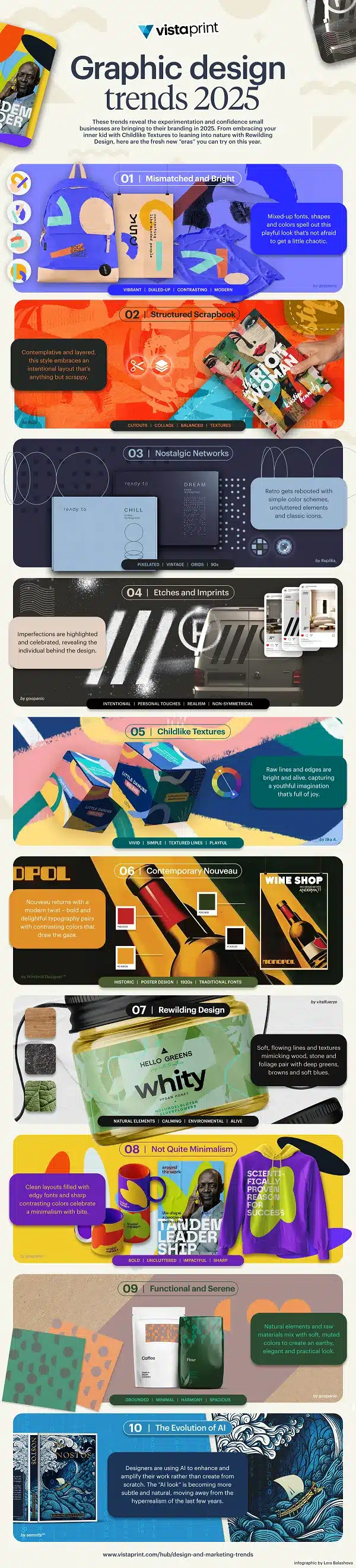

As we approach 2025, the world of graphic design is experiencing an exciting period of transformation.
With advancements in technology, the evolution of design aesthetics, and changing societal influences, designers are continually innovating. Graphic design is not just about creating beautiful visuals anymore; it’s a way of communicating ideas, emotions, and stories.
In this post, we’ll explore 17 creative trends that are set to dominate graphic design in 2025.
Mismatched and Bright
The “Mismatched and Bright” trend is all about embracing boldness, embracing contrast, and experimenting with vibrant, unexpected combinations. For small brands looking to make a memorable impact, this trend provides a unique opportunity to stand out and infuse personality into their visual identity. The key to successfully incorporating mismatched and bright elements is balance, strategic use of colour, and maintaining consistency in your brand messaging while still embracing the playfulness that this trend offers.
Here’s how small brands can tap into the Mismatched and Bright trend to create dynamic and engaging designs that capture attention:
Start with Bold, Vibrant Colour Palettes
The cornerstone of the “Mismatched and Bright” trend is the use of vivid, saturated colours. For small brands, selecting the right colour palette is critical in ensuring the boldness doesn’t overwhelm your design but instead creates energy and excitement.
Tips:
- Use complementary colours: Mismatched doesn’t mean haphazard. Choose colours that sit opposite each other on the colour wheel, like bright orange and electric blue. This creates an energetic, high-contrast effect while maintaining harmony.
- Don’t be afraid to mix unexpected hues: Think outside the traditional brand colour palette. You might combine pastel pink with neon green or bright yellow with deep purple. Mixing colours that aren’t usually seen together can generate an attention-grabbing aesthetic.
- Limit the number of colours: Even though this trend thrives on mismatch, don’t overwhelm your audience. Stick to 3-4 main colours to keep your design grounded. This will allow the colours to stand out without clashing too harshly.
Embrace Asymmetry and Dynamic Layouts
Mismatched design is not just about colours—it’s about breaking the rules of symmetry and creating layouts that feel dynamic and spontaneous. Small brands can use this approach to create a sense of movement, unpredictability, and excitement in their designs.
Tips:
- Experiment with layout grids: Use unconventional grids and freeform compositions that don’t follow a strict structure. Place elements at different angles or off-center to create tension in your design.
- Layering is key: Layer different textures, illustrations, and images on top of each other, with some peeking out from behind others. This adds depth and intrigue to your designs while embracing the idea of mismatched elements.
- Allow space for play: Avoid being too “polished” or refined in your approach. It’s okay if some design elements appear “out of place” or imperfect. This embraces the raw, authentic feel of the trend.
Incorporate Playful Typography
Typography plays a crucial role in the mismatched aesthetic. Small brands can experiment with different typefaces, font weights, and styles to create visual interest. Think about mixing bold sans-serif fonts with hand-drawn scripts or contrasting serif fonts with modern sans-serif designs.
Tips:
- Combine contrasting fonts: Play with pairing two completely different styles of typography. For example, match a chunky, bold type with a delicate, serif font. The contrast will help create a striking and energetic feel.
- Vary font sizes: Don’t be afraid to change the size of fonts within the same design. Play with larger headlines, smaller subheadings, and irregular text placement to create variety and unexpected elements.
- Incorporate custom typography: To further enhance the mismatched aesthetic, consider creating custom typography or hand-drawn elements that bring an organic, unique feel to your designs.
Use Unexpected Shapes and Patterns
The “Mismatched and Bright” trend also incorporates unexpected shapes and patterns. These elements can inject personality into your designs and give your brand a more distinctive and bold look.
Tips:
- Experiment with geometric shapes: Combine circles, triangles, and squares in non-traditional placements. The interplay of different geometric forms, especially when paired with contrasting colours, can be highly effective in creating an energetic, mismatched aesthetic.
- Mix organic with geometric patterns: Pair geometric elements like squares and stripes with free-form, organic shapes like brush strokes or hand-drawn doodles. The contrast between rigid and flowing forms creates an exciting tension that is central to the trend.
- Consider gradients and textures: Instead of flat, solid colours, experiment with gradients or texture overlays. These can create depth and intrigue while keeping the colour palette vibrant and mismatched.
Incorporate Unconventional Imagery
The “Mismatched and Bright” trend thrives on the unexpected, and this can be mirrored in the imagery you choose to use. Small brands can create impactful designs by opting for quirky, unexpected imagery that aligns with their identity but surprises their audience.
Tips:
- Use illustrations and icons: Custom illustrations that don’t necessarily match your traditional aesthetic can help give your designs a playful, youthful quality. Incorporate whimsical icons, hand-drawn doodles, or 3D-style illustrations to inject personality.
- Mix photography with illustrations: Combine photographic elements with illustrations or graphic design elements in a collage-like fashion. This can create a vibrant, mismatched effect while maintaining an appealing aesthetic.
- Play with perspective: Challenge your audience’s perception by using unusual or distorted imagery. A fresh angle or warped perspective can make your designs feel unexpected and more immersive.
Focus on Brand Storytelling Through Contrast
Mismatched design isn’t just about aesthetics; it can be an effective tool for storytelling. Using bright and contrasting elements can communicate your brand’s core values and personality. For small brands, this approach can convey a sense of innovation, creativity, and authenticity.
Tips:
- Align mismatched elements with your brand values: If your brand embraces individuality or creativity, this trend will help convey those values. Use mismatched design to show that your brand isn’t afraid to stand out from the crowd and challenges conventional norms.
- Use bold designs to make a statement: The bright colours and asymmetry can be used to communicate confidence and a bold, forward-thinking attitude. It’s about showing your audience that your brand is exciting and has a unique perspective.
- Integrate vibrant colours into your messaging: Use bright colours to highlight your brand’s key messages, ensuring that they stand out clearly and create a memorable visual experience for your audience.
Apply the Mismatched and Bright Aesthetic to Your Social Media
Small brands often leverage social media to create a deeper connection with their audience. The “Mismatched and Bright” trend can translate beautifully to platforms like Instagram, Twitter, and Facebook, where visuals are key to attracting attention.
Tips:
- Create vibrant, attention-grabbing posts: Design eye-catching social media posts with mismatched and bright elements that stand out in crowded feeds. Bold colour contrasts, playful typography, and dynamic layouts can stop users from scrolling past.
- Maintain consistency while embracing variety: While it’s essential to be bold and mismatched, maintaining some consistency across your social media profiles will help create a cohesive brand identity. Use a similar colour palette, typeface, or layout structure to ensure your posts feel connected, even if each one feels unique.
- Leverage story highlights: Use Instagram or Facebook story highlights to display your brand in a fun, vibrant way. Combine custom illustrations, bright background colours, and playful type to showcase your business’s personality.
Think Beyond Digital: Apply Mismatched Design to Print
While digital design is a natural fit for the “Mismatched and Bright” trend, it’s also effective for print media. Small brands can apply the same principles to packaging, brochures, and flyers to create unique physical collateral that turns heads.
Tips:
- Use bright packaging: Packaging that features bold mismatched colours can instantly make your product stand out on the shelf. It’s an excellent way to capture attention in a market filled with more traditional designs.
- Experiment with print finishes: Combine vibrant colours with tactile print finishes like embossing, foil stamping, or matte textures to create depth and a more dynamic experience for the consumer.
- Consider non-traditional formats: Go beyond the standard brochure or flyer by experimenting with size and shape. Consider folding techniques, die cuts, or oversized designs to make your print collateral feel unexpected and memorable.
Summary
By embracing the Mismatched and Bright trend, small brands can inject a unique sense of personality and energy into their designs. This trend is about experimenting with colour, texture, and form while still ensuring that the design communicates the right message to your audience.
Whether it’s through dynamic digital content, quirky social media posts, or bold product packaging, the key to succeeding with this trend is to have fun with your designs, take risks, and find the perfect balance between boldness and cohesion.
Structured Scrapbook
The “Structured Scrapbook” trend is a delightful fusion of DIY charm and digital design, where chaotic elements and personal touches meet structure and cohesion. For small brands, this trend offers an opportunity to create authentic, memorable experiences that feel handmade yet polished.
The beauty of the “Structured Scrapbook” trend lies in its versatility—allowing you to craft designs that feel tactile and personal while maintaining professionalism. It’s about combining elements like collages, hand-drawn elements, textured backgrounds, and a bit of nostalgia, all within a well-organized, aesthetically pleasing layout.
Here’s how small brands can leverage the Structured Scrapbook trend to make an impact and create engaging visual experiences:
Embrace Collage Design for a Personal Touch
A key feature of the “Structured Scrapbook” aesthetic is the art of collage. Merging different textures, images, and materials gives the design a tactile and curated feel. For small brands, this approach allows you to showcase multiple aspects of your business in a creative and engaging way.
Tips:
- Combine photographs with illustrations: Instead of just relying on stock images or graphic designs, try incorporating your own photos alongside hand-drawn illustrations. This mix of media adds personality and authenticity to your brand.
- Experiment with layers: Create depth by layering images, text, and textures. Don’t be afraid to let some elements peek through others, creating a sense of movement and interactivity.
- Incorporate scanned elements: Scan physical items like handwritten notes, textured paper, or fabric swatches and integrate them into your design. This adds an organic, crafted feel to your designs.
Use Tactile Elements to Create Depth and Warmth
The Structured Scrapbook trend thrives on the idea of layering tactile and physical elements. For a small brand, introducing tactile visual textures can convey authenticity, warmth, and a personal connection to your audience. These tactile elements make the design feel as though it’s been carefully assembled by hand, bringing a sense of approachability and craft.
Tips:
- Textured backgrounds: Use subtle textured backgrounds that mimic paper, fabric, or natural materials. This can give your designs a more grounded, tangible quality.
- Add hand-lettered text: Handwritten or hand-lettered typography can enhance the personal, crafted feel of your design. Whether it’s a brand slogan, product name, or tagline, adding handwritten elements will make your brand feel more human and authentic.
- Use digital textures for a handcrafted look: Simulate textures like rough paper, fabric, or cardboard to make your designs feel more handcrafted. This can create the illusion of something physical being digitised, which adds warmth and relatability to your visuals.
Create Visual Balance through Structured Layouts
While the scrapbook aesthetic encourages creativity and freedom, the “Structured Scrapbook” trend requires a balance between chaotic elements and a controlled, organized layout. Small brands can use this structure to convey professionalism while still embracing the playful, personal feel of a scrapbook.
Tips:
- Define sections: Divide your design into clear sections using lines, borders, or frames to help guide the viewer’s eye. This will help to maintain some order and balance while still showcasing the mismatched elements.
- Utilize grid systems: A grid system can help arrange your elements in a way that feels organized yet still playful. It’s a way of structuring your design without sacrificing the creativity and freedom of a scrapbook layout.
- Pay attention to spacing: Give elements room to breathe. A cluttered scrapbook look can easily become overwhelming, so ensure that each visual element has enough space around it to keep the layout readable and visually appealing.
Add Vintage or Retro Elements for Nostalgia
Scrapbooks often evoke a sense of nostalgia and personal history. By including vintage or retro elements in your designs, small brands can connect with their audience on an emotional level, fostering a sense of nostalgia and trust. This approach is particularly effective for brands looking to tell a story or establish a deeper connection with their customers.
Tips:
- Incorporate old-school illustrations: Vintage illustrations or icons—such as retro floral patterns, old-school typography, or hand-drawn motifs—can make your brand feel more timeless and nostalgic.
- Use sepia tones or faded colours: To enhance the vintage feel, apply sepia or muted pastel colours to your designs. These colours evoke a sense of warmth and history, helping your brand feel approachable and familiar.
- Include personal photographs or Polaroids: If appropriate, include photos of your team, your workspace, or your process. These personal touches will humanise your brand and help forge an emotional connection with your audience.
Experiment with Mixed Media
The beauty of the Structured Scrapbook trend is that it invites experimentation with various media. By integrating different artistic techniques—both digital and physical—brands can create a unique, eclectic visual style. Small businesses can stand out by mixing traditional design with digital elements in surprising ways.
Tips:
- Incorporate scanned textures or fabrics: If your product is related to fashion, food, or anything tactile, consider scanning fabrics or textures that relate to your product or brand identity. These can be layered into your designs digitally to create an authentic look.
- Use paint, ink, or markers digitally: Apply paint splatters, ink sketches, or marker strokes to enhance the handmade feel. You can use digital tools to simulate the appearance of hand-crafted art and then overlay them onto a clean, structured design.
- Add real-world items digitally: Consider scanning in receipts, tickets, or product packaging to incorporate real-world items into your design. This adds layers of authenticity and relevance to your brand, making your designs feel grounded in reality.
Tell a Story Through Design
One of the strongest features of the scrapbook aesthetic is its ability to tell a story. Scrapbooks are often personal records, and this sense of storytelling can be used to great effect in branding. Small brands can leverage this to showcase their journey, values, or unique selling points.
Tips:
- Build a narrative with your design: Arrange design elements in a way that tells a story, such as showing the evolution of your product or your brand’s journey. Consider using a timeline, progress bar, or journey map to visually showcase this story.
- Include quotes or testimonials: Personal stories, customer reviews, or inspirational quotes can be integrated into the design. These quotes can act as touchpoints, guiding your audience through the narrative of your brand.
- Add journaling-style text blocks: Incorporating text blocks that resemble journaling or handwritten notes can enhance the personal, storytelling aspect of your design. You could add captions or “behind the scenes” insights into your design to invite your audience into your process.
Leverage DIY and Crafting Aesthetics
At its core, the Structured Scrapbook trend is a DIY-inspired aesthetic. Small brands can use this to their advantage by embracing the hand-crafted look, creating designs that feel authentic, homegrown, and full of care. This approach can be especially appealing to audiences who value artisanal quality or a personal touch.
Tips:
- Use custom stamps or doodles: Incorporating digital versions of hand-drawn doodles or custom stamps adds personality to your design. These elements can make your brand feel more unique and original, especially if they reflect your brand’s story or core values.
- Create DIY-style patterns: Hand-drawn lines, hatching, or polka dots can evoke the feeling of a handmade scrapbook. While this approach leans into the “raw” aesthetic, keeping the elements deliberate and purposeful will help maintain visual harmony.
- Emphasize the “made with care” element: Position your design as something crafted with love and attention to detail. Highlighting the care that goes into your product or service through your design choices can create a stronger emotional connection with your audience.
Extend the Scrapbook Aesthetic to Social Media
Social media platforms are a perfect place for small brands to experiment with the Structured Scrapbook trend, as these platforms thrive on visual storytelling. The eclectic, DIY vibe of scrapbooking can make your social media presence feel unique, approachable, and real.
Tips:
- Create collages for Instagram posts: Use a collage approach for Instagram, where multiple images are combined into a single post. This allows you to tell a more complex story or showcase a variety of products in a single frame.
- Highlight the process: Share behind-the-scenes content in your posts to show the crafting or creation process behind your designs. Whether it’s through photos, videos, or time-lapse recordings, showcasing the hands-on nature of your business adds authenticity.
- Utilize Instagram Stories: Use the scrapbook approach for Instagram Stories, where you can add text, photos, and even stickers in a curated way that feels playful and personal.
Summary
The Structured Scrapbook trend is all about embracing a mix of raw, personal elements and structured design principles. For small brands, this trend offers a unique way to stand out by combining creativity, authenticity, and professionalism.
By embracing collage, textures, vintage aesthetics, and storytelling, you can create a visual identity that connects deeply with your audience, telling a story in a way that feels personal yet polished.
Nostalgic Networks
The “Nostalgic Networks” trend is rooted in the power of digital nostalgia, drawing inspiration from early internet aesthetics, retro technology, and the feeling of community that once thrived in online spaces. It taps into the emotional connection many people have to the early days of the web—think simple websites, pixelated graphics, and the original “social networks” like early forums, chatrooms, and online groups.
By incorporating these elements into branding, small businesses can create an appealing and memorable identity that resonates with both Gen Z and Millennial audiences who may have fond memories of early internet culture.
This trend blends a sense of nostalgia with the connectivity of modern networks, making it perfect for small brands looking to forge deeper connections with their audiences. By tapping into this collective memory of digital culture, brands can evoke warmth, familiarity, and a sense of belonging, all while standing out in a crowded marketplace.
Here’s how small brands can effectively harness the Nostalgic Networks trend:
Incorporate Retro Digital Aesthetics
The visual style of early internet design—think pixel art, early HTML graphics, and retro fonts—can create a sense of nostalgia while still appearing fresh and new. This aesthetic evokes the simplicity and charm of the digital era before web 2.0 made everything sleek and modern.
Tips:
- Use pixelated fonts and images: Incorporating pixel art into your design can bring a nostalgic feel that appeals to both younger audiences who enjoy the vintage aesthetic and older generations who remember the early days of the internet. Pixelated logos or headers can help your brand stand out while creating a unique visual identity.
- Embrace 90s web design: Incorporate elements such as bright colours, simple navigation, and basic grids, mimicking the design of early websites. While maintaining a sense of modernity, these elements can play into nostalgia by bringing back the feeling of browsing older, more personal online spaces.
- Use GIFs and retro animations: Integrating retro-style animations (like pixelated or low-res GIFs) into your website, social media, or email campaigns can enhance the feeling of nostalgia and fun. These elements can bring personality and whimsy to your designs.
Create Interactive, Community-Focused Experiences
In the early days of the internet, online communities were vital for fostering connections. The Nostalgic Networks trend embraces this idea by encouraging brands to build interactive, community-focused experiences. By offering opportunities for engagement and sharing, small brands can form closer bonds with their audience and create a sense of belonging.
Tips:
- Host online forums or discussion boards: Create a space for your audience to interact, share experiences, and communicate with each other. Whether it’s a Facebook group or a dedicated forum on your website, offering a virtual community can help reinforce the nostalgia of early digital spaces.
- Leverage user-generated content: Encourage customers or followers to share their experiences, photos, or stories about your brand. Use this content in your social media marketing or website to help strengthen a sense of community. The power of shared experiences is central to online nostalgia.
- Introduce old-school chat features: Recreate the sense of live, unfiltered conversations with live chat options or comment sections where customers can interact directly with your brand and each other. Brands can also host “Ask Me Anything” (AMA) sessions to foster this communal, direct connection.
Celebrate Early Digital Culture with Modern Twists
The Nostalgic Networks trend is about merging old-school digital culture with modern-day sensibilities. This approach gives your brand a fun and relatable edge while still allowing for a professional, polished feel.
Tips:
- Incorporate nostalgic symbols: Consider using vintage internet imagery like floppy disks, dial-up modems, or pixelated hearts and stars in your branding. These symbols trigger memories of earlier internet use and can create a playful visual identity for your brand.
- Use retro emojis and emoticons: In addition to classic smileys (e.g., :) or :-D), consider using symbols or visual elements that reflect early internet culture. These can help your brand feel more approachable and friendly, especially in informal channels like social media or customer support.
- Play with early digital colours: Think neon, gradients, and bright, contrasting colour schemes reminiscent of early websites, online chatrooms, or desktop wallpapers. These bold, eye-catching colours can help your brand stand out and create an energetic, nostalgic atmosphere.
Narrative-Driven Content with a Retro Digital Spin
The idea of storytelling was very much alive in the early days of the internet, whether it was on personal blogs, early online journals, or fan sites. Small brands can use the Nostalgic Networks trend to craft engaging narratives that resonate emotionally with their audience, combining retro digital culture with modern digital storytelling techniques.
Tips:
- Use blog-style writing: Bring back the feeling of early online personal blogs by writing in a more casual, relatable, and storytelling style. Focus on behind-the-scenes looks at your business, brand stories, or customer stories that resonate with the same feeling of “sharing something personal” that was so integral to early websites.
- Share throwback content: Revisit old content or documents that can help tell the history of your brand in a nostalgic way. Share old product designs, behind-the-scenes photos, or early marketing materials to show how far your brand has come and to celebrate its journey.
- Reimagine old stories for modern audiences: If your brand has been around for some time, consider reimagining or reintroducing its original story in a way that combines nostalgia with current trends. Highlight the evolution of your business and its connection to digital culture over the years.
Leverage Throwback Music and Sound Effects
One of the most immersive ways to tap into digital nostalgia is through sound. Early internet experiences were often paired with distinct sound effects, like dial-up tones or system alerts. These sounds bring back a flood of memories of the internet’s early days and can instantly make a brand feel more nostalgic.
Tips:
- Incorporate retro sound design: Consider adding retro-inspired sound effects to your website or digital advertisements, like the sound of a modem connecting, an old-school alert, or even MIDI music. These familiar sounds will immediately transport users back to a different time and evoke nostalgic feelings.
- Use music that evokes the digital era: If appropriate, integrate music inspired by early computer games, internet culture, or 90s pop music into your brand’s videos, advertisements, or social media. The right soundtrack can amplify the emotional connection and reinforce the feeling of nostalgia.
Design for Digital Detours: Non-Linear Navigation
The early internet wasn’t as straightforward as modern websites. Non-linear, rabbit-hole navigation was a defining characteristic of the web’s early days. By adopting non-traditional website navigation structures, small brands can evoke a sense of freedom and exploration, much like browsing the web in its infancy.
Tips:
- Create branching content paths: Offer visitors a chance to explore your site through links or navigation that doesn’t always follow a traditional flow. For example, link to unexpected content or create Easter eggs that users can uncover as they explore your site.
- Implement retro-style site layouts: Use grids, tables, and frames in your website design to mimic the structure of early websites. While you’ll want to keep the site functional, you can still play with layouts that feel retro while staying user-friendly.
- Foster a sense of discovery: Make your website feel like an exploration. Use hidden or unexpected links, fun pop-ups, or interactive content that keeps visitors engaged and makes them feel like they are discovering something new.
Create a Sense of Digital Fandom
The internet’s early days were full of subcultures, fan communities, and niche groups that rallied around shared interests. Small brands can tap into this sense of digital fandom by building communities around their products or services, encouraging users to embrace their unique interests and passions.
Tips:
- Cultivate a brand community: Create a community or fan group where like-minded people can gather and share their love for your brand, much like how fan clubs and forums operated in the past. Encouraging discussions or fan content can help strengthen brand loyalty.
- Create niche, shareable content: Just as old-school internet communities would create and share content that appealed to very specific interests, you can create unique, niche content that speaks directly to your audience. This could be anything from quirky product designs to specialized blog content or even exclusive limited-edition merchandise.
Leverage Social Media with Retro Flair
Social media platforms are where brands today connect with their customers, but small businesses can incorporate the Nostalgic Networks trend by using retro digital styles to differentiate themselves.
Tips:
- Utilize vintage filters and post styles: Post content that mimics the look of early web pages or retro internet forums. Use vintage filters on photos, throwback-style captions, or even pixelated graphics to bring your social media profiles to life with nostalgia.
- Revive early meme culture: Memes were a huge part of the internet’s early culture. Use retro memes or create your own based on internet history to connect with your audience in a fun, relatable way.
Summary
The Nostalgic Networks trend is a powerful way for small brands to tap into a sense of digital history and connection with their audience.
By incorporating retro aesthetics, interactive community-focused elements, and storytelling that taps into early internet culture, small businesses can create unique, emotional experiences that feel both fresh and familiar.
Etches and Imprints
The “Etches and Imprints” trend is a visual and tactile design style that invokes the idea of something being marked, carved, or pressed into a surface. Whether through digital effects that mimic real-world textures or actual physical techniques like embossing or engraving, this trend focuses on creating designs that feel both permanent and tactile, as if they are embedded in the material itself.
It reflects a sense of craftsmanship and authenticity, which appeals to modern consumers seeking brands with a personal touch, transparency, and a connection to the material world.
For small businesses, leveraging the Etches and Imprints trend can create a sense of quality, uniqueness, and tactile appeal, enhancing their branding efforts. Here’s how to incorporate this trend effectively:
Incorporate Subtle Etching Effects in Digital Designs
One of the easiest ways to harness the Etches and Imprints trend is through digital graphic design, using etched effects to add depth and texture to your brand’s visuals. These effects simulate the look of something pressed into paper, metal, or wood and can be applied to logos, headers, and even social media posts.
Tips:
- Create textured backgrounds: Subtle imprints or etched lines in the background of your digital designs can add interest and depth without overwhelming your brand’s visuals. Think about how worn or scratched textures could suggest the passage of time, giving your brand a more timeless, established feel.
- Design with negative space: Use negative space to highlight the etching effect—have your logo or branding appear as though it’s etched or embossed into the background. This approach can make the logo feel integrated with the surface it’s on, enhancing its impact and memorability.
- Apply etching to typography: Incorporate etched text effects to make the font appear carved or pressed into your materials. This works particularly well for key messages, taglines, or headers, adding an extra layer of sophistication and texture to your digital content.
Utilise Physical Etching and Embossing on Print Materials
In a world dominated by digital content, tactile elements can have a lasting impact. Etches and Imprints on print materials, such as business cards, packaging, or invitations, create a memorable experience by adding a touch of luxury and authenticity. This tactile approach invites people to engage more deeply with your brand.
Tips:
- Embossed logos and details: Use embossing or debossing (where the design is pressed into or raised above the paper) on business cards, letterheads, or packaging. This can give your materials a high-end, professional feel. By incorporating this into your branding, customers will associate your business with quality and attention to detail.
- Engraved packaging: If your brand offers products that can benefit from premium packaging, consider using etching or engraving techniques on your boxes, bags, or product labels. Whether it’s a logo or a pattern, these engraved elements can elevate the unboxing experience and leave a lasting impression on your customers.
- Etched business cards: Invest in etched or engraved business cards, which can make an immediate impact on potential clients or collaborators. These tactile cards will make your brand stand out and convey a message of quality and attention to detail.
Create Custom, Handcrafted Imprints
The Etches and Imprints trend draws heavily on the idea of handcrafted, custom designs. It reflects the growing consumer interest in authenticity, craftsmanship, and sustainability. Small businesses can take advantage of this by incorporating personalized, handmade touches in their product designs or branding.
Tips:
- Hand-pressed imprints: If your brand offers physical products, consider using hand-pressed imprints to create unique packaging or custom designs. For instance, a candle company might hand-press a design or logo into the surface of their wax, while a leather goods brand might stamp their logo or a pattern into the leather.
- Collaborate with artisans: Work with local artisans to produce bespoke packaging or product designs that feature hand-etched details. This collaboration not only highlights craftsmanship but also tells a compelling brand story about quality and care in every detail.
- Limited-edition imprints: For special releases or exclusive products, offer limited-edition imprints. This can make your products feel more valuable and collectible, increasing the emotional connection customers have with your brand.
Combine Digital and Physical Etching in Marketing
Small brands can combine digital designs with physical elements to create a seamless brand experience that plays on the tactile appeal of etching. This hybrid approach can strengthen brand identity and provide customers with a unique, interactive experience.
Tips:
- Augmented Reality (AR) experiences: Consider creating an AR experience where customers can use their smartphones to interact with etchings or imprints in a digital format. For example, customers could scan a product’s packaging to view hidden messages or see a detailed imprint animation, blending physical and digital elements in a fun and interactive way.
- Etched visuals for online stores: If your business sells products online, incorporate etched or embossed textures into your website design to give a sense of tactile depth. For instance, product images could have an etched-style effect to evoke the feeling of high-quality craftsmanship, even in a digital shopping experience.
Use Imprints to Tell Your Brand Story
Etches and Imprints are not just about aesthetics—they can also help tell your brand’s story. By integrating meaningful symbols, patterns, or messages into your design, you can communicate values such as tradition, craftsmanship, or uniqueness.
Tips:
- Symbolic etching: Incorporate symbols or motifs that are meaningful to your brand’s story, values, or heritage. For example, a company that emphasizes sustainability could include nature-inspired imprints or engravings on their packaging or products.
- Text imprints with meaning: Instead of simply using a logo, include meaningful words or phrases that reflect your brand’s ethos or mission. These imprints can add a personal touch to the branding and remind your customers of what your business stands for.
- Create a brand legacy: If your business has been around for a while, consider incorporating etching designs that represent milestones in your brand’s history. This can help build a sense of legacy and trust with your audience.
Etched Illustrations and Patterns
Beyond logos and branding elements, small businesses can also incorporate etched illustrations or patterns into their visual identity. This trend embraces the art of intricate details and textures, making it perfect for brands that want to stand out by showcasing unique, custom visuals.
Tips:
- Detailed product illustrations: Whether it’s for packaging, labels, or promotional materials, consider using finely etched or engraved illustrations to give your designs a more artisanal and sophisticated look. Intricate designs can draw customers’ attention and elevate your branding.
- Patterned imprints: Design patterns or textures that evoke a sense of craftsmanship or nature. These imprints can be incorporated into product packaging, store displays, or even website design, adding texture and a tactile feel to your branding.
- Create visual narratives: Use etched illustrations to tell a story visually. For instance, a bakery brand could use a series of etched illustrations showing the stages of bread making, adding a narrative element to their packaging or in-store displays.
Focus on Eco-Friendly Materials and Techniques
The Etches and Imprints trend aligns well with a growing consumer demand for sustainable and eco-friendly products. By using materials like recycled paper or sustainably sourced wood for your imprinted designs, you can show customers that your brand cares about the environment while also embracing the tactile qualities of etching.
Tips:
- Sustainable packaging: Use eco-friendly materials like recycled paper, bamboo, or hemp to create packaging that incorporates imprints or etching. By combining sustainability with craftsmanship, you reinforce your commitment to both quality and environmental responsibility.
- Eco-conscious production methods: Choose production methods for etching that minimize environmental impact. For example, opt for laser-etching technology, which uses less energy compared to traditional engraving techniques, or work with local artisans who prioritize sustainable practices.
Summary
The Etches and Imprints trend offers small brands an opportunity to craft a unique, tactile identity that blends artistry with authenticity. Whether through digital effects, physical imprints, or a mix of both, this trend can make your brand stand out by evoking a sense of craftsmanship, permanence, and personal connection.
By utilizing etching and imprinting techniques across your branding, packaging, and marketing efforts, you can create a memorable and distinctive experience for your customers that speaks to the quality and uniqueness of your products.
Childlike Textures
The “Childlike Textures” trend is all about embracing raw, playful, and whimsical design elements that evoke the innocence and creativity associated with childhood. This trend features textures and visuals that mimic the spontaneous, unrefined qualities of children’s art—think crayon scribbles, hand-drawn illustrations, and finger-painted brushstrokes. It’s a trend that focuses on authenticity and the joy of creation, offering brands the opportunity to convey warmth, creativity, and approachability.
For small businesses, especially those targeting families, creative professionals, or anyone looking for a more personable and authentic brand image, the Childlike Textures trend can add a distinctive and engaging element to your branding and marketing materials. Here’s how small businesses can leverage this trend effectively:
- Embrace Playful, Hand-Drawn Elements
One of the main features of the Childlike Textures trend is the use of hand-drawn or sketchy designs. This can make your brand feel more personal, approachable, and fun, which is especially important for small businesses aiming to create meaningful connections with their audience.
Tips:
- Incorporate hand-drawn logos: Instead of using a standard typeface or logo design, opt for a hand-drawn logo or font that has a playful, whimsical quality. This adds personality and a human touch to your brand, making it feel more relatable.
- Use sketchy illustrations: Replace polished, professional illustrations with rough, playful sketches that evoke the spirit of childhood creativity. For example, a children’s clothing brand might use sketches of animals, flowers, or abstract doodles to create a light-hearted, fun vibe.
- Incorporate childlike drawings into packaging: On product packaging, consider using illustrations that look like they came from a child’s imagination. This could include simple line drawings or colorful, messy art that gives off a carefree, fun energy.
- Textural Play with Crayon and Marker Effects
Crayon, marker, and pastel effects are classic elements that evoke the tactile, messy, and vibrant aspects of childhood art. By integrating these textures into your brand’s design, you can give it an organic, playful quality that appeals to a wide audience.
Tips:
- Crayon-like textures for backgrounds: Add crayon-like textures as backgrounds or accents in your designs. These can give your graphics a tactile, hand-made feel that makes your brand appear approachable and fun.
- Playful typography: Consider using fonts that mimic crayon scribbles, or even hand-drawn lettering, to add a playful and informal feel to your website or marketing materials. These fonts can evoke feelings of nostalgia and simplicity, drawing consumers into a more personal experience.
- Marker or paint strokes: Use textures that resemble marker or paint strokes for logos, banners, and product labels. This type of texture works particularly well in designs that aim for a bold and energetic look. It’s perfect for businesses like art schools, toy shops, or children’s brands.
- Use Bold, Bright Colours
The Childlike Textures trend thrives on vibrant, saturated colours that capture the attention and spark energy. Bright hues like primary reds, blues, yellows, and greens create a sense of joy and enthusiasm, making your brand feel youthful and engaging.
Tips:
- Colour blocking: Use bold colour blocking with contrasting bright colours to create a sense of playfulness in your design. For example, combining bright yellow with blue and pink can instantly give a cheerful, childlike aesthetic.
- Use colours to reflect mood: Choose colours that evoke a sense of joy, excitement, and creativity. For brands in the kids’ space or those aiming for a fun and energetic look, neon colours or pastel shades can work well to evoke feelings of happiness and lightheartedness.
- Hand-painted textures with vibrant hues: Combine textured brush strokes or splashes with bright, lively colours. This combination can look like the artwork of a child, helping your brand stand out as fresh and fun.
- Incorporate Organic, Imperfect Shapes
Childlike drawings are often characterised by their organic, imperfect shapes—whether that’s a wobbly line, a misshapen circle, or a squiggly outline. These elements suggest a lack of precision and refinement, celebrating the freedom and creativity that comes with childhood expression.
Tips:
- Wobbly lines and shapes: Integrate organic, wobbly lines into your brand’s logo, website design, or advertising. For example, instead of perfect geometric shapes, use circles or squares that are a bit wonky to evoke a sense of fun and authenticity.
- Non-linear designs: Avoid perfectly symmetrical and precise layouts, and instead, embrace asymmetry. This can be particularly effective for call-to-action buttons, header images, or illustrations, where more free-form shapes are used to create a feeling of whimsy.
- Overlapping textures and shapes: Layer textures and shapes on top of one another in an unrefined, playful way. This can work well in both digital and print materials, creating a sense of movement and spontaneity.
- Interactive and Engaging Experiences
The Childlike Textures trend can extend beyond visual design and into interactive, engaging experiences. Children are naturally curious and love to interact with the world around them, so creating engaging, hands-on experiences for your customers is a great way to apply this trend.
Tips:
- Interactive website elements: Consider designing your website with interactive features that mimic the playful spirit of the trend. For example, elements like clickable doodles, drag-and-drop features, or animations that trigger when the user hovers over a section can bring the childlike aesthetic to life in a more dynamic way.
- Gamify your content: Incorporate fun, childlike elements such as mini-games, quizzes, or colouring sheets related to your products or services. This is especially effective for children’s brands or businesses that cater to creative professionals, like art shops or DIY brands.
- Engage with your audience on social media: Create interactive social media posts where your audience can participate in a fun, childlike activity, such as drawing or crafting their own designs based on your brand’s aesthetic. Encourage them to share their creations with hashtags, giving them a sense of involvement and ownership.
- Leverage the Nostalgia Factor
Childlike Textures not only appeal to children, but they also tap into adult nostalgia for simpler times. This makes the trend perfect for businesses looking to connect with a wide range of ages, from parents shopping for children’s items to adults who long for the carefree days of their own childhood.
Tips:
- Retro illustrations: Use nostalgic, childlike illustrations that evoke classic children’s books or cartoons from the past. For example, illustrations with thick outlines and bold colours, similar to those seen in vintage picture books, can evoke a sense of nostalgia for adults while still appealing to children.
- Create products with retro designs: Offer products that feature childlike textures and designs that feel reminiscent of toys, games, and childhood favourites from earlier decades. This could be a great fit for businesses in industries like home décor, apparel, or lifestyle products.
- Use This Trend to Strengthen Emotional Connections
The Childlike Textures trend is inherently warm and inviting, making it an excellent choice for small businesses aiming to foster strong emotional connections with their customers. This approach makes your brand feel more personal, authentic, and empathetic, which can increase customer loyalty and trust.
Tips:
- Emphasise warmth in your messaging: Use childlike textures in your design, paired with warm, friendly language, to create a welcoming environment. For example, a daycare or toy store might use these textures alongside messages like “Let’s grow together” or “Inspired by play.”
- Tell a story: Use childlike textures as part of a larger narrative about the values your brand holds dear, such as creativity, authenticity, or fun. By aligning these textures with stories of imagination and possibility, you can strengthen your emotional connection with your audience.
- Build a community: Encourage a sense of belonging and community through interactive content, such as online workshops, challenges, or collaborative projects. This makes your audience feel like they are part of something creative and fun.
The Childlike Textures trend is about creating a joyful, authentic, and personal brand experience. For small businesses, it’s an opportunity to stand out with a design approach that feels approachable, fun, and warm. By integrating playful, hand-drawn elements, vibrant colours, organic shapes, and interactive features, you can create a brand that feels fresh, dynamic, and connected to the creative spirit of childhood. This trend not only appeals to families and younger audiences but can also invoke nostalgia in adults, making your brand feel universally appealing.
Contemporary Nouveau
The “Contemporary Nouveau” trend merges the timeless elegance of Art Nouveau with a modern, minimalist approach, creating a fusion of organic, flowing forms and sleek, refined designs. Drawing inspiration from the intricate, nature-inspired motifs of the early 20th century, this trend embraces curving lines, botanical elements, and intricate details, but with a contemporary twist.
In 2025, Contemporary Nouveau is all about striking a balance between vintage sophistication and minimalist design, making it perfect for small brands looking to make a bold yet refined statement.
For small businesses, especially those in industries like fashion, home décor, beauty, and lifestyle, this trend offers a way to convey both timeless elegance and modern innovation.
Here’s how you can utilise the Contemporary Nouveau trend to elevate your brand:
Incorporate Organic, Flowing Lines and Shapes
The essence of Art Nouveau is found in its natural forms—curved lines, flowing shapes, and patterns that evoke the beauty of organic elements like plants, flowers, and flowing water. When adapted to a contemporary style, these elements can be softened and simplified, offering a sophisticated yet approachable aesthetic.
Tips:
- Use soft, flowing shapes: Incorporate curving lines into your logo, website design, and product packaging. These can take the form of graceful curves or stylised representations of leaves, vines, or natural elements. For example, a jewellery brand could use delicate, flowing lines around gemstones or around the brand name to evoke elegance.
- Minimalist nature motifs: Rather than complex floral patterns, opt for subtle, minimalist representations of plants or organic textures. A beauty brand could feature botanical elements in their packaging, such as a simplified illustration of a leaf or flower, to convey the harmony between nature and modern design.
- Abstract interpretations: Consider using abstract shapes that hint at natural forms. For example, curved geometric shapes or soft, organic-inspired frames can communicate the same flowing beauty while maintaining a modern, understated look.
Embrace Monochrome with Pops of Metallics
One of the hallmarks of Contemporary Nouveau is a refined, understated colour palette. This trend leans towards monochrome tones, paired with luxurious metallic accents. The restrained colour choices give your design a sophisticated and modern feel, while metallic touches—gold, silver, or copper—add a touch of opulence and timelessness.
Tips:
- Monochrome colour schemes: Stick to a neutral or monochromatic colour palette, using shades like deep blacks, soft whites, taupes, or greys. These simple, understated tones allow the organic, flowing shapes to take centre stage.
- Add metallic accents: Integrate metallic elements—whether through typography, borders, or graphic details—to add a layer of sophistication and elevate your brand. For example, an interior design brand could use gold or silver accents in their logo or on their business cards to give the design a luxe, high-end feel.
- Subtle gradients: Instead of bold, bright colours, use gradient effects that mimic the way light falls on organic forms. This adds depth and dimension without overwhelming the minimalist design.
Infuse Sophisticated Typography
Typography in Contemporary Nouveau is an essential element, combining classic elegance with modern readability. Fonts used in this trend tend to be refined, often with subtle flourishes, yet clean enough to maintain a contemporary feel. These fonts are ideal for small businesses aiming to project both luxury and modernity.
Tips:
- Serif and sans-serif combinations: Use a combination of serif fonts for headers or logos (to evoke the classical elegance of Art Nouveau) and clean, simple sans-serif fonts for body text (to maintain readability and modernity).
- Custom typography: Consider creating custom letterforms or embellishments to your font to subtly reference the flowing lines of nature. This could be a flourish at the end of a letter or a leaf-like shape integrated into your typography, making your branding feel unique and personal.
- Balance elegance and readability: While it’s important to include intricate, beautiful fonts, don’t compromise on legibility. Make sure your brand name or tagline is easy to read at any size.
Modern Interpretations of Nature
Art Nouveau is inherently inspired by the natural world—flowers, leaves, vines, and animals. In Contemporary Nouveau, these natural motifs are simplified and stylised to fit within a minimalist context, making them suitable for modern branding that values elegance and simplicity.
Tips:
- Simplified floral designs: Instead of intricate, elaborate flowers or plants, use simplified and stylised botanical designs. A fashion brand might opt for minimalist flower icons or abstract leaf shapes for product packaging or promotional materials, keeping them clean and elegant.
- Fluid, natural patterns: Think of designs that evoke natural textures like waves, tree branches, or water ripples but rendered in a modern, simplified way. For example, a skincare brand might use subtle, flowing patterns of water ripples or leaf veins as part of their branding to evoke purity and organic qualities.
- Use of negative space: Embrace negative space to let natural elements breathe. By leaving room for designs to ‘flow’ rather than overloading with detail, your brand will feel light, modern, and spacious. This approach can be used for logos or background patterns, where the shape of leaves or flowers is suggested through the space around them.
Incorporate Luxurious Materials in Branding
The Contemporary Nouveau trend often merges beauty with practicality, and the choice of materials is no different. For small brands, incorporating high-quality, tactile materials into their branding can enhance their sophisticated and timeless image.
Tips:
- Textured packaging: Consider using textured papers or materials for your packaging to evoke a tactile experience. Embossed or debossed textures with metallic accents can create a luxurious feel that draws customers in.
- Minimalist product designs: For physical products, think about using simple yet high-end materials like glass, matte metals, or smooth ceramics. Whether it’s a bottle, a mug, or a piece of decor, the material should feel polished but not overly flashy.
- Use of organic materials: If your brand is aligned with sustainability or eco-conscious values, incorporate natural materials like wood, cotton, or hemp into your packaging or product designs. These materials align with the nature-inspired motifs of Contemporary Nouveau while emphasizing your commitment to the environment.
Play with Fluid and Geometric Combinations
The Contemporary Nouveau style is about striking a balance between natural, flowing forms and structured, geometric lines. This balance creates a harmonious design that feels both elegant and modern. Playing with this juxtaposition allows brands to combine the beauty of nature with the sharpness of modern design.
Tips:
- Layered designs: Experiment with layering organic shapes over structured, geometric backgrounds. This can create a dynamic, yet balanced visual where nature and modernity coexist. For example, a restaurant brand might feature stylised leaves layered over a simple grid pattern to balance organic and contemporary elements.
- Geometric borders with organic motifs: Use geometric shapes such as circles or squares as a backdrop for flowing organic elements. For example, a clothing brand could use clean, circular patterns as a foundation for a flowing botanical design to create a sophisticated yet contemporary aesthetic.
- Contrast organic and structured elements: In design layouts, use minimalist structures like grids or straight lines to contain flowing, nature-inspired elements. This creates visual harmony by offering a balance between the organic and the ordered, which feels both grounded and elegant.
Incorporate Motion for a Modern Twist
To bring a Contemporary Nouveau design to life, consider incorporating motion or animation elements into digital platforms. Fluid, nature-inspired animations that flow seamlessly across a website or app can take the elegant designs from static to dynamic, enhancing the user experience.
Tips:
- Subtle animations: Consider adding delicate, nature-inspired animations to your website or digital marketing materials. For example, animated leaves that gently move or patterns that shift and evolve can reinforce the organic elements of your brand.
- Microinteractions: Add microinteractions—small, responsive animations that occur when a user hovers over a button or scrolls through a page. These can mimic the fluidity of nature and provide a seamless, modern user experience.
- Scrolling effects: Implement parallax scrolling effects that give the illusion of depth and movement, mimicking the natural ebb and flow of organic forms.
Summary
Contemporary Nouveau is a beautifully intricate, yet minimalist design trend that blends the classic elegance of Art Nouveau with modern design sensibilities. Small brands can utilise this trend by incorporating flowing, organic lines, luxurious materials, nature-inspired elements, and sophisticated typography, all while maintaining a sleek, modern look.
Whether you’re creating packaging, branding, websites, or physical products, this trend offers a timeless yet contemporary aesthetic that will help your brand stand out in 2025. By balancing elegance with simplicity, Contemporary Nouveau offers the perfect opportunity for small brands to convey a sense of luxury, sophistication, and nature-inspired beauty.
Rewilding Design
The “Rewilding Design” trend is a bold movement that focuses on reconnecting with nature, celebrating raw, untamed beauty, and bringing the outdoors into the design world. In 2025, rewilding goes beyond just environmentalism—it’s about designing with an eco-conscious mindset and infusing designs with a sense of wilderness, freedom, and natural imperfection. It draws inspiration from the idea of reintroducing lost or endangered natural elements, creating designs that feel authentic, organic, and in harmony with the environment.
For small brands looking to tap into this trend, Rewilding Design offers an opportunity to create authentic, sustainable, and captivating experiences for customers. Whether your business is in fashion, home décor, wellness, or lifestyle, embracing this trend can resonate deeply with consumers who are increasingly prioritising eco-friendly practices, authenticity, and a connection to the natural world.
Here’s how small brands can utilise the Rewilding Design trend:
Embrace Natural Materials
At the heart of rewilding is a commitment to sustainability and the use of natural, raw materials. For small brands, this can mean sourcing and showcasing eco-friendly materials in products and packaging. Whether it’s organic cotton, bamboo, recycled paper, or sustainably harvested wood, the materials you use should evoke a sense of the natural world.
Tips:
- Sustainable sourcing: Commit to using materials that are renewable, biodegradable, or recycled. For instance, if you’re in the fashion industry, opt for organic fabrics such as organic cotton, hemp, or linen. In home décor, use reclaimed wood or natural stone to create a sense of authenticity.
- Showcase texture and imperfection: Let the materials speak for themselves. The rawness of untreated wood, the organic texture of recycled fabrics, or the uneven finish of handmade ceramics can create an earthy, grounded feel that aligns with the rewilding ethos.
- Transparent messaging: Share the story behind your materials. Highlight how they are sourced, the environmental benefits, and why they fit within the rewilding philosophy. This builds trust with consumers who care about sustainability.
Incorporate Wild, Organic Patterns
Designs inspired by nature should not be neat or overly symmetrical. Instead, embrace wild, organic shapes and patterns that evoke the unpredictability of the natural world. Think of the chaotic beauty found in tree bark, stone textures, flowing water, and animal markings. These imperfect, free-flowing forms add an authentic touch to your brand and help create a more visceral connection with nature.
Tips:
- Nature-inspired graphics: Create designs with abstract patterns that evoke natural textures—think tree rings, swirling water, uneven leaves, or animal prints. These can be incorporated into logos, product packaging, websites, or even physical products like fabrics or wallpapers.
- Imperfect geometry: Avoid rigid, perfectly straight lines. Incorporate asymmetry and irregular shapes that mirror the randomness of nature. For example, if you are designing product packaging, use irregular shapes or torn edges to make the packaging feel more hand-crafted and connected to nature.
- Hand-drawn elements: Incorporate hand-drawn or sketched elements that evoke the organic, spontaneous feel of nature. Whether it’s a sketch of a plant, wild animals, or abstract natural forms, hand-drawn designs give your brand a personal, grounded feel.
Eco-Conscious Packaging
Packaging is one of the first things a customer interacts with, and for small brands that embrace Rewilding Design, this is a critical area where you can make a statement. Your packaging should reflect your commitment to sustainability while also feeling authentic and in tune with nature.
Tips:
- Minimalist, functional packaging: Keep packaging as simple as possible, using only what’s necessary to protect the product and convey the brand message. Focus on recyclable, compostable, or reusable packaging options like cardboard, glass, or metal.
- Raw, textured finishes: Choose packaging materials with natural textures, such as kraft paper, cardboard, or uncoated recycled paper. This gives your products a tactile, earthy feel and reinforces the connection to nature.
- Eco-friendly printing: If your packaging needs printing, opt for plant-based inks, soy-based inks, or natural dyes. Avoid harsh chemicals and keep the design as clean and simple as possible to reduce waste and environmental impact.
Championing Wildlife and Biodiversity
Incorporating elements of wildlife or biodiversity into your brand can bring the Rewilding Design trend to life in a meaningful way. This could mean celebrating specific animals or plants in your branding or creating campaigns that focus on the importance of preserving biodiversity.
Tips:
- Wildlife-focused campaigns: For example, a wellness brand could launch a limited-edition product inspired by endangered species, with proceeds supporting wildlife conservation efforts. Your products or services could raise awareness about the importance of rewilding projects and biodiversity.
- Natural iconography: Use illustrations of wild animals, insects, or plants that are native to the region or are part of rewilding initiatives. Whether it’s a bird, bee, or endangered tree species, including these elements in your branding connects your business with the efforts to protect wildlife.
- Partnerships with environmental groups: If your brand has the resources, consider collaborating with rewilding organisations, donating a portion of sales, or supporting local wildlife preservation initiatives.
Immersive Nature-Inspired Experiences
Rewilding Design doesn’t just have to be visual—it can extend to the sensory experience. If your brand has a physical store or office space, or if you host events or experiences, consider creating immersive environments that transport people into nature.
Tips:
- Biophilic design: Incorporate elements of biophilic design in your store or office spaces, such as live plants, wood accents, or water features. These elements can create a calming, nature-inspired environment that reinforces your brand’s connection to the environment.
- Nature-based scents: Consider using essential oils or natural scents in your space, like lavender, pine, or cedarwood, to evoke a sense of being in the wild. This adds an additional layer of immersion to your customers’ experience.
- Interactive events: Host workshops or experiences that allow customers to reconnect with nature, such as planting trees, creating terrariums, or participating in local rewilding projects. These events provide customers with an opportunity to engage with your brand in a meaningful, hands-on way.
Promote Slow and Conscious Consumption
Rewilding Design is about celebrating natural rhythms and sustainability. As a small brand, you can align with the slow consumption movement, which advocates for mindful purchasing decisions and discourages fast, disposable culture.
Tips:
- Product longevity: Design products that are made to last. Whether it’s durable clothing, homeware, or accessories, focus on quality over quantity, ensuring your products stand the test of time.
- Slow fashion/slow living: Promote the idea of “slow fashion” or “slow living,” where customers invest in meaningful, lasting products. Create educational content about the environmental impact of fast fashion and encourage your audience to opt for more sustainable choices.
- Transparency and storytelling: Share the story behind each product—how it was made, who made it, and what materials were used. By offering full transparency, you inspire your customers to be more thoughtful about what they purchase.
Digital Rewilding: Nature-Inspired Digital Spaces
The Rewilding Design trend isn’t limited to physical products and spaces—it’s also making its way into digital design. As more businesses shift to online platforms, there’s a growing opportunity to integrate nature-inspired elements into your website or social media presence.
Tips:
- Organic web design: Use earthy colours, natural textures, and organic shapes in your web design to create a sense of connection with nature. Incorporate large images of wild landscapes, plants, or animals that align with your brand’s rewilding message.
- Interactive digital experiences: Create immersive, nature-inspired digital experiences on your website or through virtual events. For example, a virtual tour of a rewilded forest or interactive content about biodiversity could engage users and elevate their connection to nature.
- Eco-conscious digital practices: Reduce the carbon footprint of your digital presence by optimising images and using eco-friendly hosting services that support green energy. This shows your commitment to environmental responsibility in both the physical and digital realms.
Summary
The Rewilding Design trend is an exciting and impactful way for small brands to build a deeper connection with their customers by embracing nature, sustainability, and authenticity. Whether you’re focusing on raw materials, nature-inspired graphics, eco-conscious packaging, or immersive brand experiences, Rewilding Design is all about creating a brand that feels grounded, eco-friendly, and connected to the world around it.
By integrating natural textures, wildlife motifs, and slow consumption principles, small brands can not only set themselves apart but also appeal to a growing audience that values sustainability and authenticity.
Not Quite Minimalism
The “Not Quite Minimalism” trend is a contemporary design movement that challenges the boundaries of traditional minimalism. While minimalism has been celebrated for its clean lines, simplicity, and space, “Not Quite Minimalism” adds a layer of personality, warmth, and subtle complexity without losing the calming and streamlined effects minimalism is known for.
It’s about striking a balance between pared-back aesthetics and a rich visual identity that still feels approachable, inviting, and full of character. This trend brings in just enough embellishment, texture, or detail to maintain visual interest, yet it avoids the clutter and overstatement found in more maximalist designs.
For small brands, Not Quite Minimalism offers a powerful approach to crafting a visually appealing and functional identity that is both modern and distinctive. It allows small businesses to keep their designs simple but with an added element that makes them stand out from the crowd. Whether it’s in branding, packaging, websites, or even product design, this trend gives brands the flexibility to create an experience that feels intentional, sophisticated, and balanced.
Clean Lines with Subtle Detail
Minimalism often celebrates clean, unadorned surfaces, but Not Quite Minimalism embraces the same simplicity with added, thoughtful details. This could mean using geometric shapes, textured patterns, or soft gradients to add depth and interest.
Tips for Small Brands:
- Incorporate Soft Accents: Use textures, such as linen, matte finishes, or soft gradients, in your design to break the harshness of flat, minimalist spaces while still keeping things simple and elegant.
- Small, Purposeful Embellishments: Instead of cluttering a design with excessive decorative elements, introduce subtle touches like a delicate pattern, an elegant border, or a thoughtfully placed graphic element that enhances the design without overpowering it.
- Contrast and Variation: Balance bold design choices with neutral or muted colours. For example, a soft grey background can be paired with a pop of deep green or golden yellow for a refreshing contrast that adds visual interest without detracting from the overall minimalist aesthetic.
Warmth Through Colour
One of the major criticisms of strict minimalism is that it can feel cold or sterile. Not Quite Minimalism brings warmth back into the design by using colours that are soothing yet rich, often leaning into earthy tones, pastels, or deeper hues like mustard, terracotta, and navy. This subtle colour palette still creates a calm and clean space but feels more inviting.
Tips for Small Brands:
- Warm, Earthy Tones: Incorporate warm colours such as terracotta, burnt orange, olive green, or mustard yellow into your branding. These tones offer a friendly, approachable feel without overwhelming the design.
- Colour Gradients: Experiment with soft gradients to create a sense of depth and movement in your designs. A gentle gradient from peach to blush, for example, adds a sophisticated touch while maintaining a minimalist essence.
- Accent Colours: If your brand already uses a minimalist palette (white, black, and grey), introduce small, vibrant pops of colour as accents. These accents can be used in call-to-action buttons, icons, or illustrations, which will draw attention without cluttering the design.
Textures and Layers Without Overcrowding
While minimalism tends to avoid texture and layering, Not Quite Minimalism uses them purposefully to bring dimension to designs. However, these textures are often subtle and restrained. Think of layering different materials or finishes (wood, linen, soft-touch paper, etc.) in your branding, packaging, or product design.
Tips for Small Brands:
- Subtle Textures: Use textures in your design that evoke nature or handmade qualities—think of linen backgrounds, soft vellum paper, or wood-grain finishes. These textures offer tactile appeal and a sense of warmth.
- Layered Design Elements: Add layers of graphics or subtle patterns behind text or images. For example, a lightly faded geometric pattern can sit behind your logo to add depth without making the design feel overcrowded.
- Natural Materials for Packaging: If you’re in the physical product space, consider using materials like textured cardboard, uncoated papers, or natural fibers for your packaging to create a premium, tactile experience.
Whitespace with Purpose
Whitespace, or negative space, is an essential component of minimalism. In Not Quite Minimalism, whitespace is still present but used more creatively. Rather than leaving large areas of blank space, designers may use whitespace to balance or frame focal points in a way that creates rhythm and harmony.
Tips for Small Brands:
- Strategic Whitespace Use: Don’t be afraid to let your design breathe, but consider framing elements carefully within the whitespace. A logo can sit in the centre with a generous buffer around it, or text can be surrounded by space to make it feel intentional and balanced.
- Spacing and Alignment: Pay close attention to the spacing between elements in your design. Rather than simply creating a grid-based design, try to subtly off-center elements or create asymmetric spacing for a more dynamic look.
- Negative Space as a Design Element: Utilize negative space cleverly to form shapes or hidden elements in your design. For example, the use of negative space in a logo design could evoke an image or symbol that ties back to your brand message.
Functionality Meets Aesthetic
Not Quite Minimalism still maintains the minimalist ethos of usability and function. However, it goes one step further by combining functionality with more thoughtful design aesthetics. Every element in your brand or product should have a purpose, but those elements should also contribute to an overall pleasing aesthetic that elevates the user experience.
Tips for Small Brands:
- Simplify User Experiences: Whether it’s your website or physical product packaging, make sure that the design is intuitive and easy to navigate. A minimalist design helps the user focus on what’s important, but Not Quite Minimalism adds visual interest to ensure the experience is not only functional but engaging.
- Streamlined Products with Personality: Ensure that your products, from digital interfaces to physical goods, have an aesthetic that fits your brand’s identity, even if it’s minimal. Add details that speak to your brand’s personality, such as subtle custom icons, rounded corners, or unique shapes.
- Easy Navigation with Subtle Styling: For a website or app, ensure your interface is clean and easy to navigate but use thoughtful design elements like sleek animations, soft gradients, and interactive buttons to enhance the user experience and add visual appeal.
Sophisticated Branding Through Typography
Typography in Not Quite Minimalism is often elegant and understated, but with a unique twist. You may see simple serif fonts paired with more contemporary sans-serif fonts or large, bold letters combined with delicate, thin ones. This adds sophistication without compromising the simplicity that minimalism celebrates.
Tips for Small Brands:
- Pairing Fonts: Use a combination of fonts with differing weights to create contrast and visual interest while maintaining legibility. A bold font for headings can be paired with a lighter, more delicate font for body text to add depth.
- Whitespace and Typography: Just like other design elements, the use of whitespace can enhance the readability and elegance of your typography. By ensuring that there’s enough room between lines of text and around headers, you create a calm, pleasant reading experience.
- Custom Fonts: Consider creating or commissioning a unique typeface for your brand that embodies the ethos of Not Quite Minimalism—simple yet sophisticated with distinctive characteristics that make your branding memorable.
Sustainability and Ethical Messaging
Not Quite Minimalism also pairs well with the modern consumer’s preference for sustainability and ethical responsibility. This trend emphasizes simplicity, but not at the cost of thoughtful environmental or social considerations. Brands can use the design space to communicate their values without overwhelming the consumer.
Tips for Small Brands:
- Sustainable Product Design: Incorporate eco-friendly materials and processes into your products or packaging. A minimalist yet sustainable approach to your offerings can make your brand stand out as socially responsible.
- Ethical Design Elements: Use your design to subtly reflect your commitment to ethical practices. For example, include a small symbol or phrase on packaging that reinforces your values—whether it’s fair trade, cruelty-free, or carbon-neutral.
- Purpose-Driven Storytelling: Weave your brand story around your ethical values, and express this through design. Keep it simple, but let your messaging resonate with those who prioritize sustainability.
Summary
The Not Quite Minimalism trend offers small brands the opportunity to create a sophisticated yet approachable aesthetic that combines the best elements of minimalism with thoughtful, subtle design details. By focusing on warmth, texture, purposeful typography, and streamlined user experiences, small brands can build a distinctive, memorable identity.
With the right balance of simplicity and personality, Not Quite Minimalism allows your brand to feel modern, functional, and approachable, all while maintaining an elegant, clean aesthetic that resonates with today’s conscious consumer.
Functional and Serene
The “Functional and Serene” trend focuses on blending utility with a calm, peaceful aesthetic. This design philosophy prioritizes simplicity and functionality while creating a serene, tranquil atmosphere. It’s about ensuring that your design not only looks beautiful but also serves a clear, practical purpose, enhancing the user experience while maintaining a sense of quiet elegance. This approach goes beyond aesthetic appeal, aligning with the modern consumer’s demand for efficiency, ease of use, and thoughtful design.
For small brands, embracing the Functional and Serene trend allows you to create products, services, or experiences that feel both easy to navigate and emotionally uplifting. The focus is on clean, harmonious designs that have a direct, intuitive function while evoking a sense of peace, balance, and well-being. Whether it’s in product design, web design, or branding, this trend emphasizes creating functional designs that provide users with a calming, effortless experience.
Simplicity in Design
The core of Functional and Serene design is simplicity. It avoids unnecessary ornamentation or complex, overwhelming visuals. Instead, it relies on clean lines, ample white space, and a thoughtful use of minimalist elements to allow the user to engage with the content or product effortlessly.
Tips for Small Brands:
- Streamline Your Layout: When designing your website or branding, focus on creating clean, intuitive layouts that make navigation easy. Simplify the process by minimizing the number of steps needed to complete an action, whether it’s making a purchase or filling out a contact form.
- Minimal but Thoughtful Design: Focus on essential elements that create impact. For example, avoid cluttering your homepage with too many images or paragraphs. Instead, select a few key images and concise, compelling copy to convey your message clearly.
- Remove Unnecessary Elements: Review your design regularly to eliminate anything that doesn’t add value to the user experience. This could be excessive text, multiple call-to-action buttons, or overly complicated product packaging.
Calming Colour Palettes
In Functional and Serene design, colour plays an important role in creating a soothing atmosphere. The colour palette typically leans toward soft, muted tones like pastels, earth tones, or light neutrals. These colours invoke feelings of calmness and serenity, making them ideal for brands that want to create an inviting and peaceful environment for their audience.
Tips for Small Brands:
- Choose Soft, Neutral Colours: Opt for muted shades like soft greys, beige, pastel blues, or light greens to convey a sense of tranquility. These colours work well in both physical and digital products, offering a calm, inviting feel.
- Use Accent Colours Sparingly: While the primary palette should remain subtle, introducing a few accent colours—such as a soft coral, mustard, or deep green—can add a bit of warmth and interest without overwhelming the design.
- Colour Psychology: Leverage the psychological effects of colour. For instance, blues and greens are known for promoting relaxation and trust, making them ideal for brands in wellness, health, and lifestyle industries.
User-Centered Design
The Functional and Serene trend emphasizes functionality—creating designs that serve a clear purpose and make the user’s experience more convenient, efficient, and pleasant. It’s about anticipating user needs and offering solutions that feel intuitive and effortless.
Tips for Small Brands:
- Prioritize Accessibility: Ensure that your design is accessible to a wide range of users. This could include ensuring that your website is mobile-responsive, offering easy navigation, or ensuring your content is easy to read with proper contrast.
- Create Intuitive Experiences: Whether designing a website, app, or product, the interaction should feel natural and easy. For instance, use large, easy-to-read buttons and clear, concise instructions to guide users toward their goals.
- Consistency Across Touchpoints: Maintain consistent design elements (e.g., fonts, colours, and layouts) across all platforms. Whether someone interacts with your brand through your website, social media, or physical store, the user experience should be seamless and uniform.
Thoughtful Product Packaging
Functional packaging doesn’t just protect the product—it also plays a role in communicating your brand’s values. Functional and Serene design in packaging focuses on minimalistic, sustainable, and practical elements that enhance the unboxing experience while ensuring the product is well-protected and easy to use.
Tips for Small Brands:
- Eco-friendly Materials: Consider using sustainable materials, such as recycled paper, biodegradable plastics, or glass. Your customers will appreciate eco-conscious packaging, and it can align with a calm, nature-inspired design.
- Simple, Elegant Design: Packaging should be simple yet elegant, with clear labelling and minimalistic design. For example, use subtle typography and a neutral colour palette to create a refined yet approachable look.
- Functional Features: Make the packaging functional as well as beautiful. For example, a reusable container, easy-to-open lids, or a compartmentalized box adds utility, making the product easier to store, use, and transport.
Whitespace and Balance
Whitespace (or negative space) is essential in Functional and Serene design. It creates breathing room around design elements, allowing them to stand out and be more easily understood. By balancing elements within a layout, you create a sense of harmony that helps guide the user’s eye naturally.
Tips for Small Brands:
- Embrace Spaciousness: Avoid crowding elements together. Use generous spacing between text, images, and buttons, allowing each element to breathe and be appreciated on its own.
- Visual Balance: Achieve balance by arranging design elements in a way that feels harmonious. For example, a large headline can be balanced with a small image or an empty space to create a peaceful, non-overstimulating design.
- Guided User Flow: On websites or in product design, guide the user’s eye through intentional use of whitespace. By using whitespace around key calls to action, you help users focus on what’s most important without distractions.
Sustainable and Durable Design
The Functional and Serene trend often goes hand in hand with sustainability, as consumers increasingly desire brands that consider the longevity of their products and the environmental impact of their designs. Creating products that are durable, long-lasting, and made with sustainable materials reinforces the idea of calm, conscious living.
Tips for Small Brands:
- Design for Longevity: Think about the lifespan of your products, packaging, and design elements. Create high-quality products that are built to last, reducing the need for frequent replacements and promoting sustainability.
- Communicate Your Sustainability: Transparently communicate your brand’s commitment to sustainability through your design. Whether it’s through the use of eco-friendly materials, recyclable packaging, or energy-efficient processes, show your audience that you care about the planet.
- Ethical Sourcing and Production: Incorporate ethical and sustainable sourcing practices into your supply chain. This not only appeals to eco-conscious customers but also supports your brand’s serene, responsible image.
Emotional Connection Through Simplicity
Despite being functional, Functional and Serene design doesn’t shy away from evoking emotion. By focusing on simplicity, the design allows customers to connect with the brand on a deeper level. A serene design can create feelings of calmness, comfort, and trust—qualities that enhance the overall customer experience.
Tips for Small Brands:
- Build a Personal Connection: Use design to tell a story or create an emotional experience. For example, simple illustrations, soft textures, and meaningful colour choices can evoke a sense of nostalgia, warmth, or trust that resonates with your audience.
- Consistency in Messaging: Ensure that your messaging is as serene and thoughtful as your design. A calm, consistent brand voice combined with a serene visual identity can help form a lasting emotional bond with your audience.
- Subtle Storytelling: Include elements that evoke a sense of place or community, such as a story about your brand’s origin, your ethical sourcing practices, or your commitment to quality and simplicity.
Summary
The Functional and Serene design trend is a powerful tool for small brands looking to create an inviting, user-friendly, and emotionally engaging experience for their customers. By embracing simplicity, calming colour palettes, and intuitive functionality, small businesses can craft a brand that is not only aesthetically pleasing but also highly practical and emotionally resonant.
The beauty of this trend lies in its ability to create an environment that feels effortless yet meaningful, promoting customer satisfaction and loyalty. As consumers continue to value practicality alongside aesthetics, brands that focus on designing with both purpose and serenity will stand out in a crowded market.
So, take a moment to consider how you can infuse Functional and Serene design principles into your brand, and watch how they help you build stronger connections with your audience and elevate your business to new heights.
The Evolution of AI
Artificial Intelligence (AI) is a rapidly evolving field, reshaping industries across the globe. As technology advances, AI is becoming increasingly accessible to small businesses, providing innovative ways to enhance operations, improve customer experiences, and create personalized content.
In 2025, AI will continue to push boundaries, offering even more opportunities for brands to integrate this technology into their design, marketing, and business practices.
For small brands, adopting AI isn’t just about keeping up with technological trends; it’s about staying competitive and finding creative ways to engage with customers. AI can help automate processes, analyze data, and even assist in the creative design process, making it an invaluable asset for small businesses looking to streamline operations and enhance their brand.
Personalization at Scale
As AI technology evolves, personalization is becoming more sophisticated. AI enables brands to create highly tailored experiences for individual customers by analyzing their behaviors, preferences, and past interactions. This level of personalization can go beyond just recommending products—it can extend to custom content, unique experiences, and even dynamic website design that adapts based on user interaction.
Tips for Small Brands:
- Implement Personalized Email Campaigns: Use AI-powered email marketing tools that segment your audience based on their behavior and preferences. Personalized emails that speak directly to a customer’s interests or needs are more likely to drive engagement and sales.
- Dynamic Website Personalization: Tools like AI-driven content management systems can adapt the content and layout of your website based on user behavior. For example, if a visitor has previously browsed your products, the homepage can feature tailored recommendations that encourage further exploration.
- Chatbots and Virtual Assistants: Incorporating AI-powered chatbots on your website can provide instant customer service, guide users through their shopping experience, and answer frequently asked questions. Personalize these interactions by training your chatbot to understand and respond to unique customer queries based on data-driven insights.
AI-Powered Content Creation
AI is also revolutionizing content creation. From writing blog posts and product descriptions to generating social media posts and even creating video content, AI tools are becoming increasingly adept at producing high-quality, relevant content. Small businesses can use AI to streamline content creation, maintain a consistent content schedule, and improve engagement with their audience.
Tips for Small Brands:
- Automated Copywriting: AI tools like ChatGPT, Jasper, and Copy.ai can help generate high-quality content quickly. Use them for writing blog posts, product descriptions, or social media content, which allows your team to focus on more strategic tasks. While AI can handle the writing, make sure to review and refine the content to ensure it aligns with your brand’s voice.
- AI-Generated Visual Content: Platforms like DALL·E or Midjourney allow small brands to generate unique visuals, illustrations, or designs based on a simple text prompt. This can save time and money on design, while also allowing for highly customized visuals that reflect your brand’s identity.
- Social Media Content Strategy: AI can help identify trending topics and suggest content ideas based on audience interests. By analyzing engagement data, AI tools can also recommend the best times to post and suggest the optimal hashtags, helping your posts reach a larger audience.
Automation of Routine Tasks
One of the most significant advantages of AI for small businesses is its ability to automate routine tasks, freeing up valuable time for creative and strategic work. From inventory management to financial tracking and social media posting, AI can optimize workflows, reduce human error, and improve efficiency.
Tips for Small Brands:
- Automate Social Media Scheduling: AI-powered tools like Hootsuite, Buffer, and Sprout Social allow you to schedule posts across multiple platforms in advance. These tools can also analyze engagement metrics to suggest optimal posting times, ensuring your content reaches your audience when they’re most likely to engage.
- Customer Support Automation: Use AI-driven tools to automate customer service tasks, such as processing returns or answering common questions. By leveraging chatbots and virtual assistants, you can provide 24/7 support while allowing your team to focus on more complex customer inquiries.
- Inventory Management: AI can analyze sales trends and predict inventory needs, ensuring you never run out of popular products or overstock on items that are selling slowly. By integrating AI with your inventory system, you can make smarter purchasing decisions, reduce waste, and improve cash flow.
AI in Product and Service Development
AI’s ability to analyze vast amounts of data enables small brands to gain insights into customer preferences and trends, which can inform product and service development. AI tools can help identify emerging market trends, predict consumer behavior, and even assist in the prototyping phase of new products.
Tips for Small Brands:
- Data-Driven Product Development: Use AI-powered analytics tools to gather insights on customer feedback, market trends, and competitor products. By analyzing this data, you can identify gaps in the market and design products that meet customer needs more effectively.
- Customer Feedback Analysis: AI tools can scan online reviews, surveys, and social media mentions to analyze customer sentiment and identify common pain points. This information can help you improve your existing products and services, as well as guide future product launches.
- Product Recommendations: AI-powered recommendation engines can analyze a customer’s browsing history and purchasing behavior to suggest products they are likely to be interested in. By providing personalized recommendations, you can increase average order value and encourage repeat business.
Ethical AI and Transparent Use
As AI continues to evolve, so does the conversation about its ethical implications. For small brands, it’s essential to approach AI adoption with transparency and responsibility. Consumers are increasingly aware of how their data is used, and they expect brands to use AI in an ethical manner, particularly when it comes to personal data and privacy.
Tips for Small Brands:
- Be Transparent About AI Use: Make sure your customers know when they’re interacting with AI. Whether it’s a chatbot or personalized recommendation engine, transparency builds trust. Include clear notices or disclosures that explain how AI is being used to improve their experience.
- Respect Customer Privacy: Be mindful of data privacy laws like GDPR, and ensure your AI tools comply with these regulations. Implement data protection measures and only collect the data necessary to enhance the user experience.
- Responsible AI Design: Consider the ethical implications of AI use. Ensure that the AI tools you use are designed to treat all customers fairly and inclusively. Avoid reinforcing biases in your AI systems by using diverse datasets and regularly auditing algorithms for fairness.
Conclusion
The evolution of AI presents an exciting opportunity for small brands to enhance their operations, engage with customers more effectively, and stay ahead of the competition. By leveraging AI for personalization, content creation, automation, and product development, small businesses can streamline their processes and create more meaningful experiences for their customers.
However, as AI continues to evolve, it’s important for small brands to use this technology responsibly and transparently. By keeping customer privacy and ethics at the forefront of your AI adoption, you can build trust with your audience while reaping the benefits of cutting-edge technology.
Ultimately, the key to success in the AI-powered future is balancing innovation with human-centered design. While AI can optimize efficiency, the human touch remains essential in creating authentic, meaningful connections with your customers. By thoughtfully integrating AI into your business strategy, you can harness its potential to grow your brand and foster lasting customer loyalty.
The New Contemporary
The new contemporary trend represents a fresh approach to modern design that blends innovation, simplicity, and creativity. It’s a departure from traditional design styles, focusing on a more fluid, adaptable, and accessible aesthetic that speaks to a broad audience. For small brands, the new contemporary style offers a unique opportunity to make a bold statement without being bound by overly rigid or conventional design principles. This trend draws from a variety of influences, including minimalism, modernism, and futuristic elements, but combines them with a sense of warmth, personality, and inclusivity.
In 2025, the new contemporary trend is all about evolving design to reflect the current socio-political climate, technological advancements, and consumer needs. It’s a trend that embraces change and flexibility, which makes it particularly well-suited for small brands looking to stay relevant in a fast-paced, ever-evolving marketplace.
Here’s how small brands can use this trend effectively:
Emphasis on Simplicity, But With Personality
While contemporary design often leans toward minimalism, the new contemporary adds layers of personality to simplicity. It incorporates clean lines, functional elements, and refined visuals, but with intentional splashes of color, texture, and form that make it distinct. The style doesn’t rely on being austere but instead embraces vibrant details, interesting patterns, and dynamic shapes that reflect the personality of the brand.
Tips for Small Brands:
- Choose a Signature Colour Palette: Bold, yet simple, color choices can help convey the essence of your brand. Consider using neutral tones as your base and layering in one or two accent colors that align with your brand’s identity. This can create a modern, yet approachable aesthetic.
- Incorporate Unique Textures or Patterns: Subtle textures, such as geometric patterns or abstract shapes, can be used to bring depth to your designs without overwhelming them. Think about incorporating these elements into backgrounds, packaging, or website design.
- Personalize Your Branding: Avoid using overly generic design templates. Create a unique logo and brand visual identity that conveys a sense of personality while maintaining a minimalist, modern aesthetic. Personal touches such as hand-drawn elements or custom illustrations can be used to inject character.
Flexibility and Fluidity
The new contemporary trend embraces flexibility, which means adapting your brand’s design to various platforms and user experiences. The fluidity of this style makes it ideal for digital-first brands and allows for smooth transitions between various types of media—whether it’s your website, social media, or print materials.
Tips for Small Brands:
- Responsive Design for All Devices: Ensure your website design is responsive and adaptable to various screen sizes and devices. The new contemporary trend values seamless transitions, meaning your design should be visually appealing and functional whether viewed on a desktop, tablet, or smartphone.
- Flexible Brand Elements: While consistency is important in branding, allow your design elements to be flexible across different contexts. For example, your logo could be used in different sizes, orientations, or color schemes to suit the particular space it’s occupying without losing its integrity.
- Modular Content Layouts: Design your digital content with modularity in mind. This allows you to create flexible layouts that can be easily adjusted depending on the platform or audience, ensuring a cohesive yet adaptable look.
Integration of Technology and Design
One of the hallmarks of the new contemporary trend is the seamless integration of technology into design. From augmented reality (AR) experiences to interactive elements, the new contemporary trend is all about blending the digital with the physical world in engaging and innovative ways. For small brands, this trend offers an opportunity to connect with consumers in a more interactive and immersive way.
Tips for Small Brands:
- Leverage Augmented Reality (AR): Implement AR in your online shopping experience, allowing customers to virtually try on products or visualize how they would look in their space (for example, furniture or home décor items). AR creates a futuristic feel while providing real value to your customers.
- Interactive Web Design: Include interactive elements on your website, such as hover effects, clickable animations, or scrolling effects that encourage user engagement. These can help convey your brand’s innovative spirit and improve the overall user experience.
- Use of Dynamic Media: Incorporate videos, 3D elements, or interactive infographics in your branding and social media content. Engaging multimedia can help showcase your products in a contemporary and appealing way, making them stand out from the competition.
Sustainability and Ethical Design
The new contemporary design style reflects the growing demand for sustainability in consumer products and services. Today’s consumers, particularly younger generations, care deeply about environmental responsibility and ethical business practices. As such, brands that integrate sustainability into their design choices align with the values of their target audience.
Tips for Small Brands:
- Eco-Friendly Materials: Whether you’re designing packaging, creating merchandise, or developing digital assets, choose eco-friendly materials and methods whenever possible. Recycled, biodegradable, or upcycled materials show that your brand is committed to sustainability.
- Transparency in Design: Communicate your brand’s commitment to sustainability through your design. This could mean incorporating messaging that highlights your sustainable practices or showcasing the environmental impact of your products.
- Minimal Waste Design: Embrace the minimalist side of the new contemporary trend by designing products or packaging that minimize waste. Simple, reusable designs or packaging that serve multiple functions can resonate with eco-conscious consumers.
Social Relevance and Inclusivity
The new contemporary design style is not just about aesthetics; it’s about creating designs that are socially relevant and inclusive. Brands that recognize the diversity and social issues that matter to today’s consumers will resonate more strongly. This trend encourages brands to foster inclusivity, whether it’s through the design of their products, marketing campaigns, or brand messaging.
Tips for Small Brands:
- Inclusive Design Choices: Create designs that reflect diversity in terms of race, gender, age, and ability. For example, use imagery that showcases a broad range of people and experiences. Similarly, ensure that your website and digital products are accessible to people with disabilities by following accessibility guidelines (e.g., contrast ratios, alt text for images).
- Collaborate with Social Movements: Use your platform to support social issues that align with your brand’s values. Whether it’s through charitable campaigns or awareness-raising products, social relevance can be woven into your branding to create a more meaningful connection with your audience.
- Empathetic Brand Voice: Your brand’s messaging should reflect empathy and understanding of the social issues that matter most to your audience. Be mindful of tone and language, ensuring your communication is respectful, inclusive, and transparent.
Summary
The new contemporary trend represents a perfect opportunity for small brands to break free from the constraints of traditional design while remaining relevant to today’s consumer. By incorporating elements like simplicity with personality, flexibility, and a seamless blend of technology and sustainability, small brands can carve out a unique space in a crowded marketplace.
The beauty of this trend lies in its adaptability—it allows brands to combine different design elements that reflect both modern sensibilities and timeless values. Whether it’s through a personalized color palette, interactive digital experiences, or commitment to sustainability, small brands can harness the power of the new contemporary trend to engage their audience and stand out.
By embracing this trend, small businesses have the potential to create not only aesthetically appealing but also socially and ethically responsible brands that resonate deeply with their target consumers. This fusion of modernity, empathy, and technology provides a strong foundation for building a brand that’s not just relevant today but will continue to thrive well into the future.
Cluttercore
The Cluttercore trend is an unapologetic celebration of chaos, maximalism, and personality in design. Unlike minimalist or streamlined approaches, Cluttercore is about embracing complexity, mixing patterns, textures, and colors to create visually rich, almost overwhelming designs that tell a story. For small brands, this trend offers an exciting opportunity to create bold, memorable visuals that stand out in a sea of more restrained design styles. It’s a trend that rejects perfection and embraces imperfection and individuality, making it an excellent choice for brands looking to communicate authenticity and creativity.
In the age of hyper-curation and meticulously styled content, Cluttercore is a return to a more organic and personal aesthetic, where the “messiness” of life is honored as a beautiful and expressive force. This trend can be applied to various elements of branding, including packaging, advertising, digital content, and product design. Small brands, especially those in creative industries, can leverage this trend to establish a distinctive voice and identity.
Here’s how small brands can effectively use the Cluttercore trend to their advantage:
Bold Layering of Patterns and Textures
Cluttercore thrives on visual complexity. It involves layering various patterns, textures, and colors to create a rich, engaging visual experience. The goal is to overwhelm the senses in a way that feels exciting and lived-in, rather than chaotic or cluttered in a negative sense.
Tips for Small Brands:
- Experiment with Pattern Mixing: Don’t be afraid to mix bold patterns like stripes, florals, plaids, and polka dots. Combine them in unexpected ways to create an eclectic, dynamic look. This can work wonderfully on product packaging, store displays, or even your website design.
- Incorporate Different Textures: Mix textures like matte and glossy finishes, rough and smooth surfaces, or fabric with metal. Whether it’s in your product designs, promotional materials, or digital assets, this tactile contrast can add depth to your brand’s identity.
- Layered Graphics in Digital Designs: For digital content, embrace layered graphics. Combine hand-drawn illustrations with photography, geometric elements with organic forms, or bold text with intricate backgrounds. This creates a sense of “organized chaos,” giving your designs a lively, dynamic feel.
Vivid Colors and Contrasting Palettes
Color is a key element of the Cluttercore trend. Bright, saturated colors and bold contrasts make a statement, breaking the rules of conventional design by putting vibrant hues together in ways that are meant to surprise and delight.
Tips for Small Brands:
- Use a Bold Color Palette: Choose colors that complement each other, but don’t shy away from clashing hues. Think neon pinks paired with mustard yellows, or bright blues with deep reds. The juxtaposition of unexpected colors adds to the lively, fun nature of the trend.
- Balance Vibrancy with Calmness: While it’s tempting to use every bright color in the palette, remember to balance intense hues with neutral tones to avoid overwhelming your audience. For example, bright colors on a patterned background can be toned down with simple, neutral borders or spacing around the design.
- Play with Contrasting Tones: Don’t be afraid to create contrast between warm and cool tones, bright and muted shades. Cluttercore thrives on this sort of visual tension, creating a space where opposites coexist and create energy.
Personalized, Handcrafted Elements
One of the driving forces of Cluttercore is its sense of individuality and personality. In a world of perfectly curated, sterile designs, Cluttercore brings warmth and authenticity by incorporating hand-drawn illustrations, mixed media, and other personalized touches that create a human connection.
Tips for Small Brands:
- Incorporate Hand-Drawn Artwork: Whether it’s in the form of illustrations, doodles, or custom typography, hand-drawn elements give your designs a unique, personal feel. This can be reflected in your logo, packaging, or digital content.
- Use Crafting Materials: Consider using craft-like materials in your designs, such as scrapbook elements, stitching, or collage effects. These handcrafted aesthetics can give your branding a personal touch that feels authentic and down-to-earth.
- Create Custom Typography: Personalized fonts that mimic handwriting or playful styles can add character to your brand’s voice. Use these for your logo or headlines to reinforce the human, crafted feel of the trend.
Eclectic, Storytelling Visuals
Cluttercore design often tells a story. It’s not just about filling space with random visuals, but about creating a curated “mess” that reflects a narrative, personality, or worldview. This trend is all about showing off the personality behind the brand and letting customers feel the story behind the product.
Tips for Small Brands:
- Create Visual Collages: Use visual storytelling techniques, such as creating collages of images that represent different aspects of your brand. This could include product shots, lifestyle imagery, or abstract art that conveys your brand’s personality.
- Tell Your Story Through Your Visuals: Whether it’s in your branding, social media content, or website design, integrate storytelling elements into your visuals. This could mean using imagery that tells the story of your brand’s origins, values, or the people behind your products.
- Showcase Your Brand’s Personality: Infuse your designs with elements that reflect your brand’s personality. If your brand is quirky, playful, or bold, your designs should mirror that. Show off your brand’s imperfections, highlight its creativity, and embrace its individuality.
Layered Imagery with a Lived-In Feel
The essence of Cluttercore is the lived-in feel—designs that feel collected over time, rather than created in a single, tidy moment. The result is an aesthetic that’s both nostalgic and dynamic, with elements layered together in a way that feels intentional, even though it may look chaotic.
Tips for Small Brands:
- Incorporate Mixed Media: Use a mix of photography, digital art, textures, and vintage elements. Layer these in ways that create a tactile, lived-in look. For example, you might use a photo of your product overlaid with abstract paint splashes, handwritten text, or graphic patterns.
- Embrace Vintage and Retro Styles: Infuse elements of vintage or retro design, such as old-school fonts, nostalgic color palettes, or retro patterns. This can add depth and warmth to your designs while contributing to the messy, yet intentional, vibe.
- Use Collage Effects: Create visually complex and engaging layouts using collage-style techniques. This could include combining different types of imagery or cutting and pasting elements from various sources, blending them into a cohesive whole.
Branding and Logo Design
For small brands, adopting the Cluttercore trend means creating a brand identity that’s bold, memorable, and full of character. It’s about embracing the messiness and imperfection that comes with creating something unique. The logo could be vibrant, irregular, and even a little chaotic, but it should always represent your brand’s personality.
Practical Tips:
- Design a logo with hand-drawn elements or quirky shapes that stand out from the crowd.
- Consider using multiple colors in your logo to reflect the playful, eclectic nature of Cluttercore.
- Use a combination of different textures or graphic elements to give your logo depth and personality.
Packaging Design
Packaging is one of the easiest ways for small brands to experiment with Cluttercore. Product packaging can tell the story of your brand through a mix of vibrant patterns, personalized touches, and texture contrasts. The goal is to make the unboxing experience exciting, dynamic, and full of personality.
Practical Tips:
- Use bold, eye-catching designs with a mix of patterns and colors to create visually stimulating packaging.
- Add personalized, handwritten labels or tags to make your product feel unique and crafted.
- Think about sustainability—Cluttercore doesn’t mean wastefulness, so incorporate recycled materials and sustainable practices in your packaging design.
Social Media and Digital Content
On social media, Cluttercore can translate into engaging, dynamic visuals that reflect your brand’s authenticity. Whether it’s on Instagram, TikTok, or Pinterest, the goal is to create content that feels alive, personal, and full of energy.
Practical Tips:
- Use dynamic images with lots of layers—think collages, mixed media, and vibrant color contrasts.
- Show behind-the-scenes glimpses of your creative process or the messy reality of building your brand.
- Create engaging videos or GIFs that mix real-life shots with playful animations, incorporating chaotic, joyful, and imperfect elements.
Summary
The Cluttercore trend offers small brands a way to stand out with bold, unique, and vibrant designs that reflect authenticity and creativity. By embracing pattern mixing, personalized elements, layered textures, and dynamic visuals, small brands can craft an identity that feels fresh, approachable, and full of life. This trend is perfect for brands that want to make a statement and create designs that truly resonate with their audience.
When done thoughtfully, Cluttercore allows small brands to break free from minimalist norms and create an immersive, memorable experience for their customers.
Getting Sentimental
The Getting Sentimental trend is all about embracing nostalgia, emotion, and personal connection through design. In today’s fast-paced, digitally driven world, consumers are increasingly drawn to brands that make them feel something—whether that’s through memories, stories, or a sense of comfort. This trend draws on emotional connections, often tapping into feelings of warmth, heritage, or shared experiences. It’s a powerful way for small brands to stand out by connecting with their audience on a deeper, more personal level.
For small businesses looking to make an impact, Getting Sentimental is an opportunity to infuse your brand with emotion, authenticity, and stories that resonate with your customers. Whether you’re revisiting classic designs, celebrating heritage, or telling your brand’s story through evocative visuals, sentimental design creates a bond with your audience that can foster loyalty and trust.
Here’s how small brands can harness the Getting Sentimental trend to create designs that evoke emotional responses and deepen their connection with customers:
Nostalgia and Heritage
One of the central elements of Getting Sentimental is nostalgia—the yearning for a simpler time, childhood memories, or past experiences. Many brands are tapping into this by referencing vintage aesthetics, retro logos, and classic designs that remind consumers of earlier times.
Tips for Small Brands:
- Incorporate Vintage Aesthetics: Use elements of vintage design, such as retro fonts, old-school color palettes, and classic iconography, to evoke a sense of nostalgia. This can help create an emotional connection with audiences who long for the past.
- Celebrate Your Brand’s History: If your brand has a long history, bring it into your modern-day designs. Highlighting the brand’s legacy can create a sense of trust and authenticity. For newer brands, establishing a narrative that roots you in a historical or sentimental context can help foster emotional ties.
- Reference Pop Culture from the Past: Integrate elements from past decades that people fondly remember. This could be from the 80s, 90s, or even the early 2000s. Think about cultural touchstones like music, movies, and fashion that your target audience relates to.
Personalized, Handcrafted Elements
A key aspect of the Getting Sentimental trend is the emphasis on individuality and personal connection. Handcrafted, bespoke elements are particularly effective for small brands, allowing them to stand out by offering unique products or experiences.
Tips for Small Brands:
- Create Custom Products: Offer personalized products or services that cater to individual customer needs. This could include custom engravings, embroidery, or bespoke designs that make the customer feel special.
- Handmade Touches: Even if your brand doesn’t focus on handmade products, incorporating handmade elements (like illustrations or handwritten fonts) can communicate care and authenticity. This works especially well for packaging, where small details can make a big impact.
- Highlight Personal Stories: Share the personal stories behind your products or services. For example, if you’re selling artisan goods, share the process behind each piece, highlighting the craftsmanship and love that went into it.
Emotional Storytelling
Emotional storytelling is a powerful tool within the Getting Sentimental trend. Through narratives, brands can create connections with their audiences by evoking empathy, relatability, and emotional responses. Telling a meaningful story about your brand, products, or customers can help build a deeper connection.
Tips for Small Brands:
- Use Storytelling in Marketing: Incorporate storytelling into your marketing materials, whether it’s on your website, in your product descriptions, or on social media. Share the journey of your brand, how it started, the challenges you’ve overcome, and the people who make it happen.
- Share Customer Testimonials: Encourage your customers to share their stories about how your product or service has impacted them. Sharing authentic, emotional testimonials can strengthen your brand’s credibility and resonate deeply with potential customers.
- Celebrate Milestones: Don’t shy away from celebrating important milestones in your brand’s life. Whether it’s an anniversary, the launch of a product, or your team’s achievements, these moments can be woven into your brand narrative to build a sense of connection and shared experience with your customers.
Evoke Comfort and Warmth
Another critical aspect of Getting Sentimental is the feeling of comfort, safety, and warmth. This can be communicated through design choices like soft colors, cozy textures, or imagery that invokes feelings of home and security.
Tips for Small Brands:
- Use Warm Color Palettes: Soft, warm colors like earthy tones, pastels, and muted hues create a sense of comfort and relaxation. Consider incorporating these colors into your branding, especially if your products or services are meant to bring comfort, such as in wellness, food, or home goods.
- Soft, Inviting Textures: In packaging or digital content, consider using textures that evoke warmth and coziness. This might include matte finishes, soft gradients, or even patterns that resemble fabrics, such as knit textures or plush surfaces.
- Create Cozy Imagery: Use visuals that evoke comfort, such as a cup of tea, a warm blanket, or a family gathered together. These images tap into the emotional aspect of the Getting Sentimental trend and make your audience feel at ease.
Sentimental Products and Limited Editions
The Getting Sentimental trend can be extended to product design, where limited edition items or products with emotional significance are created to resonate with customers. These products often tap into a shared experience or memory, making them feel exclusive or precious.
Tips for Small Brands:
- Launch Limited Editions: Create special, limited-edition versions of your products that have sentimental value, whether it’s a holiday-themed product or a collaboration with a local artist. Make these items feel like something special that people will want to keep as part of their personal memories.
- Create Anniversary or Commemorative Items: Mark significant milestones in your brand’s life with commemorative items that customers can treasure. Whether it’s your first product or a special event, these items can hold emotional value for customers.
- Offer Keepsake Products: Products that have sentimental value, like memory boxes, journals, or keepsake jewelry, are great ways to tap into this trend. Items that encourage customers to hold onto memories or mark important life moments can create lasting emotional connections with your brand.
Community and Shared Experiences
One of the most powerful ways to get sentimental in design is to tap into the sense of community and shared experiences. Whether it’s through social media, events, or collaborations, creating opportunities for customers to feel part of a larger group adds emotional weight to your brand.
Tips for Small Brands:
- Engage Your Community: Use your platform to create conversations around shared values, experiences, or causes. This could involve social media campaigns, events, or collaborations with local artists or other brands that resonate with your community.
- Celebrate Your Customers: Show appreciation for your customers by showcasing their stories, whether through testimonials, photos, or shout-outs. Making your customers feel special and valued can create long-lasting emotional bonds.
- Create Collaborative Products: Consider creating products in collaboration with other brands or artists who share your values and story. These products can speak to shared experiences or values and add sentimental value for your customers.
Branding and Identity
To create an emotional connection with your customers, make sure your branding reflects the sentimental values you want to communicate. This could involve using nostalgic colors, vintage fonts, or personal stories in your brand’s visuals.
Practical Tips:
- Use classic, timeless fonts and colors that evoke a sense of nostalgia and warmth.
- Incorporate elements of your brand’s story into your logo or tagline to help customers connect with your journey.
Product Design
Infuse your products with elements that tell a story or evoke emotion. This could be through the use of personalizations, limited-edition items, or designs that celebrate special moments.
Practical Tips:
- Offer customizable options for your products, whether it’s personalized engraving or bespoke designs.
- Launch limited-edition items that tap into significant moments in your brand’s history or relate to a nostalgic theme.
Social Media Content
Use social media platforms to tell your brand’s story and engage with your audience on an emotional level. Share customer stories, behind-the-scenes glimpses, or throwback content that connects your audience to the past.
Practical Tips:
- Share nostalgic content or behind-the-scenes stories that connect your products to memories or experiences.
- Engage your audience by asking them to share their own stories or memories related to your brand.
Conclusion
The Getting Sentimental trend is a powerful way for small brands to differentiate themselves by tapping into the emotions and nostalgia that drive customer loyalty. By incorporating elements of nostalgia, personalized touches, emotional storytelling, and a sense of comfort, small brands can create deeper connections with their audience.
Whether through product design, branding, or social media content, the Getting Sentimental trend allows brands to evoke powerful feelings and make lasting memories with their customers. In today’s world, where connection and authenticity matter more than ever, this trend provides a unique opportunity for small businesses to build an emotional bond that goes beyond a transaction.
AI-Fueled Art
The AI-fueled art trend is an exciting development in the world of design, powered by artificial intelligence that can create unique, striking visuals. With AI’s growing influence on creative fields, brands can use AI-generated art to produce eye-catching content that stands out in a crowded marketplace. This trend offers new possibilities for small brands to create personalized, innovative, and cost-effective design solutions that resonate with a modern audience.
By integrating AI into your design process, small businesses can bring a futuristic edge to their branding while maintaining creativity and authenticity. AI tools can generate art that ranges from abstract illustrations to more structured designs, enabling brands to experiment with styles and effects that would otherwise be difficult or time-consuming to achieve manually.
Here’s how small brands can utilize the AI-fueled art trend to elevate their design and marketing strategies:
AI-Generated Visuals
AI-generated art uses algorithms to create original artwork, allowing brands to explore endless creative possibilities. These AI tools can generate unique patterns, textures, and designs based on user input or predefined criteria. The resulting art can range from abstract, surreal designs to hyper-realistic illustrations, depending on the brand’s needs.
Tips for Small Brands:
- Experiment with Abstract Designs: AI tools can produce stunning abstract artwork that can serve as an eye-catching backdrop for your website, product packaging, or marketing materials. Use bold, unexpected combinations of colors and shapes to grab attention.
- Create Custom Illustrations: Instead of using generic stock images, try using AI to create custom illustrations or patterns that reflect your brand’s personality and style. This can help make your branding feel more unique and personal.
- Enhance Visual Storytelling: AI can help create visuals that convey complex stories in a simple way. You can generate art that enhances your brand’s narrative, like futuristic cityscapes, digital landscapes, or stylized portraits of your customers or products.
Personalized Content and Customization
AI-driven art tools can allow for greater personalization and customization, creating a more tailored experience for your customers. Whether it’s designing one-of-a-kind product packaging or offering custom AI-generated art for clients, this trend provides an opportunity to cater to the individual preferences of your audience.
Tips for Small Brands:
- Offer Custom AI Art for Customers: One unique way to embrace AI-fueled art is to offer personalized designs for your customers. For example, if you sell apparel or accessories, you could allow customers to submit a theme or idea, and then generate unique AI art based on that input to create a custom product.
- Create Personalized Marketing Materials: Instead of generic visuals for email campaigns or social media posts, use AI to generate personalized images tailored to specific customer segments or even individual customers. This can help increase engagement and make your audience feel more connected to your brand.
Dynamic Branding
AI art is well-suited for creating dynamic, ever-evolving branding materials that stand out from static designs. By using AI, brands can create adaptable, flexible visuals that change over time or respond to customer interactions. This can create an innovative, cutting-edge feel that appeals to modern consumers.
Tips for Small Brands:
- Create Interactive Graphics: Use AI-generated visuals to create dynamic branding that responds to customer inputs. For example, use interactive web elements that change or shift based on mouse movement, clicks, or even the time of day. This level of interactivity can enhance the user experience and make your website or app more engaging.
- Develop Evolving Designs: AI art can be used to create designs that evolve over time. For example, a brand could produce a series of AI-generated logos that change periodically, reflecting new seasons, product launches, or themes. This can give your brand a fresh, forward-thinking image.
- Experiment with Motion Graphics: AI can be used to generate motion graphics that add an extra layer of dynamism to your brand’s visuals. Whether it’s animated logos, backgrounds, or advertisements, incorporating AI-driven motion can elevate your marketing materials.
AI-Generated Content for Social Media
Social media is one of the best platforms for experimenting with AI-fueled art. With AI, brands can generate eye-catching visuals that are perfect for Instagram, Facebook, or other platforms, helping to grab attention and engage followers.
Tips for Small Brands:
- Create Unique Social Media Posts: Use AI tools to generate images that match the aesthetic of your brand’s social media feed. You can create stunning digital artwork or visual effects that will catch the eye of your audience as they scroll through their feeds.
- Design Custom Graphics for Campaigns: For marketing campaigns or promotions, use AI to generate images that align with the theme of your campaign. Whether it’s a product launch, seasonal sale, or special event, AI can provide you with artwork that feels fresh and relevant.
- Leverage AI for Influencer Collaborations: AI-generated art can also be used to create custom visuals for influencer collaborations. For instance, you can work with influencers to create personalized content that features AI art, such as custom-made filters or branded graphics, to boost engagement.
Speed and Cost-Effectiveness
One of the most appealing aspects of AI-fueled art is its ability to produce high-quality visuals quickly and affordably. For small brands with limited resources, using AI tools can significantly reduce the time and cost associated with creating professional-grade artwork.
Tips for Small Brands:
- Quick Turnaround on Design Projects: Use AI to speed up the design process, allowing you to generate multiple visual options in a fraction of the time it would take a human designer. This can be especially useful for time-sensitive campaigns or product launches.
- Reduce Design Costs: Hiring a professional designer can be expensive, especially for small brands with tight budgets. AI can provide a cost-effective solution by generating creative assets that would otherwise require a larger budget for professional design services.
- Leverage AI for A/B Testing: AI-generated art can be used to quickly produce different design variations for A/B testing. By comparing different visuals, you can better understand what resonates with your audience and optimize your marketing materials.
Sustainability Through AI Design
Sustainability is an increasing concern for modern consumers, and AI art can contribute to more sustainable design practices. Traditional design processes often require significant resources, but AI can help streamline production by reducing waste and the need for physical materials.
Tips for Small Brands:
- Digital-First Designs: Create entirely digital artwork that reduces the need for printing physical copies of marketing materials, reducing waste and environmental impact.
- Optimize Product Packaging: Use AI to design efficient and minimal packaging, helping to reduce material waste and streamline production. AI can generate packaging designs that maximize space, reduce excess materials, and incorporate eco-friendly elements.
Brand Identity
Use AI-generated art to create unique, memorable visuals that resonate with your brand’s identity. By integrating AI into your branding, you can create one-of-a-kind designs that help differentiate your brand in a competitive market.
Practical Tips:
- Explore AI tools that generate logos, typography, and visual assets aligned with your brand’s values and aesthetics.
- Use AI to experiment with different art styles and approaches until you find one that feels authentic and distinctive for your brand.
Marketing and Advertising
AI-fueled art offers a wealth of possibilities for creating compelling marketing materials. Whether for paid ads, email newsletters, or social media content, AI can generate visuals that are sure to capture your audience’s attention.
Practical Tips:
- Use AI to generate promotional banners, ad creatives, and email templates that stand out.
- Create attention-grabbing ads with AI-driven visuals that incorporate your product in visually striking, creative ways.
Customer Engagement
AI-driven art can help enhance customer engagement by offering personalized or interactive visuals. Whether it’s through custom products, personalized ads, or dynamic website features, AI can bring a fresh, engaging element to your marketing efforts.
Practical Tips:
- Offer personalized products that feature custom AI art based on customer preferences.
- Incorporate AI-generated art into customer-facing experiences, like personalized thank you notes, interactive product guides, or custom packaging.
Conclusion
The AI-fueled art trend presents a wealth of opportunities for small brands to create dynamic, personalized, and cost-effective visuals that engage customers and differentiate the brand. From unique logo designs to interactive social media posts, AI provides brands with the tools to explore new creative possibilities, all while maintaining flexibility, affordability, and speed.
By leveraging AI’s power, small businesses can not only stay ahead of design trends but also craft a futuristic and innovative brand image that appeals to modern consumers. Embrace AI as a creative partner and see how it can transform your brand’s design approach in the digital age.
Crafted Harmony
The Crafted Harmony trend is rooted in the idea of creating balanced, seamless designs that convey a sense of unity, warmth, and thoughtful curation. It’s about blending different elements — whether colour, texture, typography, or imagery — to create designs that feel organic and connected. In a world where fast fashion and mass production often dominate, Crafted Harmony stands out by embracing a more intentional, mindful approach to design. It emphasizes hand-made aesthetics, authenticity, and a feeling of sincerity in every piece.
For small brands, Crafted Harmony can be a powerful tool for communicating your values, such as a commitment to quality, craftsmanship, and personalized experiences. It helps create an emotional connection with your audience by offering designs that feel intentional and well-thought-out, rather than rushed or generic.
Here’s how small brands can use the Crafted Harmony trend effectively:
Balanced Design Elements
At its core, Crafted Harmony is about balance. Every element in a design — whether it’s colours, shapes, or textures — should complement each other and work together in a cohesive way. In a world full of clutter and overstimulation, a well-balanced design can offer a refreshing sense of calm.
Tips for Small Brands:
- Create Visual Balance: When designing your branding materials (like logos, packaging, and websites), ensure that every element is in harmony with the others. This means balancing visual weight across the design. For example, if you have a bold logo or typography on one side, balance it with lighter elements on the opposite side to avoid overcrowding.
- Use Colour Theory: Incorporating colours that complement each other can help create a harmonious look. Consider using complementary or analogous colour schemes to create a sense of balance. Avoid using too many contrasting colours that could create a chaotic or discordant feeling.
- Use Negative Space: Negative space is the “empty” space in your design, and when used correctly, it can help elements breathe and keep your design from feeling too crowded. A spacious design gives a sense of tranquillity, which is key to Crafted Harmony.
Handcrafted Aesthetic
The Crafted Harmony trend embraces authenticity, and one of the ways to communicate this is through handcrafted elements. These designs evoke a sense of care and personal touch, something that feels human and deliberate.
Tips for Small Brands:
- Incorporate Hand-Drawn Elements: If your brand’s aesthetic supports it, consider using hand-drawn illustrations, typography, or patterns in your branding. This can add a layer of authenticity and warmth to your designs, as it communicates a sense of individuality and craftsmanship.
- Texture and Material Choices: Textures can add an important tactile quality to your designs. For packaging or product design, consider using materials that have a hand-crafted look and feel, like rough paper, embossed textures, or even fabric swatches. These tactile elements bring a sense of craftsmanship and elevate your product’s perceived value.
- Vintage-Inspired Elements: Embrace vintage typography or decorative elements in your designs to invoke a sense of nostalgia and craftsmanship. Think of the intricate flourishes and high-quality printing processes from bygone eras. These details help communicate the idea that your brand values the timeless appeal of well-crafted things.
Earthy and Natural Colours
The colour palette for Crafted Harmony often leans towards earthy tones — soft greens, browns, beiges, and muted blues — colours that reflect nature and convey a sense of groundedness and organic beauty.
Tips for Small Brands:
- Earthy and Muted Tones: Incorporate natural, muted tones into your brand’s design to convey the feeling of balance and calm. Use colours inspired by nature — think of clay reds, olive greens, or stone greys. These colours can create a grounding effect and a harmonious atmosphere.
- Combine Warm and Cool Tones: A good mix of warm and cool tones can create a balanced, visually pleasing composition. For instance, a combination of warm terracotta and cool navy can create a peaceful yet dynamic look. Experiment with different combinations that reflect your brand’s personality.
Thoughtful Typography
Typography plays a crucial role in Crafted Harmony, as it can either complement or disrupt the design. The key here is to select fonts that align with the overall theme of harmony and balance, ensuring that the typefaces feel in sync with the rest of the design elements.
Tips for Small Brands:
- Pick Fonts with Personality: Choose fonts that feel unique but not overly elaborate. Hand-lettered or serif fonts often work well for this type of design because they convey a sense of craft. Keep it simple, however, to maintain legibility.
- Avoid Font Overload: Too many different fonts can disrupt the harmonious feel of your design. Stick to two or three complementary fonts (one for headers, one for body text, and possibly one for accents) to maintain balance and cohesiveness.
- Pair with Organic Elements: Integrate typography with organic elements like illustrations, floral designs, or abstract shapes. This can create a sense of flow, making the typography feel more like a part of the whole design rather than a separate element.
Simplicity and Elegance
While Crafted Harmony doesn’t call for minimalism, it does advocate for simplicity and restraint. Avoid overcomplicating the design by adding too many superfluous elements. The goal is to maintain elegance through simplicity, where each element has a purpose.
Tips for Small Brands:
- Focus on Essentials: When designing logos or packaging, remove any unnecessary elements that don’t contribute to the overall aesthetic or message. Strive for simplicity and elegance in every design decision.
- Quality Over Quantity: In product packaging, for instance, focus on fewer, more meaningful elements — whether it’s a logo, a texture, or a small illustration. The emphasis should be on the quality of the craftsmanship rather than the quantity of design features.
Authenticity and Storytelling
At the heart of Crafted Harmony is authenticity. Every design element should feel connected to your brand’s story and values, creating a cohesive narrative that resonates with your audience.
Tips for Small Brands:
- Tell Your Brand’s Story Through Design: Use visual elements that tell the story of your brand. For instance, if your brand is eco-conscious, incorporate sustainable, natural textures or colours into your design. Authenticity will help customers feel a deeper connection with your brand.
- Embrace Local Craftsmanship: If your brand values handmade or locally crafted products, reflect this in your designs by using textures or materials that convey this ethos. Showcase the craftsmanship and quality that goes into your products through thoughtful design elements.
Delicate Detailing
In Crafted Harmony, small, delicate details play a significant role in conveying a sense of care and attention. These tiny elements might not be immediately noticeable but contribute to the overall feeling of unity and thoughtfulness.
Tips for Small Brands:
- Add Subtle Embellishments: Whether it’s a delicate pattern, a tiny hand-drawn illustration, or an embossed detail, subtle embellishments can bring a touch of elegance and harmony to your design without overwhelming the visual experience.
- Use Subtle Gradients or Shadows: To add depth without overcomplicating the design, experiment with gentle gradients or shadows that create a sense of dimension and tactility. These soft effects will contribute to a more harmonious and refined look.
Create a Consistent Brand Identity
To leverage the Crafted Harmony trend, small brands should aim to create a consistent, cohesive identity across all their touchpoints, from packaging to websites to advertising. Ensuring that all design elements work together harmoniously will build brand recognition and trust.
Practical Tips:
- Use a consistent colour palette, typography, and design style across all your branding materials.
- Make sure that your logo and imagery reflect the sense of intentionality and authenticity that Crafted Harmony embodies.
Product Packaging Design
If you’re a product-based business, Crafted Harmony can elevate your packaging, making it stand out on shelves or in online photos. Thoughtful, harmonized design will communicate to customers that your product is high-quality, intentional, and created with care.
Practical Tips:
- Use natural textures, clean typography, and understated designs to evoke a sense of craftsmanship and quality.
- Incorporate elements of your brand’s story or values into the packaging design to add authenticity.
Marketing and Digital Presence
Crafted Harmony can also be applied to your digital marketing efforts. From your website design to your social media posts, ensure that your online presence reflects the same thoughtful, harmonious aesthetic.
Practical Tips:
- Use balanced layouts, subtle animations, and natural colour schemes to create a cohesive online experience.
- Share behind-the-scenes glimpses of the design process, emphasizing the care and craftsmanship that go into your products or services.
Conclusion
The Crafted Harmony trend is all about creating designs that feel intentional, authentic, and connected. By focusing on balance, simplicity, and attention to detail, small brands can elevate their visual identity and communicate a sense of care and quality to their customers.
Whether through handcrafted aesthetics, thoughtful typography, or harmonious colour choices, embracing Crafted Harmony will help your brand stand out by offering designs that feel genuine, warm, and carefully crafted. This trend speaks to consumers’ desire for authenticity and craftsmanship, making it an ideal approach for small businesses seeking to forge deeper connections with their audience.
Embracing the Dark
The “Embracing the Dark” trend is a bold, immersive design movement that uses darker hues, moody atmospheres, and dramatic contrasts to create a sense of sophistication, luxury, and intrigue. Moving away from the bright, clean aesthetic that has dominated the design world, this trend celebrates the depth and richness that dark colours can bring to branding, packaging, and digital content.
The “dark” in this trend isn’t just about using black. It’s about creating an overall atmospheric feel, using a mix of dark tones like deep blues, charcoal greys, rich burgundies, and forest greens. The use of shadows, muted lighting, and minimalism allows for a focus on texture, typography, and quality, drawing attention to details that would otherwise go unnoticed in a lighter design.
For small brands, Embracing the Dark can provide a powerful way to differentiate your business from competitors, infusing your brand identity with a sense of sophistication, elegance, and mystery. Here’s how small brands can leverage this trend effectively:
Dark Colour Palettes
The cornerstone of the Embracing the Dark trend is a carefully curated dark colour palette. This doesn’t just mean using black, but incorporating shades of dark blues, deep greens, muted purples, and charcoal greys. These colours evoke feelings of luxury, mystery, and drama.
Tips for Small Brands:
- Use Rich, Deep Colours: Consider integrating shades like midnight blue, forest green, and deep plum. These hues convey a sense of sophistication and exclusivity, perfect for high-end brands, boutique shops, or those offering premium services.
- Accent with Metallics or Bold Contrasts: Pair dark tones with metallic accents (such as gold, silver, or copper) to elevate your design. The combination of dark and metallic creates a sense of luxury and refinement. Alternatively, using bright white or bold colour pops can provide striking contrast and make your design stand out.
- Consider Texture and Depth: Dark colours allow you to play with textures. Matte finishes, glossy contrasts, or embossed details can bring depth to your designs, especially when used on packaging or print materials.
Minimalist Approach
Embracing the Dark often pairs with minimalist design principles. When working with dark colours, less is often more. The simplicity of the design allows the mood to speak for itself, giving space to the details and making the overall design feel more refined and purposeful.
Tips for Small Brands:
- Keep It Simple: Focus on clear, bold branding elements. Opt for clean typography and a streamlined layout that lets the dark tones shine without overwhelming the viewer.
- Use Negative Space: Negative space can be especially powerful in dark designs. By leaving large areas of empty space around your brand’s logo or other focal points, you can allow your design to “breathe” while maintaining an air of sophistication.
- Avoid Clutter: With a dark colour palette, it’s easy for designs to feel heavy or cluttered if there are too many elements competing for attention. Stick to essential visuals and messaging to maintain balance and focus.
Mood and Atmosphere
One of the key aspects of Embracing the Dark is the mood it evokes. Dark tones help to create an atmosphere of mystery, intrigue, and sophistication. This mood can be particularly effective in the luxury, beauty, and fashion industries, where creating a sense of exclusivity is vital.
Tips for Small Brands:
- Leverage Dark, Atmospheric Photography: In your marketing, website, or social media content, use moody, atmospheric photography that pairs well with dark themes. Play with lighting and shadows to highlight your products in a way that feels dramatic but still inviting.
- Tell a Story Through Visuals: Use the dark aesthetic to tell a story that reflects your brand’s personality. For instance, if your brand has a mysterious, adventurous ethos, you could showcase products against dark, natural backdrops to reflect that narrative.
- Create an Immersive Experience: On your website or in-store, use dark themes to set a tone that aligns with your brand’s narrative. This can enhance the user’s experience by pulling them into a world that feels distinct and memorable.
High-Contrast Design
While Embracing the Dark is about using dark hues, it doesn’t mean the designs should be dull or washed out. High contrast between dark tones and light accents can create striking visuals that draw the eye to specific elements of your brand identity.
Tips for Small Brands:
- Make Use of White or Light Elements: Contrast dark backgrounds with white text, light accents, or bold typography. This helps ensure readability and makes sure your brand’s message stands out even in a darker setting.
- Bold and Clean Typography: The typography you use on dark backgrounds should be bold and easy to read. White, light grey, or metallic typeface often works well. Avoid thin fonts that could get lost against dark backdrops.
- Highlight Key Features: Use high contrast to direct attention to key aspects of your branding. Whether it’s your logo, a call-to-action button, or a tagline, the contrast will ensure that it stands out and grabs attention.
Luxury and Exclusivity
Dark colours have long been associated with luxury, sophistication, and high-end brands. Embracing the Dark can communicate these qualities to your customers, signaling that your brand offers premium products or services.
Tips for Small Brands:
- Premium Packaging: If your brand sells products, especially in the fashion, beauty, or food sectors, consider using dark, sleek packaging. The richness of dark materials, paired with minimalistic design and luxurious details like embossing or foil stamping, will communicate quality and exclusivity.
- Focus on Elegance Over Flashiness: Keep your design elegant and avoid overloading it with flashy elements. Let the simplicity of the dark tones convey your brand’s refined nature, rather than relying on decorative flourishes.
- Communicate Quality: In your branding and marketing, emphasize the premium quality of your products or services. The “dark” aesthetic can align perfectly with messages of craftsmanship, attention to detail, and luxury.
Storytelling with Darkness
Darkness is often associated with storytelling, mystery, and drama. By embracing dark tones, small brands can weave a narrative that feels engaging, immersive, and captivating. Whether through visual cues or language, brands can use Embracing the Dark to add layers to their story and create a more profound emotional connection.
Tips for Small Brands:
- Narrative-Driven Design: Build your brand around a narrative that ties into the darker tones of your design. Whether it’s about a journey, a mystery, or a sense of nostalgia, let your designs reflect that story.
- Incorporate Metaphors: Use metaphors of darkness — such as the night, the unknown, or the moon — to evoke curiosity or to communicate brand values like exploration, resilience, or innovation.
Emotional Connection
The Embracing the Dark trend taps into emotions by creating a sense of intimacy and reflection. By using dark tones thoughtfully, brands can evoke feelings of calm, contemplation, and personal connection.
Tips for Small Brands:
- Create an Intimate Experience: Use dark, warm tones on your website and in your social media content to evoke feelings of comfort and intimacy. Dark colours often make spaces feel more enclosed, which can give the audience a sense of personal connection.
- Humanize Your Brand: Even though the design may lean toward the dramatic and the dark, it should still feel approachable. Personalize your messaging and design to make your audience feel like they’re engaging with something real and human.
Product Design and Packaging
The Embracing the Dark trend can be applied directly to your product design and packaging. Using dark colours and minimalist design will immediately make your products feel more premium. Small brands can stand out by offering sleek, bold packaging that attracts attention for its elegance and sophistication.
Practical Tips:
- Use dark, matte finishes or textured surfaces to create a tactile experience that complements your brand’s luxurious vibe.
- Pair dark tones with unexpected pops of colour or metallic details to make the design feel more modern and fresh.
Marketing Materials
The trend is also effective in marketing materials, whether for digital or print. If you’re looking to create high-end, sophisticated promotional materials, dark tones will help elevate your messaging.
Practical Tips:
- Use dark themes in brochures, advertisements, or digital banners. Incorporate high-quality, atmospheric photography to enhance the dark aesthetic.
- For digital marketing, experiment with dark mode designs on your website, social media posts, or email newsletters to give your audience a different, engaging experience.
Brand Identity and Web Design
Consider using dark tones as the foundation for your brand identity. Your website’s dark-themed design, combined with elegant typography, will give your online presence an edge. The immersive experience of a dark-themed website can leave a lasting impression on visitors.
Practical Tips:
- Opt for dark backgrounds with minimal design and bold, clean fonts.
- Ensure your website is easy to navigate with a focus on clarity, even when using darker elements.
Conclusion
The Embracing the Dark trend is all about creating an atmosphere that communicates sophistication, luxury, and mystery. By strategically using dark colours, minimalism, and contrast, small brands can create a visually compelling and emotionally engaging experience for their customers.
Whether through product design, digital marketing, or brand storytelling, this trend can help small businesses carve out a unique niche and build an authentic connection with their audience.
Look from Above
The “Look from Above” trend is rooted in aerial perspectives and top-down imagery, which brings a unique and fresh viewpoint to design, photography, and branding. This trend emphasizes the power of observing from an elevated angle to create a sense of depth, intrigue, and clarity. It often captures the organization and details of an environment in a way that highlights symmetry, structure, and spatial awareness, offering a fresh perspective on everyday objects and scenes.
For small brands, embracing the Look from Above trend can enhance the visual appeal of your content, create a sense of order and balance, and provide an elevated aesthetic that sets you apart from competitors. This trend is particularly effective in industries like fashion, food, interior design, and lifestyle, where showcasing the finer details in a neat, organized manner can highlight the quality and care behind your products or services.
Here’s how small brands can effectively harness the Look from Above trend:
Top-Down Photography and Flat Lays
The most direct application of this trend is through top-down photography or flat lays, where products, objects, or environments are arranged in a visually appealing manner and photographed from above. This perspective offers a unique way to showcase a wide variety of items in one shot, making it perfect for highlighting the details of multiple products, creating thematic collections, or simply giving a sense of space.
Tips for Small Brands:
- Showcase Multiple Products: For product-based businesses, top-down photography is ideal for showing how various items work together. For example, a fashion brand could show how accessories complement an outfit, or a food business could highlight a meal with accompanying condiments, drinks, or utensils.
- Create an Organized Layout: The overhead perspective allows you to focus on symmetry and balance. Keep your layout tidy and thoughtfully organized to show off your products clearly and with purpose.
- Use Props and Context: Adding props that align with your brand’s story can give context to your products. For instance, a small coffee shop can style a top-down shot with coffee cups, beans, and pastries, reinforcing the atmosphere of a welcoming space.
- Experiment with Backgrounds: Use different backgrounds to create contrast or highlight your products. Natural textures like wood, marble, or linen can complement your brand’s aesthetic and give depth to the flat lay.
Emphasizing Detail and Texture
One of the most striking aspects of Look from Above is the ability to highlight intricate details and textures that may not be as noticeable in other types of photography. The overhead view allows customers to appreciate the craftsmanship of your products or the meticulousness of your services.
Tips for Small Brands:
- Capture Texture and Quality: Whether you sell handcrafted items, gourmet food, or textiles, top-down photography can showcase the fine details that demonstrate the quality of your products.
- Focus on Close-ups: Use the aerial view to zoom in on fine details that represent your brand’s commitment to quality. A close-up of the stitching on a leather wallet, the layers of a pastry, or the grain of a wooden table can communicate the care and attention to detail that your brand embodies.
Visual Storytelling with Arrangement
How objects or products are arranged in a top-down shot tells a story. The positioning, grouping, and spatial relationships between items convey meaning and engage the viewer’s attention in subtle but powerful ways.
Tips for Small Brands:
- Create Themes and Narratives: Arrange your products in a way that tells a story. For example, a beauty brand could group products based on their usage (morning skincare, nighttime skincare) or arrange them according to seasons or moods.
- Use Patterns and Shapes: Think about how shapes, lines, and patterns interact within the flat lay. Symmetry, repetition, and contrast can make your imagery more striking and aesthetically pleasing, which helps hold the viewer’s attention.
- Incorporate Personal Elements: Add items that reflect your brand’s identity and values. If your small brand focuses on sustainability, consider incorporating eco-friendly materials, such as a bamboo toothbrush or recycled packaging, to create a sense of harmony and brand coherence in the image.
Enhanced Product Visibility
The Look from Above perspective is especially useful for brands that offer products with a high level of detail or complexity. The top-down view provides a clear, organized display that highlights every element of the product, giving customers a better understanding of what’s included and how it can be used.
Tips for Small Brands:
- Provide Complete Product Views: For products that come in sets, bundles, or multiple components, top-down shots give the perfect opportunity to display everything clearly in one shot. For example, a kitchenware brand can showcase an entire utensil set, or a jewelry brand could display a necklace, bracelet, and ring together.
- Use Layering: Layering products in a strategic way can help your customers visualize how they interact or how they can be used together. This is particularly effective for fashion brands, where layering items like shoes, bags, and clothes gives a sense of how pieces work in a complete outfit.
Color and Contrast
Since the Look from Above trend often involves capturing multiple items in a single frame, the interplay of colour becomes important. Bright, bold, or complementary colours can help create dynamic images that immediately draw attention to your brand.
Tips for Small Brands:
- Use Color Blocking: Consider grouping products by colour or creating visual contrasts to make certain items pop. For example, if your brand sells stationery, a grouping of pens, notebooks, and paper in complementary colours will create a vibrant and eye-catching display.
- Focus on Colour Harmony: Alternatively, brands that prefer a more understated look can focus on using a monochromatic or muted colour palette that reflects elegance and calm. Neutral tones can work especially well for fashion or lifestyle brands that want to exude sophistication.
Simplicity and Cleanliness
The Look from Above approach often benefits from a minimalist aesthetic. By focusing on a few key elements and leaving plenty of space around them, you can make your product the clear focal point while maintaining a clean and polished look.
Tips for Small Brands:
- Avoid Clutter: Since top-down shots often display multiple items, it’s crucial to keep the space clean and organized. Too much visual clutter can confuse the viewer and detract from the main message.
- Simplicity Breeds Elegance: When arranging items, aim for simplicity. Choose a few key items that best represent your brand and ensure they are the focal point of the image.
Product Photography for Marketing
For small brands, top-down photography can instantly elevate your marketing materials, from social media posts to product listings. A well-styled flat lay or aerial shot is a simple yet powerful way to show off your products with style and sophistication.
Practical Tips:
- Use flat lays for your website’s product pages, or for your social media feeds (Instagram, Pinterest, etc.). These platforms are especially well-suited to highly visual content, and well-executed top-down images can boost engagement and drive sales.
- Experiment with different angles and compositions to keep your content fresh and diverse.
Building a Signature Visual Style
Small brands can use top-down photography to develop a consistent visual identity. By creating a recognizable look or pattern with flat lays, your brand can develop a unique and cohesive aesthetic that resonates with customers.
Practical Tips:
- Develop a signature visual style by using consistent props, colours, and compositions in your photos. Whether you’re styling food, fashion, or products, make sure your images have a recognizable style that customers can associate with your brand.
- For a stronger brand identity, you can even add a watermark or logo to your top-down photos to ensure they are instantly identifiable.
Interactive Social Media Content
Look from Above is especially effective for creating engaging and interactive content for social media. Top-down shots naturally lend themselves to aesthetic content, which is highly shareable and often leads to higher engagement rates.
Practical Tips:
- Encourage your followers to recreate your top-down shots with their own products or items. This interaction creates a sense of community and can lead to increased visibility for your brand.
- Run a campaign where customers submit their own top-down photos using your products, providing them with a chance to be featured on your brand’s social media.
Conclusion
The Look from Above trend offers small brands the chance to showcase their products in a creative, visually appealing way that engages customers and highlights the finer details. Whether through clean, minimalist flat lays or more intricate, layered arrangements, this trend can help communicate your brand’s quality, attention to detail, and creativity.
By embracing the aerial perspective, small brands can develop striking marketing materials, foster customer interaction, and create a signature visual identity that sets them apart in the competitive marketplace.
Conclusion
As we head into 2025, these 17 graphic design trends will shape the way designers approach creativity, technology, and culture. From AI advancements to nostalgic aesthetics, the design world will continue to evolve and push boundaries.
Whether embracing vibrant colours, minimalism with a twist, or nature-inspired motifs, the future of graphic design is exciting and full of endless possibilities. Stay tuned, as these trends will likely inspire some of the most innovative and visually captivating designs yet to come.

Author:
Mark Ford

What Makes a Design Look “Professional”? A Visual Breakdown
Design is more than just making something look nice. Professional design is about function, clarity, trust, and results. For small business owners, startups, eCommerce brands and local tradespeople, it can be the difference between someone clicking off your site or deciding to contact you. In this post, we’re breaking down what gives a design that [...]


