

When it comes to website design, every detail matters. From the layout and content to the navigation and images, every element plays a crucial role in shaping the user experience.
Among these elements, color is often underestimated in its impact. However, color has a profound effect on how users perceive your website and can significantly influence its conversion rate.
In this blog post, we will delve into the fascinating world of color psychology and explore how the choice of colors can affect the conversion rate of your website.
Infographic by QuickSprout.
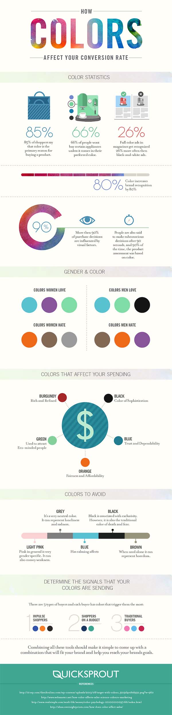
The Psychology of Color
Color psychology is the study of how colors can influence human emotions and behaviors. It’s a field that has been widely researched and applied in various domains, including marketing and web design. Understanding the psychological effects of colors is essential for creating a website that resonates with your target audience and encourages them to take the desired actions.
Red: The Color of Urgency and Action
Red is a powerful and attention-grabbing color. It’s often associated with urgency, excitement, and passion. When used strategically, red can be an effective color for call-to-action buttons, encouraging users to take immediate action, such as making a purchase or signing up for a newsletter. However, it’s important to use red sparingly and strategically, as an excessive amount of red can be overwhelming and create a sense of urgency that may deter users.
Blue: The Color of Trust and Stability
Blue is one of the most popular colors in web design, and for good reason. It conveys a sense of trust, reliability, and stability. Many tech companies and financial institutions use shades of blue in their branding to establish credibility and build trust with their audience. If your website aims to convey professionalism and reliability, incorporating blue into your color scheme can be a smart choice.
Green: The Color of Health and Nature
Green is often associated with health, nature, and growth. It’s a calming color that can create a sense of balance and harmony. Websites related to health and wellness, eco-friendly products, or outdoor activities can benefit from using green in their design. Green can also be used to signify success or positive actions, making it a great choice for confirmation messages or progress indicators.
Yellow: The Color of Optimism and Clarity
Yellow is a cheerful and optimistic color that grabs attention and communicates clarity. It’s often used for highlighting important information or for creating a sense of warmth and friendliness. However, yellow should be used cautiously as the dominant color, as excessive use can be straining on the eyes and may convey a sense of caution or warning.
Black: The Color of Luxury and Elegance
Black is a color associated with luxury, elegance, and sophistication. It’s often used by high-end brands to convey a sense of exclusivity and quality. When used as a background color, black can make other colors and elements on your website pop, creating a visually striking contrast. However, it’s essential to balance black with other colors to avoid a website that feels too dark or intimidating.
White: The Color of Simplicity and Purity
White is a color that represents simplicity, purity, and cleanliness. It’s commonly used in minimalist web design and can create a sense of openness and clarity. White backgrounds with black or colored text are a classic choice for readability and a clean aesthetic. White can also be used to highlight content and make it stand out.
Color Harmony and Contrast
Choosing the right colors for your website is not just about picking individual colors; it’s also about creating a harmonious color palette that works well together. One essential concept in color design is contrast. Contrast refers to the difference in brightness between elements, such as text and background. A good contrast ensures that text is easily readable and that important elements stand out.
High Contrast for Readability
For text-heavy websites or those with important information, it’s crucial to have high contrast between text and background colors. For example, using dark text on a light background or vice versa ensures that the text is easily legible. Websites that fail to provide adequate contrast may frustrate users and lead to higher bounce rates.
Use of Complementary Colors
Complementary colors are colors that are opposite each other on the color wheel, such as red and green or blue and orange. When used together, complementary colors can create a vibrant and visually appealing design. However, it’s important to use complementary colors strategically, as excessive use can be overwhelming. Complementary colors are often used for call-to-action buttons or to create visual interest on a webpage.
Analogous Color Schemes for Harmony
Analogous color schemes consist of colors that are adjacent to each other on the color wheel, such as blue, blue-green, and green. These color schemes create a harmonious and pleasing visual effect. They can be suitable for websites that want to convey a sense of calmness and unity. However, analogous color schemes may lack the contrast needed for certain elements like buttons or headings, so it’s essential to balance them with neutrals or complementary colors.
The Impact of Color on Conversion Rate
Now that we’ve explored the psychology of color and the principles of color design, let’s delve into how color can affect the conversion rate of your website. Conversion rate refers to the percentage of visitors who take a desired action on your website, such as making a purchase, signing up for a newsletter, or filling out a contact form. Here are some ways in which color can influence conversion rates:
1. Call-to-Action Buttons
Call-to-action (CTA) buttons are one of the most critical elements of a website when it comes to conversion. The color of your CTA buttons can significantly impact whether users click on them or not. Red and orange are often associated with urgency and can encourage users to take immediate action. Blue and green, on the other hand, convey trust and reliability, making users more comfortable with clicking. The choice of CTA button color should align with your specific goals and the emotions you want to evoke in your audience.
2. Trust and Credibility
The color scheme of your website can affect the perception of your brand’s trustworthiness and credibility. As mentioned earlier, blue is a color that is often associated with trust and stability. If your website uses shades of blue in its design, it can help instill a sense of confidence in visitors. On the other hand, using too many bright and contrasting colors may give the impression of a less serious or reliable website.
3. Brand Identity
Color plays a crucial role in brand identity. Your website’s color scheme should align with your brand’s personality and values. Consistency in color usage across your website and other branding materials helps in building brand recognition. When visitors associate your brand with specific colors, it can lead to increased trust and loyalty, ultimately impacting conversion rates positively.
4. Emotional Connection
Colors evoke emotions, and those emotions can influence user decisions. For example, a website that uses warm, inviting colors like reds, oranges, and yellows can create a sense of excitement and enthusiasm. On the other hand, a website with cool, calming colors like blues and greens can make visitors feel relaxed and at ease. Depending on your target audience and the emotions you want to evoke, your color choices can help establish a stronger emotional connection with your visitors, increasing the likelihood of conversion.
5. Readability and User Experience
The readability of your website is crucial for keeping users engaged and encouraging them to explore further. Proper color contrast between text and background is essential to ensure that users can easily read your content. Websites with poor color choices that lead to low contrast can frustrate users and result in higher bounce rates, negatively impacting conversion rates.
6. Cultural Considerations
It’s essential to consider cultural differences when selecting colors for your website. Colors can have varying meanings and associations in different cultures. For example, while white may symbolize purity in Western cultures, it can represent mourning in some Eastern cultures. Understanding the cultural significance of colors is important, especially if your website has a global audience. Failing to consider cultural preferences can alienate potential customers and harm your conversion rate.
A/B Testing and Color Optimization
Determining the ideal color scheme for your website isn’t a one-size-fits-all process. What works for one website may not work for another. That’s where A/B testing comes in. A/B testing involves creating two versions of a webpage with different color schemes and measuring which one performs better in terms of conversion rate.
When conducting A/B tests related to color, keep these best practices in mind:
- Test One Element at a Time: To isolate the impact of color, make sure you’re only testing the color of a specific element, such as the CTA button or the background.
- Use a Large Sample Size: To obtain statistically significant results, test your color variations on a sizable sample of your website’s visitors.
- Monitor Different Conversion Goals: Depending on your website’s objectives, you may want to test different conversion goals, such as sales, sign-ups, or downloads.
- Be Patient: A/B testing requires patience, as you may need to collect data over an extended period to draw meaningful conclusions.
- Consider User Feedback: In addition to quantitative data, gather qualitative feedback from users about their perception of the color choices. This can provide valuable insights into their emotional responses.
Conclusion
Color is a powerful tool in web design, capable of influencing user behavior and conversion rates. By understanding the psychology of color, employing principles of color harmony and contrast, and conducting A/B testing, you can optimize your website’s color scheme to effectively communicate your brand’s message and encourage visitors to take the desired actions.
Remember that there is no one-size-fits-all approach to color selection for websites. The right colors for your site will depend on your brand, target audience, and specific goals. Continuously monitor and analyze the impact of your color choices to ensure that your website remains visually appealing and conversion-friendly.
In the ever-competitive online landscape, the careful consideration of color can be the difference between a website that converts visitors into customers and one that struggles to engage its audience. So, take the time to choose your colors wisely, and watch as they work their magic on your website’s conversion rate.

Author:
Mark Ford



