
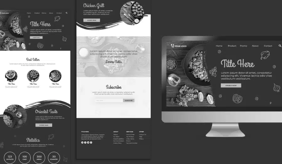
Are you struggling to find a WordPress theme that truly supports your website’s purpose? Want to know how to pick a theme that looks great and delivers the results you need?
You’ll find some WordPress basics in this infographic.
Here’s a summary of what’s covered:
- Why Your Theme Choice Matters
- The Pitfalls of a Poorly Designed Theme
- Responsiveness Is Non-Negotiable
- Match the Theme to Your Content Type
- Don’t Be Misled by Demo Content
- Features Should Match Your Needs—No More, No Less
- Free vs. Paid Themes: What to Consider
- Bonus Features You Get with Paid Themes
- Make Sure the Theme Is SEO-Friendly
- Customisation Should Be Straightforward
Check out the post below for more.

Choosing a WordPress theme isn’t just about looks—it’s about setting your website up for success. The right theme influences everything from your user experience and mobile compatibility to SEO and brand perception.
With thousands of free and premium options available, making the right choice can feel overwhelming. This guide will walk you through the key factors to consider so your theme truly supports your website goals.
Why Your Theme Choice Matters
Your theme sets the foundation for your entire website. A poorly chosen theme can negatively affect load times, responsiveness, and SEO. In contrast, a well-selected theme enhances user experience, strengthens your branding, and makes content delivery seamless. Getting it right is crucial from both a design and strategic perspective.
- A theme controls layout, colours, fonts, and key visual elements of your site.
- Good themes are lightweight, secure, and regularly updated.
- Bad themes can slow your site down and weaken search engine rankings.
- Design directly influences how users perceive your professionalism and credibility.
The Pitfalls of a Poorly Designed Theme
Not all themes are created equal. Some may look impressive on the surface but are poorly coded, bloated with features, or incompatible with key plugins. These issues can cause technical headaches and damage your site’s reputation. Understanding these pitfalls helps you avoid unnecessary trouble down the line.
- Poorly built themes may break during updates or conflict with plugins.
- Bloated themes often include excessive features you don’t need.
- Outdated themes leave your site vulnerable to security risks.
- Lack of developer support makes it difficult to troubleshoot issues.
Responsiveness Is Non-Negotiable
More than half of all web traffic comes from mobile devices. If your theme isn’t responsive, your users will struggle to navigate your site on smartphones and tablets. A responsive design automatically adapts to different screen sizes, ensuring an optimal experience across all devices.
- Look for themes that preview well on mobile, tablet, and desktop.
- Use Google’s Mobile-Friendly Test to assess theme responsiveness.
- Avoid themes that require separate mobile versions.
- Prioritise themes built with mobile-first design in mind.
Match the Theme to Your Content Type
A theme should complement—not compete with—your content. Whether you’re running a blog, eCommerce site, portfolio, or business homepage, the layout and features should align with your content strategy. Don’t force your content to fit into an unsuitable structure.
- Choose magazine-style layouts for content-heavy or news websites.
- Portfolios should highlight visual content with grid-based galleries.
- eCommerce themes should support product listings, carts, and checkout flows.
- Bloggers should prioritise readability with clean, text-focused designs.
Don’t Be Misled by Demo Content
Demo content is designed to look polished and impressive, but it rarely reflects how the theme will look with your own material. Judging a theme based solely on its demo can result in disappointment and wasted time. Always look beyond the visuals and test with your actual content.
- Replace demo content with your own before committing to a theme.
- Check whether demo images and layouts are included in the download.
- Test your branding and copy to see how well the layout adapts.
- Consider how easy it is to customise fonts, colours, and spacing.
Features Should Match Your Needs—No More, No Less
Some themes try to be everything to everyone and end up doing nothing well. Feature overload can lead to slow performance and unnecessary complexity. Instead, focus on a theme that provides the exact features you need without the extras that bloat your website.
- Avoid themes that come bundled with too many plugins or options.
- Make a list of must-have features and choose a theme that meets them.
- Don’t pay for flashy animations or gimmicks you won’t use.
- Consider future growth—pick a theme that can scale with your needs.
Free vs. Paid Themes: What to Consider
Both free and paid themes have their place, but each comes with trade-offs. Free themes can be great for small projects with simple needs, while paid themes often offer more control, updates, and support. Assess your project’s scope and budget before deciding.
- Free themes may lack support and long-term updates.
- Paid themes often come with better documentation and flexibility.
- Don’t assume “premium” means better—evaluate each theme on its merits.
- Look for well-reviewed themes from reputable developers or marketplaces.
Bonus Features You Get with Paid Themes
Premium themes often include extras that enhance the overall experience for both developers and users. While these features shouldn’t be the sole reason for purchasing, they can add real value when aligned with your goals. Be sure you’ll use what’s included.
- Regular updates keep your theme compatible with WordPress core changes.
- Premium support channels help resolve issues quickly and efficiently.
- Greater flexibility allows for deeper customisation and branding.
- Extras like built-in SEO, performance tools, or design templates can save time.
Make Sure the Theme Is SEO-Friendly
Search engine visibility starts with your site’s structure and code. A good theme will follow best practices for HTML markup, load times, and mobile compatibility. Poorly coded themes can slow your site down and sabotage your SEO efforts before you even begin.
- Choose themes with lightweight code and fast loading speeds.
- Ensure headings, tags, and structure are optimised for SEO.
- Avoid themes with excessive JavaScript and CSS files.
- Check compatibility with popular SEO plugins like Yoast or Rank Math.
Customisation Should Be Straightforward
A good theme is easy to personalise without needing advanced coding knowledge. Customising layout, colours, fonts, and key visual elements should be intuitive, allowing you to create a unique brand experience. If it’s too hard to modify, it’s not worth your time.
- Check for compatibility with drag-and-drop page builders like Elementor.
- Ensure the theme supports WordPress Customizer for easy editing.
- Look for clear documentation or tutorials to help with setup.
- Prioritise themes that allow flexibility without breaking the design.
Final Thoughts: Choosing with Confidence
Your WordPress theme is the backbone of your website experience. Rather than chasing trends or picking the flashiest demo, focus on what will support your long-term goals. A well-chosen theme should be fast, responsive, easy to customise, and tailored to your content and user journey.
Whether you opt for a free or paid theme, take your time to evaluate all the key areas—from responsiveness and SEO to features and support. Your future self (and your users) will thank you for making a thoughtful, strategic decision.

Author:
Mark Ford



