

Color is a powerful tool in design. It can evoke emotions, convey messages, and create a memorable brand identity.
When it comes to your logo and website, choosing the right colors is crucial for making a strong first impression and communicating your brand’s personality.
In this guide, we will explore the psychology of color, the importance of color in branding, and provide practical tips on how to select the perfect colors for your logo and website.
Infographic brought to you by DesignMantic.
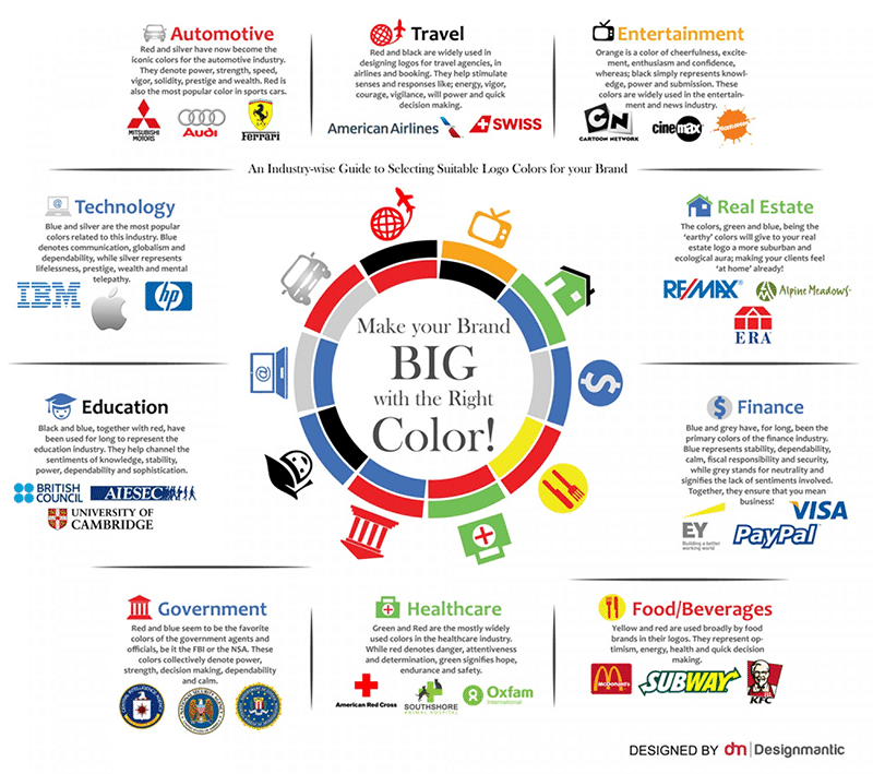
Understanding the Psychology of Color
Before diving into the process of selecting colors for your logo and website, it’s essential to understand the psychology of color. Different colors can trigger specific emotions and associations, and this knowledge can help you make informed choices that align with your brand’s goals and values. Here’s a breakdown of some common colors and their psychological effects:
1. Red
- Emotions: Passion, energy, excitement, and love.
- Associations: Danger, urgency, and warmth.
- Use Cases: Red can be a great choice for brands that want to convey a sense of energy and urgency, such as Coca-Cola.
2. Blue
- Emotions: Trust, calmness, professionalism, and reliability.
- Associations: The sky and the ocean, which can symbolize expansiveness and stability.
- Use Cases: Many tech companies like Facebook and IBM use blue to convey trust and reliability.
3. Green
- Emotions: Growth, health, freshness, and harmony.
- Associations: Nature and eco-friendliness.
- Use Cases: Green is often used by brands focused on sustainability and wellness, such as Whole Foods Market.
4. Yellow
- Emotions: Joy, optimism, happiness, and friendliness.
- Associations: Sunshine and warmth.
- Use Cases: Yellow can be a great choice for brands that want to radiate positivity, like McDonald’s.
5. Purple
- Emotions: Royalty, luxury, creativity, and spirituality.
- Associations: Elegance and sophistication.
- Use Cases: Brands like Cadbury use purple to convey a sense of luxury and quality.
6. Orange
- Emotions: Enthusiasm, energy, and creativity.
- Associations: Fun and playfulness.
- Use Cases: Orange can be a good choice for brands that want to appear energetic and innovative, such as Nickelodeon.
7. Black
- Emotions: Elegance, power, sophistication, and mystery.
- Associations: Luxury and exclusivity.
- Use Cases: Many high-end fashion brands like Chanel use black in their branding.
8. White
- Emotions: Purity, simplicity, cleanliness, and innocence.
- Associations: Minimalism and transparency.
- Use Cases: Brands like Apple have embraced white in their branding to convey simplicity and elegance.
9. Brown
- Emotions: Earthiness, stability, and reliability.
- Associations: Natural and organic.
- Use Cases: Brown is commonly used by brands in the food and outdoor industries, like Hershey’s.
10. Pink
- Emotions: Femininity, love, and sweetness.
- Associations: Romance and playfulness.
- Use Cases: Brands targeting a female audience, like Victoria’s Secret, often use pink.
These are just general associations, and the impact of color can vary depending on cultural and personal factors. It’s essential to consider your target audience and the specific message you want to convey when choosing colors for your logo and website.
The Importance of Color in Branding
Color plays a significant role in branding for several reasons:
1. Brand Recognition
Consistency in color usage helps people recognize and remember your brand. When customers see your logo or visit your website, they should immediately associate the colors with your brand. This recognition fosters trust and loyalty.
2. Emotional Connection
Colors can evoke emotional responses, creating a deeper connection between your brand and your audience. The right colors can make your brand feel relatable and resonate with your target demographic.
3. Differentiation
In a crowded marketplace, using unique and distinctive colors can set your brand apart from competitors. This distinctiveness can help consumers remember your brand and choose it over others.
4. Communication
Colors can convey messages and values without the need for words. They can communicate your brand’s personality, mission, and ethos, making it easier for customers to understand what you stand for.
Now that you understand the significance of color in branding, let’s delve into the process of choosing the right colors for your logo and website.
How to Choose the Right Color for Your Logo
Your logo is often the first point of contact between your brand and potential customers. It’s essential to choose colors that not only align with your brand but also leave a lasting impression. Here’s a step-by-step guide to help you select the perfect colors for your logo:
1. Define Your Brand’s Personality
Start by defining your brand’s personality and values. Is your brand playful and fun, or is it serious and professional? Understanding your brand’s personality will guide your color choices.
2. Know Your Target Audience
Consider your target audience’s preferences and psychology. What colors resonate with them, and what emotions do you want to evoke in your audience?
3. Competitor Analysis
Analyze your competitors’ logos and color schemes. You want to stand out in the market, so choose colors that differentiate your brand while still fitting within your industry.
4. Color Associations
Refer back to the psychology of color mentioned earlier. Think about which colors align with your brand’s message and personality. For example, if you run a health and wellness brand, green or blue might be suitable choices.
5. Color Combinations
Experiment with different color combinations. You can use tools like Adobe Color Wheel or Coolors to create and test color palettes that work well together.
6. Test for Versatility
Ensure that your chosen colors work well in various applications and backgrounds. Your logo should be adaptable to different mediums, from digital to print.
7. Seek Feedback
Don’t hesitate to seek feedback from peers, mentors, or a professional designer. A fresh perspective can provide valuable insights and help you make an informed decision.
8. Finalize Your Color Palette
Once you’ve considered all the factors and gathered feedback, finalize your color palette. Ensure that you have both primary and secondary colors that can be used consistently across all your branding materials.
How to Choose the Right Color for Your Website
Your website is a crucial touchpoint for your brand, and the colors you choose can impact user experience and perception. Here’s how to select the right colors for your website:
1. Consistency with Logo
Your website’s color scheme should align with your logo’s colors to maintain brand consistency. Use the same primary and secondary colors to create a cohesive visual identity.
2. Readability
Ensure that text is easily readable against the background color. High contrast between text and background improves user experience and accessibility.
3. Mood and Tone
Consider the mood and tone you want to convey through your website. If you want to create a calm and soothing atmosphere, consider using cool colors like blues and greens. For an energetic and vibrant feel, opt for warm colors like reds and oranges.
4. Hierarchy and Call to Action
Use color to establish hierarchy on your website. Use a primary color for important elements like call-to-action buttons to draw attention and guide users’ actions.
5. Accessibility
Ensure that your color choices meet accessibility standards. Some users may have visual impairments, so providing sufficient contrast and alternative text for images is essential.
6. Responsiveness
Consider how your color choices will look on different devices and screen sizes. Test your website’s appearance on various screens to ensure a consistent and visually appealing experience.
7. User Testing
Conduct user testing to gather feedback on your color choices. This can help identify any issues with readability or user experience.
8. Brand Consistency
Maintain consistency not only in color but also in typography and design elements throughout your website. This reinforces your brand’s identity and message.
Case Studies: Brands and Their Color Choices
Let’s take a look at a few well-known brands and their color choices to understand how color can reflect a brand’s identity:
1. Coca-Cola
Coca-Cola’s use of red reflects its energetic and passionate brand personality. The color red is also associated with the excitement and joy of sharing a cold drink with friends.
2. Apple
Apple’s minimalist and sleek brand image is complemented by its use of white. White represents simplicity, cleanliness, and sophistication, aligning perfectly with Apple’s design ethos.
3. Starbucks
Starbucks uses a soothing green color that reflects its commitment to sustainability and a sense of relaxation. It also ties in with the natural elements and coffee-growing regions the brand emphasizes.
4. Facebook
Facebook’s blue color choice conveys trustworthiness and professionalism. It aims to create a sense of reliability in its users and establish itself as a reputable social media platform.
Conclusion
Choosing the right colors for your logo and website is a critical aspect of branding and design. Colors can evoke emotions, communicate messages, and create a strong brand identity. By understanding the psychology of color, defining your brand’s personality, and considering your target audience, you can make informed color choices that align with your brand’s goals and values. Whether you’re designing a logo or a website, the right colors can leave a lasting impression and help you stand out in the competitive world of business and online presence. So, take the time to choose your colors wisely, and watch your brand come to life in vibrant and memorable ways.

Author:
Mark Ford



