

Are you trying to figure out how to design landing pages that instantly grab attention and pull visitors in? Want to learn the essential elements that help you build trust from the first glance to the final click?
You’ll find the core principles of effective landing page design in this infographic.
Here’s a summary of what’s covered:
- Above-the-Fold Elements
- Call-To-Action (CTA)
- Benefit Features
- Social Proof
- Closing Argument
Check out the post below for more.
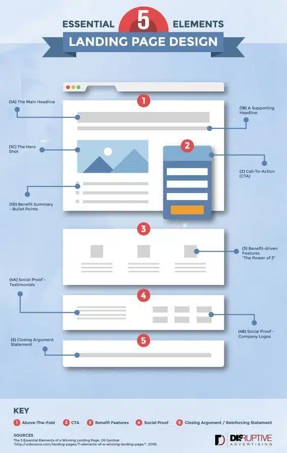
A great landing page does more than look good. It guides your visitor from first impression to final action with clarity, purpose, and trust. When the right elements appear in the right order, people naturally feel more confident, more informed, and more willing to take the next step. That is why high-converting landing pages are built on structure rather than guesswork. The design decisions you make define how long a visitor stays, how they feel, and ultimately whether they convert.
To create a landing page that resonates, you need to combine strong messaging, purposeful visuals, persuasive proof, and a clear action path.
Above-the-Fold Elements
The above-the-fold area is your first and most critical opportunity to connect with your audience. Visitors decide within seconds whether your page feels relevant, trustworthy, and worthy of their attention. A strong headline, supportive subheadline, compelling imagery, and clear benefits all work together to build instant confidence.
When these elements support each other, the user understands exactly what you offer and why it matters. The above-the-fold section is not about overwhelming your visitor, but giving them a reason to keep reading.
- A concise main headline that clearly states your value proposition.
- A supporting headline that adds context or clarifies your promise.
- A hero image or visual that reinforces the message and sets expectations.
- A short benefit summary that highlights immediate reasons to stay engaged.
Call-To-Action (CTA)
Your call-to-action is the most important functional element on the page. It directs visitors toward the goal, whether that is signing up, requesting a quote, or making a purchase.
A CTA must be visible, psychologically compelling, and aligned with user intent. The placement, wording, and design play major roles in whether someone clicks or hesitates. When your CTA feels natural and risk-free, users are far more likely to act.
- Use clear, action-driven language that tells the user exactly what will happen next.
- Position your CTA prominently so it can be seen without scrolling.
- Remove friction by keeping form fields minimal and intuitive.
- Repeat your CTA in logical places throughout the page for reinforcement.
Benefit Features
After capturing initial interest, you need to deepen the visitor’s understanding of what you offer. Benefit-driven features explain how your solution helps, why it is valuable, and what makes it different. Presenting these benefits in a structured, easy-to-scan format gives visitors the information they need to build trust.
Using the “Power of 3” keeps the content focused, digestible, and persuasive without overwhelming the reader. This section shifts attention from what your product is to why it matters.
- Highlight the top three benefits that provide the most meaningful impact.
- Use short, punchy text to keep the focus on outcomes rather than technicalities.
- Support benefits with small icons or visuals to increase clarity and engagement.
- Ensure each benefit connects directly to a likely customer need or pain point.
Social Proof
Social proof reassures visitors that your offering delivers real results for real people. Testimonials, reviews, and company logos demonstrate that others have trusted you and benefited from your service. This creates a powerful emotional shift from uncertainty to confidence.
Social proof works because people rely on external validation when making decisions, especially in moments of doubt or risk. A dedicated social proof section can significantly influence conversion rates by removing the fear of making the wrong choice.
- Display short, authentic testimonials that highlight specific results or outcomes.
- Include customer names, job roles, or industries where appropriate to add credibility.
- Showcase well-known client or partner logos to reinforce your credibility.
- Keep the layout simple and organised so the proof feels genuine, not forced.
Closing Argument
Your closing argument pulls everything together and provides a final moment of reassurance. This section reminds visitors of the key promise, reaffirms the value, and gives them a compelling reason to act now. A strong closing statement helps convert hesitant readers by reinforcing what’s at stake and why your solution is the right choice.
While subtle, it plays a major role in driving conversions among visitors who scroll to the bottom before making a decision. The goal is to gently guide them toward the CTA with a renewed sense of confidence.
- Summarise the core value proposition in clear, benefit-focused language.
- Address any lingering concerns by reinforcing what makes your offer reliable.
- Keep the message short and motivational to encourage final action.
- Position your CTA nearby to capture conversions at the moment of readiness.
Conclusion
Designing a landing page that captures attention and earns trust requires more than attractive visuals or catchy text. It demands a structured journey that moves visitors from curiosity to clarity, and from clarity to action. When each section of your page works toward this purpose, conversions rise naturally because every element plays a meaningful role.
Visitors feel informed rather than pressured, supported rather than sold to, and confident instead of uncertain. By combining strong above-the-fold messaging, a compelling CTA, benefit-driven features, persuasive social proof, and a solid closing argument, you create a landing page that guides every user toward a confident decision.

Author:
Mark Ford



