

In the digital age, a company’s online presence is often the first point of contact with potential customers.
Your website is your virtual storefront, and your logo serves as the face of your brand.
In this blog post, we’ll delve into the fascinating world of design psychology to explore how your logo and website fonts can profoundly impact the way your customers feel about your brand.
Infographic by RCM Websites.
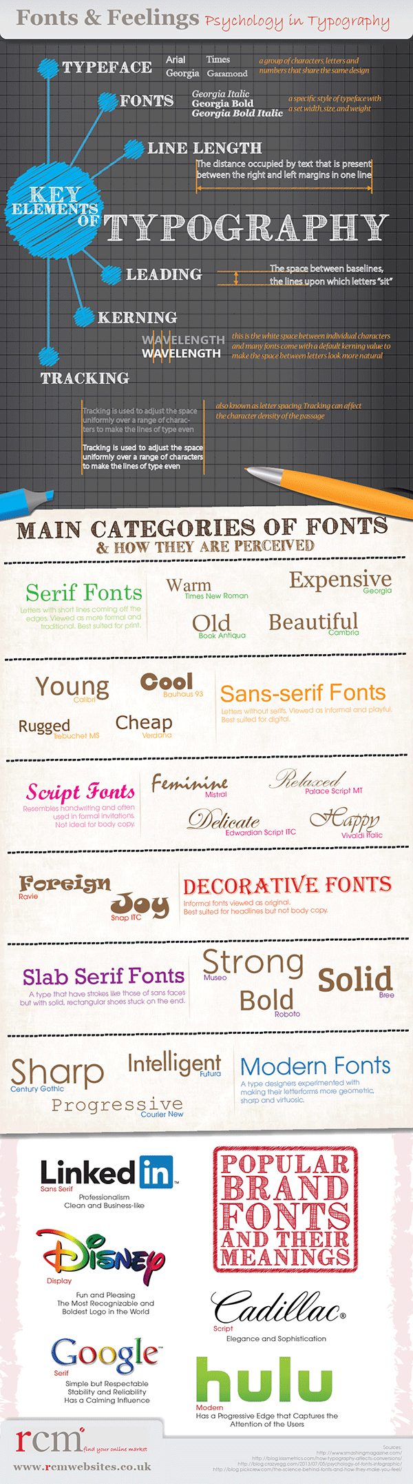
The Psychology of Design
Before we dive into the specifics of logos and fonts, it’s essential to understand the psychology behind design. Design isn’t just about making things look pretty; it’s about creating an emotional connection between your brand and your audience.
Emotions play a significant role in consumer behavior. People make purchasing decisions based on how a brand makes them feel. Therefore, understanding how design elements like logos and fonts influence emotions is crucial for any business aiming to build a strong and lasting relationship with its customers.
The Power of Logos
Your logo is your brand’s visual identity. It’s the first thing many people notice about your company, and it should convey your brand’s personality, values, and mission in a single image. Let’s explore how different elements of your logo design can evoke specific emotions.
Color Palette
The colors in your logo have a profound impact on how people perceive your brand. Each color has its own emotional connotations:
- Red: Excitement, passion, and energy
- Blue: Trust, reliability, and professionalism
- Green: Growth, health, and sustainability
- Yellow: Optimism, warmth, and friendliness
- Black: Elegance, sophistication, and luxury
For example, if you’re running a healthcare startup, using a green color palette in your logo can convey a sense of trust and growth, which is essential in the healthcare industry. On the other hand, a luxury fashion brand might opt for black to signify elegance and sophistication.
Typography
The choice of fonts in your logo is equally significant. Different fonts evoke different emotions:
- Serif Fonts: These fonts are associated with tradition, respect, and reliability. They are often used by established brands to convey a sense of history and trustworthiness.
- Sans-serif Fonts: These fonts are modern, clean, and minimalistic. They convey a sense of simplicity and innovation, making them popular among tech companies.
- Script Fonts: These fonts can be elegant, playful, or even romantic, depending on the style. They are often used by brands that want to evoke a sense of personality and creativity.
Consider the famous Coca-Cola logo, which uses a script font to evoke a sense of nostalgia and warmth. In contrast, tech giants like Google and Apple use clean and modern sans-serif fonts to convey innovation and simplicity.
Shape and Symbolism
The shapes and symbols in your logo also contribute to the emotional response it elicits. For example:
- Circles: Circles convey a sense of unity, community, and wholeness. They are often used by brands that want to create a feeling of inclusivity and connection.
- Triangles: Triangles signify stability, balance, and energy. They are commonly used by brands that want to showcase strength and innovation.
- Curves: Curved lines and shapes can evoke a sense of softness, comfort, and approachability. They are often used by brands in industries like childcare or wellness.
Consider the Nike swoosh, a simple and iconic logo that uses a curved shape to evoke a sense of movement and action, aligning perfectly with the brand’s message of athleticism and achievement.
Website Fonts: The Silent Communicators
While logos have the advantage of being a visual representation of your brand, website fonts play a crucial role in shaping your brand’s online presence. Fonts are the silent communicators of your website, subtly influencing the user’s perception of your brand. Let’s explore how different fonts can impact user emotions.
Serif vs. Sans-serif
One of the primary distinctions in fonts is between serif and sans-serif. Serif fonts have small lines or embellishments at the ends of their characters, while sans-serif fonts are clean and lack these embellishments.
- Serif Fonts: These fonts are often associated with tradition, authority, and reliability. When used in website copy, they can create a sense of credibility and professionalism.
- Sans-serif Fonts: Sans-serif fonts are modern, clean, and easy to read on screens. They convey a sense of simplicity, innovation, and approachability, making them popular for web content.
When choosing fonts for your website, consider your brand’s personality. For example, an academic institution might opt for serif fonts to convey authority and tradition, while a tech startup may prefer sans-serif fonts to emphasize innovation and approachability.
Font Size and Spacing
The size and spacing of your website fonts also play a role in user experience and emotions. Here’s how:
- Font Size: Larger fonts are easier to read and can convey a sense of importance or urgency. Smaller fonts may be used for secondary information or to create a more intimate reading experience.
- Line Spacing (Leading): The space between lines of text can affect readability and the overall feel of your content. Tighter spacing can create a sense of efficiency, while increased spacing can enhance readability and convey a more relaxed feel.
Consider the website of a high-end fashion brand, which might use larger fonts and generous spacing to create an elegant and luxurious browsing experience. In contrast, a news website might use smaller fonts and tighter spacing to fit more content on the page and convey a sense of efficiency.
Font Style and Personality
Fonts come in a wide range of styles, each with its own personality. Some common font styles and their emotional connotations include:
- Serif Fonts: Classic, timeless, and traditional
- Sans-serif Fonts: Modern, clean, and minimalistic
- Script Fonts: Elegant, creative, and personal
- Display Fonts: Bold, attention-grabbing, and expressive
When choosing fonts for your website, consider how the style aligns with your brand’s personality and message. A law firm’s website, for example, would benefit from classic serif fonts to convey professionalism and trust, while a creative agency might use expressive display fonts to showcase creativity and innovation.
Case Studies: Brands Nailing Logo and Font Psychology
Let’s take a closer look at some real-world examples of brands that have effectively leveraged logo and font psychology to connect with their target audience:
1. Coca-Cola
The Coca-Cola logo is a prime example of effective logo and font psychology. The iconic script font, with its flowing curves, evokes a sense of warmth, nostalgia, and timelessness. The use of red in the logo adds an element of excitement and passion. Combined, these elements create a powerful emotional connection with consumers, making Coca-Cola one of the most recognized and beloved brands worldwide.
2. Apple
Apple’s logo and font choices have played a pivotal role in positioning the brand as a leader in innovation and design. The clean and minimalist use of the Apple logo, along with the use of the sans-serif San Francisco font in its marketing materials and website, conveys simplicity, sophistication, and cutting-edge technology. This design strategy aligns perfectly with Apple’s brand values and resonates with its target audience.
3. Disney
Disney’s logo and fonts are synonymous with magic, storytelling, and creativity. The distinctive and whimsical font used in the Disney logo, often referred to as “Walt Disney Script,” instantly transports viewers to the enchanting world of Disney’s animated films. The logo’s iconic castle imagery further reinforces the brand’s magical and imaginative identity, making it a beloved and enduring brand for generations.
The Importance of Consistency
Consistency in design is key to building a strong and recognizable brand. Your logo and website fonts should align with each other and with your overall brand identity. Inconsistencies can confuse and alienate your audience, diluting the emotional impact you aim to achieve.
When creating or updating your brand’s visual identity, consider the following tips:
- Develop Brand Guidelines: Create a comprehensive set of brand guidelines that outline the use of your logo, color palette, fonts, and other design elements. Share these guidelines with your team and any external partners to ensure consistent branding across all touchpoints.
- Test and Iterate: Don’t be afraid to test different logo and font combinations to see how they resonate with your target audience. Collect feedback and iterate based on the emotional response you want to evoke.
- Stay Informed: Keep an eye on design trends and emerging fonts to ensure that your brand remains relevant and contemporary. However, avoid chasing trends at the expense of your brand’s core identity.
- Adapt for Digital: As more interactions occur online, it’s essential to adapt your logo and fonts for digital platforms. Ensure that your logo looks great on various screen sizes and that your website fonts are optimized for readability on screens.
Conclusion
Your logo and website fonts are powerful tools for shaping the way your customers feel about your brand. By understanding the psychology of design and making deliberate choices in color, typography, shape, and symbolism, you can create a brand identity that resonates with your target audience on a deep emotional level.
Remember that design is not static; it evolves with your brand and your audience. Regularly assess how your logo and fonts align with your brand’s values and the emotions you want to evoke in your customers. With a well-crafted visual identity, your brand can leave a lasting impression and build strong, emotional connections with your audience in the ever-evolving digital landscape.

Author:
Mark Ford



