So you’ve heeded Google’s warning, you’ve got your small business website mobile friendly, but is your content optimised for mobile users too?

A paragraph of text on a large screen can seem like an essay on a mobile device. Take the time to break your content up into easy to follow slices in order to provide mobile visitors with the best possible user experience.

Vertical Leap share some great tips to help you achieve this in the infographic below.
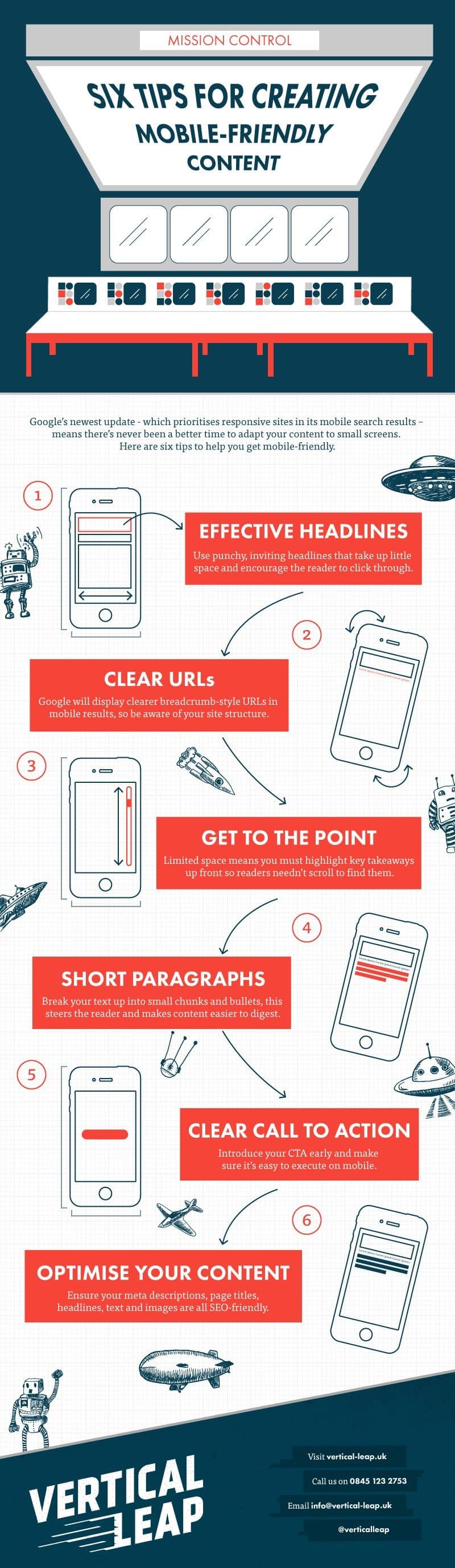
Is Your Site Mobile Optimised 6 Tips to Create Mobile Friendly Content


Mark Walker-Ford

Author:
Mark Ford

Categories: Web Design
  • 5 Website Design Principles That Keep Visitors Coming Back (1)

    5 Website Design Principles That Keep Visitors Coming Back

    Are you trying to create a website that keeps visitors engaged and encourages them to return? Want to discover the key design principles that make websites both effective and memorable? […]

  • No Website, No Growth_ Why Being Online Is Non-Negotiable (1)

    No Website, No Growth: Why Being Online Is Non-Negotiable

    Are you wondering why having a website is now essential for small business growth? Want to discover the key reasons being online is no longer optional for success? […]

  • How to Build a B2B Website Homepage That Wins Clients in Seconds (1)

    How to Build a B2B Website Homepage That Wins Clients in Seconds

    Are you struggling to make your B2B homepage capture attention and win over potential clients? Want to learn the essential features that turn a homepage into a powerful client-converting tool? […]

  • How to Align Your Website with Proven UX Best Practices (1)

    How to Align Your Website with Proven UX Best Practices

    Are you ready to make your website easier and more enjoyable for visitors to use? Want to discover the proven UX best practices that top-performing sites follow? […]