

Are you considering rebranding your business in 2017? Want to know the modern trends that should guide you along the way?
In the world of branding and marketing, logos play a crucial role in establishing a company’s identity. A well-designed logo can convey a company’s values, personality, and vision, making it an essential element of any successful business strategy.
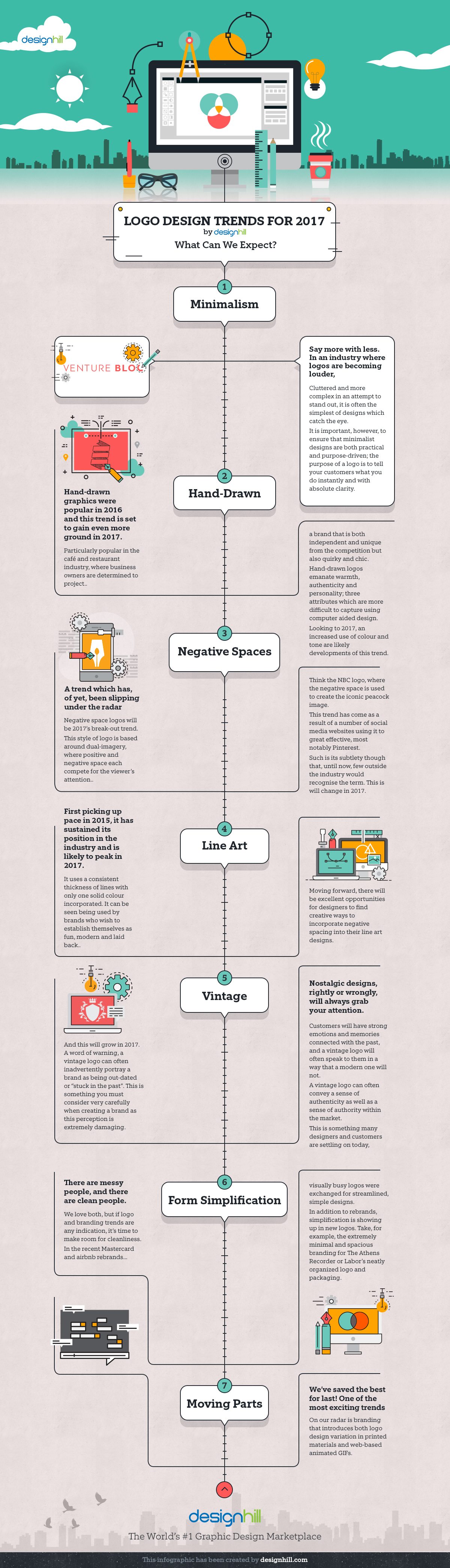
However, logo design trends evolve over time, reflecting changes in design aesthetics, technology, and cultural influences. In 2017, several exciting logo design trends emerged, bringing fresh ideas and modern aesthetics to the forefront. In this blog post, we will explore seven logo design trends of 2017 that defined modernity and creativity in branding.
Designhill share their 7 logo design trends to look out for in this infographic.
Minimalism and Simplicity
Minimalism has been a dominant design trend for several years, and 2017 was no exception. Minimalistic logos are characterized by clean lines, simple shapes, and a focus on essential elements. This trend emphasizes the “less is more” philosophy, where designers strive to convey a message or brand identity using as few design elements as possible.
One of the key advantages of minimalistic logos is their versatility. They work well across various platforms and applications, from business cards to billboards. Famous brands like Apple, Nike, and Google have embraced minimalism in their logos, which has contributed to its widespread adoption.
In 2017, many companies and startups adopted this trend, opting for logos with uncomplicated shapes, geometric elements, and limited color palettes. The simplicity of these logos allowed them to stand out in a crowded marketplace and resonate with consumers seeking clarity and authenticity.
Hand-Drawn and Lettering Logos
Amid the prevalence of digital design tools, there was a resurgence of interest in hand-drawn and lettering logos in 2017. These logos showcase the craftsmanship and unique artistic touch of the designer. Hand-drawn logos often evoke a sense of nostalgia and authenticity, making them an excellent choice for businesses aiming to establish a personal connection with their audience.
Incorporating hand-drawn elements or custom lettering into a logo can help create a distinctive and memorable brand identity. Many craft breweries, coffee shops, and artisanal businesses turned to this trend to communicate their commitment to quality and craftsmanship.
Geometric Shapes and Patterns
Geometric shapes and patterns have long been a staple in logo design, but in 2017, they experienced a resurgence in popularity. This trend involves using geometric elements, such as triangles, circles, and polygons, to create visually appealing and balanced logos. Geometric patterns can add depth and complexity to a logo while maintaining a sense of order and symmetry.
Many tech startups and modern businesses adopted geometric shapes and patterns to convey precision, innovation, and futuristic aesthetics. This trend often combines simplicity with complexity, resulting in logos that are both visually appealing and conceptually meaningful.
Gradient and Color Transitions
Logo design in 2017 also saw an increased use of gradients and color transitions. These design elements create a sense of depth and dimensionality, making logos appear more dynamic and visually engaging. Gradients allow designers to play with a wide range of colors and shades, adding vibrancy and energy to a brand’s identity.
This trend was particularly popular among companies in the tech, entertainment, and fashion industries. Brands like Instagram and Spotify incorporated gradients into their logos, reflecting a sense of modernity and creativity. The use of gradients also made logos more adaptable to various backgrounds and contexts.
Negative Space
Negative space is a design technique that utilizes the space around and between objects to create hidden or dual meanings within a logo. This clever use of negative space encourages viewers to engage with the logo on a deeper level, uncovering hidden symbols or messages.
In 2017, negative space logos gained popularity for their ability to convey multiple layers of meaning. Many businesses employed this technique to create logos that told a story or represented their values and mission. Notable examples include the FedEx logo, which hides an arrow between the letters “E” and “X,” symbolizing speed and accuracy.
Responsive and Adaptive Logos
As digital platforms and devices continued to evolve, so did logo design. In 2017, responsive and adaptive logos became increasingly important. These logos are designed to look great and maintain their integrity across various screen sizes and resolutions, from smartphones to large displays.
The rise of responsive logos was driven by the need for consistent branding in the digital age. Companies wanted their logos to remain recognizable and effective, regardless of the platform or device used by their audience. This trend led to the creation of simplified versions of logos, often referred to as “logomarks,” which could be easily scaled and adapted without losing their visual impact.
Retro and Vintage Revival
Nostalgia is a powerful marketing tool, and in 2017, many brands capitalized on it by embracing retro and vintage design aesthetics. Logos inspired by the past, such as those reminiscent of the 1970s or 1980s, created a sense of familiarity and warmth. These logos often feature bold typography, vibrant colors, and playful elements that evoke a sense of nostalgia.
The appeal of retro and vintage logos extended to various industries, from food and beverage companies to fashion brands. By tapping into the nostalgia of their target audience, businesses could connect with consumers on an emotional level and differentiate themselves from competitors.
Conclusion
In 2017, the world of logo design saw a diverse range of trends that reflected the changing landscape of design, technology, and consumer preferences. From minimalism and simplicity to hand-drawn and lettering logos, geometric shapes, gradients, negative space, responsive designs, and retro revivals, each trend brought its unique character and storytelling potential to logo design.
As we look back at these trends from 2017, it’s important to note that design trends are constantly evolving. What was considered modern and cutting-edge at one point may become dated over time. Therefore, businesses should approach logo design with a focus on timeless principles and adaptability to ensure that their logos remain relevant and effective in the ever-changing world of branding and marketing. Whether it’s 2017 or the present day, a well-designed logo will always be a key asset in conveying a brand’s identity and making a lasting impression on its audience.

Author:
Mark Ford


