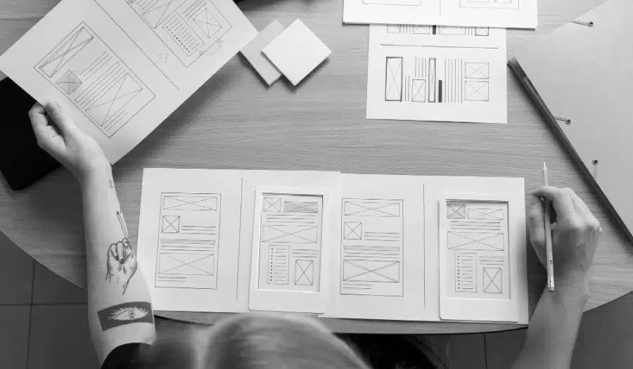
Web design has come a long way since the early days of the World Wide Web. What began as simple, text-based pages with a handful of hyperlinks has evolved into a complex and visually stunning medium that plays a crucial role in our lives.
The journey of web design from the 1990s to the present day is a fascinating one, marked by significant technological advancements, changing user expectations, and creative innovations.
In this blog post, we will take a deep dive into the evolution of web design, exploring the key trends and milestones that have shaped the way websites look and function today.
Infographic by Ameri Commerce.

The Birth of the Web: The 1990s
The story of web design begins in the early 1990s when the World Wide Web was born. During this period, web design was in its infancy, and websites were incredibly basic. Here are some defining characteristics of web design in the 1990s:
1. Text-Heavy Pages
The first websites were predominantly text-based. They featured simple HTML structures with black text on a white background. Graphics were minimal, and there were no CSS (Cascading Style Sheets) to control the layout or appearance of web pages. Web designers relied on plain HTML tags for formatting.
2. Hyperlinked Navigation
Navigation menus were typically composed of hyperlinked text. Users would click on these links to navigate between pages, often presented in a list format. This early navigation style was functional but lacked the visual appeal we see in modern websites.
3. Limited Typography
Web designers had very limited control over typography in the 1990s. Most websites used default fonts, and the ability to style text was basic at best. Text size and color were about the extent of typographic control.
4. 256-Color Palette
Early web design was constrained by a limited color palette due to the display capabilities of monitors at the time. Designers had to work within the constraints of a 256-color palette, which resulted in visually simple and somewhat crude designs.
5. Static Layouts
Websites of the 1990s had fixed, static layouts. Regardless of the user’s screen size or resolution, web pages had a fixed width and did not adapt to different devices. This lack of responsiveness made browsing the web on different devices a less-than-optimal experience.
6. Animated GIFs
One of the notable design elements of the 1990s web was the widespread use of animated GIFs. These small, looping animations were often used for eye-catching elements or to add some movement to otherwise static pages.
7. Slow Dial-Up Connections
Web design in the 1990s had to accommodate the slow dial-up internet connections of the era. This meant that web pages needed to be lightweight and load quickly, leading to minimalist designs.
The Rise of the Dot-Com Boom: Late 1990s to Early 2000s
The late 1990s saw the emergence of the dot-com boom, with countless new websites launching daily. This period brought significant changes to web design:
1. Introduction of Tables
Tables were used to create more complex layouts, allowing for more structured page designs. While not ideal for web accessibility and responsive design, tables provided designers with greater control over page layout.
2. Cascading Style Sheets (CSS)
CSS was introduced in the late 1990s and revolutionized web design. It allowed designers to separate content from presentation, making it easier to control typography, layout, and colors. CSS brought a significant leap forward in design flexibility and consistency.
3. Flash Animation
Adobe Flash was a multimedia platform that gained popularity in web design during the late 1990s and early 2000s. It allowed for interactive animations, video, and games on websites. Flash was cutting-edge at the time, but its use declined in the following decade due to compatibility and security issues.
4. Browser Wars
The late 1990s also saw the “Browser Wars” between Internet Explorer and Netscape Navigator. Web designers had to deal with compatibility issues, leading to the adoption of practices like “Best Viewed in Internet Explorer” or “Best Viewed in Netscape” labels on websites.
5. Gradient and Bevel Effects
Designers started experimenting with gradient backgrounds, drop shadows, and bevel effects to make websites look more polished and three-dimensional. These effects added depth to web design.
The Era of Web 2.0: Mid-2000s
The mid-2000s marked the transition to Web 2.0, a term that represented a shift from static web pages to dynamic, interactive experiences. Here are some key developments during this period:
1. Rounded Corners
Web design in the mid-2000s embraced rounded corners for elements like buttons and boxes. This design trend aimed to soften the look of websites and make them feel more approachable.
2. AJAX and Dynamic Content
Asynchronous JavaScript and XML (AJAX) enabled websites to load content dynamically without refreshing the entire page. This technology led to the rise of interactive web applications and smoother user experiences.
3. Web Standards
Web standards became more widely adopted, leading to improved compatibility across different browsers. The Web Standards Project (WaSP) advocated for consistent HTML and CSS practices, reducing the need for browser-specific hacks.
4. Web Fonts
The use of custom web fonts became more accessible thanks to services like Google Fonts. This allowed designers to expand their typographic choices beyond system fonts.
5. Web 2.0 Aesthetics
Web 2.0 design was characterized by glossy buttons, reflections, and gradients. Drop-down menus and rounded corners became standard elements in this era. Popular websites like YouTube and Facebook adopted these design trends.
6. Mobile Optimization
Mobile devices gained popularity, prompting web designers to consider mobile optimization. However, responsive web design as we know it today was not widespread yet.
The Era of Responsive Design: Late 2000s to Present
The late 2000s and early 2010s brought significant changes to web design as the industry responded to the proliferation of smartphones and tablets. Here’s how web design evolved during this period:
1. Responsive Web Design
Ethan Marcotte coined the term “responsive web design” in 2010, advocating for websites that adapt to various screen sizes and devices. This approach revolutionized web design, making it more user-friendly and adaptable to the growing array of devices.
2. Mobile-First Design
With the increasing importance of mobile browsing, designers began adopting a “mobile-first” approach. This meant designing for mobile devices before considering the desktop experience, ensuring that websites performed well on smaller screens.
3. Minimalism
Minimalism became a dominant design trend, characterized by clean lines, ample white space, and a focus on essential content. Minimalist design improved page loading times and enhanced user readability.
4. Flat Design
Flat design eschewed the skeuomorphic elements of earlier years in favor of simple, two-dimensional visuals. Icons and buttons featured flat colors and lacked shadows or gradients.
5. Parallax Scrolling
Parallax scrolling, which creates a 3D effect by moving background images at a different speed than the foreground, gained popularity for adding depth and interactivity to websites.
6. Card-Based Layouts
Card-based layouts, popularized by Pinterest and later adopted by social media platforms like Twitter, organized content into visually appealing, digestible chunks.
7. High-Quality Imagery
Advancements in display technology and faster internet connections allowed for the use of high-resolution images and videos, making websites more visually engaging.
Current Trends in Web Design
As of today, web design continues to evolve. Here are some current trends and considerations that are shaping the field:
1. Dark Mode
Dark mode, which offers a dark color scheme for websites, has gained popularity due to its aesthetics and potential energy savings on OLED screens.
2. Microinteractions
Microinteractions are subtle animations or feedback elements that enhance user engagement and provide visual cues, such as liking a post or confirming an action.
3. Voice User Interface (VUI) Design
As voice assistants and smart speakers become more prevalent, VUI design focuses on creating conversational and user-friendly experiences.
4. Accessibility
Web designers are increasingly prioritizing accessibility, ensuring that websites are usable by individuals with disabilities. This includes designing with screen readers, keyboard navigation, and other assistive technologies in mind.
5. 3D Graphics and WebGL
Advancements in browser technology have made it possible to incorporate 3D graphics and WebGL for interactive and immersive web experiences.
6. AI-Driven Design
Artificial intelligence is being used to analyze user behavior and customize website content and layouts in real time, providing a more personalized user experience.
Conclusion
The evolution of web design from the 1990s to the present day is a testament to the rapid pace of technological change and creative innovation. What began as simple text-based pages with hyperlinks has transformed into a dynamic, visually stunning medium that plays a central role in our digital lives. With the ongoing evolution of technology and user expectations, web design will continue to adapt and redefine itself in the years to come. As we look to the future, one thing is certain: the journey of web design is far from over, and it will continue to shape the way we interact with the online world.

Author:
Mark Ford