

Are you struggling to keep visitors on your website long enough to convert them? Want to uncover the most common reasons users leave your site—and how to fix them fast?
You’ll find some web design basics in this infographic.
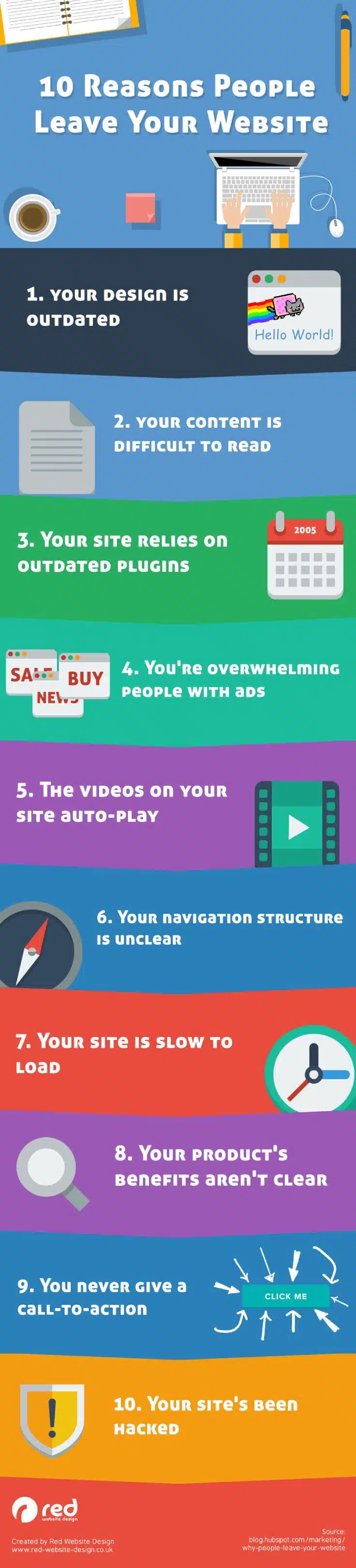
Here’s a summary of what’s covered:
- Your Design Is Outdated
- Your Content Is Difficult to Read
- Your Site Relies on Outdated Plugins
- You’re Overwhelming People with Ads
- The Videos on Your Site Auto-Play
- Your Navigation Structure Is Unclear
- Your Site Is Slow to Load
- Your Product’s Benefits Aren’t Clear
- You Never Give a Call-to-Action
- Your Site’s Been Hacked
Check out the post below for more.
Ever wonder why your website visitors aren’t sticking around? Whether you’re running an online shop, a blog, or a business website, poor design and functionality can turn visitors away before you even get a chance to engage them.
In a digital world full of competition, every second counts—and every element of your site matters. Below, we explore the top reasons users abandon websites and how you can fix each issue to keep them coming back.
Your Design Is Outdated
First impressions are everything, and your website’s design is the first thing visitors notice. An old or clunky layout can make your business look behind the times, even if your services are top-notch. A modern, clean interface builds trust and encourages users to stay longer. Design isn’t just about looks—it’s about usability too.
- Update your site design every few years to stay current with trends and tech.
- Use consistent branding, colours, and typography across all pages.
- Ensure your layout is mobile-friendly and responsive on all devices.
- Prioritise a simple, user-focused structure over decorative clutter.
Your Content Is Difficult to Read
If users struggle to read your content, they won’t hang around. Walls of text, poor formatting, or low contrast can all make your pages hard to digest. You need clear, scannable content that makes information easy to find and understand. Accessibility plays a big role in keeping readers engaged.
- Use short paragraphs, headings, and bullet points for better readability.
- Choose legible fonts with appropriate sizing and spacing.
- Make sure there’s enough contrast between text and background.
- Avoid jargon and write in plain, conversational language.
Your Site Relies on Outdated Plugins
Outdated plugins can cause display errors, break site functionality, or open your website up to security risks. They may also prevent your site from performing properly on newer browsers. Relying on old tech is a quick way to lose user trust and damage your reputation. Keep your backend as fresh as your frontend.
- Regularly update all plugins, themes, and CMS components.
- Remove or replace unsupported or obsolete plugins.
- Test functionality after every update to catch compatibility issues.
- Choose lightweight plugins from reputable developers.
You’re Overwhelming People with Ads
Pop-ups, autoplaying banners, and overbearing ad placements can turn a good user experience into a frustrating one. While monetisation is important, intrusive advertising risks pushing visitors away. A more balanced approach can preserve revenue without sacrificing user trust.
- Limit the number of ads per page to avoid visual clutter.
- Disable auto-play and sound on video ads.
- Keep pop-ups minimal and easy to dismiss.
- Prioritise user experience over aggressive monetisation tactics.
The Videos on Your Site Auto-Play
Few things irritate users more than unexpected sound or movement when a page loads. Auto-play videos can disrupt browsing, especially in professional or quiet environments. Even worse, they often slow down page load times and distract from your core message.
- Turn off auto-play settings for all embedded videos.
- Give users clear controls to play, pause, or mute content.
- Use thumbnails or stills with play buttons instead of direct embeds.
- Consider silent video loops if you must add movement.
Your Navigation Structure Is Unclear
If users can’t find what they’re looking for quickly, they won’t stay. A confusing menu, broken links, or a lack of logical hierarchy makes your site frustrating to explore. Good navigation helps guide your visitors through their journey with ease and clarity.
- Use a simple, consistent menu layout on every page.
- Group similar pages under clear, descriptive categories.
- Add a search function for quick content access.
- Make sure all navigation links work and lead to relevant pages.
Your Site Is Slow to Load
In a world of instant gratification, nobody waits for a slow website. Every additional second your site takes to load increases bounce rates and reduces conversions. Performance is not just a technical issue—it’s a business-critical one.
- Compress images and optimise media files for the web.
- Minimise the use of heavy scripts and third-party tracking tools.
- Choose a fast, reliable hosting provider.
- Use performance tools like Google PageSpeed Insights to find bottlenecks.
Your Product’s Benefits Aren’t Clear
Visitors need to understand quickly what your product or service can do for them. If your value proposition is hidden, vague, or jargon-filled, users will move on. Clear communication drives conversions and builds confidence in your offering.
- Highlight the main benefits at the top of the page.
- Use headlines and subheadings that speak to customer needs.
- Include testimonials, case studies, or product demos where possible.
- Avoid technical language unless your audience expects it.
You Never Give a Call-to-Action
Without clear direction, users won’t know what to do next. Whether you want them to sign up, contact you, or make a purchase, a call-to-action (CTA) is essential. A missing or poorly placed CTA is a missed opportunity.
- Add strong, visible CTAs on every important page.
- Use action words like “Get Started,” “Book Now,” or “Learn More.”
- Position your CTA above the fold as well as at the end of content.
- Test different versions to see what performs best.
Your Site’s Been Hacked
If your site’s been compromised, it will erode trust instantly. Malware warnings, strange pop-ups, or defaced content can scare users away permanently. Security isn’t optional—it’s foundational to online credibility.
- Use SSL encryption and keep your security certificates current.
- Install firewalls and anti-malware tools to protect your site.
- Schedule regular backups and updates.
- Monitor your site for suspicious activity and respond quickly to threats.
Conclusion
Your website is often the first and most important point of contact between you and potential customers. If visitors are abandoning it, chances are one or more of the issues above are to blame. Fortunately, each of these problems can be fixed with deliberate action and ongoing care.
By modernising your design, clarifying your messaging, speeding up your site, and putting your users first, you’ll not only reduce bounce rates—you’ll also turn casual visitors into loyal customers. Don’t let a few avoidable mistakes cost you opportunities. Make your site a place where people want to stay.

Author:
Mark Ford



