Are you struggling to get your website ranking on Google? Is your SEO strategy failing to generate visitors and sales enquiries?
We share 6 web design mistakes that could be holding you back in this infographic.
Here’s a quick summary:
- Images instead of text
- Irrelevant pop ups
- Unfriendly navigation
- Heavy images
- Using flash
- Not being mobile friendly
Check out the infographic for more detail.
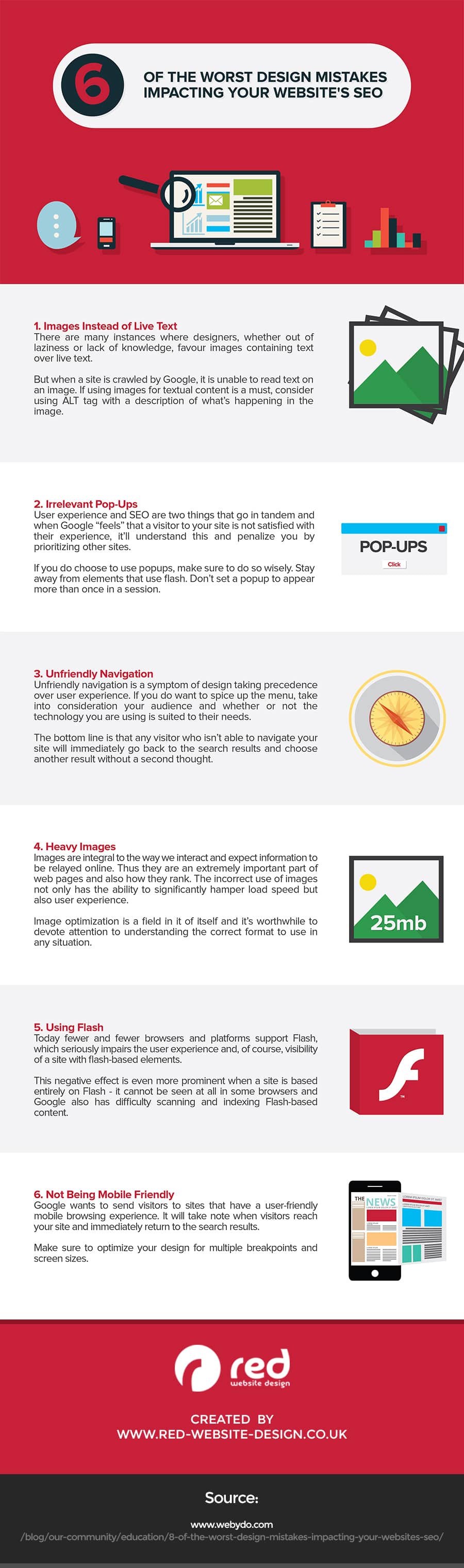
The digital landscape is constantly evolving, and having an effective online presence is crucial for the growth of any business. However, even the most visually stunning websites can fail to attract and retain visitors if they neglect crucial aspects of web design that impact SEO. Here are six common web design mistakes that can significantly hinder your SEO efforts and stall your business growth.
Images Instead of Text
When designing a website, it can be tempting to use images for headings, titles, or key pieces of information to create a visually appealing look. However, this practice can severely undermine your site’s SEO and accessibility. Here’s an in-depth look at why this happens and how small businesses can avoid these pitfalls.
Why Images Instead of Text Is a Problem
- Search Engine Crawling: Search engines use bots to crawl and index websites. These bots rely heavily on text to understand the content of a site. When important information is embedded in images rather than in text, it becomes invisible to these bots, leading to missed opportunities for ranking in search results.
- Accessibility Issues: Not all users experience your website in the same way. Visually impaired users rely on screen readers to navigate the web. Screen readers cannot interpret images unless they have descriptive alt text, making it essential to present crucial information in text format.
- Slower Load Times: Images generally have larger file sizes than text, which can slow down your site’s loading time. This not only frustrates users but also negatively impacts your SEO, as search engines favor faster-loading sites.
Tips for Small Businesses
- Use Text for Important Information: Always use text for headings, titles, and key pieces of information. Reserve images for visual elements that complement your text, such as photos, illustrations, or decorative graphics.
- Alt Text for Images: For every image on your website, provide descriptive alt text. This text serves as a placeholder when the image cannot be displayed and helps search engines understand the image’s context. For example, instead of just “product image,” use “red running shoes with white stripes.”
- Scalable Vector Graphics (SVGs): When you need to use icons or simple graphics, consider using SVGs. These are text-based files that can be indexed by search engines and scaled to any size without losing quality.
- Avoid Text in Images for Buttons or CTAs: Use HTML and CSS to create buttons and calls-to-action (CTAs) instead of embedding text within images. This practice ensures that your CTAs are readable by search engines and accessible to screen readers.
- Image Optimization: Compress images using tools like TinyPNG or JPEG Optimizer to reduce file sizes without compromising quality. Smaller image sizes lead to faster loading times, enhancing user experience and SEO.
- Responsive Images: Use responsive design techniques to ensure images adapt to different screen sizes and resolutions. This can involve using the srcset attribute in HTML to provide different image files for different device conditions.
- Text Overlays on Images: If you need to place text over an image, use CSS to overlay the text instead of embedding it within the image itself. This approach allows search engines to index the text and ensures it remains accessible.
- Consistent Branding Without Sacrificing SEO: Maintain brand aesthetics by choosing web-safe fonts and CSS styles that reflect your brand’s identity. This approach ensures that your website looks professional and cohesive without relying on image-based text.
- Regular Audits and Updates: Periodically review your website to identify any instances where text might have been placed within images. Replace these with text-based alternatives and update alt texts to ensure ongoing SEO and accessibility compliance.
- Testing for Accessibility: Use tools like WAVE or Lighthouse to test your website for accessibility. These tools can help identify where you might have used images instead of text and offer suggestions for improvement.
Case Study: A Practical Example
Consider a small e-commerce business selling handmade jewelry. Initially, the website used images for all product names and descriptions to achieve a unique, artistic look. Despite the visually appealing design, the site struggled to rank on Google, and many visually impaired customers reported issues navigating the site.
To address these problems, the business implemented the following changes:
- Replaced Image-Based Text: All product names and descriptions were converted to HTML text.
- Added Descriptive Alt Text: Each product image was given detailed alt text, such as “Handcrafted silver necklace with turquoise beads.”
- Optimized Images: Product photos were compressed to improve loading times without compromising quality.
- Enhanced Accessibility: CSS was used to overlay text on images where necessary, ensuring the text was readable by search engines and screen readers.
As a result, the website saw a significant improvement in search engine rankings and a more positive user experience. The bounce rate decreased, and the site attracted more organic traffic, leading to increased sales.
Conclusion
For small businesses, the balance between visual appeal and functionality is critical. While images are essential for creating an engaging and attractive website, relying on them for conveying important information can severely hinder your SEO and accessibility efforts. By following these in-depth tips and best practices, you can ensure your website remains both beautiful and functional, driving better results in search engine rankings and providing a superior experience for all users.
Irrelevant Pop-Ups
Pop-ups can be a double-edged sword in web design. When used correctly, they can capture leads, promote offers, and enhance user engagement. However, irrelevant or poorly executed pop-ups can frustrate visitors, increase bounce rates, and harm your SEO. Here’s a detailed look at why pop-ups can be problematic and how small businesses can use them effectively.
Why Irrelevant Pop-Ups Are a Problem
- User Experience: Pop-ups that appear immediately upon entering a site or that cover the entire screen can be intrusive and disrupt the user experience. Visitors often find these interruptions annoying, which can lead to quick exits from your site.
- Increased Bounce Rates: When users leave your site quickly because of intrusive pop-ups, your bounce rate increases. High bounce rates signal to search engines that your site may not be providing valuable content, negatively impacting your SEO rankings.
- Mobile Usability: Pop-ups can be particularly problematic on mobile devices, where screen space is limited. Poorly optimized pop-ups can make navigation difficult and discourage mobile users from staying on your site.
- Search Engine Penalties: Search engines like Google penalize websites that use intrusive interstitials (a type of pop-up) that make content less accessible, particularly on mobile devices. This can lead to lower rankings and decreased visibility.
Tips for Small Businesses
- Relevance and Timing: Ensure that your pop-ups are relevant to the content the user is viewing and appear at the right time. For example, an exit-intent pop-up (which appears when the user is about to leave the site) can be an effective way to capture leads without interrupting the browsing experience.
- Value Proposition: Make sure your pop-ups offer something of value to the user. This could be a discount, a free resource, or useful information. The value proposition should be clear and compelling to encourage users to engage with the pop-up rather than closing it immediately.
- Frequency: Limit the frequency of your pop-ups. Bombarding users with multiple pop-ups during a single session can be extremely off-putting. Consider setting a cap on how often a pop-up appears to the same user within a specific timeframe.
- User-Friendly Design: Design your pop-ups to be easily dismissible. Include a clear and visible close button, and avoid using pop-ups that are difficult to close or that reappear too quickly after being dismissed.
- Targeting and Personalization: Use targeted and personalized pop-ups to improve relevance. For instance, show returning visitors different pop-ups than new visitors, or tailor pop-ups based on the pages the user has visited. Personalization can increase the likelihood of user engagement.
- A/B Testing: Conduct A/B testing to determine the most effective pop-up designs, messages, and timings. Testing different variations can help you identify what resonates best with your audience and refine your strategy accordingly.
- Mobile Optimization: Ensure that your pop-ups are mobile-friendly. Use smaller, less intrusive pop-ups that fit well on mobile screens and don’t obstruct the main content. Google recommends avoiding interstitials that cover a large portion of the screen, particularly on mobile devices.
- Compliance with Regulations: Be aware of regulations such as the GDPR (General Data Protection Regulation) and CCPA (California Consumer Privacy Act) that govern user data and consent. Ensure that your pop-ups comply with these regulations, particularly when collecting email addresses or personal information.
- Analytics and Feedback: Use analytics to monitor the performance of your pop-ups. Track metrics such as conversion rates, bounce rates, and time on site to gauge the effectiveness of your pop-ups. Additionally, consider gathering user feedback to understand how they perceive your pop-ups and make necessary adjustments.
Best Practices for Implementing Pop-Ups
- Exit-Intent Pop-Ups: Use exit-intent pop-ups to capture users who are about to leave your site. These pop-ups can offer a discount, ask for feedback, or encourage users to subscribe to your newsletter. Since they appear when users are already leaving, they are less likely to interrupt the browsing experience.
- Scroll-Triggered Pop-Ups: Implement pop-ups that appear after the user has scrolled a certain percentage of the page. This indicates that the user is engaged with your content, making them more likely to respond positively to the pop-up.
- Timed Pop-Ups: Set pop-ups to appear after a user has spent a specific amount of time on your site. This ensures that users have had a chance to engage with your content before being presented with a pop-up.
- Interactive Elements: Incorporate interactive elements into your pop-ups, such as quizzes, surveys, or spin-to-win wheels. These elements can make the pop-up experience more engaging and enjoyable for users.
- Content-Specific Pop-Ups: Tailor pop-ups to the content of the page. For example, if a user is reading a blog post about SEO tips, a pop-up offering a free SEO guide would be relevant and valuable.
- Slide-In Pop-Ups: Consider using slide-in pop-ups that appear from the side or bottom of the screen. These are less intrusive than full-screen pop-ups and can be an effective way to capture attention without disrupting the user experience.
Case Study: Effective Use of Pop-Ups
Let’s take the example of a small online bookstore. Initially, the site used aggressive pop-ups that appeared immediately upon landing, offering a discount code. This approach led to high bounce rates and user complaints.
The bookstore revised its strategy by implementing the following changes:
- Exit-Intent Pop-Ups: These pop-ups offered a discount code or a free chapter of a popular book, appearing only when the user was about to leave the site.
- Scroll-Triggered Pop-Ups: When users reached 75% of a blog post, a pop-up would offer a related eBook at a discounted price.
- Timed Pop-Ups: A pop-up inviting users to join the bookstore’s newsletter appeared after 30 seconds on the site, providing enough time for users to get interested in the content.
- Mobile-Friendly Pop-Ups: Smaller, non-intrusive pop-ups were designed for mobile users, ensuring easy navigation and accessibility.
These changes resulted in a significant decrease in bounce rates and an increase in user engagement and conversion rates. By aligning pop-ups with user behavior and providing value, the bookstore enhanced both the user experience and SEO performance.
Conclusion
For small businesses, pop-ups can be a powerful tool to drive engagement and conversions if used correctly. The key is to ensure they are relevant, well-timed, and user-friendly. By following these in-depth tips and best practices, you can harness the potential of pop-ups to enhance your website’s performance without compromising on user experience or SEO.
Unfriendly Navigation
Navigation is a fundamental aspect of web design that significantly influences user experience and SEO performance. When visitors can easily find what they’re looking for, they are more likely to stay on your site longer, engage with your content, and return in the future. Conversely, unfriendly navigation can frustrate users, increase bounce rates, and hurt your SEO. Here’s an in-depth look at why navigation matters and how small businesses can optimize their site navigation effectively.
Why Unfriendly Navigation Is a Problem
- User Frustration: When users struggle to find information on your site, they are likely to leave quickly and look for it elsewhere. This not only increases your bounce rate but also diminishes the likelihood of conversions and customer retention.
- Increased Bounce Rates: Poor navigation can lead to higher bounce rates, which signal to search engines that your site may not be providing valuable content. This can negatively impact your rankings in search engine results pages (SERPs).
- Lower Engagement: Complex or confusing navigation can discourage users from exploring your site further. Lower engagement reduces the time users spend on your site, which is another factor search engines consider when ranking websites.
- SEO Crawling Issues: Search engine bots rely on your navigation structure to crawl and index your site. If your navigation is poorly organized or has broken links, bots may struggle to index your content effectively, leading to missed opportunities for ranking.
Tips for Small Businesses
- Simplify Your Menu Structure: Keep your navigation menu simple and straightforward. Limit the number of top-level menu items to a manageable number (typically 5-7) to avoid overwhelming users. Use submenus to organize related content under clear, descriptive headings.
- Descriptive Labels: Use clear and descriptive labels for your menu items. Avoid jargon or overly creative terms that may confuse users. For example, instead of “Discover Our World,” use “About Us” or “Our Story” to clearly indicate the page’s content.
- Consistent Navigation: Ensure that your navigation is consistent across all pages of your site. Users should always be able to find the main menu in the same location with the same options, providing a predictable and reliable user experience.
- Logical Organization: Organize your navigation in a logical and intuitive manner. Group related pages together and use categories that make sense to your users. For example, an e-commerce site might have categories like “Men,” “Women,” “Kids,” and “Sale.”
- Search Functionality: Include a search bar prominently on your site to help users quickly find specific content. Make sure the search function is robust and returns relevant results. This can significantly enhance user experience and reduce frustration.
- Breadcrumbs: Use breadcrumb navigation to show users their location within your site’s hierarchy. Breadcrumbs provide a clear path back to the previous pages and help users understand the structure of your site.
- Internal Linking: Use internal links within your content to guide users to related pages and keep them engaged. Internal linking also helps search engines crawl and index your site more effectively, improving SEO.
- Mobile-Friendly Navigation: Optimize your navigation for mobile devices. Use responsive design to ensure that your menu adapts to different screen sizes. Consider using a “hamburger” menu for mobile users to save space while still providing easy access to all navigation options.
- Footer Navigation: Include important links in your footer, such as contact information, privacy policy, and terms of service. Footer navigation provides an additional layer of accessibility for users who scroll to the bottom of your pages.
- Regular Audits and Updates: Regularly review your navigation to ensure it remains functional and user-friendly. Test your site with real users to gather feedback and identify any navigation issues that need to be addressed.
Best Practices for Implementing User-Friendly Navigation
- Card Sorting: Use card sorting exercises to understand how users categorize and label your content. This can help you design a navigation structure that aligns with user expectations and behavior.
- User Testing: Conduct user testing sessions to observe how real users interact with your navigation. Identify any pain points or areas of confusion and make adjustments based on their feedback.
- Mega Menus for Complex Sites: If your site has a large amount of content, consider using a mega menu. Mega menus display all options in a two-dimensional dropdown layout, allowing users to see all available options at a glance without overwhelming them.
- Sticky Navigation: Implement sticky navigation that remains visible as users scroll down the page. This ensures that the menu is always accessible without requiring users to scroll back to the top.
- Clear Call-to-Actions (CTAs): Incorporate clear CTAs in your navigation, such as “Contact Us,” “Get a Quote,” or “Sign Up.” Make these CTAs stand out visually to guide users towards important actions.
- Prioritize Important Pages: Place the most important pages or categories at the beginning of your navigation menu. Users are more likely to click on items that appear first, so prioritize high-value content.
- Avoid Dropdown Overload: While dropdown menus can be useful, avoid creating overly complex dropdowns with multiple layers. This can confuse users and make navigation cumbersome.
- Accessible Navigation: Ensure that your navigation is accessible to all users, including those with disabilities. Use proper HTML markup for menus and ensure keyboard navigability. ARIA (Accessible Rich Internet Applications) landmarks can help screen readers interpret navigation elements correctly.
Case Study: Improved Navigation for a Small Business
Let’s consider a small online boutique selling handmade crafts. Initially, the site had a cluttered navigation menu with numerous categories and subcategories, making it difficult for users to find specific products. This led to high bounce rates and low conversion rates.
To address these issues, the boutique implemented the following changes:
- Simplified Menu: The navigation menu was streamlined to include only the main categories: “Shop,” “About Us,” “Blog,” and “Contact.” Subcategories were organized logically under the “Shop” section.
- Descriptive Labels: Menu items were renamed to be more descriptive. For example, “Handmade Jewelry” replaced “Jewels.”
- Search Bar: A search bar was added to the top of the site, allowing users to quickly find specific products.
- Breadcrumbs: Breadcrumb navigation was introduced to help users understand their location within the site and easily navigate back to previous pages.
- Mobile Optimization: The site’s navigation was optimized for mobile devices with a responsive hamburger menu.
These changes resulted in a significant improvement in user engagement, lower bounce rates, and higher conversion rates. The streamlined navigation made it easier for users to find products, leading to increased sales and customer satisfaction.
Conclusion
Effective navigation is essential for creating a positive user experience and optimizing your site for search engines. By simplifying your menu structure, using clear and descriptive labels, and ensuring consistency and accessibility, small businesses can enhance their website’s usability and SEO performance. Regularly review and update your navigation to keep it user-friendly and aligned with your business goals. With thoughtful design and implementation, user-friendly navigation can drive engagement, improve SEO, and support the growth of your business.
Heavy Images
Navigation is a fundamental aspect of web design that significantly influences user experience and SEO performance. When visitors can easily find what they’re looking for, they are more likely to stay on your site longer, engage with your content, and return in the future. Conversely, unfriendly navigation can frustrate users, increase bounce rates, and hurt your SEO. Here’s an in-depth look at why navigation matters and how small businesses can optimize their site navigation effectively.
Why Unfriendly Navigation Is a Problem
- User Frustration: When users struggle to find information on your site, they are likely to leave quickly and look for it elsewhere. This not only increases your bounce rate but also diminishes the likelihood of conversions and customer retention.
- Increased Bounce Rates: Poor navigation can lead to higher bounce rates, which signal to search engines that your site may not be providing valuable content. This can negatively impact your rankings in search engine results pages (SERPs).
- Lower Engagement: Complex or confusing navigation can discourage users from exploring your site further. Lower engagement reduces the time users spend on your site, which is another factor search engines consider when ranking websites.
- SEO Crawling Issues: Search engine bots rely on your navigation structure to crawl and index your site. If your navigation is poorly organized or has broken links, bots may struggle to index your content effectively, leading to missed opportunities for ranking.
Tips for Small Businesses
- Simplify Your Menu Structure: Keep your navigation menu simple and straightforward. Limit the number of top-level menu items to a manageable number (typically 5-7) to avoid overwhelming users. Use submenus to organize related content under clear, descriptive headings.
- Descriptive Labels: Use clear and descriptive labels for your menu items. Avoid jargon or overly creative terms that may confuse users. For example, instead of “Discover Our World,” use “About Us” or “Our Story” to clearly indicate the page’s content.
- Consistent Navigation: Ensure that your navigation is consistent across all pages of your site. Users should always be able to find the main menu in the same location with the same options, providing a predictable and reliable user experience.
- Logical Organization: Organize your navigation in a logical and intuitive manner. Group related pages together and use categories that make sense to your users. For example, an e-commerce site might have categories like “Men,” “Women,” “Kids,” and “Sale.”
- Search Functionality: Include a search bar prominently on your site to help users quickly find specific content. Make sure the search function is robust and returns relevant results. This can significantly enhance user experience and reduce frustration.
- Breadcrumbs: Use breadcrumb navigation to show users their location within your site’s hierarchy. Breadcrumbs provide a clear path back to the previous pages and help users understand the structure of your site.
- Internal Linking: Use internal links within your content to guide users to related pages and keep them engaged. Internal linking also helps search engines crawl and index your site more effectively, improving SEO.
- Mobile-Friendly Navigation: Optimize your navigation for mobile devices. Use responsive design to ensure that your menu adapts to different screen sizes. Consider using a “hamburger” menu for mobile users to save space while still providing easy access to all navigation options.
- Footer Navigation: Include important links in your footer, such as contact information, privacy policy, and terms of service. Footer navigation provides an additional layer of accessibility for users who scroll to the bottom of your pages.
- Regular Audits and Updates: Regularly review your navigation to ensure it remains functional and user-friendly. Test your site with real users to gather feedback and identify any navigation issues that need to be addressed.
Best Practices for Implementing User-Friendly Navigation
- Card Sorting: Use card sorting exercises to understand how users categorize and label your content. This can help you design a navigation structure that aligns with user expectations and behavior.
- User Testing: Conduct user testing sessions to observe how real users interact with your navigation. Identify any pain points or areas of confusion and make adjustments based on their feedback.
- Mega Menus for Complex Sites: If your site has a large amount of content, consider using a mega menu. Mega menus display all options in a two-dimensional dropdown layout, allowing users to see all available options at a glance without overwhelming them.
- Sticky Navigation: Implement sticky navigation that remains visible as users scroll down the page. This ensures that the menu is always accessible without requiring users to scroll back to the top.
- Clear Call-to-Actions (CTAs): Incorporate clear CTAs in your navigation, such as “Contact Us,” “Get a Quote,” or “Sign Up.” Make these CTAs stand out visually to guide users towards important actions.
- Prioritize Important Pages: Place the most important pages or categories at the beginning of your navigation menu. Users are more likely to click on items that appear first, so prioritize high-value content.
- Avoid Dropdown Overload: While dropdown menus can be useful, avoid creating overly complex dropdowns with multiple layers. This can confuse users and make navigation cumbersome.
- Accessible Navigation: Ensure that your navigation is accessible to all users, including those with disabilities. Use proper HTML markup for menus and ensure keyboard navigability. ARIA (Accessible Rich Internet Applications) landmarks can help screen readers interpret navigation elements correctly.
Case Study: Improved Navigation for a Small Business
Let’s consider a small online boutique selling handmade crafts. Initially, the site had a cluttered navigation menu with numerous categories and subcategories, making it difficult for users to find specific products. This led to high bounce rates and low conversion rates.
To address these issues, the boutique implemented the following changes:
- Simplified Menu: The navigation menu was streamlined to include only the main categories: “Shop,” “About Us,” “Blog,” and “Contact.” Subcategories were organized logically under the “Shop” section.
- Descriptive Labels: Menu items were renamed to be more descriptive. For example, “Handmade Jewelry” replaced “Jewels.”
- Search Bar: A search bar was added to the top of the site, allowing users to quickly find specific products.
- Breadcrumbs: Breadcrumb navigation was introduced to help users understand their location within the site and easily navigate back to previous pages.
- Mobile Optimization: The site’s navigation was optimized for mobile devices with a responsive hamburger menu.
These changes resulted in a significant improvement in user engagement, lower bounce rates, and higher conversion rates. The streamlined navigation made it easier for users to find products, leading to increased sales and customer satisfaction.
Conclusion
Effective navigation is essential for creating a positive user experience and optimizing your site for search engines. By simplifying your menu structure, using clear and descriptive labels, and ensuring consistency and accessibility, small businesses can enhance their website’s usability and SEO performance. Regularly review and update your navigation to keep it user-friendly and aligned with your business goals. With thoughtful design and implementation, user-friendly navigation can drive engagement, improve SEO, and support the growth of your business.
Heavy Images
Images play a crucial role in web design, enhancing visual appeal and engaging users. However, heavy, unoptimized images can severely slow down your website, leading to poor user experience and negatively impacting your SEO. Here’s an in-depth look at why heavy images are problematic and how small businesses can optimize their images effectively.
Why Heavy Images Are a Problem
- Slow Loading Times: Large image files take longer to load, increasing the overall loading time of your website. Slow-loading pages can frustrate users, leading to higher bounce rates as visitors leave your site before it fully loads.
- SEO Impact: Search engines, including Google, use page speed as a ranking factor. Slow-loading pages are less likely to rank well in search engine results, reducing your site’s visibility and organic traffic.
- Mobile Experience: Mobile users often rely on slower internet connections compared to desktop users. Heavy images can make it difficult for mobile users to access your site, leading to a poor mobile experience and potential loss of traffic from mobile search results.
- Bandwidth Consumption: Large images consume more bandwidth, which can be costly, particularly for users on limited data plans. This can deter mobile users from visiting your site frequently.
Tips for Small Businesses
- Image Compression: Compress images to reduce their file size without sacrificing quality. Tools like TinyPNG, JPEG Optimizer, and ImageOptim can significantly decrease the size of your images while maintaining visual clarity.
- Appropriate File Formats: Choose the right file format for your images. Use JPEG for photographs and complex images, PNG for images with transparent backgrounds, and SVG for simple graphics and icons. WebP is an emerging format that provides high-quality images at smaller file sizes.
- Responsive Images: Implement responsive images that adapt to different screen sizes and resolutions. Use the srcset attribute in HTML to provide multiple versions of an image, allowing the browser to select the most appropriate one based on the device and screen size.
- Lazy Loading: Implement lazy loading for images, which defers the loading of images until they are about to appear in the user’s viewport. This can significantly improve initial page load times and enhance user experience. Libraries like LazyLoad or native lazy loading with the loading=”lazy” attribute can help achieve this.
- Image Dimensions: Resize images to the appropriate dimensions before uploading them to your site. Avoid using oversized images and relying on HTML or CSS to scale them down, as this still requires the full image to be loaded.
- Content Delivery Network (CDN): Use a CDN to deliver your images. CDNs store copies of your images on servers around the world, allowing users to download images from a server geographically closer to them, reducing load times.
- Optimize Image Metadata: Remove unnecessary metadata from your image files. Metadata can add to the file size without providing any visible benefit to the user.
- Alt Text and Titles: Include descriptive alt text and titles for your images. While this doesn’t directly affect image size, it improves accessibility and helps search engines understand the content of your images, contributing to better SEO.
Best Practices for Optimizing Images
- Use Image Optimization Tools: Regularly use image optimization tools to compress and optimize your images. Tools like Adobe Photoshop, GIMP, or online services like TinyPNG and Compressor.io can automate the process of reducing file sizes.
- Automate Optimization: Implement automation tools in your content management system (CMS) to optimize images on upload. Plugins like Smush for WordPress can automatically compress images and strip unnecessary metadata when images are uploaded to your site.
- Regular Audits: Conduct regular audits of your website’s images to ensure they remain optimized. Use tools like Google PageSpeed Insights or GTmetrix to identify images that may be slowing down your site and need optimization.
- Progressive JPEGs: Use progressive JPEGs for large images. Progressive JPEGs load in layers, providing a low-quality version of the image first, which then gradually improves in quality. This can enhance perceived load times and user experience.
- Use Vector Graphics When Possible: For logos, icons, and other simple graphics, use vector formats like SVG. Vectors are scalable and typically have smaller file sizes compared to raster images.
- Leverage Browser Caching: Configure your server to leverage browser caching for images. This allows returning visitors to load images from their cache rather than downloading them again, reducing load times and server load.
- Combine Images: Where appropriate, combine multiple images into a single image sprite. This technique reduces the number of HTTP requests required to load images, improving overall page load times.
Case Study: Effective Image Optimization
Consider a small online furniture store that initially faced slow loading times due to large, high-resolution product images. These slow load times led to higher bounce rates and lower search engine rankings.
To address these issues, the store implemented the following changes:
- Image Compression: All product images were compressed using TinyPNG, reducing file sizes by up to 70% without noticeable loss in quality.
- Responsive Images: The store used the srcset attribute to serve different image sizes based on the user’s device, ensuring mobile users received appropriately sized images.
- Lazy Loading: Lazy loading was implemented, so images only loaded as users scrolled down the page.
- Content Delivery Network: The store used a CDN to distribute images, significantly reducing load times for users in different geographical locations.
- Regular Audits: Monthly audits were conducted using Google PageSpeed Insights to identify and optimize any new images that were slowing down the site.
These optimizations resulted in faster load times, lower bounce rates, and improved search engine rankings. The store experienced increased user engagement, higher conversion rates, and a better overall user experience.
Conclusion
Optimizing images is crucial for maintaining a fast, user-friendly website that ranks well in search engine results. By compressing images, choosing the right file formats, implementing responsive images, and leveraging techniques like lazy loading and CDNs, small businesses can significantly improve their website’s performance. Regular audits and the use of automation tools can help maintain optimal image performance, ensuring a seamless and efficient user experience that supports your business growth.
Using Flash
Flash was once a popular technology for adding interactivity, animations, and multimedia to websites. However, it has become obsolete and is no longer supported by most browsers and mobile devices. Relying on Flash can render your content inaccessible, degrade user experience, and severely impact your SEO. Here’s an in-depth look at why using Flash is problematic and how small businesses can transition to modern alternatives.
Why Using Flash Is a Problem
- Lack of Support: Major browsers like Chrome, Firefox, and Safari have stopped supporting Flash. Adobe, the creator of Flash, officially ended support for Flash Player on December 31, 2020. This means any content relying on Flash will not be displayed on most modern browsers.
- SEO Issues: Search engines cannot crawl and index content embedded in Flash. This means that any information or functionality contained within Flash elements is invisible to search engines, leading to missed opportunities for ranking and visibility.
- Security Vulnerabilities: Flash has been notorious for its security vulnerabilities, making websites using it susceptible to attacks and malware. This can put your website and users at risk, leading to potential data breaches and loss of trust.
- Poor Mobile Compatibility: Flash is not supported on many mobile devices, including iPhones and iPads. With an increasing number of users accessing websites via mobile devices, relying on Flash can result in a poor mobile user experience and lost traffic.
- Performance Issues: Flash can be resource-intensive, leading to slower load times and increased CPU usage. This can degrade the performance of your website, leading to a negative impact on user experience and SEO.
Tips for Small Businesses
- Transition to HTML5: HTML5 is the modern standard for creating interactive and multimedia content on the web. It is widely supported across all major browsers and mobile devices, and it offers a more secure, efficient, and SEO-friendly alternative to Flash.
- Use JavaScript and CSS3: For animations and interactivity, leverage JavaScript and CSS3. These technologies are highly performant and can be used to create complex animations and interactive elements that are compatible with all devices.
- Responsive Design: Ensure your website is built using responsive design principles. This allows your site to adapt to different screen sizes and resolutions, providing a seamless experience across desktops, tablets, and smartphones.
- Upgrade Legacy Content: If you have existing content that relies on Flash, consider upgrading it to use modern web technologies. This might involve re-creating animations, games, or interactive elements using HTML5, JavaScript, and CSS3.
- Use Web Animation APIs: Web Animation APIs allow you to create complex animations directly in the browser using JavaScript. These APIs provide fine-grained control over animations and are well-supported by modern browsers.
- Interactive Media Alternatives: For video and audio content, use modern formats like MP4, WebM, and Ogg for video, and MP3, AAC, and Ogg for audio. These formats are widely supported and provide better performance and compatibility than Flash-based media.
- CMS and Plugin Updates: Ensure your content management system (CMS) and any associated plugins are updated to support modern web standards. Many CMS platforms offer plugins that can help convert Flash content to HTML5.
- Testing and Validation: Test your website across different browsers and devices to ensure compatibility and performance. Tools like BrowserStack or LambdaTest can help you identify issues and ensure a consistent user experience.
Best Practices for Transitioning from Flash
- Audit Existing Flash Content: Conduct a thorough audit of your website to identify any Flash content that needs to be replaced. This includes banners, navigation elements, interactive features, and media players.
- Prioritize Critical Content: Start by replacing the most critical Flash content first, such as navigation elements or key interactive features that impact user experience and site functionality.
- Create a Migration Plan: Develop a detailed migration plan that outlines the steps needed to replace Flash content with modern alternatives. This plan should include timelines, resources, and key milestones to ensure a smooth transition.
- Engage Professional Help: If your site relies heavily on Flash, consider hiring professional web developers who specialize in modern web technologies. They can help you efficiently transition your content and ensure it meets current web standards.
- User Communication: Inform your users about the transition and any potential disruptions. Providing clear communication can help manage expectations and maintain user trust during the migration process.
- Backup and Testing: Before making any changes, back up your existing website to ensure you can restore it if something goes wrong. Thoroughly test the new content in a staging environment before deploying it to your live site.
Case Study: Transitioning from Flash
Consider a small online education platform that initially used Flash for its interactive learning modules and video content. As browser support for Flash declined, the platform faced increasing compatibility issues, resulting in frustrated users and declining traffic.
To address these challenges, the platform implemented the following changes:
- Audit and Plan: Conducted a comprehensive audit to identify all Flash-based content and developed a detailed migration plan.
- HTML5 for Interactivity: Re-created interactive learning modules using HTML5 and JavaScript, ensuring compatibility across all devices and browsers.
- Modern Video Formats: Converted video content to MP4 format and used HTML5 video players for seamless playback on all devices.
- Responsive Design: Redesigned the website to be fully responsive, enhancing the user experience for both desktop and mobile users.
- Testing and Launch: Thoroughly tested the new content in a staging environment and gradually rolled out updates to minimize disruptions.
These changes resulted in improved site performance, enhanced user experience, and better SEO rankings. The platform saw increased user engagement, higher retention rates, and a boost in organic traffic.
Conclusion
Transitioning away from Flash is essential for maintaining a modern, user-friendly, and SEO-optimized website. By adopting HTML5, JavaScript, and CSS3, small businesses can create interactive and multimedia content that is compatible with all devices and browsers. Regularly auditing and updating your site ensures it remains secure, fast, and accessible, providing a better experience for your users and supporting your business growth.
Not Being Mobile-Friendly
In today’s digital age, having a mobile-friendly website is essential for any business. With more people accessing the internet via mobile devices than ever before, a site that isn’t optimized for mobile use can significantly hinder user experience, increase bounce rates, and negatively impact SEO. Here’s an in-depth look at why mobile-friendliness matters and how small businesses can ensure their websites provide a seamless mobile experience.
Why Not Being Mobile Friendly Is a Problem
- User Experience: A non-mobile-friendly website can be difficult to navigate on smaller screens, leading to a frustrating user experience. Elements that work well on desktops, such as small text and closely spaced links, can be hard to interact with on mobile devices.
- SEO Impact: Search engines like Google use mobile-friendliness as a ranking factor. Websites that are not optimized for mobile devices are likely to rank lower in search engine results, reducing visibility and organic traffic.
- High Bounce Rates: Mobile users are likely to leave a site quickly if it doesn’t load properly or is hard to navigate. High bounce rates signal to search engines that the site may not be providing valuable content, further impacting SEO.
- Decreased Conversion Rates: A poor mobile experience can deter users from completing desired actions, such as making a purchase or filling out a contact form, leading to lower conversion rates.
Tips for Small Businesses
- Responsive Web Design: Implement a responsive web design that automatically adjusts the layout and content based on the user’s device. This ensures a seamless experience across desktops, tablets, and smartphones.
- Mobile-First Design Approach: Adopt a mobile-first design approach, where you design the mobile version of your site first and then scale up for larger screens. This ensures that mobile usability is prioritized from the beginning.
- Simplified Navigation: Simplify your site’s navigation for mobile users. Use a hamburger menu or a collapsible navigation bar to save space and make it easy for users to find what they need.
- Readable Text: Ensure that text is large enough to read without zooming. Use a minimum font size of 16 pixels and maintain a good contrast between text and background for readability.
- Touch-Friendly Elements: Make sure all interactive elements, such as buttons and links, are large enough to be easily tapped with a finger. There should be enough space around these elements to prevent accidental clicks.
- Optimized Images and Media: Optimize images and media for mobile devices by compressing file sizes and using appropriate formats. This improves load times and reduces data consumption for mobile users.
- Fast Loading Times: Mobile users expect fast loading times. Use techniques like lazy loading, browser caching, and content delivery networks (CDNs) to ensure your site loads quickly on all devices.
- Eliminate Intrusive Pop-Ups: Avoid using intrusive pop-ups that can cover the screen and make navigation difficult. If you need to use pop-ups, ensure they are easy to close and do not interfere with the user’s ability to interact with the site.
- Test on Multiple Devices: Regularly test your website on a variety of mobile devices and browsers to ensure compatibility and performance. Tools like Google’s Mobile-Friendly Test can help identify issues and provide suggestions for improvement.
- AMP (Accelerated Mobile Pages): Consider using AMP for your website’s pages. AMP is a framework designed to create fast-loading mobile pages, improving user experience and potentially boosting your SEO.
Best Practices for Implementing Mobile-Friendly Design
- Viewport Meta Tag: Ensure that your website includes a viewport meta tag to control the layout on mobile browsers. This helps your site scale correctly to fit different screen sizes.
- Flexible Grid Layouts: Use flexible grid layouts that adapt to different screen sizes. This ensures that your website looks good and functions well regardless of the device being used.
- Fluid Images: Make sure images are fluid and scale appropriately with the screen size. This prevents images from overflowing their containers and maintains a clean, organized look.
- CSS Media Queries: Utilize CSS media queries to apply different styles based on the device’s screen size. This allows you to create a tailored experience on different devices.
- Minimize HTTP Requests: Reduce the number of HTTP requests by combining files and using CSS sprites. Fewer requests mean faster load times, which is crucial for mobile users.
- Leverage Browser Caching: Configure your server to leverage browser caching for static assets like images, CSS, and JavaScript files. This speeds up repeat visits by loading previously cached resources.
- Optimize Forms: Simplify forms for mobile users by reducing the number of fields and using auto-fill options. Large input fields and clear labels improve usability on small screens.
- Progressive Web Apps (PWAs): Consider developing a Progressive Web App, which combines the best features of websites and mobile apps. PWAs offer offline functionality, push notifications, and faster load times, providing an enhanced mobile experience.
Case Study: Enhancing Mobile Friendliness
Let’s examine a small online bakery that initially had a desktop-centric website. The site used small text, complex navigation, and large images that slowed down load times on mobile devices. These issues resulted in high bounce rates and low mobile conversions.
To address these problems, the bakery implemented the following changes:
- Responsive Design: Redesigned the website with a responsive layout using a modern CSS framework, ensuring the site adapted to various screen sizes.
- Mobile-First Approach: Adopted a mobile-first design approach, focusing on simplifying the mobile experience before scaling up to larger screens.
- Optimized Images: Compressed images and used appropriate formats to ensure fast loading times on mobile devices.
- Simplified Navigation: Implemented a hamburger menu for easy access to all site sections without cluttering the screen.
- Enhanced Readability: Increased font sizes and ensured good contrast between text and background to improve readability.
- Touch-Friendly Design: Enlarged buttons and increased spacing between interactive elements to make them easy to tap.
These changes resulted in a significant improvement in user engagement, lower bounce rates, and higher conversion rates. The streamlined navigation made it easier for users to find products, leading to increased sales and customer satisfaction.
Conclusion
Ensuring your website is mobile-friendly is crucial for providing a positive user experience and optimizing your site for search engines. By adopting responsive design, optimizing images, simplifying navigation, and leveraging modern web technologies, small businesses can create a seamless mobile experience. Regular testing and updates will help maintain mobile usability, supporting business growth and improving overall site performance.
Conclusion
In the competitive world of online business, effective web design is crucial for both user experience and SEO. Avoiding these common mistakes can help ensure your website not only looks great but also performs well in search engine rankings, driving traffic and fostering business growth. Focus on creating a site that balances aesthetics with functionality, and you’ll be well on your way to building a successful online presence.

Author:
Mark Ford