

In today’s digital age, your business’s online presence is more crucial than ever.
Your website is often the first point of contact between your brand and potential customers. It’s where you make your first impression, and first impressions matter.
While many elements contribute to the overall design of your website, two key components stand out: fonts and colors.
These seemingly simple choices can speak volumes about your business, conveying important messages about your brand, values, and personality.
In this blog post, we will delve into the world of fonts and colors, exploring what they say about your business and how to make the right choices to leave a lasting and positive impression.
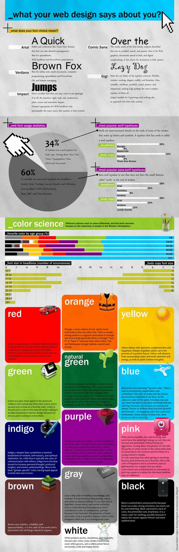
The Psychology of Colors
Colors have a profound impact on human psychology and can evoke a wide range of emotions and associations. When choosing the color scheme for your website, it’s essential to consider the message you want to convey and the feelings you want to evoke in your audience. Here are some common colors and the emotions they can elicit:
1. Red
- Emotions: Passion, energy, excitement, and love.
- Impressions: Red can convey urgency and is often associated with sales and discounts. It can also create a sense of excitement and stimulation.
2. Blue
- Emotions: Trust, calmness, professionalism, and reliability.
- Impressions: Blue is often used by corporate and tech-related companies to convey trustworthiness and stability.
3. Green
- Emotions: Growth, health, nature, and relaxation.
- Impressions: Green is often used by eco-friendly and health-related businesses to emphasize their commitment to sustainability and well-being.
4. Yellow
- Emotions: Happiness, optimism, creativity, and warmth.
- Impressions: Yellow can grab attention and create a feeling of cheerfulness, making it suitable for creative and playful brands.
5. Black
- Emotions: Elegance, sophistication, power, and mystery.
- Impressions: Black is often associated with luxury and high-end products. It can also convey a sense of authority and professionalism.
6. White
- Emotions: Purity, simplicity, cleanliness, and openness.
- Impressions: White can create a sense of minimalism and cleanliness. It’s often used in healthcare and technology industries to convey simplicity and transparency.
7. Purple
- Emotions: Creativity, luxury, royalty, and spirituality.
- Impressions: Purple is often used by creative and artistic brands. It can also convey a sense of exclusivity and uniqueness.
8. Orange
- Emotions: Energy, enthusiasm, warmth, and creativity.
- Impressions: Orange is a vibrant and attention-grabbing color. It’s often used by brands that want to convey a sense of fun and creativity.
9. Brown
- Emotions: Earthiness, stability, reliability, and warmth.
- Impressions: Brown is often associated with natural and organic products. It can create a sense of trust and authenticity.
When selecting colors for your website, it’s crucial to consider your target audience and the message you want to convey. A financial institution may opt for a predominantly blue color scheme to instill trust, while a children’s toy company might choose vibrant and playful colors like red and yellow to appeal to kids and parents.
The Power of Typography
Just as colors evoke emotions and impressions, typography plays a significant role in shaping your website’s personality and how visitors perceive your brand. Fonts convey more than just words; they can communicate values, style, and professionalism. Here are some key aspects to consider when choosing fonts for your website:
1. Serif vs. Sans-serif
- Serif Fonts: These fonts have small decorative lines or “serifs” at the ends of characters. They are often associated with tradition, formality, and professionalism. Serif fonts like Times New Roman or Georgia can be used to convey a classic and elegant look.
- Sans-serif Fonts: Sans-serif fonts lack the decorative serifs and are known for their clean and modern appearance. They are often used to convey simplicity, clarity, and a more casual or contemporary style. Popular sans-serif fonts include Arial, Helvetica, and Calibri.
2. Font Size and Hierarchy
The size of your fonts and how you use them to create hierarchy is crucial for guiding users through your content. Headings should be larger and bolder than body text to make them stand out. A clear font hierarchy enhances readability and helps users navigate your website effortlessly.
3. Consistency
Consistency in typography is key to creating a cohesive and professional-looking website. Use a limited set of fonts and font weights throughout your site to maintain a unified brand identity.
4. Readability
Above all else, your chosen fonts must be easy to read. Fancy or overly stylized fonts may look attractive, but they can hinder readability and frustrate users. Prioritize legibility to ensure that your content is accessible to all visitors.
Case Studies: What Your Choices Say
To illustrate the impact of font and color choices on a brand’s image, let’s look at a few case studies of well-known companies and their website designs:
1. Coca-Cola
Colors: Coca-Cola uses a bold red color as its primary brand color. This choice aligns with the brand’s energetic and exciting image, reinforcing the idea that drinking Coca-Cola is an enjoyable and stimulating experience.
Fonts: The company primarily uses a custom script font for its logo and branding. This font choice adds a touch of uniqueness and nostalgia, as it has been consistent over the years. It also suggests a sense of tradition and history.
2. Apple
Colors: Apple opts for a minimalist and sleek design, with a clean white background and the occasional use of black and gray. This choice reflects Apple’s commitment to simplicity, innovation, and cutting-edge technology.
Fonts: Apple uses the sans-serif font San Francisco for its website and product interfaces. This font is known for its clarity and modernity, aligning perfectly with Apple’s brand identity as a leader in tech design and user experience.
3. Starbucks
Colors: Starbucks incorporates earthy tones of green and brown into its website and overall branding. These colors evoke a sense of warmth, naturalness, and sustainability, aligning with the brand’s focus on coffee and eco-friendly practices.
Fonts: The company uses a custom font called “Starbucks Serif” for its logo and branding. This font combines elements of both serif and sans-serif fonts, striking a balance between tradition and modernity. It suggests that Starbucks offers a blend of quality and innovation.
4. Airbnb
Colors: Airbnb employs a variety of colors, but its main brand color is a soft coral shade. This color choice conveys warmth, friendliness, and a sense of adventure, aligning with Airbnb’s mission of connecting people with unique travel experiences.
Fonts: Airbnb uses the sans-serif font Circular for its website and app. Circular is a contemporary and versatile font that suggests clarity and ease of use, which is essential for a platform focused on booking accommodations.
How to Choose the Right Fonts and Colors for Your Business
Now that we’ve explored the psychology behind colors and the impact of typography, let’s delve into the process of selecting the right fonts and colors for your business’s website:
1. Understand Your Brand
Before diving into color and font selection, take a step back and define your brand identity. What are your brand values? What emotions do you want to evoke in your audience? What distinguishes your business from competitors? Understanding your brand’s essence is the foundation for making the right design choices.
2. Consider Your Target Audience
Your target audience plays a significant role in determining your design choices. Consider their preferences, demographics, and the message you want to convey to them. If your audience is primarily young and tech-savvy, you might opt for bold and modern design elements. For a more mature and traditional audience, classic fonts and colors may be more appropriate.
3. Test and Iterate
Don’t be afraid to experiment with different color and font combinations. Create mockups and gather feedback from colleagues or focus groups. A/B testing can also help you determine which design choices resonate most with your audience. Keep in mind that design trends evolve, so it’s essential to stay updated and adapt your website accordingly.
4. Ensure Accessibility
Accessibility should be a top priority when choosing fonts and colors. Ensure that your chosen font is legible, even for individuals with visual impairments. Use color contrast tools to check that text is easily readable against the background color. Accessibility not only makes your website inclusive but also enhances its usability.
5. Stay Consistent
Consistency is key to building a strong brand identity. Once you’ve chosen your colors and fonts, use them consistently across all your online and offline materials. This includes your website, social media profiles, marketing materials, and even physical spaces if applicable.
6. Seek Professional Help
If you’re unsure about design choices, don’t hesitate to seek the help of professional designers. They can provide valuable insights and expertise in color theory and typography to create a visually appealing and effective website.
Conclusion
Your website’s fonts and colors are powerful tools for conveying your brand’s personality, values, and message to your audience. By understanding the psychology behind colors and the impact of typography, you can make informed design choices that leave a lasting and positive impression. Remember that your website is often the first point of contact with potential customers, so make sure it tells the story you want it to tell. Invest the time and effort in choosing the right fonts and colors for your business, and you’ll be well on your way to creating a memorable and impactful online presence.

Author:
Mark Ford

Mastering the Art of the Landing Page: Design, Copy, and Conversion in Harmony
Are you trying to design a landing page that not only looks great but actually converts visitors into customers? Want to learn how to balance design, copy, and strategy to create landing pages that work in perfect harmony? […]


