In a hyper competitive business world, image is everything! Your logo design is the one thing that will be present across all your marketing media and is the easiest thing for consumers to remember. We all know what the Golden Arches are right?
In the world of business, a logo is more than just a pretty graphic. It’s a powerful symbol that communicates a multitude of messages about your company, its values, and its personality. Think of it as your business’s visual signature – a way to instantly connect with your audience and convey your identity.
In this blog post, we will delve deep into the fascinating world of logos, exploring what they say about your business and why they matter more than you might think.
So what does your logo say about you? 123 Print have created this handy infographic that breaks down what the colours and fonts you use say about your business.
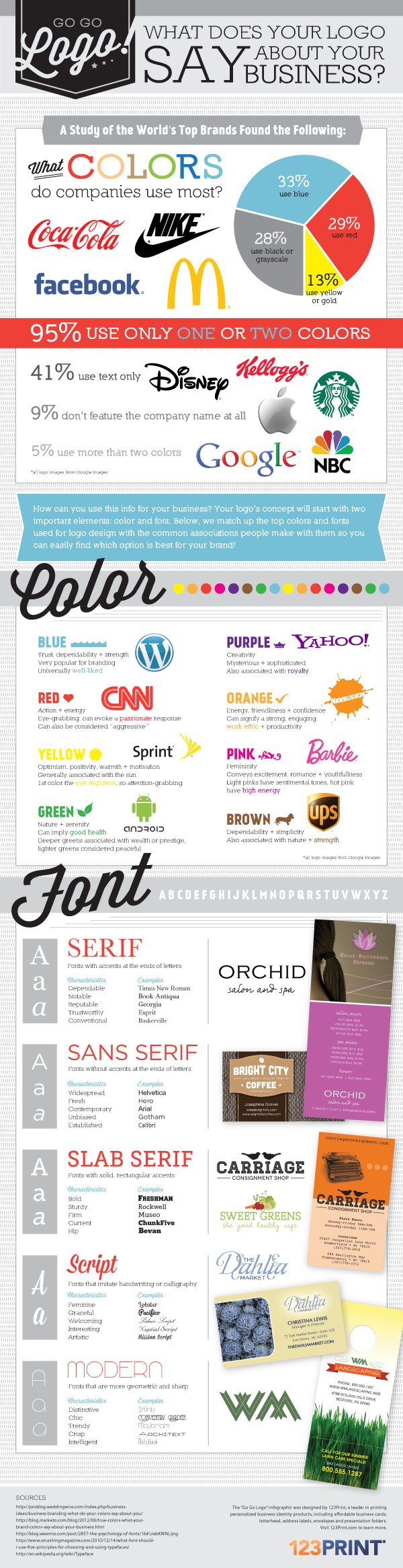
The Visual Language of Logos
Before we dive into the intricacies of what your logo communicates, it’s important to understand the basic elements of logos and how they function as a visual language. A well-designed logo combines various visual elements to create a unique and memorable representation of your brand.
These elements include:
Color
The colors used in your logo can evoke specific emotions and associations. For example, blue is often associated with trust and professionalism, while red can symbolize passion and energy. The choice of color in your logo can convey a lot about your brand’s personality and values.
Shape
The shapes and forms within your logo also carry meaning. Rounded shapes can suggest a friendly and approachable brand, while sharp angles can convey strength and precision. The overall shape of your logo can communicate the essence of your business.
Typography
The typeface or font you use in your logo is another critical element. Different fonts have distinct personalities – some are elegant and sophisticated, while others are bold and playful. The right choice of typography can reinforce your brand’s message.
Symbols and Icons
Many logos incorporate symbols or icons that represent specific ideas or concepts. These can be literal representations of your product or service, or they can be more abstract, conveying a deeper meaning or story.
Composition
The arrangement and composition of all these elements within your logo play a significant role in how it’s perceived. Balance, symmetry, and spacing all contribute to the overall visual impact.
The Subtle Psychology of Color
Color is perhaps one of the most influential aspects of logo design when it comes to conveying meaning and emotion. Different colors have the power to evoke specific feelings and associations.
Here are some common color choices and what they typically symbolize:
Red
Red is a color that demands attention. It’s often associated with passion, excitement, and energy. Brands like Coca-Cola and Netflix use red in their logos to create a sense of excitement and urgency.
Blue
Blue is a color that conveys trust, reliability, and professionalism. It’s commonly used by tech companies like IBM and social media giants like Facebook to establish a sense of credibility.
Green
Green is closely associated with nature, growth, and health. Companies in the eco-friendly and health sectors often choose green in their logos to convey a sense of well-being and sustainability. Think of brands like Whole Foods and Starbucks.
Yellow
Yellow is a bright and cheerful color that symbolizes optimism and happiness. Brands like McDonald’s and Ikea use yellow to create a sense of friendliness and positivity.
Black
Black is a color that represents sophistication, luxury, and elegance. High-end fashion brands like Chanel and luxury car manufacturers like Mercedes-Benz often use black in their logos to convey a sense of exclusivity.
Purple
Purple is associated with creativity, imagination, and luxury. Brands like Cadbury and Yahoo use purple to create a sense of creativity and uniqueness.
Orange
Orange is a color that radiates enthusiasm, warmth, and energy. Brands like Fanta and Nickelodeon use orange to convey a sense of fun and excitement.
Pink
Pink is often associated with femininity, love, and compassion. Brands in the beauty and fashion industries frequently use pink to create a sense of romance and care.
Brown
Brown is a color that represents stability, reliability, and earthiness. Brands like UPS and Hershey’s use brown to convey a sense of trustworthiness and dependability.
White
White is a color that symbolizes purity, simplicity, and cleanliness. Brands like Apple and Nike use white to create a sense of minimalism and perfection.
It’s important to note that the psychological associations with colors can vary across cultures and contexts. What a color conveys in one culture may have a different meaning in another. Therefore, it’s crucial to consider your target audience and their cultural background when choosing the colors for your logo.
The Impact of Shape and Form
In addition to color, the shapes and forms within your logo also play a significant role in conveying meaning. Different shapes can evoke specific emotions and associations, and they can give your logo a unique personality.
Here are some common shapes and their typical meanings:
Circles
Circles are often associated with unity, wholeness, and harmony. They convey a sense of completeness and balance. Many tech companies use circular logos to symbolize connectivity and inclusivity.
Squares and Rectangles
Squares and rectangles represent stability, order, and reliability. They convey a sense of structure and professionalism. Many financial and legal businesses opt for square or rectangular logos to establish trust.
Triangles
Triangles are dynamic shapes that can convey a sense of upward movement and progress. They symbolize ambition and innovation. Companies in the tech and automotive industries often use triangles to suggest forward-thinking.
Curves and Swooshes
Curves and swooshes can add a sense of fluidity and movement to your logo. They often convey a feeling of creativity and flexibility. This style is popular among design and marketing firms.
Geometric Patterns
Geometric patterns can create a sense of precision and order. They are often used by engineering and architectural companies to represent precision and attention to detail.
Organic Shapes
Organic shapes, such as those found in nature, can evoke feelings of warmth and authenticity. They are often used by brands in the natural and organic food industries to convey a sense of purity and wholesomeness.
The choice of shape should align with your brand’s personality and values. For example, if you run a creative design agency, a logo with organic shapes or swooshes might be more appropriate to convey a sense of creativity and flexibility.
The Typography of Trust
Typography, or the choice of fonts and lettering in your logo, is another crucial element that can influence how your brand is perceived. Different fonts have distinct personalities, and they can convey a wide range of emotions and associations.
Here are some common font categories and their typical meanings:
Serif Fonts
Serif fonts have small decorative lines at the ends of the letters. They are often associated with tradition, elegance, and professionalism. Serif fonts like Times New Roman are commonly used by newspapers and law firms.
Sans-Serif Fonts
Sans-serif fonts lack the decorative lines at the ends of letters. They are modern, clean, and minimalist. Brands like Google and Airbnb use sans-serif fonts to convey a sense of simplicity and innovation.
Script Fonts
Script fonts mimic cursive handwriting and are often associated with creativity, elegance, and personalization. Brands in the fashion and beauty industries frequently use script fonts to create a sense of luxury and style.
Display Fonts
Display fonts are highly decorative and unique. They are often used for branding purposes and can convey a wide range of emotions, from whimsy to sophistication. Companies seeking to stand out may opt for custom display fonts.
Handwritten Fonts
Handwritten fonts can create a sense of authenticity and personalization. They are often used by small businesses and artisanal brands to convey a homemade or unique feel.
The choice of typography should align with your brand’s message and values. For example, if you’re running a tech startup focused on innovation, a clean sans-serif font might be a better fit than a traditional serif font.
The Symbolism of Symbols and Icons
Symbols and icons are visual elements within a logo that can carry specific meanings and associations. They can range from literal representations of your product or service to more abstract symbols that convey a deeper message.
Here are some examples of symbolic elements in logos:
Animals
Animals are often used in logos to symbolize qualities associated with specific animals. For example, a lion may symbolize strength and courage, while a dove may symbolize peace and harmony.
Nature
Elements from the natural world, such as trees, mountains, or waves, can convey a sense of environmental responsibility, sustainability, or a connection to nature.
Abstract Shapes
Abstract shapes can be used to convey more complex ideas or concepts. For example, a spiral might symbolize growth and expansion, while a maze could represent problem-solving.
Letters and Initials
Many logos incorporate letters or initials to represent the brand’s name. These letters can be stylized in unique ways to create a distinctive visual identity.
Objects and Products
Some logos feature images of the products or services offered by the company. For example, a coffee shop might have a coffee cup in its logo, while a bakery might feature a loaf of bread.
Cultural Symbols
Cultural symbols and motifs can be used to convey a sense of heritage or connection to a specific culture or tradition.
The choice of symbols or icons should align with your brand’s story and message. It’s important to ensure that the symbol you choose resonates with your target audience and effectively communicates your brand’s values.
The Power of Composition
The arrangement and composition of the various elements within your logo are crucial in determining how it is perceived. A well-balanced and visually pleasing composition can make your logo more memorable and impactful.
Here are some compositional considerations:
Balance
Balance refers to the distribution of visual weight within your logo. Achieving balance is important for creating a harmonious and stable design. There are two types of balance:
- Symmetrical Balance: When the elements on one side of the logo mirror those on the other side, creating a sense of equilibrium.
- Asymmetrical Balance: When the visual weight is distributed unevenly but still achieves balance through careful placement of elements.
The choice between symmetrical and asymmetrical balance depends on your brand’s personality and message. Symmetrical balance can suggest stability and tradition, while asymmetry can convey creativity and innovation.
Proximity
The proximity of elements within your logo can affect how they are perceived. Elements that are close together are often perceived as related, while those that are spaced apart may be seen as separate or disconnected.
Alignment
The alignment of elements within your logo can create a sense of order and organization. Aligning elements along a grid or axis can create a cohesive and structured design.
Negative Space
Negative space is the empty or blank space around and between the elements in your logo. Effective use of negative space can create hidden meanings or add depth to your design.
Scaling
The size and scaling of elements within your logo can emphasize certain elements and create hierarchy. A larger element may draw more attention and convey its importance.
Case Studies: What Some Famous Logos Say
To illustrate the power of logos in conveying messages about businesses, let’s take a closer look at some famous logos and analyze what they communicate:
Apple
Apple’s iconic logo is a simple apple with a bite taken out of it. This logo communicates a sense of innovation, creativity, and approachability. The bite out of the apple suggests a playful and irreverent spirit. It tells consumers that Apple products are user-friendly and cutting-edge.
Nike
Nike’s swoosh logo is a perfect example of a logo that conveys motion and forward progress. The swoosh resembles a checkmark, suggesting that choosing Nike means making a confident and positive choice. It embodies the brand’s message of empowerment and achievement.
McDonald’s
The golden arches of McDonald’s logo are instantly recognizable. The arches create a sense of welcoming and familiarity. They suggest a place where you can enjoy a quick and satisfying meal. The bright red and yellow colors evoke feelings of warmth and happiness.
Coca-Cola
Coca-Cola’s classic logo features a script font and a flowing, cursive style. This choice of typography conveys a sense of tradition and timelessness. The bright red color creates a sense of excitement and enjoyment. Overall, the logo communicates the idea of a classic and refreshing beverage.
Amazon
Amazon’s logo is not just a smiley face; it’s also an arrow that starts at ‘A’ and ends at ‘Z.’ This clever design element suggests that Amazon has everything you need, from A to Z. It communicates the brand’s commitment to providing a wide range of products and excellent customer service.
FedEx
The FedEx logo features a hidden arrow between the ‘E’ and the ‘X.’ This arrow symbolizes speed, precision, and forward movement, aligning with the company’s promise of efficient delivery services.
The Evolution of Logos
Logos are not static; they can evolve and change over time to adapt to shifting brand identities and market trends. Let’s take a look at a few examples of how famous logos have evolved:
Starbucks
Starbucks’ original logo featured a more detailed and intricate image of a siren. Over the years, the logo has been simplified and stylized, with the siren becoming the iconic green and white image we recognize today. This transformation reflects a shift toward a cleaner, more contemporary look while retaining the brand’s heritage.
Pepsi
Pepsi’s logo has undergone numerous changes since its inception. From a simple script font to the dynamic circle design it is today, each iteration has reflected the brand’s evolving image. The current logo uses red, white, and blue to evoke a sense of patriotism and global appeal.
Google’s logo has evolved from a simple and playful serif font to a clean and colorful sans-serif design. This transformation reflects the company’s transition from a quirky startup to a global tech giant. The use of vibrant colors adds a sense of innovation and diversity.
The Importance of Consistency
While logos can evolve, it’s crucial to maintain consistency in your brand’s visual identity. Consistency helps build brand recognition and trust. When consumers see your logo consistently across various touchpoints, such as your website, social media, and products, they develop a sense of familiarity and reliability.
Consistency also ensures that your logo continues to convey the same message and values over time. If your logo undergoes frequent and drastic changes, it can confuse your audience and dilute your brand’s identity.
The Logo Design Process
Creating a logo that effectively communicates your brand’s message is a complex process that requires careful thought and consideration. Here are the key steps involved in the logo design process:
Define Your Brand
Start by clearly defining your brand’s personality, values, and mission. Understanding what your brand stands for is essential in guiding the design process.
Research Your Audience
Research your target audience to gain insights into their preferences and expectations. Your logo should resonate with your audience and communicate a message that appeals to them.
Choose Your Visual Elements
Select the color palette, shapes, typography, and symbols that best represent your brand. Consider the psychological associations and meanings of these elements.
Sketch and Conceptualize
Sketch out various ideas and concepts for your logo. Explore different design options and compositions. This is the brainstorming phase where creativity flows freely.
Create Digital Versions
Once you’ve narrowed down your concepts, create digital versions of your logo using design software. Pay attention to details like scaling, alignment, and spacing.
Test and Iterate
Gather feedback from a diverse group of people, including potential customers and colleagues. Use their input to refine your logo and make improvements.
Consider Adaptability
Ensure that your logo is versatile and can be used across various media and platforms. It should look great in both color and black and white, as well as in different sizes.
Protect Your Logo
If your logo design is unique and original, consider trademarking it to protect your brand identity from unauthorized use.
Conclusion
Your logo is not just a pretty graphic; it’s a powerful tool for communicating your brand’s personality, values, and message.
Every aspect of your logo, from its color and shape to its typography and symbols, contributes to the overall impression it creates. By understanding the subtle psychology of design elements and the importance of consistency, you can create a logo that effectively conveys what your business is all about.
So, the next time you see a logo, take a closer look – it might be saying more about the business behind it than you think.

Author:
Mark Ford