

Are you looking for ways to improve your website conversion rate? Want to learn how to reframe your website CTAs into more engaging copy?
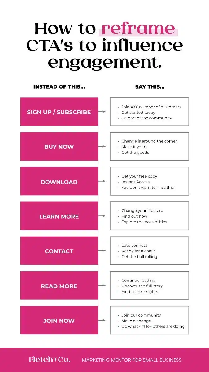
Fletch & Co shares its website call to action ideas in this infographic.
They break things down into the following categories:
- Sign up / subscribe
- Buy now
- Download
- Learn more
- Contact
- Read more
- Join now
Check out the infographic for more information.
Call to action (CTA) buttons play a crucial role in guiding your website visitors toward taking the desired action.
Whether you want them to make a purchase, sign up for a newsletter, or engage with your content, a strong CTA is essential. However, not all CTAs are equally effective. Some common CTAs can be too vague or pushy, ultimately leading to a poor user experience or reduced conversions.
In this blog post, we’ll take a closer look at seven commonly used CTAs that might not be doing your website any favours and suggest more effective alternatives.
Sign Up / Subscribe
Why avoid it?
The phrase “Sign up” or “Subscribe” is often used on websites to get users to join an email list or register for a service. While this sounds straightforward, it’s too generic and lacks a compelling reason for users to take action. Visitors may see this as a vague ask, without understanding exactly what they’re signing up for or the value they’ll receive in return.
When you ask users to “sign up” or “subscribe” without offering a clear benefit, you risk losing their interest or, worse, scaring them away because they feel like they’re committing to something without knowing the return on investment.
What to use instead?
Instead of simply saying “Sign Up” or “Subscribe,” make your CTA specific and clear. Provide a tangible benefit, and tell visitors exactly what they will get. For example:
- “Get 10% Off Your First Order” – This CTA gives visitors a clear incentive for signing up.
- “Join Our VIP List for Exclusive Offers” – This version emphasizes exclusivity and adds value to the CTA.
- “Receive Free Weekly Tips” – If your content is valuable, offering it for free is a great way to encourage sign-ups.
By specifying what visitors will get, you’ll make them feel more confident and excited about clicking your CTA.
Buy Now
Why avoid it?
“Buy Now” can often sound too aggressive or high-pressure for many users. While it’s true that you want to encourage conversions, a CTA like this may cause visitors to hesitate or even leave the site. It doesn’t take into consideration where the visitor is in the buyer’s journey. If someone is just browsing or needs more information before purchasing, the “Buy Now” button might feel too sudden or forceful.
What to use instead?
Instead of using “Buy Now,” consider a CTA that moves the customer forward in the buying process without rushing them into a decision. Here are a few examples:
- “Add to Cart” – This is less intimidating and still gets visitors closer to making a purchase.
- “See Pricing” – If someone is unsure about the cost, offering to reveal the price can help them feel more in control.
- “Start Your Free Trial” – If you offer a service, give visitors the chance to try before they buy. This removes barriers and builds trust.
By easing the user into the purchase process, you create a smoother path to conversion.
Download
Why avoid it?
“Download” is another common CTA that often doesn’t provide enough detail or context. Visitors may not know what exactly they’re downloading or what the file contains. This can make them hesitant to click. Whether it’s a whitepaper, an app, or an e-book, without context, the action seems arbitrary, and visitors are less likely to proceed.
What to use instead?
Clarify the value of the content they will receive. A great CTA should inform the user about the type of download and the benefit of it. For example:
- “Download Our Free E-book” – Let visitors know exactly what they’re getting and that it’s free.
- “Get Your Free Template” – If you offer a valuable resource, be clear about it.
- “Access Your Free Report” – If you’re offering something with high perceived value, emphasise that it’s free and that it will be useful.
By being specific about what visitors will get, you help build trust and encourage more clicks.
Learn More
Why avoid it?
While “Learn More” is a popular CTA, it’s often seen as a non-committal and vague request. It doesn’t provide any immediate sense of urgency or reward. The visitor may not understand why they should click or what exactly they’ll learn. Overusing this phrase can also make your website feel generic or uninspiring.
What to use instead?
Try making your CTA more specific, actionable, and goal-oriented. Instead of a vague “Learn More,” you might want to try:
- “See How It Works” – If you’re offering a product or service, this CTA explains what visitors will learn.
- “Discover Our Features” – This version can be used for software, apps, or tech products where users need more information.
- “Find Out What Makes Us Different” – If your product or service has unique selling points, this CTA entices visitors to discover them.
A more specific CTA like these will make the value of the action clearer and encourage engagement.
Contact
Why avoid it?
The CTA “Contact” is often used as a catch-all button to encourage users to get in touch, whether they have a question or want to inquire about services. While it’s certainly a necessary action for some businesses, it’s too vague and impersonal. It doesn’t specify why someone would want to contact you, nor does it inspire urgency or excitement.
What to use instead?
Instead of a simple “Contact,” make the CTA more inviting and goal-oriented. Think about why visitors might want to reach out and offer a compelling reason. Here are some alternatives:
- “Schedule a Free Consultation” – This CTA provides a clear incentive for getting in touch.
- “Talk to an Expert” – This CTA implies that visitors will get helpful, personalised advice.
- “Get Your Free Quote Today” – If you offer services or products that require a price estimate, use this CTA to nudge visitors toward action.
By focusing on the value and outcome of contacting you, you increase the likelihood of engagement.
Read More
Why avoid it?
“Read More” is another frequently used CTA that doesn’t inspire much enthusiasm. It’s often used for blog posts or news articles, but it’s a bit too passive. It doesn’t create a sense of urgency or provide a real reason for users to continue reading. Visitors may not feel compelled to click if they’re unsure whether the content will be worth their time.
What to use instead?
To make your “Read More” CTA more enticing, give users a taste of what they can expect. Provide them with a preview or a benefit of clicking. Consider these alternatives:
- “Get the Full Story” – This CTA implies there’s more valuable content that they can access.
- “Uncover the Details” – This can spark curiosity, making users want to dive deeper.
- “Continue Reading for Tips” – If your content offers practical advice, focus on that benefit.
With these types of CTAs, you’re providing value and making it clear why the visitor should continue reading.
Join Now
Why avoid it?
“Join Now” can sometimes sound too presumptive, especially if users are unsure about what they’re joining or what they’ll get from the experience. It’s a fairly generic phrase that doesn’t offer enough motivation for the user to take immediate action. Without context or a clear benefit, visitors may opt to click away.
What to use instead?
Like other CTAs, the key to a successful “Join Now” button is to offer clarity, value, and incentives. Here are some alternatives:
- “Become a Member for Exclusive Access” – This creates a sense of exclusivity, which can make visitors feel like they’re joining something special.
- “Join Our Community for Support and Resources” – This highlights the benefits of joining, such as access to support or useful resources.
- “Sign Up for VIP Offers and Rewards” – If you have a loyalty programme or exclusive offers, make this clear in your CTA.
By making your CTA more specific and appealing, you increase the chances that users will follow through.
Conclusion
In the competitive world of website design and digital marketing, a well-crafted CTA can make all the difference. Avoid generic or vague phrases like “Sign up” or “Learn more,” and instead focus on creating CTAs that clearly communicate value, urgency, and relevance to the user.
By offering specific benefits and ensuring that your CTAs align with where visitors are in their buyer’s journey, you can significantly improve your conversion rates.
Remember, a great CTA isn’t just about prompting action – it’s about motivating visitors to take that action with a clear understanding of what’s in it for them. By following these guidelines and using more effective alternatives, you can create a website experience that drives real results.

Author:
Mark Ford


