Are you looking for ways to improve the user experience of your website? Want to know the current design trends that are working well for others?
In the fast-paced world of web design, staying ahead of the curve is crucial. With technology and user preferences constantly evolving, it’s essential for web designers and developers to keep an eye on the latest trends in user experience (UX) design.
In this blog post, we’ll explore seven UX design trends that were prominent in 2017. While these trends may have evolved or been replaced by new ones since then, understanding their impact can provide valuable insights into the ever-changing landscape of web design.
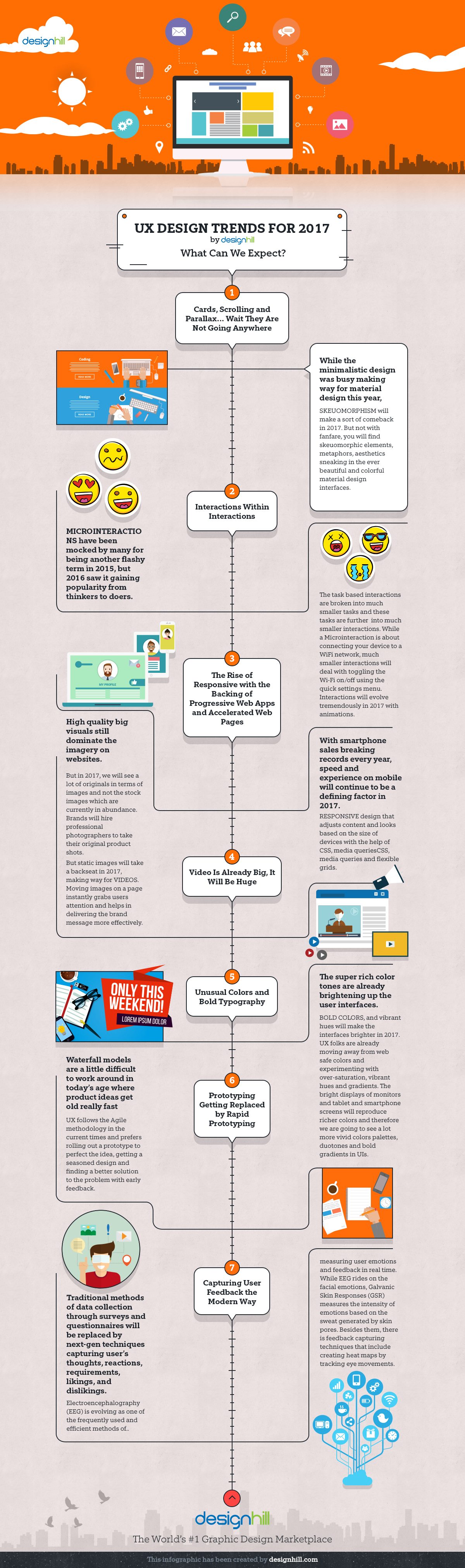
Designhill share 7 UX trends for 2017 in this infographic.
Mobile-First Design
By 2017, mobile internet usage had already surpassed desktop usage, making it clear that mobile-friendly design was no longer optional but a necessity. As a result, the concept of “mobile-first” design gained traction. This approach prioritizes designing and optimizing websites for mobile devices before addressing the desktop experience.
Mobile-first design recognizes that mobile users have different needs and constraints, such as smaller screens and touch-based navigation. Key principles of mobile-first design include responsive layouts, fast-loading pages, and simplified navigation. This trend pushed designers to think about how content and functionality adapt to various screen sizes and touch interactions, ultimately leading to more user-friendly websites.
Minimalism and Flat Design
The trend toward minimalism and flat design was well-established by 2017 and continued to dominate the web design landscape. This design philosophy emphasizes simplicity, clarity, and the removal of unnecessary elements. Flat design, in particular, avoids gradients, shadows, and three-dimensional effects in favor of clean lines, vibrant colors, and a focus on typography.
One notable example of minimalism and flat design in 2017 was Google’s Material Design, which influenced many websites and apps. This approach aimed to create a unified user experience across different platforms by providing a set of design principles and guidelines. The result was clean and intuitive interfaces that prioritized usability.
Microinteractions
Microinteractions are subtle, often unnoticed animations or interactions that enhance the user experience. They can include actions like button presses, hover effects, loading spinners, or notifications. In 2017, designers began to pay more attention to these small details to make websites feel more responsive and engaging.
One prime example of microinteractions in 2017 was Facebook’s “Like” button. When users clicked it, they not only saw the count increase but also witnessed a brief animation of the thumb icon changing color and size. These microinteractions provided instant feedback and made the interaction more satisfying. Incorporating such subtle animations became a common practice to create a more delightful user experience.
Video Backgrounds
Video backgrounds became a prominent trend in 2017, adding dynamic and visually appealing elements to websites. Instead of static images or text, websites started using background videos to grab users’ attention and convey information in a more engaging way.
Video backgrounds were especially effective for showcasing products, services, or brand stories. For instance, a hotel website could feature a video of its beautiful surroundings, while a tech company might use a video to demonstrate its latest product in action. However, designers had to be cautious about video file sizes to ensure fast loading times and avoid frustrating users with slow connections.
Card-Based Layouts
Card-based layouts gained popularity in 2017, largely due to their flexibility and suitability for responsive design. Inspired by the concept of physical cards, these design elements presented content in easily digestible, modular units. Each card could contain a piece of information, an image, or a call-to-action, making it ideal for organizing and displaying diverse content types.
Card-based layouts were widely adopted by social media platforms like Pinterest and Twitter, where they helped streamline content presentation and encouraged user engagement. This trend also contributed to the rise of grid-based designs, providing a structured and visually pleasing way to organize content on both desktop and mobile screens.
Conversational Interfaces and Chatbots
2017 saw the rise of conversational interfaces and chatbots as an innovative way to enhance user experiences. Companies started integrating chatbots into their websites and messaging apps to provide real-time support, answer common questions, and guide users through processes.
These chatbots utilized natural language processing and artificial intelligence to engage users in conversations that felt more human-like. While chatbots had been around before 2017, this year marked a significant improvement in their capabilities and integration into various industries, from e-commerce to customer service.
Personalization and User-Centered Design
User-centered design became a paramount focus in 2017, with websites increasingly tailoring their content and experiences to individual user preferences. Personalization involved using data and analytics to deliver relevant content, recommendations, and user interfaces based on a user’s behavior, location, or previous interactions with the site.
For example, e-commerce websites started recommending products based on a user’s browsing history, while news websites offered personalized content recommendations. This trend aimed to create a more engaging and relevant experience for users, ultimately increasing user satisfaction and conversion rates.
Conclusion
The year 2017 witnessed significant advancements in website user experience design, with trends such as mobile-first design, minimalism, microinteractions, video backgrounds, card-based layouts, conversational interfaces, and personalization taking center stage. While the digital landscape has evolved since then, these trends laid the foundation for many of the design principles and techniques that continue to shape the web today.
As web designers and developers, it’s essential to stay informed about past trends and ongoing developments in user experience design. By understanding the lessons and innovations of previous years, we can build upon them to create websites and web applications that provide exceptional user experiences in the ever-evolving digital world. Whether you’re designing for desktop or mobile, focusing on user-centered design principles and keeping an eye on emerging trends will always be a recipe for success in the field of web design.

Author:
Mark Ford