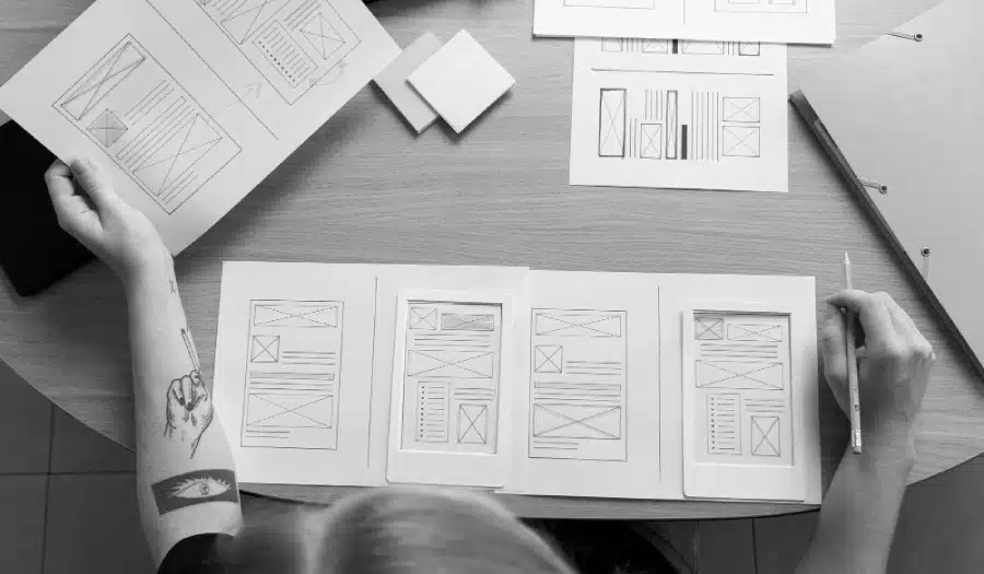
Are you looking for ways to improve your blog design? Want to know how to structure your posts to maximise conversions?
Firepole Marketing share their tips for success in this infographic.
They break things down into the following areas:
- Header
- Article
- Below the article
- Side bar
- Footer
Check out the infographic for more detail.
![Blog Design Tips: The Anatomy of a High-Converting Blog Post Layout [Infographic]](https://red-website-design.co.uk/wp-content/uploads/Blog-Design-Tips-The-Anatomy-of-a-High-Converting-Blog-Post-Layout.jpg)
In the world of blogging, content is king, but design is the queen that helps keep readers engaged and coming back for more. A well-designed blog post layout can make a significant difference in the success of your blog. It not only enhances the visual appeal of your content but also plays a crucial role in converting casual visitors into loyal readers. In this blog post, we’ll dive deep into the anatomy of a high-converting blog post layout and provide you with essential tips to create a design that captivates your audience and drives results.
The Power of First Impressions
The first few seconds a visitor spends on your blog post can make or break their decision to stay and read. This is why the top of your blog post layout is of utmost importance. It sets the stage for the entire reading experience and should be designed to make a strong first impression.
1. Eye-Catching Headline
Your blog post’s headline should be bold, clear, and attention-grabbing. Use a font size and style that stands out from the rest of the text. Additionally, consider using color or typography effects to make the headline pop. The goal is to make readers want to explore further.
2. Engaging Featured Image
Accompany your headline with a compelling featured image. The image should be relevant to the content and evoke curiosity or emotion. High-quality visuals can capture the reader’s attention and encourage them to keep scrolling.
The Flow of Content
Once you’ve captured your reader’s attention, it’s crucial to maintain their interest as they dive deeper into your blog post. The flow of content and readability play a significant role in achieving this.
3. Use Readable Fonts
Choose fonts that are easy to read, both on desktop and mobile devices. Sans-serif fonts like Arial or Helvetica tend to work well for online content. Ensure that your font size is large enough for comfortable reading but not so large that it feels overwhelming.
4. Clear Typography Hierarchy
Establish a clear hierarchy in your typography to guide readers through the content. Use headings and subheadings with different font sizes and styles to break up text and make it scannable. This not only aids in readability but also makes it easier for readers to find the information they’re looking for.
5. Ample White Space
Don’t overcrowd your blog post with text and images. Leave enough white space around the content to give readers breathing room. White space makes the layout feel clean and uncluttered, enhancing the reading experience.
6. Use Bullet Points and Lists
When presenting information or key points, consider using bullet points or numbered lists. Lists are easy to scan and digest, making it convenient for readers to grasp the main ideas of your blog post quickly.
Enhancing Visual Appeal
Visual elements can significantly enhance the appeal of your blog post and keep readers engaged. Here are some tips on how to incorporate them effectively:
7. High-Quality Images and Graphics
Incorporate high-quality images, infographics, and illustrations that complement your content. Avoid using pixelated or blurry visuals, as they can deter readers. Ensure that your visuals are properly sized to fit the layout without distortion.
8. Consistent Color Scheme
Maintain a consistent color scheme throughout your blog post layout. Use colors that align with your blog’s branding or theme. Consistency in colors helps create a cohesive and visually appealing reading experience.
9. Visual Hierarchy
Create a visual hierarchy within your blog post by using different text styles and sizes for headings, subheadings, and body text. Make sure that the most critical information stands out visually and is easy to find.
10. Incorporate Multimedia
Don’t limit your blog posts to text and images. Incorporate multimedia elements like videos, audio clips, and interactive content when relevant. These elements can add depth and variety to your posts, making them more engaging.
The Call to Action (CTA)
A high-converting blog post layout should guide readers toward taking action. Whether it’s subscribing to your newsletter, sharing the post, or purchasing a product, your call to action (CTA) should be strategically placed and visually appealing.
11. Strategically Positioned CTA
Place your CTA strategically within your blog post layout. It’s common to include a CTA at the end of the post, but you can also use them within the content, especially if it’s contextually relevant. For example, you might include a CTA for a related eBook within a section discussing the topic.
12. Attention-Grabbing Buttons
Design your CTA buttons to stand out. Use contrasting colors and make them visually appealing. The text on the button should be action-oriented, such as “Download Now” or “Subscribe Today.” Ensure that the button size is large enough to be easily clickable on both desktop and mobile devices.
Mobile Responsiveness
With the increasing number of users accessing content on mobile devices, it’s essential to ensure that your blog post layout is mobile-responsive. A responsive design adapts seamlessly to different screen sizes and orientations.
13. Test on Multiple Devices
Before publishing your blog post, test it on various devices, including smartphones and tablets. Ensure that the text, images, and overall layout look and function correctly on smaller screens. A responsive design is crucial for retaining mobile readers.
Speed and Performance
The loading speed and overall performance of your blog post layout can impact both user experience and search engine rankings.
14. Optimize Images
Optimize your images to reduce file sizes without compromising quality. This can significantly improve the loading speed of your blog post. Use image compression tools or plugins to automate this process.
15. Minimize HTTP Requests
Limit the number of external scripts, stylesheets, and fonts used in your blog post layout. Each HTTP request adds to the loading time, so minimize them whenever possible.
Social Sharing
Encouraging readers to share your content on social media can help expand your blog’s reach. Make it easy for them to do so with well-placed social sharing buttons.
16. Prominent Social Icons
Include social sharing buttons at the top or bottom of your blog post, or as a floating sidebar. Ensure that these icons are easily recognizable, and consider using share count indicators to show the popularity of your content.
Accessibility Matters
Accessibility should be a top priority when designing your blog post layout. Making your content accessible ensures that it can be enjoyed by a wider audience, including those with disabilities.
17. Alt Text for Images
Always provide descriptive alt text for images. This helps visually impaired readers understand the content of the images through screen readers.
18. Keyboard Navigation
Ensure that your blog post can be navigated using a keyboard alone. Some users rely on keyboard navigation due to disabilities, so make sure all interactive elements are accessible via keyboard shortcuts.
Testing and Optimization
The final tip for creating a high-converting blog post layout is to continuously test and optimize your design based on user feedback and data analytics.
19. A/B Testing
Perform A/B testing on different elements of your blog post layout, such as CTA buttons, headlines, and color schemes. This allows you to identify what resonates best with your audience and make data-driven improvements.
20. Analyze User Behavior
Use analytics tools to track user behavior on your blog post. Pay attention to metrics like time on page, bounce rate, and click-through rate on CTAs. Analyzing this data can provide insights into which aspects of your layout are effective and which need improvement.
Conclusion
A high-converting blog post layout is a combination of art and science. It requires a deep understanding of design principles, user behavior, and content strategy. By following the twenty tips outlined in this blog post, you can create a layout that not only captivates your audience but also drives results, whether it’s increased readership, engagement, or conversions. Remember that design is not static; it should evolve and adapt to the changing needs and preferences of your audience. Stay committed to improving your blog’s layout, and you’ll reap the rewards of a thriving online presence.

Author:
Mark Ford