

What colours do you use on your website? Were you aware they could be turning your visitors away?
We love a colour psychology infographic here at Red Website Design, you’ll find loads here in our blog telling you how to use colour to improve your marketing, but not many talk about the negative effects your colours could be having.
Take a look at this infographic from CoShedule which shows the negative emotions colours can evoke, how could that be affecting your website?
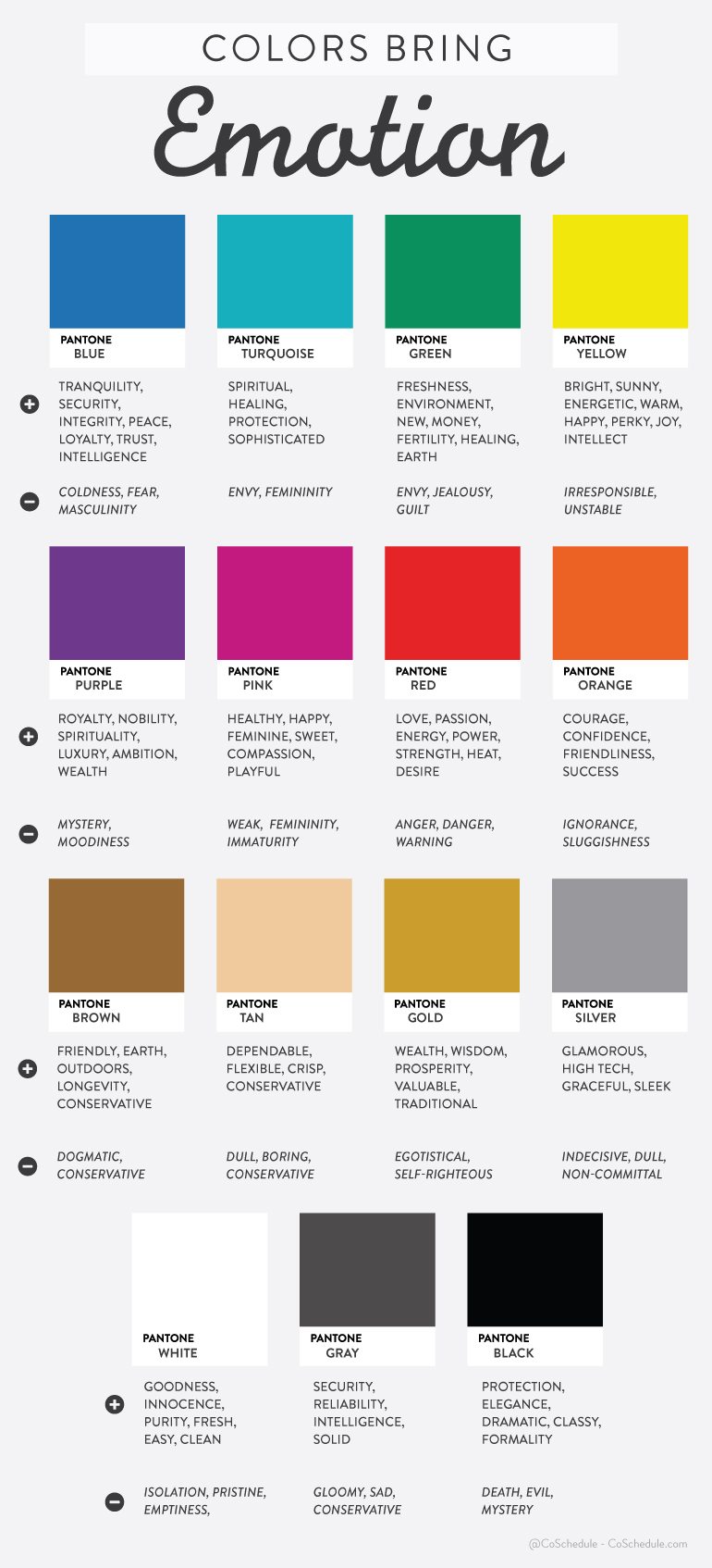
In the digital age, your website is often the first point of contact between your business and potential customers. A well-designed website can make a strong first impression and play a significant role in converting visitors into customers. However, there’s more to web design than just aesthetics and functionality. Color, in particular, plays a crucial role in shaping visitors’ perceptions and emotions. In this blog post, we’ll explore the fascinating relationship between color and emotion and discuss how the wrong choice of website colors could potentially drive customers away.
The Psychology of Color
Color is a powerful communicator of emotions, and its impact on human psychology has been extensively studied. Different colors evoke different feelings and associations, often on a subconscious level. Understanding the psychology of color is essential for designing a website that resonates with your target audience and conveys the right message.
1. Red: Passion and Urgency
Red is a color associated with strong emotions, such as passion, love, and anger. It also creates a sense of urgency and can stimulate appetite, which is why you often see it used in food-related industries. However, excessive use of red can be overwhelming and even create a feeling of anxiety.
2. Blue: Trust and Stability
Blue is one of the most popular colors for websites, especially in the corporate world. It conveys a sense of trust, reliability, and stability. Many financial institutions and tech companies use blue in their branding to establish credibility. However, too much blue can come across as cold and uninviting.
3. Green: Growth and Freshness
Green is associated with nature, growth, and freshness. It’s often used by eco-friendly and health-related businesses to convey a sense of well-being. Green can also represent money and wealth. However, the wrong shade of green may not convey the desired emotions or associations.
4. Yellow: Optimism and Energy
Yellow is a color that radiates positivity, optimism, and energy. It grabs attention and is often used for call-to-action buttons or warnings. However, too much yellow can be overwhelming and create feelings of anxiety or frustration.
5. Purple: Luxury and Sophistication
Purple has long been associated with royalty, luxury, and sophistication. It’s a color that can convey elegance and creativity. However, overusing purple can make a website feel overly exclusive or even pretentious.
6. Orange: Creativity and Playfulness
Orange is a vibrant and energetic color that represents creativity and playfulness. It’s often used by brands that want to appear approachable and fun. However, excessive use of orange can be distracting and may not be suitable for all industries.
7. Black: Elegance and Mystery
Black is a color that exudes elegance, sophistication, and a sense of mystery. It’s often used in fashion and luxury brands to convey a premium image. However, too much black can make a website feel dark and unwelcoming.
8. White: Simplicity and Cleanliness
White is a symbol of simplicity, cleanliness, and purity. It’s often used to create a minimalist and modern look. However, an all-white website can sometimes come across as sterile and lacking personality.
Understanding these color associations is just the first step in using color effectively in web design. The key is to choose the right colors that align with your brand’s personality and resonate with your target audience.
The Impact of Color on User Behavior
Now that we’ve explored the psychology of color, let’s dive deeper into how color can influence user behavior on your website.
1. Conversion Rates
One of the most critical aspects of a website is its ability to convert visitors into customers. Color plays a significant role in this process. By choosing the right colors for your call-to-action buttons and other conversion elements, you can encourage users to take the desired actions, such as making a purchase or signing up for a newsletter.
For example, the color red is often associated with urgency, making it an excellent choice for “Buy Now” buttons. On the other hand, green, which represents growth and positivity, can be used for “Sign Up” buttons to convey a sense of progress and opportunity.
2. Brand Recognition
Consistency in color usage is crucial for building brand recognition. When users consistently encounter the same colors on your website, they begin to associate those colors with your brand. This association can lead to increased brand recall and loyalty.
Consider the iconic use of red by Coca-Cola or the dominant blue in Facebook’s branding. These colors have become synonymous with their respective brands, making them instantly recognizable.
3. User Experience
Color also plays a significant role in shaping the overall user experience. The wrong color choices can lead to a confusing or frustrating experience for visitors. For example, using clashing colors or too many contrasting colors can make it difficult for users to read content or navigate your site.
Additionally, the use of color can influence the perceived loading time of a website. A study by the Missouri University of Science and Technology found that warm colors like red and yellow can make users perceive a website as loading faster, while cool colors like blue and green can make it feel slower.
4. Emotional Engagement
Color has the power to evoke emotions, and emotional engagement is a crucial factor in user experience. When visitors connect with your website on an emotional level, they are more likely to stay longer, explore more content, and ultimately convert into customers.
For example, a website selling outdoor adventure gear might use earthy tones like greens and browns to evoke a sense of adventure and connection to nature. This emotional engagement can help build a stronger bond between the brand and the customer.
Common Color Mistakes in Web Design
While understanding the psychology of color and its impact on user behavior is essential, it’s equally crucial to avoid common color mistakes in web design. Here are some of the most prevalent errors to watch out for:
1. Clashing Colors
Using colors that clash or create visual discomfort is a surefire way to drive visitors away. It’s essential to consider color harmony and ensure that your color choices are visually pleasing. Tools like color wheels and color palette generators can help you create harmonious color schemes.
2. Too Many Colors
An overly colorful website can be overwhelming and distracting. Limit your color palette to a few primary and secondary colors to create a cohesive and visually pleasing design. A cluttered and chaotic color scheme can make it challenging for users to focus on the content or take action.
3. Ignoring Accessibility
Accessibility is a critical consideration in web design. Ignoring color contrast and accessibility guidelines can alienate users with visual impairments. Ensure that your text is easy to read against the background color and that your color choices meet accessibility standards.
4. Inconsistent Branding
Consistency in branding is vital, and this extends to color usage. Using different colors on different pages or platforms can confuse users and dilute your brand’s identity. Make sure that your chosen colors align with your brand guidelines and are used consistently across all touchpoints.
5. Neglecting Cultural Differences
Colors can have different cultural meanings and associations. What may be considered a positive color in one culture may have negative connotations in another. It’s essential to research and consider the cultural context of your target audience when selecting colors for your website.
Case Studies: The Impact of Color on Conversion
To illustrate the real-world impact of color on website conversion rates, let’s explore a few case studies:
1. Heinz vs. Hunt’s Ketchup
In one famous experiment, researchers changed the color of the Heinz ketchup bottle label from red to green. The result? Sales of Heinz ketchup plummeted. Why? The red label was strongly associated with the product, and the sudden change in color created confusion and distrust among consumers.
This case study highlights the importance of consistency in branding and the strong emotional connections that consumers can have with specific colors.
2. HubSpot’s “Red vs. Green” Button Test
HubSpot, a leading inbound marketing platform, conducted an A/B test to determine the impact of button color on conversion rates. In the test, they compared a green button with a red one. The result? The red button outperformed the green one by 21%.
This experiment demonstrates how a simple color change can have a significant impact on user behavior and conversion rates.
3. Performable’s “Green vs. Red” Button Test
In another A/B test, web analytics company Performable compared the performance of a green button to that of a red button. The result was similar to HubSpot’s test, with the red button leading to a 21% increase in conversions.
These case studies emphasize the importance of carefully selecting colors for call-to-action buttons and other conversion elements on your website.
Tips for Choosing Website Colors Wisely
Now that we’ve explored the psychology of color, its impact on user behavior, and common color mistakes to avoid, let’s wrap up with some practical tips for choosing website colors wisely:
1. Understand Your Audience
Start by understanding your target audience. What are their preferences, emotions, and associations with colors? Conduct surveys or research to gather insights into their color preferences and cultural backgrounds.
2. Align with Brand Identity
Your website colors should align with your brand’s identity and values. Consider the message you want to convey and choose colors that reflect that message consistently.
3. Use Color Harmoniously
Create a harmonious color palette that includes a primary color, secondary colors, and accent colors. Tools like Adobe Color Wheel or Coolors can help you generate pleasing color combinations.
4. Test and Iterate
Don’t be afraid to test different color variations and measure their impact on conversion rates and user engagement. A/B testing can help you identify the most effective color choices for your specific audience.
5. Prioritize Accessibility
Ensure that your chosen colors meet accessibility standards. Use tools like the Web Content Accessibility Guidelines (WCAG) to evaluate color contrast and readability.
6. Consider Cultural Context
If your target audience spans different cultures, consider the cultural context of your color choices to avoid unintentional negative associations.
7. Seek Professional Help
If you’re unsure about color choices or their impact, consider consulting with a professional web designer or a color psychologist who can provide expert guidance.
In conclusion, color is a powerful tool in web design that can influence emotions, behaviors, and brand perception. By understanding the psychology of color, avoiding common color mistakes, and following best practices, you can create a visually appealing and effective website that resonates with your audience and turns visitors into loyal customers. Remember that color is not just a visual element; it’s a language that can speak to the hearts and minds of your users.

Author:
Mark Ford



