

Are you looking for a Google font combination for your website? Want your website fonts to be feminine and convey beauty?
Betty Red Design share 5 font combinations you should try in this infographic.
Here’s what makes their list:
- Oswald + Droid Serif
- Playfair Display + Lato
- Quicksand + Jacques Francois
- Old Standard + Gudea
- Copse + Muli
Check out the infographic to see the pairings in action.
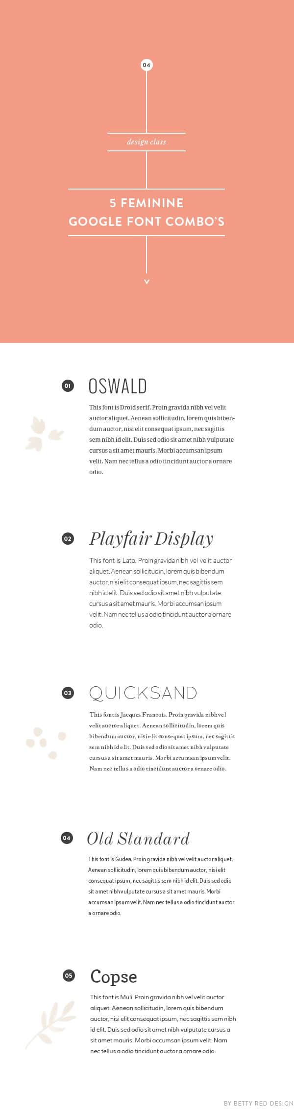
In the digital age, your website and brand image are often the first impressions potential customers have of your business. Typography plays a significant role in how your brand is perceived, especially when it comes to feminine aesthetics. The right font combinations can evoke feelings of elegance, warmth, and approachability. Google Fonts offers a plethora of free typefaces that can help you craft a beautiful and cohesive brand identity. Here are five feminine Google font combinations that will elevate your website and brand image.
Oswald + Droid Serif
When it comes to establishing a memorable online presence, the right typography can make all the difference. The combination of Oswald and Droid Serif offers a perfect blend of modernity and tradition, making it an ideal choice for small businesses looking to create a feminine and sophisticated brand image. Here, we’ll explore this pairing in more detail and provide practical tips on how to effectively implement it in your branding strategy.
Understanding the Fonts
Oswald: This sans-serif typeface is characterized by its bold, condensed letterforms that make a strong visual statement. Originally designed for digital use, Oswald is highly legible on screens, making it suitable for various applications, including websites, social media graphics, and marketing materials.
Droid Serif: A classic serif typeface, Droid Serif features soft, rounded edges that enhance readability and give a friendly, approachable feel. Its traditional roots and elegant curves make it perfect for body text, providing a sense of comfort and familiarity.
Why Choose Oswald + Droid Serif?
- Versatile Aesthetics: The modernity of Oswald paired with the classic charm of Droid Serif creates a versatile aesthetic suitable for a variety of industries, from fashion and beauty to wellness and lifestyle.
- Enhanced Readability: The contrast between the bold headlines in Oswald and the easy-to-read body text in Droid Serif ensures that your content is accessible and engaging.
- Clear Hierarchy: This combination establishes a clear visual hierarchy, allowing users to easily differentiate between headings and body text, which is crucial for guiding visitors through your content.
Tips for Effective Use of Oswald + Droid Serif
- Establish a Clear Brand Voice
Before diving into design, consider your brand’s voice and the emotions you want to evoke. Oswald’s strong, confident style can convey authority and professionalism, while Droid Serif adds warmth and approachability. Determine how you want your audience to feel when they engage with your brand and tailor your typography accordingly.
- Use Oswald for Headlines and Key Messages
- Headlines: Use Oswald for your main headings, subheadings, and key messages. The boldness of this font ensures that important information stands out.
- Size and Weight: Experiment with different sizes and weights (e.g., using bold or regular styles) to create visual interest and guide the reader’s eye through your content. For example, use a larger size for main headings and slightly smaller sizes for subheadings.
- Color Choices: Choose colors that align with your brand identity. For instance, pairing Oswald with a soft pastel color can create a welcoming feel, while a darker color can add a sense of professionalism and seriousness.
- Implement Droid Serif for Body Text
- Body Text: Use Droid Serif for paragraphs, captions, and any lengthy text to enhance readability. This serif typeface is designed for comfort, making it ideal for keeping readers engaged.
- Line Height and Spacing: Adjust line height and letter spacing to ensure your text is easy to read. A line height of 1.5 to 1.6 times the font size can improve legibility, especially on mobile devices.
- Contrast: Ensure there is sufficient contrast between the text and background colors. Dark text on a light background (or vice versa) is usually the best choice for readability.
- Create Consistency Across Platforms
- Web Design: Implement the Oswald + Droid Serif combination consistently across your website. Use Oswald for navigation menus, buttons, and headings, while Droid Serif should be reserved for body text. This consistency reinforces your brand identity.
- Social Media: Extend this font pairing to your social media graphics and posts. Use Oswald for eye-catching headlines or quotes and Droid Serif for captions and descriptions.
- Print Materials: Maintain this font combination in business cards, brochures, and flyers to create a cohesive brand image that resonates across both digital and print platforms.
- Use Responsive Design
- Responsive Typography: Ensure your typography is responsive to different screen sizes. This means adjusting font sizes, line heights, and spacing for mobile devices, tablets, and desktops to ensure optimal readability across all platforms.
- Test on Multiple Devices: Regularly test your website on various devices to ensure that the Oswald + Droid Serif combination looks and functions well. Pay attention to how text appears on smaller screens and make adjustments as needed.
- A/B Testing for Optimization
- Test Variations: Experiment with different font sizes, weights, and colors to see what resonates best with your audience. A/B testing can help you identify which combinations lead to better engagement and conversions.
- Collect Feedback: Consider gathering feedback from customers or colleagues about their preferences regarding font styles. Their insights can provide valuable information on how your typography is perceived.
- Branding Considerations
- Logo Design: If you’re designing a logo, consider integrating Oswald for the brand name, as its boldness can help establish brand recognition. Use Droid Serif for any tagline or descriptor for a cohesive look.
- Consistency in Messaging: Ensure that your messaging aligns with the visual style of your fonts. For instance, if Oswald conveys confidence, your messaging should reflect that tone to maintain a strong brand identity.
Conclusion
The combination of Oswald and Droid Serif is a powerful duo that can enhance your small business’s online presence and overall brand image. By thoughtfully implementing this font pairing across your website and marketing materials, you can create a visually appealing and cohesive brand identity that resonates with your target audience.
Remember, typography is not just about aesthetics; it’s about communication. Make sure that your choice of fonts conveys the right message and emotions, reinforcing your brand’s voice and values. With the right approach to design, Oswald and Droid Serif can help you craft a beautiful, feminine brand image that stands out in a crowded marketplace.
Playfair Display + Lato
The combination of Playfair Display and Lato is a powerful pairing that balances elegance and modernity, making it an ideal choice for small businesses looking to establish a sophisticated yet approachable brand identity. This duo is particularly effective for industries such as fashion, beauty, lifestyle, and hospitality, where aesthetics play a crucial role in attracting customers. Here, we will explore this font pairing in greater detail and provide practical tips on how to effectively implement it in your branding strategy.
Understanding the Fonts
Playfair Display: This serif typeface is characterized by its high contrast and elegant curves, reminiscent of classic literature and sophisticated design. Its distinct style makes it perfect for headings, titles, and any text that requires emphasis. Playfair Display embodies a timeless quality, which can evoke a sense of luxury and refinement.
Lato: A modern sans-serif typeface, Lato features clean lines and a warm, friendly feel. Its versatility and readability make it an excellent choice for body text, providing a contemporary contrast to the more ornate Playfair Display. Lato is designed for optimal legibility, which is essential for maintaining user engagement on websites and in printed materials.
Why Choose Playfair Display + Lato?
- Balanced Aesthetic: The contrast between the elegant serif of Playfair Display and the clean sans-serif lines of Lato creates a harmonious visual balance, suitable for various brand applications.
- Enhanced Readability: This combination ensures that content is easy to read while maintaining an appealing aesthetic, which is essential for keeping visitors engaged and informed.
- Versatile Usage: Playfair Display and Lato can be used across a variety of platforms and formats, from websites to social media and print materials, ensuring a cohesive brand identity.
Tips for Effective Use of Playfair Display + Lato
- Define Your Brand Identity
Before diving into design, clarify your brand identity and the message you want to communicate. Consider the emotions you want your audience to feel—whether it’s elegance, warmth, or modernity—and choose your typography accordingly. The luxurious feel of Playfair Display paired with the approachable nature of Lato can evoke a sophisticated yet friendly brand image.
- Utilize Playfair Display for Headlines and Key Messages
- Headlines: Use Playfair Display for all major headings and key messages. Its distinct styling will draw attention and establish a strong focal point for your content.
- Font Sizes and Weights: Experiment with various sizes and weights (e.g., bold for main headings and regular for subheadings) to create visual hierarchy and guide the reader’s attention through your content.
- Color Choices: Choose colors that resonate with your brand identity. For a luxurious feel, consider deep colors like navy, emerald, or burgundy for Playfair Display, while keeping lighter tones for Lato to maintain balance.
- Implement Lato for Body Text
- Body Text: Use Lato for all body text and descriptive content. Its clean, modern lines make it easy to read, which is crucial for keeping visitors engaged.
- Line Height and Spacing: Adjust line height and letter spacing to enhance readability. A line height of 1.5 times the font size is often recommended for body text, ensuring comfort during reading.
- Contrast: Ensure sufficient contrast between the body text and background colors. Dark text on a light background (or light text on a dark background) is typically the most readable option.
- Maintain Consistency Across All Platforms
- Web Design: Implement the Playfair Display + Lato combination consistently across your website. Use Playfair Display for navigation menus, buttons, and headings, while Lato should be reserved for body text. This consistency reinforces brand identity and aids in user experience.
- Social Media: Extend this font pairing to social media graphics, posts, and branding materials. Use Playfair Display for impactful quotes or announcements and Lato for captions and descriptions.
- Print Materials: Keep this font combination in your business cards, brochures, and flyers to create a cohesive brand image that resonates across both digital and print platforms.
- Embrace Responsive Design
- Responsive Typography: Ensure your typography is responsive to different screen sizes. Adjust font sizes, line heights, and spacing for mobile devices, tablets, and desktops to guarantee optimal readability across all platforms.
- Testing on Multiple Devices: Regularly test your website on various devices to ensure that the Playfair Display + Lato combination looks and functions well. Pay attention to how text appears on smaller screens and make adjustments as necessary.
- A/B Testing for Optimization
- Test Variations: Experiment with different font sizes, weights, and color combinations to see what resonates best with your audience. A/B testing can help you identify which combinations lead to better engagement and conversions.
- Feedback Collection: Gather feedback from customers or colleagues regarding their preferences for font styles. Their insights can provide valuable information on how your typography is perceived.
- Branding Considerations
- Logo Design: If you’re designing a logo, consider incorporating Playfair Display for the brand name to emphasize sophistication. Use Lato for any tagline or descriptor for a cohesive look.
- Consistent Messaging: Ensure that your messaging aligns with the visual style of your fonts. For example, if Playfair Display conveys elegance, your messaging should reflect that tone to maintain a strong brand identity.
Creative Applications of Playfair Display + Lato
- Website Layout: Create a striking homepage layout with a large, bold Playfair Display heading that captures attention, followed by well-structured paragraphs in Lato to provide essential information.
- Email Marketing: Design your email campaigns with Playfair Display for subject lines and headlines, and Lato for the body content to create a visually appealing and professional appearance.
- Print Advertising: Use Playfair Display for eye-catching headlines in brochures or flyers, complemented by informative text in Lato to maintain clarity and elegance.
- Brand Storytelling: Tell your brand’s story using a mix of both typefaces. Start with Playfair Display for impactful chapter headings and use Lato for narrative content, making your story engaging and readable.
Conclusion
The combination of Playfair Display and Lato is a sophisticated and effective choice for small businesses aiming to establish a refined yet approachable brand identity. By thoughtfully implementing this font pairing across your website, marketing materials, and social media, you can create a visually appealing and cohesive brand image that resonates with your target audience.
Remember, typography is more than just aesthetics; it’s about communication and connection. Ensure your choice of fonts conveys the right message and emotions, reinforcing your brand’s voice and values. With the right approach, Playfair Display and Lato can help you craft a beautiful brand image that stands out in a competitive marketplace, ultimately attracting and retaining your ideal customers.
Quicksand + Jacques Francois
The font pairing of Quicksand and Jacques Francois offers a fresh and modern aesthetic, making it an excellent choice for small businesses seeking to convey a sense of playfulness, creativity, and approachability. This combination works particularly well for brands in industries such as design, tech startups, creative agencies, and lifestyle products. Let’s delve into the characteristics of these fonts, why they work well together, and practical tips for effectively implementing them in your branding strategy.
Understanding the Fonts
Quicksand: Quicksand is a geometric sans-serif typeface that features rounded edges and a friendly demeanor. Its clean lines and modern appearance make it an excellent choice for body text, user interfaces, and any design requiring a contemporary touch. Quicksand embodies a casual yet professional vibe, making it versatile for various applications.
Jacques Francois: In contrast, Jacques Francois is a serif typeface that adds a touch of elegance and sophistication to the mix. With its classic serifs and slightly whimsical flair, this font is perfect for headings, titles, and other prominent text elements. Jacques Francois evokes a sense of tradition while still feeling fresh, making it a great option for brands that want to blend classic elegance with modern aesthetics.
Why Choose Quicksand + Jacques Francois?
- Visual Contrast: The combination of Quicksand’s geometric sans-serif style with Jacques Francois’s traditional serif creates a dynamic contrast, helping important information stand out while maintaining overall harmony in your design.
- Approachability Meets Sophistication: This pairing successfully balances the friendly, approachable qualities of Quicksand with the refined elegance of Jacques Francois, allowing your brand to appeal to a broad audience.
- Versatile Applications: Quicksand and Jacques Francois can be effectively utilized across various platforms—websites, social media, print materials, and advertising—ensuring consistency in your brand image.
Tips for Effective Use of Quicksand + Jacques Francois
- Define Your Brand Personality
Before integrating this font pairing, clearly define your brand personality and the message you want to convey. Determine whether your brand leans more toward playful, professional, or a mix of both. Understanding your brand’s identity will guide your typography choices and ensure alignment with your overall messaging.
- Use Jacques Francois for Headlines and Key Text
- Headlines: Utilize Jacques Francois for major headings, titles, and calls to action. Its classic serif style draws attention and adds a touch of sophistication to your design.
- Font Sizes and Weights: Experiment with various font sizes and weights. For instance, use bold weights for main headings and lighter weights for subheadings to create visual hierarchy and emphasize important points.
- Color Choices: Choose colors that reflect your brand identity. Pair darker, richer hues for Jacques Francois with lighter shades for Quicksand to create an appealing contrast that is visually engaging.
- Implement Quicksand for Body Text
- Body Text: Use Quicksand for all body text and longer content sections. Its geometric design enhances readability, ensuring your audience can easily engage with your content.
- Line Height and Spacing: Adjust line height and letter spacing to enhance legibility. A line height of 1.5 to 1.6 times the font size is often recommended for body text, creating a comfortable reading experience.
- Contrast: Ensure sufficient contrast between Quicksand and the background. A dark text color on a light background or vice versa will help maintain readability.
- Maintain Consistency Across Platforms
- Web Design: Apply the Quicksand + Jacques Francois pairing consistently across your website. Use Jacques Francois for headings, buttons, and promotional banners while Quicksand should dominate body text, descriptions, and longer paragraphs.
- Social Media: Extend this font combination to your social media graphics and posts. Use Jacques Francois for impactful headlines in your posts and Quicksand for captions and descriptions, creating a unified brand presence.
- Print Materials: Ensure your brochures, flyers, and business cards utilize this font combination to reinforce your brand identity in both digital and print contexts.
- Embrace Responsive Design
- Responsive Typography: Make sure your typography is responsive and adapts to different screen sizes. Adjust font sizes and line heights for mobile devices, tablets, and desktops to guarantee optimal readability on all platforms.
- Testing Across Devices: Regularly test how your font pairing appears on various devices. Check for consistency in appearance, readability, and overall design aesthetics.
- Utilize A/B Testing for Optimization
- Experiment with Variations: Conduct A/B testing with different font sizes, styles, and color combinations to discover what resonates most with your audience. This data-driven approach will help you refine your typography choices for better engagement.
- Collect Feedback: Gather feedback from customers or colleagues about their preferences for font styles. Their insights can guide your decisions and enhance the effectiveness of your typography.
- Branding Considerations
- Logo Design: If you’re creating a logo, consider incorporating Jacques Francois for the brand name to emphasize sophistication, and Quicksand for a tagline to convey modernity and approachability.
- Consistent Messaging: Align your messaging with the tone of your fonts. For instance, if Jacques Francois conveys elegance, ensure your content reflects a similar tone to maintain a cohesive brand identity.
Creative Applications of Quicksand + Jacques Francois
- Website Layout: Create a visually engaging homepage by using a large, bold Jacques Francois heading that captures attention, followed by well-structured Quicksand body text that provides essential information about your business.
- Email Marketing: Design your email campaigns using Jacques Francois for subject lines and main headings, while Quicksand can be used for the body content to create an attractive and professional appearance.
- Print Advertising: Utilize Jacques Francois for impactful headlines in brochures or flyers, complemented by informative content in Quicksand to maintain clarity and elegance.
- Brand Storytelling: Tell your brand’s story effectively by using Jacques Francois for significant chapter headings and Quicksand for narrative content, ensuring a visually appealing and engaging reading experience.
Conclusion
The combination of Quicksand and Jacques Francois is an innovative and versatile choice for small businesses looking to establish a modern and friendly brand identity. By thoughtfully implementing this font pairing across your website, marketing materials, and social media, you can create a cohesive and visually appealing brand image that resonates with your target audience.
Remember, typography is a crucial element of communication and connection. The right font pairing can significantly enhance your message and how it’s perceived by your audience. With careful consideration and strategic implementation, Quicksand and Jacques Francois can help you craft a brand identity that stands out in a competitive marketplace, ultimately attracting and retaining your ideal customers.
Old Standard + Gudea
The font pairing of Old Standard and Gudea presents a unique opportunity for small businesses to convey a sense of tradition, reliability, and modernity simultaneously. This combination is particularly well-suited for businesses in sectors such as education, consulting, finance, and any industry that values trustworthiness and clarity. Let’s explore the characteristics of these fonts, why they work well together, and practical tips for implementing this pairing effectively in your branding strategy.
Understanding the Fonts
Old Standard: Old Standard is a classic serif typeface that reflects the aesthetic of traditional print typography. Its high contrast between thick and thin strokes, along with its refined serifs, gives it an air of sophistication and elegance. Old Standard is ideal for headings, subheadings, and any text that aims to convey authority and trust.
Gudea: In contrast, Gudea is a modern sans-serif typeface characterized by its geometric shapes and clean lines. It has a slightly rounded appearance, making it approachable and versatile. Gudea works beautifully for body text and user interfaces, providing clarity and readability without sacrificing style.
Why Choose Old Standard + Gudea?
- Balanced Aesthetic: The combination of Old Standard’s traditional serif design with Gudea’s modern sans-serif style creates a balanced visual aesthetic that appeals to both contemporary and classic sensibilities.
- Enhanced Readability: Gudea’s clean lines ensure excellent legibility in body text, while Old Standard’s elegance provides a sophisticated touch to headings and key messages, allowing for effective communication.
- Versatile Applications: This pairing can be utilized across various platforms—websites, social media, print materials, and advertising—ensuring consistency and coherence in your brand image.
Tips for Effective Use of Old Standard + Gudea
- Define Your Brand Identity
Before integrating this font pairing, it’s essential to have a clear understanding of your brand identity. Ask yourself:
- What message do you want to convey?
- How do you want your audience to perceive your brand?
By defining your brand’s personality, you can select typography that aligns with your values and enhances your messaging.
- Use Old Standard for Headlines and Key Text
- Headlines: Utilize Old Standard for all major headings, titles, and calls to action. Its traditional style grabs attention and conveys a sense of professionalism and authority.
- Font Sizes and Weights: Experiment with different weights and sizes. For example, use bold or italic styles for emphasis, especially in headings, to create a hierarchy that guides the reader through your content.
- Color Choices: Choose colors that reflect your brand identity. Darker hues can enhance the elegance of Old Standard, while lighter tones can create a modern feel when paired with Gudea.
- Implement Gudea for Body Text
- Body Text: Use Gudea for all body text and descriptive content. Its geometric design enhances readability, making it suitable for longer passages of text, such as articles, blog posts, and product descriptions.
- Line Height and Spacing: Ensure appropriate line height and letter spacing for optimal readability. A line height of 1.5 times the font size is often recommended for body text to create a comfortable reading experience.
- Contrast: Ensure that there is sufficient contrast between Gudea and the background. High contrast (e.g., dark text on a light background) will improve legibility.
- Maintain Consistency Across Platforms
- Web Design: Apply the Old Standard + Gudea pairing consistently throughout your website. Use Old Standard for headers and key information while Gudea should be the dominant font for body text to maintain visual coherence.
- Social Media: Extend this font combination to your social media graphics and posts. Use Old Standard for impactful headlines in your posts and Gudea for captions and descriptions, creating a unified brand presence.
- Print Materials: Ensure that your brochures, business cards, and flyers utilize this font combination to reinforce your brand identity across both digital and print media.
- Embrace Responsive Design
- Responsive Typography: Ensure that your typography is responsive and adjusts to different screen sizes. Modify font sizes and line heights for mobile devices, tablets, and desktops to guarantee optimal readability on all platforms.
- Testing Across Devices: Regularly check how your font pairing appears on various devices. Look for consistency in appearance, readability, and overall design aesthetics.
- Use A/B Testing for Optimization
- Experiment with Variations: Conduct A/B testing with different font sizes, styles, and color combinations to determine which designs resonate most with your audience. This data-driven approach will help you refine your typography choices for better engagement.
- Gather Feedback: Collect feedback from customers or colleagues regarding their font preferences. Their insights can guide your decisions and enhance the effectiveness of your typography.
- Branding Considerations
- Logo Design: If you’re designing a logo, consider using Old Standard for the brand name to convey sophistication and reliability, while incorporating Gudea for taglines or descriptors to add a modern touch.
- Consistent Messaging: Align your messaging with the tone of your fonts. If Old Standard represents tradition, ensure your content reflects a similar tone to maintain a cohesive brand identity.
Creative Applications of Old Standard + Gudea
- Website Layout: Create an engaging homepage by featuring a large, elegant Old Standard heading that captures attention, followed by structured Gudea body text that provides essential information about your services or products.
- Email Marketing: Design your email campaigns using Old Standard for subject lines and main headings, while Gudea can be used for the body content to create a professional and cohesive appearance.
- Print Advertising: Utilize Old Standard for prominent headings in brochures or flyers, complemented by informative content in Gudea to ensure clarity and elegance.
- Brand Storytelling: Effectively tell your brand’s story by using Old Standard for significant chapter headings and Gudea for narrative content, ensuring a visually appealing and engaging reading experience.
Conclusion
The combination of Old Standard and Gudea is a powerful choice for small businesses looking to establish a brand identity that balances tradition and modernity. By thoughtfully implementing this font pairing across your website, marketing materials, and social media, you can create a cohesive and visually appealing brand image that resonates with your target audience.
Typography is more than just a design element; it’s a crucial part of your brand’s communication. The right font pairing can significantly enhance your message and how it’s perceived by your audience. With careful consideration and strategic implementation, Old Standard and Gudea can help you craft a brand identity that stands out, fosters trust, and ultimately attracts and retains your ideal customers.
Copse + Muli
The font pairing of Copse and Muli offers a unique blend of elegance and modernity, making it an excellent choice for small businesses looking to establish a refined yet approachable brand image. This combination is especially suitable for businesses in creative industries, hospitality, wellness, and any brand that values aesthetics and clarity. Let’s dive into the characteristics of these fonts, explore why they work well together, and provide practical tips for effectively integrating this pairing into your branding strategy.
Understanding the Fonts
Copse: Copse is a beautiful serif typeface that combines traditional serif features with a contemporary twist. Its slightly condensed letterforms and soft curves give it an elegant appearance, making it perfect for headings, logos, and display text. Copse conveys a sense of professionalism and trustworthiness while remaining approachable.
Muli: Muli is a modern sans-serif font characterized by its clean lines and geometric shapes. It offers excellent legibility, making it ideal for body text and digital applications. Muli’s versatility allows it to adapt to various styles and settings, making it a great companion to the elegance of Copse.
Why Choose Copse + Muli?
- Complementary Styles: The combination of Copse’s refined serifs and Muli’s minimalistic sans-serif design creates a balanced and harmonious visual experience, allowing for an effective contrast between headings and body text.
- Versatility Across Media: This font pairing works well in both digital and print formats, ensuring consistency across your branding materials, including websites, social media graphics, brochures, and business cards.
- Enhanced Readability: Muli’s clean and straightforward design ensures that body text remains easy to read, while Copse adds character and elegance to headlines, improving overall communication.
Tips for Effective Use of Copse + Muli
- Define Your Brand Voice
Before implementing this font pairing, it’s crucial to establish a clear understanding of your brand voice. Consider the following questions:
- What values do you want your brand to convey?
- How do you want your audience to perceive your business?
Having a solid grasp of your brand identity will help guide your typography choices and ensure they align with your messaging.
- Use Copse for Headlines and Emphasis
- Headlines: Utilize Copse for major headings, titles, and key messages. Its elegant design will draw attention and create a strong first impression.
- Font Sizes and Weights: Experiment with different font weights and sizes. A bolder Copse heading can create a strong visual hierarchy, while lighter weights can soften the look and feel for less critical headings.
- Color Choices: Choose colors that resonate with your brand. Earthy tones or pastels can enhance the warmth of Copse, while contrasting colors can make it stand out.
- Implement Muli for Body Text
- Body Text: Use Muli for all body text and informative content. Its simplicity and readability make it ideal for longer passages, ensuring that your audience can easily absorb information.
- Line Height and Spacing: Maintain proper line height (typically 1.5 times the font size) and letter spacing to enhance legibility. This is particularly important for mobile devices and smaller screens.
- Contrast: Ensure that the contrast between Muli and the background is sufficient. A dark Muli on a light background enhances readability, while a light Muli on a dark background can create a striking effect.
- Maintain Consistency Across Platforms
- Web Design: Apply the Copse + Muli pairing consistently throughout your website. Use Copse for headers and significant text while employing Muli for the majority of your content to create visual coherence.
- Social Media: Extend this font combination to your social media graphics and posts. Use Copse for headlines and Muli for captions and descriptions to maintain a unified brand presence.
- Print Materials: Ensure that brochures, business cards, and flyers utilize this font pairing to reinforce your brand identity in both digital and print media.
- Embrace Responsive Design
- Responsive Typography: Ensure that your typography is responsive, adapting to different screen sizes. Modify font sizes and styles for mobile devices and desktops to guarantee optimal readability.
- Testing Across Devices: Regularly check how your font pairing appears on various devices. Look for consistency in appearance, readability, and overall design aesthetics.
- Use A/B Testing for Optimization
- Experiment with Variations: Conduct A/B testing with different font sizes, styles, and color combinations to determine which designs resonate most with your audience. This data-driven approach will help you refine your typography choices for better engagement.
- Gather Feedback: Collect feedback from customers or colleagues regarding their font preferences. Their insights can guide your decisions and enhance the effectiveness of your typography.
- Branding Considerations
- Logo Design: Consider incorporating Copse into your logo for a sophisticated touch. You can use Muli for a tagline or descriptor to add a modern feel to your branding.
- Consistent Messaging: Ensure that your messaging aligns with the tone of your fonts. If Copse represents elegance, ensure that your content reflects a similar tone to maintain a cohesive brand identity.
Creative Applications of Copse + Muli
- Website Layout: Create an engaging homepage by featuring a prominent Copse heading that captures attention, followed by structured Muli body text that provides essential information about your services or products.
- Email Marketing: Design your email campaigns using Copse for subject lines and main headings, while Muli can be used for body content to create a professional and cohesive appearance.
- Print Advertising: Utilize Copse for striking headings in brochures or flyers, complemented by informative content in Muli to ensure clarity and elegance.
- Brand Storytelling: Use Copse for significant chapter headings and Muli for narrative content in your brand’s story, ensuring a visually appealing and engaging reading experience.
Conclusion
The combination of Copse and Muli is a compelling choice for small businesses looking to create a brand identity that balances elegance and modernity. By thoughtfully implementing this font pairing across your website, marketing materials, and social media, you can create a cohesive and visually appealing brand image that resonates with your target audience.
Typography plays a crucial role in brand communication. The right font pairing can significantly enhance your message and how it is perceived by your audience. With careful consideration and strategic implementation, Copse and Muli can help you craft a brand identity that stands out, fosters trust, and ultimately attracts and retains your ideal customers.
Conclusion
Choosing the right font combination is crucial for establishing a strong brand identity, especially for feminine brands aiming for elegance and approachability. The five Google font combinations outlined above—Oswald + Droid Serif, Playfair Display + Lato, Quicksand + Jacques Francois, Old Standard + Gudea, and Copse + Muli—offer a range of styles and tones that can be tailored to fit your specific brand vision.
As you consider your website and branding efforts, remember that typography is not just about aesthetics; it’s about conveying your message and values. By selecting the right font pairings, you can create a beautiful, cohesive brand image that resonates with your audience and leaves a lasting impression. Happy designing!

Author:
Mark Ford



