Fonts are like the clothing of your website. Just as you wouldn’t want to wear mismatched and ill-fitting clothes, you should avoid using the wrong fonts on your website. Font coordination is a crucial aspect of web design that can greatly impact the user experience, readability, and overall aesthetics of your site.
In this comprehensive guide, we’ll delve deep into the world of fonts and explore how you can avoid making font-related mistakes on your website.
We’ll cover everything from the basics of typography to advanced font pairing techniques. By the end of this article, you’ll have the knowledge and tools to create a visually appealing and user-friendly website through effective font coordination.
Infographic from Fast Print.
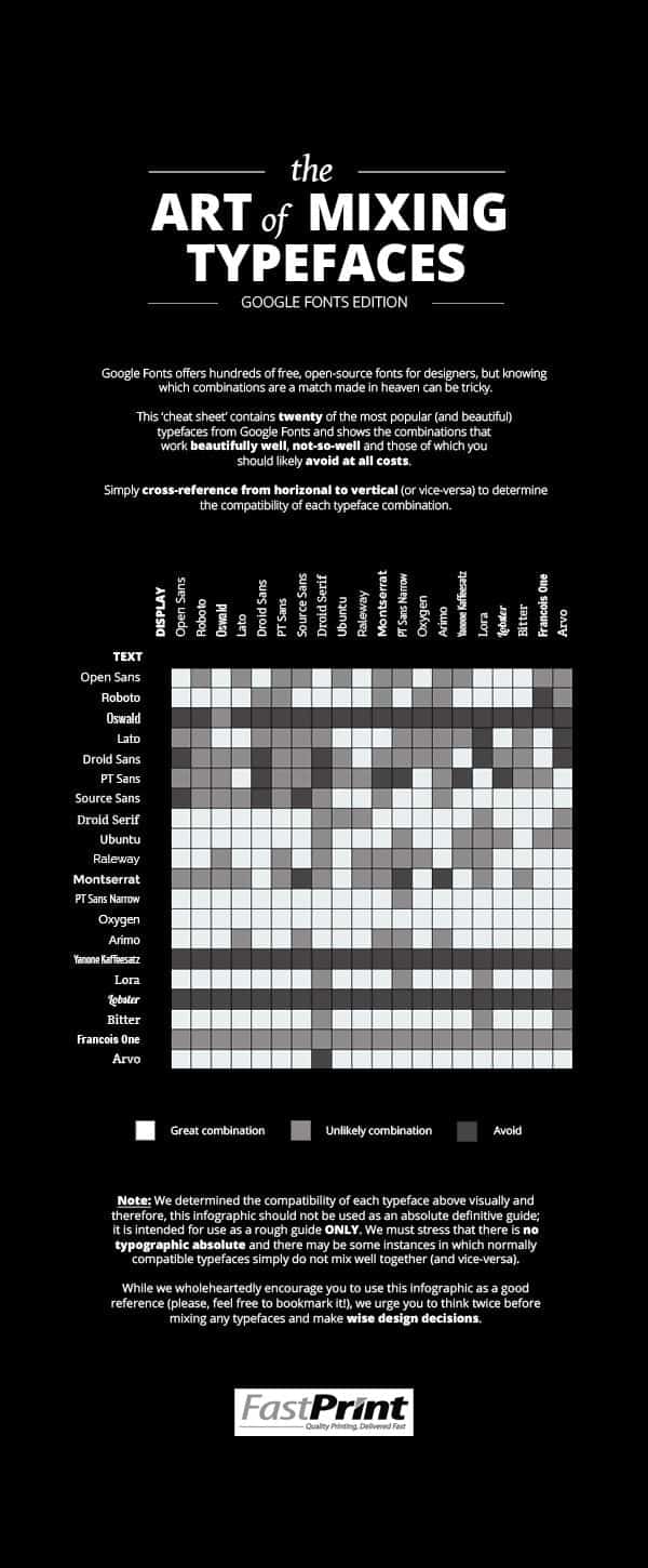
The Importance of Typography
Before we dive into font coordination, it’s essential to understand the fundamental role of typography in web design. Typography is the art and technique of arranging type to make written language readable and visually appealing. It encompasses various aspects of text, including font choice, size, spacing, and layout. Here’s why typography matters:
1. Readability
The primary purpose of text on a website is to convey information. If your text is difficult to read, visitors will quickly lose interest and leave. Proper typography ensures that your content is legible and easy on the eyes.
2. Brand Identity
Fonts can be a powerful tool for establishing and reinforcing your brand’s identity. Consistent font usage across your website helps create a cohesive and memorable brand image.
3. Aesthetics
Typography significantly influences the overall look and feel of your website. The right fonts can enhance the visual appeal and convey the desired mood or tone.
4. User Experience
A well-thought-out typography system contributes to a positive user experience. Visitors should be able to navigate your site effortlessly and understand the content without distractions or confusion.
Now that we understand why typography is important let’s explore the dos and don’ts of font coordination.
The Dos of Font Coordination
When it comes to font coordination, several best practices can help you make the right choices for your website. Let’s delve into these dos:
1. Start with a Font Hierarchy
A font hierarchy is a system that defines the order and usage of fonts on your website. It typically consists of three main levels:
- Primary Font: This is the font used for headings and main content. It should be easy to read and reflect your brand’s personality.
- Secondary Font: Used for subheadings, captions, and other supporting text. It should complement the primary font and provide contrast.
- Tertiary Font: Reserved for special occasions, like quotes or highlighted text. It adds variety and emphasis.
Establishing a clear hierarchy ensures consistency and readability throughout your website.
2. Consider Readability
Always prioritize readability. Choose fonts that are easy to read on various devices and screen sizes. Sans-serif fonts like Arial and Helvetica are commonly used for body text because of their legibility.
3. Limit Font Choices
While there are thousands of fonts available, resist the temptation to use too many. A cluttered mix of fonts can create confusion and make your website look unprofessional. Stick to a maximum of two or three fonts for a clean and cohesive design.
4. Think About Contrast
Contrast is crucial for guiding the reader’s eye and emphasizing key information. Pair fonts with contrasting styles, such as pairing a serif font with a sans-serif font. This contrast will make headings and subheadings stand out.
5. Test on Different Devices
Fonts may appear differently on various devices and browsers. Test your font choices on multiple devices to ensure consistent readability and appearance.
6. Consider Accessibility
Accessibility is a critical aspect of web design. Choose fonts and font sizes that meet accessibility standards, making your content usable for everyone, including those with visual impairments.
7. Use Web-Safe Fonts or Embed Fonts
To ensure your fonts display correctly across different devices and browsers, use web-safe fonts or embed custom fonts using web font services like Google Fonts or Adobe Fonts.
8. Pay Attention to Line Spacing and Kerning
Proper line spacing (leading) and kerning (letter spacing) are essential for legibility. Avoid text that’s too cramped or too spaced out. Experiment with these settings to find the right balance.
The Don’ts of Font Coordination
Now that we’ve covered the dos, let’s explore the font coordination mistakes you should avoid:
1. Using Too Many Fonts
One of the most common mistakes is using too many fonts. A mishmash of fonts can make your website look chaotic and unprofessional. Stick to a limited selection to maintain a cohesive design.
2. Choosing Fonts That Don’t Match Your Brand
Your font choices should align with your brand’s identity. If you have a serious and professional brand, playful and decorative fonts may not be appropriate.
3. Neglecting Mobile-Friendly Fonts
Not all fonts are suitable for small screens. Avoid using overly intricate fonts that become illegible on mobile devices. Always test fonts on different screen sizes.
4. Ignoring Line Length
Long lines of text can be challenging to read. Aim for an optimal line length (around 50-75 characters per line) to improve readability.
5. Using All Caps Excessively
While occasional use of all caps can add emphasis, using them excessively can be hard to read and come across as shouting. Reserve all caps for headings or short phrases.
6. Overly Fancy Fonts
Decorative fonts have their place, but they should be used sparingly. Using overly fancy fonts for body text can be distracting and hinder readability.
7. Inconsistent Font Sizes
Maintain consistency in font sizes throughout your website. Inconsistencies can confuse visitors and disrupt the flow of content.
8. Poor Color Choices
The color of your text matters as much as the font itself. Ensure good contrast between text and background colors to enhance readability.
Advanced Font Pairing Techniques
Once you’ve mastered the basics of font coordination, you can explore advanced font pairing techniques to give your website a unique and polished look. Here are some advanced tips:
1. Contrast with Style
Pair fonts that have contrasting styles. For example, combine a bold sans-serif font with an elegant serif font for a dynamic contrast that draws attention to important elements.
2. Use Font Weight for Emphasis
Vary font weights within the same family to add emphasis without changing the font itself. For instance, you can use a regular weight for body text and a bold weight for headings.
3. Experiment with Font Sizes
Experiment with font sizes to create a hierarchy within your content. Larger fonts for headings, smaller fonts for body text, and medium-sized fonts for subheadings can make your content more scannable.
4. Mix Serif and Sans-Serif Fonts
Combining serif and sans-serif fonts can create a balanced and visually appealing contrast. Use sans-serif for body text and serif for headings, or vice versa.
5. Use Fonts with Similar Proportions
Fonts with similar proportions can create a harmonious and balanced design. Experiment with fonts that share similar x-heights and letter widths for a cohesive look.
Tools for Font Coordination
To streamline the font coordination process, several online tools and resources are available. These tools can help you choose, pair, and implement fonts effectively:
1. Google Fonts
Google Fonts offers a vast collection of web fonts that you can easily embed into your website. The platform provides font pairing recommendations and allows you to test fonts in real-time.
2. Adobe Fonts
Formerly known as Typekit, Adobe Fonts offers a wide range of high-quality fonts for web and print. It seamlessly integrates with Adobe Creative Cloud applications.
3. Font Pairing Tools
Several online tools and websites help you discover font pairings that work well together. These tools analyze fonts and suggest compatible combinations.
4. Typography Generators
Typography generators let you experiment with fonts, sizes, and styles to see how they look together. These tools are great for visualizing font choices before implementing them on your website.
Case Studies: Font Coordination in Action
To better understand the principles of font coordination, let’s look at some real-world examples of websites that have successfully implemented typography strategies:
1. Medium
Medium is known for its clean and reader-friendly design. They use a combination of serif and sans-serif fonts for headings and body text. The fonts are simple, making for a pleasant reading experience.
2. Apple
Apple’s website showcases the power of consistency. They stick to their signature San Francisco font across all devices and platforms, reinforcing their brand identity.
3. H&M
H&M combines sans-serif fonts with bold typography for its online store. The fonts they use are easy to read and reflect the brand’s modern and stylish image.
Conclusion
Font coordination is a critical aspect of web design that can significantly impact your website’s readability, aesthetics, and user experience. By following the dos and don’ts outlined in this guide and experimenting with advanced font pairing techniques, you can create a visually appealing and user-friendly website that leaves a positive impression on your visitors.
Remember that font coordination is not a one-size-fits-all approach. It should align with your brand’s identity and the content you’re presenting. With careful consideration and the right tools, you can master the art of typography and make your website stand out in the digital landscape. So, go ahead, choose your fonts wisely, and craft a web experience that leaves a lasting impression.

Author:
Mark Ford