Are you trying to choose a font to use on your marketing material? Want your font to match the personality of your brand?
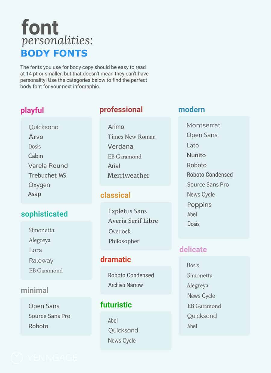
Venngage share the personalities of some of the most common fonts in this infographic.
They break things down as follows:
- Playful
- Professional
- Modern
- Sophisticated
- Classical
- Delicate
- Minimal
- Dramatic
- Futuristic
Check out the infographic for more detail.
Fonts play a crucial role in the identity of a brand. They can evoke emotions, convey messages, and create a lasting impression on your audience. Choosing the right body font is essential to ensure your brand’s voice is communicated effectively. In this post, we’ll explore different font personalities and how they align with various brand identities. By the end, you’ll have a clearer understanding of how to select a body font that complements your brand.
Playful
Choosing a playful font can significantly enhance your brand’s image, especially if you operate in sectors that thrive on creativity and engagement. This section delves deeper into playful fonts, offering small businesses practical tips and guidance on how to effectively implement them into their branding strategy.
Understanding Playful Fonts
Playful fonts are characterized by their whimsical, fun, and lighthearted design. They often have rounded edges, unique shapes, and an informal feel, making them appealing to a younger audience or brands that want to convey a friendly and approachable vibe. Playful fonts can be a powerful tool for storytelling, helping to establish a connection with your audience through visual cues.
Characteristics of Playful Fonts
- Rounded Edges: Fonts with soft, rounded edges appear friendlier and more inviting.
- Quirky Designs: Look for fonts that have unconventional letterforms or unique ligatures.
- Bold Colors: Pairing playful fonts with vibrant colors enhances their appeal and can grab attention.
When to Use Playful Fonts
Playful fonts are ideal for brands that want to create a fun atmosphere. Here are some specific contexts where playful fonts can be most effective:
- Children’s Products: Toys, clothing, and educational materials often benefit from playful typography.
- Creative Agencies: Graphic design firms, marketing agencies, or any business in the creative sector can use playful fonts to convey innovation and creativity.
- Event Promotion: Festivals, parties, or community events can leverage playful fonts to attract attention and create excitement.
Tips for Small Businesses
- Know Your Audience: Understand who your target audience is and how playful fonts will resonate with them. For example, if you’re targeting parents looking for toys for their children, a playful font can create a warm and inviting atmosphere.
- Pairing with Other Fonts: Playful fonts often work best when paired with a more neutral font for body text. This combination ensures readability while maintaining a fun brand identity. Consider using a playful font for headings and a more traditional sans serif or serif font for body text.
- Use Sparingly: While playful fonts can add character to your branding, they should be used selectively. Limit their use to headings, logos, or specific calls to action to maintain professionalism and avoid overwhelming your audience.
- Maintain Readability: Choose playful fonts that are still legible at various sizes. If a font is too stylized, it can become difficult to read, especially in smaller applications like business cards or social media posts. Test your font in different contexts to ensure clarity.
- Consider Brand Personality: Your choice of font should align with your overall brand personality. If your brand is built around fun and creativity, playful fonts can reinforce this identity. However, if you also have serious or professional aspects, ensure that the playful font complements rather than contradicts those elements.
- Create Consistency: Consistency across all branding materials is crucial. If you choose a playful font for your logo, use it in marketing materials, websites, and social media graphics to create a cohesive brand image.
- Test and Gather Feedback: Before finalizing your font choices, test them with your audience. Use surveys or focus groups to gather feedback on how well the fonts communicate your brand’s message. This input can guide your final decision.
- Be Culturally Sensitive: When using playful fonts, be mindful of cultural differences and how font choices may be perceived in different cultures. Certain playful styles may resonate well in some cultures but may be viewed as inappropriate or unprofessional in others.
Examples of Playful Fonts
Here are a few playful font options that small businesses can consider:
- Comic Sans: Often criticized, this font can be effective when used in the right context, such as children’s products.
- Pacifico: A handwritten font that exudes warmth and approachability, making it great for lifestyle brands.
- Bangers: This bold, cartoonish font works well for entertainment-related brands, conveying energy and excitement.
- Poppins: While a geometric sans serif, its rounded edges give it a friendly feel, making it versatile for various applications.
Integrating Playful Fonts into Your Brand
- Logo Design: Incorporate a playful font into your logo to instantly communicate your brand’s fun nature. This can make your brand more memorable and help it stand out.
- Social Media Presence: Use playful fonts in your social media graphics and posts to attract engagement. Bright colors and fun typography can enhance shareability.
- Website Design: Incorporate playful fonts in your website design, particularly in headings and buttons. Ensure that the font complements the overall design and does not hinder user experience.
- Marketing Materials: Apply playful fonts in flyers, brochures, and business cards to create a lively impression. Make sure they align with your brand colors for a consistent look.
- Merchandising: If your business includes merchandise, playful fonts can be great for t-shirts, tote bags, and other products, adding personality and charm.
Conclusion
Using playful fonts can significantly enhance your brand identity, especially for small businesses looking to create a friendly and engaging atmosphere. By understanding your audience, maintaining readability, and ensuring brand consistency, you can effectively integrate playful fonts into your branding strategy. With the right approach, playful fonts can help you connect with your audience, enhance your marketing efforts, and ultimately, build a strong and memorable brand.
Professional
Choosing a professional font is crucial for businesses that aim to project credibility, reliability, and competence. This section explores professional fonts, providing small businesses with practical tips and guidance on effectively incorporating them into their branding strategy.
Understanding Professional Fonts
Professional fonts typically exhibit characteristics such as clean lines, structured forms, and minimal embellishments. They often belong to the serif or sans-serif categories and convey a sense of seriousness and authority, making them suitable for corporate branding, legal services, financial institutions, and other fields where trust and professionalism are paramount.
Characteristics of Professional Fonts
- Simplicity: Professional fonts avoid overly decorative elements, focusing instead on clarity and legibility.
- Balanced Proportions: The letterforms are typically well-proportioned, contributing to a sense of stability and order.
- Neutral Appearance: Many professional fonts have a neutral appearance, making them versatile for various applications without drawing too much attention away from the content.
When to Use Professional Fonts
Professional fonts are ideal for brands that want to establish credibility and trustworthiness. Here are specific contexts where professional fonts can be most effective:
- Corporate Branding: Businesses in finance, law, healthcare, and consulting can benefit from professional fonts that convey authority.
- Formal Communication: Use professional fonts for business reports, proposals, contracts, and official correspondence to maintain a serious tone.
- Website Design: A professional font can enhance your website’s credibility and encourage users to engage with your content.
Tips for Small Businesses
- Choose the Right Font Family: Research different font families that convey professionalism. Common examples include:
- Serif Fonts: Times New Roman, Georgia, and Garamond. These fonts are traditional and often evoke a sense of reliability.
- Sans-Serif Fonts: Arial, Helvetica, and Calibri. These fonts offer a modern and clean look, making them suitable for various professional settings.
- Prioritize Readability: Ensure that the font you choose is easily readable across different mediums. Test your font in various sizes and formats to confirm that it maintains clarity, especially in digital formats where screen resolutions may vary.
- Limit Font Variations: Stick to one or two professional fonts to maintain consistency across all branding materials. Using too many different fonts can create visual chaos and detract from your brand’s professional image.
- Consider Hierarchy: Establish a clear hierarchy within your typography by using different weights (bold, regular) or sizes to differentiate between headings, subheadings, and body text. This enhances readability and guides the audience’s eye through your content.
- Color Selection: When pairing professional fonts with colors, opt for muted or neutral tones that enhance the professional feel. Avoid overly bright or distracting colors, which may undermine the seriousness of your message.
- Incorporate Brand Elements: Ensure that your font choice aligns with your overall brand identity. If your brand has a formal image, choose a more traditional font. For a modern yet professional feel, opt for sans-serif fonts that are sleek and straightforward.
- Use for Essential Communications: Reserve professional fonts for key communications, such as business cards, brochures, presentations, and reports. This creates a consistent brand image and reinforces your professionalism in the eyes of your audience.
- Test and Gather Feedback: Before finalizing your professional font choice, gather feedback from trusted colleagues or customers. Their insights can help you understand how the font is perceived and whether it effectively communicates your brand’s message.
Examples of Professional Fonts
Here are a few professional font options that small businesses can consider:
- Times New Roman: A classic serif font that conveys formality and tradition, often used in legal documents and academic settings.
- Arial: A widely used sans-serif font that offers a clean and modern appearance, suitable for various business applications.
- Roboto: A contemporary sans-serif font designed for digital use, providing a professional look without sacrificing readability.
- Baskerville: A sophisticated serif font that balances elegance with professionalism, ideal for branding in creative fields.
Integrating Professional Fonts into Your Brand
- Logo Design: If your brand operates in a formal industry, incorporate a professional font into your logo design to convey trust and credibility. This can help establish a strong first impression with potential clients.
- Marketing Materials: Use professional fonts in brochures, flyers, and advertisements to create a polished and cohesive look. Ensure that the font aligns with your overall branding strategy.
- Business Communication: Consistently use professional fonts in emails, proposals, and reports to maintain a serious tone. This not only reflects your professionalism but also enhances your brand’s reputation.
- Website Design: Select professional fonts for your website to create a user-friendly experience. Pair the font with ample white space and a clean layout to enhance readability and navigation.
- Social Media Presence: While playful fonts may be appropriate for some social media content, maintain professionalism in your branding by using professional fonts in profile descriptions, promotional graphics, and announcements.
Conclusion
Incorporating professional fonts into your branding strategy is essential for small businesses looking to establish credibility and build trust with their audience. By understanding the characteristics of professional fonts and following best practices, you can effectively convey your brand’s message while maintaining a polished appearance. Whether in your logo, marketing materials, or digital presence, professional fonts can significantly enhance your brand identity and foster a positive perception among your target audience.
Modern
Modern fonts are increasingly popular in today’s design landscape, appealing to businesses that want to convey a sleek, contemporary aesthetic. This section provides an in-depth exploration of modern fonts, offering practical tips and guidance for small businesses looking to effectively implement them into their branding strategy.
Understanding Modern Fonts
Modern fonts are characterized by their clean lines, geometric shapes, and minimalistic designs. They often eschew the ornamental features found in traditional fonts, opting for simplicity and functionality. Modern fonts can evoke feelings of innovation, forward-thinking, and sophistication, making them ideal for startups, tech companies, and brands aiming to appeal to a youthful, contemporary audience.
Characteristics of Modern Fonts
- Geometric Shapes: Modern fonts often feature geometric forms, giving them a structured and organized appearance.
- Clean Lines: The absence of excessive embellishments contributes to their straightforwardness and ease of reading.
- Asymmetry: Many modern fonts embrace asymmetrical designs that create visual interest without overwhelming the viewer.
- Monospaced Options: Some modern fonts employ monospaced designs, where each character occupies the same amount of horizontal space, enhancing clarity and readability.
When to Use Modern Fonts
Modern fonts are suitable for brands that want to project an image of innovation and contemporary style. Here are specific contexts where modern fonts can be most effective:
- Technology Companies: Tech startups and companies focusing on cutting-edge products can benefit from modern fonts to communicate their innovative nature.
- Creative Agencies: Marketing firms, design studios, and other creative agencies can use modern fonts to convey a fresh and trendy image.
- E-Commerce Websites: Modern fonts can enhance the user experience on e-commerce sites, making them more appealing and accessible to a tech-savvy audience.
Tips for Small Businesses
- Select the Right Font Family: Research various modern font families that align with your brand’s personality. Popular modern font families include:
- Futura: A geometric sans-serif font known for its clean lines and contemporary feel.
- Montserrat: A versatile sans-serif font that combines modernity with friendliness, making it suitable for various applications.
- Avenir: A classic modern font that balances elegance with readability, perfect for professional branding.
- Open Sans: A humanist sans-serif font that offers a modern appearance with excellent legibility, particularly on digital platforms.
- Focus on Readability: While modern fonts are often sleek and stylish, prioritize readability. Test your font choices in various sizes and contexts to ensure they remain clear and legible, particularly for mobile users.
- Limit Variations: Choose one or two modern fonts for your branding to maintain consistency. Avoid using too many different fonts, which can create visual clutter and dilute your brand identity.
- Experiment with Weights: Modern fonts often come in various weights (light, regular, bold). Use these weights to establish a hierarchy in your typography, differentiating between headings, subheadings, and body text.
- Color Pairings: When using modern fonts, consider pairing them with bold or muted colors that enhance their aesthetic appeal. Bright, vibrant colors can draw attention, while more subdued tones can create a sophisticated look.
- Use Negative Space: Embrace negative space (the area around and between elements) in your designs to create a clean and modern look. This can enhance the overall aesthetic and improve readability.
- Test and Gather Feedback: Before finalizing your modern font choices, gather feedback from colleagues or potential customers. Understanding how your audience perceives the font can help you make informed decisions.
- Integrate with Other Design Elements: Ensure that your modern fonts work well with other design elements, such as logos, icons, and images. A cohesive design enhances brand recognition and strengthens your overall image.
Examples of Modern Fonts
Here are a few modern font options that small businesses can consider:
- Helvetica: A widely recognized sans-serif font known for its versatility and clean lines, making it a popular choice across various industries.
- Proxima Nova: A modern sans-serif font that bridges the gap between classic and contemporary styles, offering a fresh, professional look.
- Raleway: An elegant sans-serif font that adds a touch of sophistication to modern designs while maintaining a minimalist aesthetic.
- Gotham: A geometric sans-serif font characterized by its strong, modern appearance, often used in branding and advertising.
Integrating Modern Fonts into Your Brand
- Logo Design: Incorporate a modern font into your logo to convey a contemporary image. This can help your brand stand out and appeal to a modern audience.
- Website Design: Select modern fonts for your website to create a sleek, user-friendly experience. Ensure that the font is legible across all devices, especially on mobile.
- Marketing Materials: Use modern fonts in brochures, flyers, and advertisements to maintain a fresh and appealing look. Ensure that the fonts align with your overall branding strategy.
- Social Media Presence: Leverage modern fonts in your social media graphics to create a cohesive and visually appealing brand identity. Consistency across platforms reinforces brand recognition.
- Email Marketing: Apply modern fonts in your email campaigns to enhance engagement and readability. Ensure that the fonts display correctly across different email clients.
Conclusion
Incorporating modern fonts into your branding strategy is essential for small businesses looking to convey an image of innovation and sophistication. By understanding the characteristics of modern fonts and following best practices, you can effectively communicate your brand’s message while appealing to a contemporary audience. Whether in your logo, marketing materials, or digital presence, modern fonts can significantly enhance your brand identity and help you connect with your target market.
Sophisticated
Sophisticated fonts convey elegance, refinement, and a sense of luxury, making them an excellent choice for businesses aiming to attract a discerning clientele. This section provides an in-depth exploration of sophisticated fonts, along with practical tips and guidance for small businesses looking to effectively incorporate them into their branding strategy.
Understanding Sophisticated Fonts
Sophisticated fonts typically exhibit characteristics such as intricate details, classic forms, and a polished appearance. They often belong to the serif category or feature unique script styles that convey a sense of exclusivity and high-end appeal. Businesses in luxury goods, high-end services, and creative industries can benefit from sophisticated fonts to communicate their brand values effectively.
Characteristics of Sophisticated Fonts
- Serif Features: Many sophisticated fonts are serif-based, which adds an element of tradition and formality. The serifs (the small lines at the ends of characters) can enhance the overall elegance of the font.
- Intricate Letterforms: Sophisticated fonts often feature unique, intricate letterforms that can add character and distinction to your branding.
- Refined Aesthetics: These fonts tend to have a polished and refined look, suitable for high-end branding and marketing materials.
- Elegant Curves and Flourishes: Sophisticated fonts may include elegant curves and flourishes, providing a sense of artistry and creativity.
When to Use Sophisticated Fonts
Sophisticated fonts are ideal for brands that want to project an image of luxury, exclusivity, and professionalism. Here are specific contexts where sophisticated fonts can be most effective:
- Luxury Brands: Businesses in the fashion, jewelry, and automotive industries can use sophisticated fonts to enhance their brand image.
- Creative Agencies: Design studios, marketing firms, and other creative agencies can benefit from sophisticated fonts to showcase their artistic flair.
- High-End Services: Service-oriented businesses such as consulting firms, event planning, and fine dining restaurants can leverage sophisticated fonts to communicate quality and exclusivity.
Tips for Small Businesses
- Choose the Right Font Family: Research various sophisticated font families that align with your brand’s personality. Consider fonts such as:
- Bodoni: A classic serif font known for its high contrast and elegant letterforms, perfect for luxury branding.
- Didot: Another elegant serif font that conveys sophistication and refinement, often used in fashion and editorial contexts.
- Playfair Display: A modern serif font that combines classic design with contemporary appeal, ideal for upscale branding.
- Lora: A well-balanced serif font with beautiful curves, suitable for both print and digital applications.
- Prioritize Readability: While sophistication often comes with intricate designs, it’s crucial to ensure readability. Test your font choices at various sizes and formats to maintain clarity, especially in smaller applications.
- Limit Variations: Stick to one or two sophisticated fonts to maintain consistency in your branding. Using too many different fonts can create visual chaos and dilute your brand identity.
- Establish Hierarchy: Create a clear hierarchy in your typography by using different weights or sizes to differentiate between headings, subheadings, and body text. This enhances readability and guides the audience’s eye through your content.
- Use Color Wisely: Pair sophisticated fonts with muted or elegant color palettes to enhance their visual appeal. Avoid overly bright or distracting colors, which may undermine the sophistication of your message.
- Incorporate Brand Elements: Ensure that your font choice aligns with your overall brand identity. If your brand has a formal and luxurious image, choose a more traditional font. For a modern yet sophisticated feel, opt for serif fonts with contemporary characteristics.
- Utilize Negative Space: Embrace negative space in your designs to enhance the overall elegance of your typography. A clean layout with ample whitespace can elevate the sophistication of your branding.
- Test and Gather Feedback: Before finalizing your sophisticated font choices, gather feedback from trusted colleagues or customers. Their insights can help you understand how the font is perceived and whether it effectively communicates your brand’s message.
Examples of Sophisticated Fonts
Here are a few sophisticated font options that small businesses can consider:
- Garamond: A timeless serif font known for its elegance and readability, often used in high-end publications and branding.
- Serifa: A sophisticated slab-serif font that combines modernity with classic appeal, suitable for upscale branding.
- Miller: A well-crafted serif font that offers sophistication and versatility, ideal for luxury brands and professional services.
- Cormorant Garamond: A refined serif font with a contemporary twist, providing an upscale appearance perfect for branding.
Integrating Sophisticated Fonts into Your Brand
- Logo Design: Incorporate a sophisticated font into your logo to convey a high-end image. This can help your brand stand out and attract a more upscale audience.
- Marketing Materials: Use sophisticated fonts in brochures, flyers, and advertisements to create a polished and cohesive look. Ensure that the fonts align with your overall branding strategy.
- Website Design: Select sophisticated fonts for your website to create a luxurious and user-friendly experience. Ensure that the font is legible across all devices, especially on mobile.
- Social Media Presence: Leverage sophisticated fonts in your social media graphics to create a cohesive and visually appealing brand identity. Consistency across platforms reinforces brand recognition.
- Business Communication: Apply sophisticated fonts in official documents, presentations, and email communications to maintain a formal tone. This reflects your professionalism and enhances your brand’s reputation.
Conclusion
Incorporating sophisticated fonts into your branding strategy is essential for small businesses looking to convey an image of elegance and luxury. By understanding the characteristics of sophisticated fonts and following best practices, you can effectively communicate your brand’s message while appealing to a discerning audience. Whether in your logo, marketing materials, or digital presence, sophisticated fonts can significantly enhance your brand identity and help you connect with your target market.
Classical
Classical fonts evoke a sense of tradition, reliability, and timelessness, making them an excellent choice for businesses that want to convey a rich heritage or an air of authority. This section delves into the characteristics of classical fonts, when to use them, and practical tips for small businesses to effectively incorporate them into their branding strategy.
Understanding Classical Fonts
Classical fonts often have a historical lineage and are characterized by their elegant, ornamental features. They are typically serif fonts, emphasizing readability and grace. Businesses in sectors like finance, law, education, and luxury goods can utilize classical fonts to reinforce their credibility and evoke a sense of tradition.
Characteristics of Classical Fonts
- Serif Design: Most classical fonts are serif typefaces, featuring small lines or strokes regularly attached to the ends of a larger stroke in a letter. These serifs enhance readability and add an element of sophistication.
- Traditional Letterforms: Classical fonts often have well-proportioned and balanced letterforms that reflect time-honored design principles, creating an aesthetically pleasing look.
- Elegant Detailing: Many classical fonts feature ornate details, such as swashes, ligatures, and curves, that contribute to their overall beauty and refinement.
- Versatility: Classical fonts can be versatile in their applications, suitable for both print and digital formats, making them an excellent choice for a variety of branding needs.
When to Use Classical Fonts
Classical fonts are ideal for brands that want to project an image of trustworthiness, authority, and tradition. Here are specific contexts where classical fonts can be most effective:
- Financial Institutions: Banks and investment firms can benefit from classical fonts to instill confidence and reliability in their clientele.
- Legal Firms: Law offices often utilize classical fonts to convey professionalism and a sense of heritage.
- Educational Institutions: Schools and universities can adopt classical fonts to reflect their long-standing traditions and commitment to excellence.
- Luxury Goods: High-end brands, especially in fashion and jewelry, can leverage classical fonts to convey sophistication and timeless elegance.
Tips for Small Businesses
- Select the Right Font Family: Research various classical font families that align with your brand’s personality. Consider fonts such as:
- Times New Roman: A classic serif font that’s highly legible and widely recognized, suitable for formal communications.
- Garamond: An elegant serif font known for its readability and aesthetic appeal, often used in publishing.
- Baskerville: A transitional serif font that exudes sophistication and is ideal for high-end branding.
- Georgia: A contemporary serif font designed for clarity on screens, making it versatile for both print and digital use.
- Emphasize Readability: While classical fonts can be ornate, readability should always be a priority. Test your font choices at various sizes and formats to ensure clarity, especially in smaller applications.
- Limit Font Variations: Stick to one or two classical fonts to maintain consistency in your branding. Using too many different fonts can create confusion and dilute your brand identity.
- Establish a Clear Hierarchy: Create a clear typography hierarchy by using different weights and sizes to differentiate between headings, subheadings, and body text. This enhances readability and guides the audience through your content.
- Pair with Complementary Fonts: Consider pairing classical fonts with complementary sans-serif fonts to create a harmonious design. This can add visual interest and help establish a modern yet timeless aesthetic.
- Incorporate a Limited Color Palette: Classical fonts often shine in more muted or traditional color palettes. Stick to colors that enhance the font’s elegance and readability, such as deep blues, rich greens, or classic black and white.
- Utilize Negative Space: Embrace negative space in your designs to highlight the beauty of classical fonts. A clean layout with ample whitespace can elevate the overall sophistication of your branding.
- Test and Gather Feedback: Before finalizing your classical font choices, seek feedback from colleagues or trusted customers. Understanding how your audience perceives the font can help you make informed decisions.
Examples of Classical Fonts
Here are a few classical font options that small businesses can consider:
- Bodoni: A classic serif font known for its high contrast and elegant letterforms, perfect for luxury branding.
- Palatino: An elegant serif font with a historical flair, ideal for formal documents and high-end marketing materials.
- Bookman: A serif font that combines readability with an inviting appearance, suitable for both print and digital applications.
- Merriweather: A modern serif font designed for readability, making it a versatile choice for online content.
Integrating Classical Fonts into Your Brand
- Logo Design: Incorporate a classical font into your logo to convey a sense of tradition and authority. This can help your brand stand out and attract a more discerning audience.
- Marketing Materials: Use classical fonts in brochures, business cards, and other print materials to create a polished and cohesive look. Ensure that the fonts align with your overall branding strategy.
- Website Design: Select classical fonts for your website to create a timeless and user-friendly experience. Ensure that the font is legible across all devices, particularly on mobile.
- Social Media Presence: Leverage classical fonts in your social media graphics to create a cohesive and visually appealing brand identity. Consistency across platforms reinforces brand recognition.
- Official Communication: Apply classical fonts in official documents, presentations, and email communications to maintain a formal tone. This reflects professionalism and enhances your brand’s reputation.
Conclusion
Incorporating classical fonts into your branding strategy is essential for small businesses looking to convey an image of authority, reliability, and tradition. By understanding the characteristics of classical fonts and following best practices, you can effectively communicate your brand’s message while appealing to a sophisticated audience. Whether in your logo, marketing materials, or digital presence, classical fonts can significantly enhance your brand identity and help you connect with your target market.
Delicate
Delicate fonts are characterized by their lightness, elegance, and subtlety, making them ideal for brands that wish to convey a sense of grace, refinement, and sensitivity. This section explores the defining traits of delicate fonts, suitable contexts for their use, and practical tips for small businesses to integrate them effectively into their branding strategy.
Understanding Delicate Fonts
Delicate fonts are often sans-serif or serif typefaces that exhibit fine strokes, soft curves, and a gentle overall appearance. They evoke feelings of sophistication and charm, making them suitable for brands that focus on aesthetics, beauty, and attention to detail. Businesses in sectors like fashion, beauty, weddings, and artisanal products can benefit from delicate fonts to create a warm and inviting brand presence.
Characteristics of Delicate Fonts
- Fine Strokes: Delicate fonts usually have thin, graceful strokes that create an airy, light feel, distinguishing them from bolder, heavier fonts.
- Curvilinear Shapes: Many delicate fonts feature soft, rounded shapes that contribute to a gentle and approachable appearance.
- Elegant Letterforms: Delicate fonts often possess unique letterforms that add character and distinction, enhancing their aesthetic appeal.
- Feminine Touch: While not exclusively feminine, many delicate fonts carry a subtle, feminine quality, making them suitable for brands targeting female audiences or products.
When to Use Delicate Fonts
Delicate fonts are best suited for brands that want to project an image of elegance, charm, and warmth. Here are specific contexts where delicate fonts can be particularly effective:
- Fashion Brands: Clothing and accessory brands that emphasize style and beauty can leverage delicate fonts to enhance their visual identity.
- Beauty and Skincare: Cosmetics and skincare brands can use delicate fonts to convey a sense of luxury and gentleness.
- Weddings and Events: Businesses in the wedding industry—such as planners, florists, and invitation designers—can benefit from delicate fonts to evoke romance and elegance.
- Artisanal Products: Brands focusing on handmade or artisanal goods can use delicate fonts to reflect craftsmanship and attention to detail.
Tips for Small Businesses
- Choose the Right Font Family: Research various delicate font families that align with your brand’s personality. Consider fonts such as:
- Lora: A serif font that combines elegance with readability, making it perfect for both print and digital applications.
- Alex Brush: A flowing script font that conveys a sense of sophistication and delicacy, ideal for invitations and branding.
- Bodoni Moda: A modern take on a classic serif font that features delicate strokes and a refined look, suitable for luxury branding.
- Raleway: A sans-serif font with a clean and elegant appearance, offering versatility for a variety of branding needs.
- Prioritize Readability: While delicacy is important, readability should always be a priority. Test your font choices at various sizes and formats to ensure clarity, especially in smaller applications.
- Limit Font Variations: Stick to one or two delicate fonts to maintain consistency in your branding. Using too many different fonts can create visual confusion and dilute your brand identity.
- Create a Clear Hierarchy: Establish a typography hierarchy by using different weights and sizes to differentiate between headings, subheadings, and body text. This enhances readability and guides the audience through your content.
- Pair with Complementary Fonts: Consider pairing delicate fonts with stronger, bolder typefaces to create a visual balance. This can help emphasize key messages while maintaining an overall sense of elegance.
- Use Color Strategically: Pair delicate fonts with soft, muted color palettes to enhance their visual appeal. Pastel colors or muted tones can complement the lightness of the font and create a harmonious design.
- Embrace Whitespace: Utilize negative space effectively in your designs to highlight the beauty of delicate fonts. A clean layout with ample whitespace can elevate the overall sophistication of your branding.
- Test and Gather Feedback: Before finalizing your delicate font choices, gather feedback from trusted colleagues or customers. Their insights can help you understand how the font is perceived and whether it effectively communicates your brand’s message.
Examples of Delicate Fonts
Here are a few delicate font options that small businesses can consider:
- Garamond: An elegant serif font known for its lightness and readability, often used in high-end publications and branding.
- Dancing Script: A casual, cursive font that offers a friendly and inviting feel, suitable for social media and marketing materials.
- Cinzel: A modern serif font inspired by classical Roman inscriptions, providing a delicate yet sophisticated appearance.
- Quicksand: A rounded sans-serif font that combines simplicity with a friendly aesthetic, ideal for contemporary branding.
Integrating Delicate Fonts into Your Brand
- Logo Design: Incorporate a delicate font into your logo to convey elegance and charm. This can help your brand stand out and appeal to a more sophisticated audience.
- Marketing Materials: Use delicate fonts in brochures, flyers, and advertisements to create a refined and inviting look. Ensure that the fonts align with your overall branding strategy.
- Website Design: Select delicate fonts for your website to create a warm and user-friendly experience. Ensure that the font is legible across all devices, particularly on mobile.
- Social Media Presence: Leverage delicate fonts in your social media graphics to create a cohesive and visually appealing brand identity. Consistency across platforms reinforces brand recognition.
- Product Packaging: Consider using delicate fonts in your product packaging to enhance the perceived value and aesthetic appeal of your offerings. This can attract customers and encourage purchases.
Conclusion
Incorporating delicate fonts into your branding strategy is essential for small businesses looking to convey an image of elegance, charm, and sophistication. By understanding the characteristics of delicate fonts and following best practices, you can effectively communicate your brand’s message while appealing to your target audience. Whether in your logo, marketing materials, or digital presence, delicate fonts can significantly enhance your brand identity and help you connect with discerning customers.
Minimal
Minimal fonts embody simplicity, clarity, and functionality, making them a popular choice for brands that want to convey a clean and modern image. This section delves into the defining features of minimal fonts, appropriate contexts for their use, and practical tips for small businesses to effectively incorporate them into their branding strategies.
Understanding Minimal Fonts
Minimal fonts are characterized by their straightforward designs, often featuring clean lines, geometric shapes, and a lack of excessive embellishments. These fonts focus on legibility and simplicity, making them ideal for brands that prioritize a sleek and contemporary aesthetic. Businesses in tech, fashion, lifestyle, and wellness often adopt minimal fonts to create an impression of efficiency and modernity.
Characteristics of Minimal Fonts
- Simplicity: Minimal fonts have a straightforward design with no unnecessary decorations, allowing for easy readability and a clean appearance.
- Geometric Shapes: Many minimal fonts use geometric forms, such as circles and rectangles, contributing to their modern look.
- Open Spaces: Minimal fonts often feature ample whitespace within and around the letters, enhancing readability and visual clarity.
- Versatility: These fonts can be used in various applications, from print materials to digital platforms, making them highly adaptable.
When to Use Minimal Fonts
Minimal fonts are best suited for brands that want to project an image of efficiency, modernity, and sophistication. Here are specific contexts where minimal fonts can be particularly effective:
- Tech Companies: Brands in the tech industry often use minimal fonts to convey innovation, simplicity, and functionality.
- Fashion and Lifestyle Brands: Minimal fonts can enhance a brand’s aesthetic, particularly for modern and luxury fashion labels that focus on clean lines and sophistication.
- Wellness and Health: Brands in the wellness sector often adopt minimal fonts to project a sense of clarity and focus, aligning with their message of well-being.
- Creative Agencies: Design and creative agencies can benefit from minimal fonts to showcase their expertise and commitment to modern design principles.
Tips for Small Businesses
- Choose the Right Font Family: Research various minimal font families that resonate with your brand’s personality. Consider fonts such as:
- Helvetica: A timeless sans-serif font known for its clean lines and versatility, suitable for a range of applications.
- Futura: A geometric sans-serif font that offers a modern look, making it great for brands seeking a contemporary feel.
- Montserrat: A modern, geometric sans-serif font that works well in both digital and print contexts, providing a clean and professional appearance.
- Roboto: A widely used sans-serif font that combines geometric forms with friendly curves, ideal for tech and modern brands.
- Prioritize Legibility: Ensure that your chosen minimal fonts are easily readable across various platforms and sizes. Test your fonts in different contexts to confirm clarity.
- Maintain Consistency: Limit the use of font styles to one or two minimal fonts to create a cohesive brand identity. Consistency across all branding materials strengthens brand recognition.
- Use Font Weight Strategically: Experiment with different font weights to establish a clear hierarchy in your designs. This helps guide the viewer’s attention and enhances readability.
- Incorporate Whitespace: Utilize negative space effectively in your designs. Ample whitespace not only enhances the minimal aesthetic but also allows your content to breathe, improving overall clarity.
- Pair with Complementary Fonts: Consider pairing minimal fonts with softer or more decorative typefaces to create visual contrast and interest. This can help highlight key messages while maintaining a modern aesthetic.
- Use Color Wisely: Minimal fonts work well with monochromatic or muted color palettes. Experiment with subtle color variations to enhance your brand’s identity without overwhelming the design.
- Test and Gather Feedback: Before finalizing your minimal font choices, seek feedback from colleagues or target customers. Their insights can help determine if the font effectively communicates your brand’s message and resonates with your audience.
Examples of Minimal Fonts
Here are a few minimal font options that small businesses can consider:
- Avenir: A geometric sans-serif font that combines modernity with elegance, suitable for various branding applications.
- Open Sans: A humanist sans-serif font that offers excellent legibility and a friendly appearance, ideal for digital use.
- Lato: A sans-serif font that balances warmth and professionalism, making it suitable for a wide range of businesses.
- Source Sans Pro: A clean and modern sans-serif font that works well for both print and digital applications, ensuring readability across various formats.
Integrating Minimal Fonts into Your Brand
- Logo Design: Incorporate a minimal font into your logo to create a clean and professional look. This can help establish a strong visual identity for your brand.
- Marketing Materials: Use minimal fonts in brochures, flyers, and advertisements to maintain a contemporary and professional appearance. This enhances the effectiveness of your marketing efforts.
- Website Design: Select minimal fonts for your website to create a streamlined and user-friendly experience. Ensure that the fonts are legible on all devices, particularly mobile.
- Social Media Presence: Leverage minimal fonts in your social media graphics to create a cohesive and polished brand identity. Consistency across platforms reinforces brand recognition.
- Product Packaging: Consider using minimal fonts in your product packaging to enhance the perceived value and modernity of your offerings. This can attract customers and create a lasting impression.
Conclusion
Incorporating minimal fonts into your branding strategy is essential for small businesses aiming to convey an image of clarity, modernity, and sophistication. By understanding the characteristics of minimal fonts and following best practices, you can effectively communicate your brand’s message while appealing to your target audience. Whether in your logo, marketing materials, or digital presence, minimal fonts can significantly enhance your brand identity and help you connect with customers seeking simplicity and elegance.
Dramatic
Dramatic fonts are characterized by their bold, expressive, and often elaborate designs. They can evoke strong emotions, make statements, and create memorable brand identities. This section explores the features of dramatic fonts, appropriate contexts for their use, and practical tips for small businesses looking to leverage these fonts effectively in their branding strategies.
Understanding Dramatic Fonts
Dramatic fonts stand out due to their unique and often exaggerated characteristics. These fonts can include ornate serifs, unconventional shapes, and dynamic letterforms that capture attention and convey strong messages. When used correctly, dramatic fonts can help brands establish a distinctive identity and create a memorable visual presence.
Characteristics of Dramatic Fonts
- Boldness: Dramatic fonts often feature thick, heavy strokes that command attention and convey strength. Their bold nature makes them ideal for headlines and key messaging.
- Expressiveness: These fonts can evoke a wide range of emotions, from excitement and passion to elegance and sophistication. Their expressive nature allows brands to connect with their audience on a deeper level.
- Unique Letterforms: Dramatic fonts frequently incorporate unconventional shapes and styles, making them visually striking and memorable. This uniqueness can set a brand apart from competitors.
- Varied Styles: Dramatic fonts can range from vintage and ornate to modern and edgy, offering a broad spectrum of options for different branding needs.
When to Use Dramatic Fonts
Dramatic fonts are best suited for brands that want to make a bold statement or convey a strong personality. Here are specific contexts where dramatic fonts can be particularly effective:
- Fashion Brands: High-end fashion labels often use dramatic fonts in their branding to evoke luxury and style.
- Entertainment Industry: Film, music, and event promotion often rely on dramatic fonts to convey excitement and energy.
- Art and Design: Creative agencies, galleries, and artists can benefit from dramatic fonts that reflect their artistic vision and passion.
- Culinary Brands: Restaurants and food products can use dramatic fonts to convey creativity and evoke appetizing imagery.
Tips for Small Businesses
- Choose the Right Dramatic Font: Research various dramatic font families that resonate with your brand’s personality. Consider fonts such as:
- Baskerville: A classic serif font known for its elegance and sophistication, making it suitable for luxury brands.
- Playfair Display: An elegant serif font that combines traditional and modern elements, ideal for fashion and lifestyle brands.
- Bebas Neue: A bold sans-serif font with strong lines, perfect for creating impactful headlines in advertising and branding.
- Raleway: A stylish sans-serif font that offers both drama and readability, suitable for creative businesses.
- Establish a Clear Hierarchy: Use dramatic fonts primarily for headlines or key messages, as their boldness can overpower smaller text. Create a hierarchy by pairing dramatic fonts with more subdued body fonts to maintain readability.
- Limit Usage: While dramatic fonts can be eye-catching, overusing them can lead to cluttered designs. Use them sparingly in your branding to highlight key messages or elements without overwhelming your audience.
- Pair with Simple Fonts: Complement dramatic fonts with simple, clean typefaces to balance the visual impact. This creates contrast and ensures that your message remains clear and legible.
- Consider Color and Background: Dramatic fonts often work best with contrasting colors and clean backgrounds. Ensure that the color palette enhances the font’s impact while maintaining readability.
- Create a Strong Brand Message: Use dramatic fonts to reflect your brand’s values and personality. Consider the emotions you want to evoke and choose fonts that align with those feelings.
- Test for Readability: Before finalizing your font choices, test them across different mediums, including print, digital, and social media. Ensure that the fonts are legible at various sizes and distances.
- Use Dramatic Fonts for Specific Campaigns: Leverage dramatic fonts in marketing campaigns or promotions that require a strong visual presence. This can include event posters, social media graphics, and website banners.
- Align with Brand Storytelling: Incorporate dramatic fonts into your brand storytelling efforts. Use them in key messages that resonate with your audience, helping to create a memorable brand narrative.
- Gather Feedback: Seek feedback from your target audience regarding your font choices. Understanding how they perceive your branding can help refine your approach and ensure it aligns with their expectations.
Examples of Dramatic Fonts
Here are a few dramatic font options that small businesses can consider:
- Cinzel: A serif font inspired by classical Roman inscriptions, perfect for brands looking to convey elegance and heritage.
- Oswald: A bold sans-serif font that offers a modern and impactful look, suitable for various applications.
- Lobster: A playful script font that can evoke excitement and energy, making it great for casual or fun branding.
- Abril Fatface: A bold serif font with thick strokes, ideal for fashion and creative brands looking to make a statement.
Integrating Dramatic Fonts into Your Brand
- Logo Design: Incorporate a dramatic font into your logo to create a striking visual identity. This can help your brand stand out and be easily recognizable.
- Marketing Materials: Use dramatic fonts in brochures, flyers, and advertisements to create eye-catching designs that attract attention and communicate your brand message effectively.
- Website Design: Select dramatic fonts for your website’s headlines and call-to-action buttons to create a memorable user experience. Ensure that the font is legible on all devices, particularly mobile.
- Social Media Presence: Leverage dramatic fonts in your social media graphics to create a consistent and visually appealing brand identity. This can enhance engagement and brand recognition.
- Event Promotions: Use dramatic fonts in event marketing materials, such as posters and tickets, to convey excitement and attract attendees. This can enhance the overall experience of your brand’s events.
Conclusion
Incorporating dramatic fonts into your branding strategy can significantly enhance your brand’s visual identity and help convey strong emotions. By understanding the characteristics of dramatic fonts and following best practices, small businesses can create impactful designs that resonate with their target audience. Whether in your logo, marketing materials, or digital presence, dramatic fonts can elevate your brand and help you connect with customers looking for bold and expressive experiences.
Futuristic
Futuristic fonts embody innovation, technology, and modernity, making them ideal for brands that want to position themselves as forward-thinking and cutting-edge. These fonts often feature sleek lines, geometric shapes, and unique letterforms that convey a sense of progress and possibility. In this section, we’ll explore the characteristics of futuristic fonts, appropriate contexts for their use, and practical tips for small businesses looking to effectively integrate these fonts into their branding.
Understanding Futuristic Fonts
Futuristic fonts are designed to evoke feelings of modernity and technological advancement. They often showcase streamlined aesthetics, minimalistic designs, and unique character structures that challenge traditional typography norms. These fonts can help brands convey a message of innovation, creativity, and forward-thinking solutions, making them particularly appealing to technology-driven industries and creative fields.
Characteristics of Futuristic Fonts
- Geometric Shapes: Many futuristic fonts utilize geometric shapes, such as circles, squares, and triangles, in their letterforms. This design approach gives them a clean and modern appearance.
- Sleek Lines: Futuristic fonts often feature smooth, flowing lines that convey a sense of motion and progress. These lines can enhance the readability and appeal of the font.
- Unique Letterforms: Futuristic fonts frequently include unconventional letterforms that may be abstract or stylized. This uniqueness can help brands stand out and create a memorable identity.
- Minimalistic Design: Many futuristic fonts embrace a minimalistic approach, stripping away unnecessary embellishments to focus on simplicity and clarity. This can help convey a modern and professional image.
When to Use Futuristic Fonts
Futuristic fonts are particularly suitable for brands that want to project an image of innovation, technology, or cutting-edge design. Here are specific contexts where futuristic fonts can be particularly effective:
- Technology Companies: Startups and established tech companies can use futuristic fonts in their branding to convey a sense of advancement and creativity.
- Gaming Industry: Game developers and publishers often leverage futuristic fonts to create an immersive experience that resonates with their audience.
- Design and Creative Agencies: Agencies that focus on innovative design solutions can benefit from futuristic fonts that reflect their forward-thinking ethos.
- Automotive Brands: Car manufacturers, especially those focusing on electric or autonomous vehicles, can use futuristic fonts to emphasize their commitment to innovation.
Tips for Small Businesses
- Choose the Right Futuristic Font: Research various futuristic font families to find one that aligns with your brand identity. Some popular options include:
- Orbitron: A geometric sans-serif font that conveys a space-age feel, suitable for tech and gaming brands.
- Exo: A modern sans-serif font with rounded edges and a sleek design, perfect for companies emphasizing innovation.
- Neuropolitical: A stylish font that combines futurism with readability, making it ideal for various applications.
- Rajdhani: A versatile font that balances geometric shapes with a contemporary look, suitable for digital and tech brands.
- Establish a Clear Brand Identity: Ensure that your chosen futuristic font reflects your brand’s mission, values, and target audience. Align the font style with your overall branding strategy to create a cohesive identity.
- Use Futuristic Fonts Sparingly: Due to their unique and bold nature, futuristic fonts are best used for headlines, logos, or key messaging rather than body text. Pair them with simpler fonts for a balanced and legible design.
- Create Contrast with Simpler Fonts: To enhance readability, combine futuristic fonts with clean, minimalist body fonts. This contrast will help ensure that your messaging remains clear and engaging.
- Test for Legibility: Before finalizing your font choices, test them across various platforms, such as websites, social media, and print materials. Ensure that the fonts are legible at different sizes and in various contexts.
- Consider Your Color Palette: Futuristic fonts often work well with vibrant colors and high contrast. Ensure that your color choices complement the font’s modern aesthetic and enhance readability.
- Integrate into Digital Presence: Leverage futuristic fonts in your website design, app interfaces, and social media graphics. Consistent use across digital platforms can reinforce your brand identity and create a cohesive user experience.
- Utilize for Key Campaigns: Incorporate futuristic fonts in marketing campaigns that focus on innovation, new product launches, or technology-related messaging. This can create a strong visual impact and attract attention.
- Be Mindful of Trends: Stay updated on design trends and how they impact the perception of futuristic fonts. While it’s essential to convey innovation, ensure that your font choices remain timeless and relevant.
- Gather Feedback: Seek feedback from your audience regarding your font choices and overall branding. Understanding their perception can help refine your approach and ensure it aligns with their expectations.
Examples of Futuristic Fonts
Here are a few futuristic font options that small businesses can consider:
- Coda: A sans-serif font with rounded edges and a modern design, making it suitable for tech and creative brands.
- Ailerons: A stylish font inspired by aircraft design, perfect for automotive and aviation brands aiming for a sleek look.
- Digital: A font that mimics digital displays, ideal for tech companies and gaming brands looking for an authentic futuristic vibe.
- Varela Round: A clean and modern sans-serif font with rounded edges, making it versatile for various branding applications.
Integrating Futuristic Fonts into Your Brand
- Logo Design: Incorporate a futuristic font into your logo to establish a strong visual identity that conveys innovation and modernity. Ensure that the font is distinct and aligns with your brand values.
- Marketing Materials: Use futuristic fonts in brochures, flyers, and advertisements to create eye-catching designs that communicate your brand message effectively. This can help reinforce your position as a forward-thinking brand.
- Website Design: Select futuristic fonts for your website’s headers, navigation menus, and call-to-action buttons. Ensure that the font remains legible across all devices and aligns with your overall website design.
- Social Media Graphics: Leverage futuristic fonts in your social media posts, profile images, and cover photos to create a consistent and visually appealing brand identity. This can enhance engagement and brand recognition.
- Event Promotions: Use futuristic fonts in promotional materials for events, conferences, or product launches to convey excitement and attract attendees. This can help establish your brand as a leader in innovation.
Conclusion
Incorporating futuristic fonts into your branding strategy can significantly enhance your brand’s visual identity and help convey a message of innovation and modernity. By understanding the characteristics of futuristic fonts and following best practices, small businesses can create impactful designs that resonate with their target audience. Whether in your logo, marketing materials, or digital presence, futuristic fonts can elevate your brand and help you connect with customers seeking cutting-edge experiences.
Conclusion
Choosing the right body font is a crucial part of your brand identity. Each font personality conveys different messages and emotions, so it’s essential to select one that aligns with your brand values and audience. Whether you want to appear playful, professional, or futuristic, understanding the characteristics of each font type will help you make informed decisions.
When selecting your body font, consider the following steps:
- Identify Your Brand Personality: Understand the core values and mission of your brand.
- Define Your Audience: Know who you are trying to reach and what resonates with them.
- Experiment and Test: Create samples with different fonts and gather feedback from stakeholders.
- Ensure Readability: No matter the style, your chosen font should always prioritize clarity and legibility.
- Stay Consistent: Once you’ve chosen a body font, use it consistently across all brand materials to reinforce your identity.
By carefully selecting a body font that matches your brand personality, you’ll enhance your visual communication and strengthen your brand presence. Happy font hunting!

Author:
Mark Ford

The Essential Marketing Toolkit: 19 Tools Every Modern Marketer Should Know About
Are you looking for the most effective tools to streamline your marketing, boost creativity, and save time? Want to discover the must-have platforms that every modern marketer should be using to stay ahead of the competition? […]