

The world wide web is a visual medium, and first impressions matter. When visitors land on your website, they form an opinion within milliseconds.
One crucial element that influences this snap judgment is color. The colors you choose for your website can significantly impact how users perceive and interact with your content.
In this blog post, we’ll explore the psychological and practical aspects of color in web design, discussing how it can either make or break your website’s success.
Infographic by Stealth Blog.
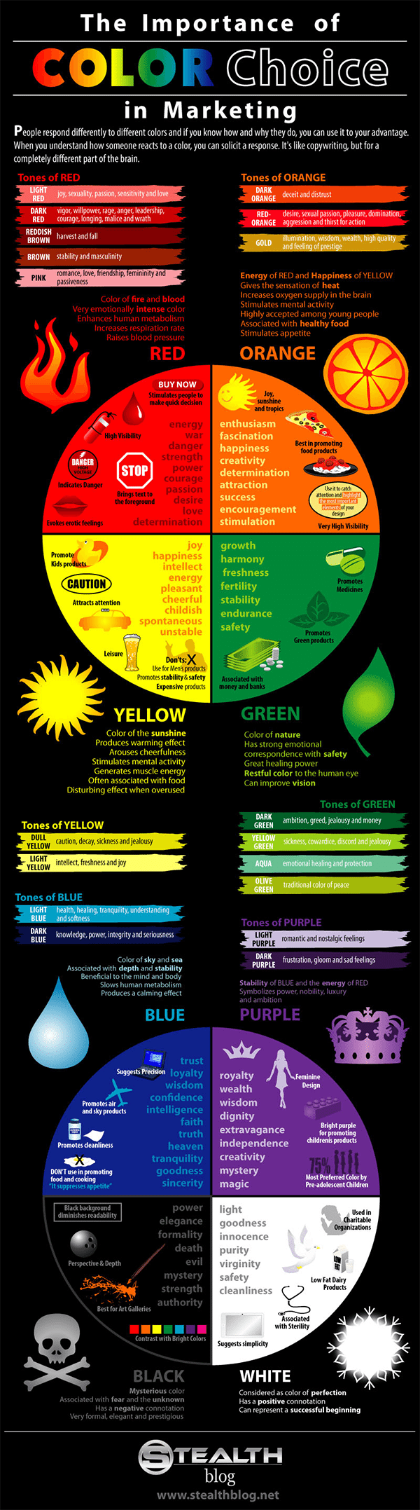
The Psychology of Color
Before delving into the practical implications of color in web design, let’s first understand the psychology behind it. Colors evoke emotions, associations, and responses. Different colors can convey various messages and set the tone for your website. Here are some common psychological associations with colors:
- a. Red: Red is often associated with passion, urgency, and excitement. It can grab attention and create a sense of urgency, making it useful for calls to action (CTAs).
- b. Blue: Blue is a color of trust, professionalism, and tranquility. It’s commonly used by financial and tech companies to convey reliability.
- c. Yellow: Yellow is bright, cheerful, and attention-grabbing. It’s often used to highlight important information.
- d. Green: Green represents growth, health, and nature. It’s frequently used by eco-friendly and health-related websites.
- e. Purple: Purple is associated with luxury, sophistication, and creativity. It can be used to create a sense of elegance.
- f. Black: Black represents power, luxury, and sophistication. It can be used for minimalist and elegant designs.
- g. White: White signifies purity, simplicity, and cleanliness. It’s commonly used for minimalist and clean designs.
Understanding these psychological associations can help you choose the right colors to convey the intended message of your website.
Building a Consistent Brand Identity
Color plays a pivotal role in creating a consistent brand identity. When visitors recognize your website’s colors, they start forming a mental connection with your brand. Consistency in color helps establish trust and familiarity.
Consider the example of Coca-Cola. The company’s use of red and white is so ingrained in the public’s mind that seeing those colors immediately brings to mind the brand’s logo and products. Your website’s color scheme should reflect your brand’s personality, values, and message.
The Importance of Color Contrast
Accessibility is a fundamental aspect of web design. Your website should be accessible to everyone, including individuals with visual impairments. Color contrast is crucial for readability, ensuring that text is easily distinguishable from the background.
The Web Content Accessibility Guidelines (WCAG) provide specific contrast ratios that must be met for text and interactive elements. Failing to meet these contrast requirements can result in a less inclusive website, potentially alienating a portion of your audience.
Using Color Hierarchy for Content
Color can be a powerful tool for creating content hierarchy on your website. A well-structured color hierarchy guides users’ attention and helps them navigate your site more effectively.
For instance, you might use a bold, vibrant color for your primary CTAs to make them stand out. Subtle variations in color can also be used to differentiate sections, such as headers, subheadings, and body text. This differentiation enhances the readability and overall user experience.
Responsiveness and Color
In today’s digital landscape, websites are accessed on a wide range of devices, including smartphones, tablets, and desktop computers. It’s crucial to consider how your chosen colors will appear across different screen sizes and resolutions.
Some colors may not render well on certain devices or under specific lighting conditions. Testing your color choices on various devices and screens ensures a consistent and appealing user experience across the board.
Cultural Considerations
The perception of color can vary significantly across cultures. Colors that convey one message in one culture may have entirely different meanings in another. It’s essential to consider your target audience’s cultural background when choosing colors for your website.
For example, while white represents purity and cleanliness in many Western cultures, it symbolizes mourning and death in some Asian cultures. Failing to consider these cultural nuances can lead to misunderstandings and potential alienation of your audience.
A/B Testing and Color
A/B testing is a valuable technique for optimizing website performance, and color is no exception. You can use A/B testing to compare the performance of different color schemes and determine which one resonates better with your audience.
For example, you can create two versions of a landing page—one with a red CTA button and another with a green CTA button. By monitoring user interactions and conversion rates, you can gather data to inform your color choices and improve your website’s effectiveness.
The Impact of Color on Conversions
Color can have a significant impact on your website’s conversion rate. Certain colors are known to influence user behavior and encourage specific actions. Here are some examples:
- a. Red CTAs: Red is often associated with urgency and can encourage users to take immediate action, such as making a purchase or signing up for a newsletter.
- b. Green CTAs: Green is associated with positivity and can be used to signify that a particular action is safe or beneficial.
- c. Yellow Highlights: Yellow is attention-grabbing and can be used to draw users’ attention to important information or discounts.
- d. Blue Trust: Blue is often used by banks and financial institutions to convey trust and reliability, which can encourage users to open accounts or invest.
- e. Neutral Backgrounds: Neutral colors like white, gray, or beige can create a calm and unobtrusive backdrop that allows other elements, such as products or services, to stand out.
By strategically using color to guide user actions, you can optimize your website for better conversion rates.
Overcoming Color Challenges
While color can be a powerful tool in web design, it also presents some challenges. Here are a few common color-related challenges and how to overcome them:
- a. Accessibility: Ensure that your website meets accessibility standards by providing sufficient color contrast for text and interactive elements. Use online tools and color contrast checkers to verify compliance.
- b. Compatibility: Test your color choices on various devices and browsers to ensure consistent rendering. Make adjustments as needed to accommodate different screen sizes and resolutions.
- c. Branding: While it’s essential to align your website’s color scheme with your brand, be open to adjustments if user feedback or A/B testing suggests that certain colors are hindering your site’s performance.
- d. Cultural Sensitivity: If your target audience includes diverse cultural groups, research the cultural meanings of your chosen colors to avoid unintentional offense.
Conclusion
Color is a vital component of web design that can profoundly impact your website’s success. By understanding the psychology of color, building a consistent brand identity, ensuring accessibility, using color hierarchy, considering responsiveness, accounting for cultural differences, and employing A/B testing, you can harness the power of color to make your website more engaging, accessible, and conversion-friendly.
Remember that color choices should be intentional and aligned with your website’s goals and target audience. When used effectively, color can be a powerful tool to create a visually appealing and highly effective website that leaves a lasting impression on your visitors.

Author:
Mark Ford



