Are your social posts ever looking grainy, stretched, or oddly cropped after uploading? Want to learn the image sizes that keep every platform sharp, professional, and scroll-stopping?
You’ll find the essential social media image sizing rules in this guide.
Here’s a summary of what’s covered:
- X (Twitter)
- TikTok
Check out the post below for more.
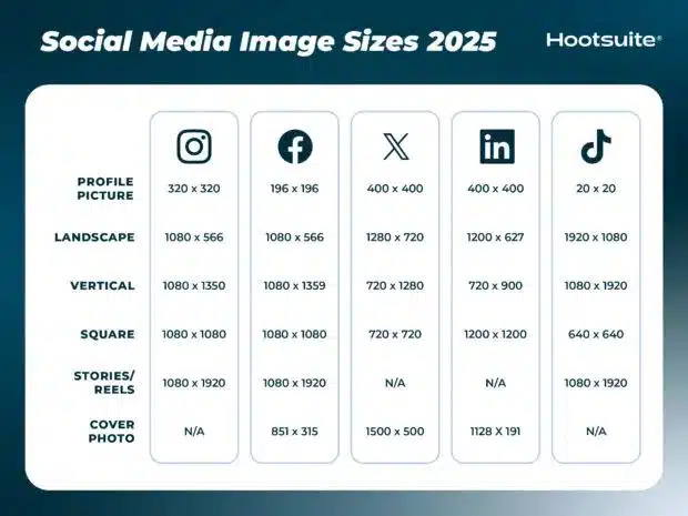
Publishing visuals online should be simple, yet nothing ruins a great piece of content faster than pixelation, cropping issues, or a fuzzy-looking photo. Getting your social media image sizes right ensures your posts look professional and consistent every time. When your graphics are crisp, properly proportioned, and optimised, they perform better and help reinforce your brand’s credibility across every platform.
This guide walks you through the correct image dimensions and aspect ratios for major social media channels. You will learn the correct sizing for profile photos, posts, stories, and banners, and discover simple ways to keep your content sharp and impactful. Whether you schedule posts daily or create campaign assets once a month, having a clear framework makes your work easier and more effective.
When you use the right dimensions, you remove the risk of distorted logos, stretched backgrounds, or important text being cut off. This is particularly vital for businesses, creators, marketers, and agencies where consistency and quality play a key role in audience trust. With the right sizing strategy, your visual content will feel polished and engaging.
Let’s break down the ideal image sizes for each major platform and how you can apply them seamlessly in your content workflow.
Instagram is a visual-first platform, so image quality matters more here than almost anywhere else. Using the right dimensions helps your posts look sharp, prevents automatic cropping, and ensures your brand appears polished across the grid, Stories, and Reels. Because Instagram supports square, vertical, and landscape formats, choosing the right one for each post type makes a noticeable impact.
From Reels that take over the full screen to square posts that sit neatly on your grid, getting the ratios correct keeps everything aligned and professional. Whether you are a business showcasing products, or a creator posting lifestyle content, optimising your artwork gives you the best chance of engagement. It also helps maintain a consistent visual feel across your profile.
To avoid blurry uploads, always export designs at the highest resolution available within these recommended formats. This ensures your visuals stay crisp and appealing.
- Profile picture: 320 × 320
- Landscape post: 1080 × 566
- Vertical post: 1080 × 1350
- Square post: 1080 × 1080
- Stories/Reels: 1080 × 1920
Facebook content ranges from square images in feed posts to widescreen timeline covers, making correct formatting essential for clarity. Users often view Facebook content on a combination of desktop and mobile devices, so inappropriate sizing can lead to awkward cropping and pixelation. Prioritising the right dimensions ensures your brand looks polished in every context.
Cover photos need particular attention, as large text or logos near the edges can be cut off depending on device type. Feed posts appear best when optimised in either square or vertical format, helping you stand out as users scroll. Maintaining crisp quality means saving images at both high resolutions and correct aspect ratios.
Facebook remains a multi-purpose platform, so clear visuals help you build credibility, deliver messages effectively, and support stronger campaign performance.
- Profile picture: 196 × 196
- Landscape post: 1080 × 566
- Vertical post: 1080 × 1359
- Square post: 1080 × 1080
- Cover photo: 851 × 315
X (Twitter)
X relies heavily on clean, engaging content that is easy to digest quickly. Posts move fast on this platform, so visuals must be clear and properly sized to make an immediate impact. Whether sharing infographics, promotional banners, or photography, choosing the right dimensions avoids blurry uploads and awkward cropping.
With many users scrolling on mobile devices, clarity is essential for retaining attention. Square and landscape formats work particularly well, and consistent sizing makes your feed look cohesive. Profile and header images also need careful placement, as logos or text near the edges can be cropped by the interface.
Optimising content for X ensures your brand stands out in a busy news-driven environment, helping messages land with greater precision.
- Profile picture: 400 × 400
- Landscape post: 1280 × 720
- Vertical post: 720 × 1280
- Square post: 720 × 720
- Cover photo: 1500 × 500
LinkedIn is a professional platform, so image quality directly reflects on your brand authority and trustworthiness. Whether you are publishing a company update, showcasing achievements, or sharing industry insights, optimised visuals give your content a polished edge. Poorly sized graphics can distract from your message and reduce credibility.
Cover and profile images often form the first impression, particularly on company pages, making proper sizing a simple but important branding step. Square and landscape posts tend to perform well, particularly when used for thought leadership content, carousels, or event announcements. Keeping aspect ratios consistent helps maintain a clean visual identity across your feed.
Treat LinkedIn like a digital shop window for your business. Sharp, properly formatted visuals reinforce professionalism and make your updates stand out in a competitive landscape.
- Profile picture: 400 × 400
- Landscape post: 1200 × 627
- Vertical post: 720 × 900
- Square post: 1200 × 1200
- Cover photo: 1128 × 191
TikTok
TikTok is built around vertical video and mobile-first content, making full-screen portrait dimensions essential. The platform prioritises fast-moving, visually engaging clips, so crisp, properly proportioned visuals significantly improve watch time and viewer retention. As users scroll rapidly, quality becomes a key differentiator.
Profile imagery is small on TikTok, so simple designs or clean headshots work best. Meanwhile, video and thumbnail sizes should follow recommended guidelines to prevent blurring and cropping. Consistency is important when building a recognisable presence across your grid and video thumbnails.
Focusing on correct ratios helps ensure your videos look professional while also aligning with TikTok’s native display format. This results in smoother performance and a more credible visual identity.
- Profile picture: 20 × 20
- Landscape video: 1920 × 1080
- Vertical video: 1080 × 1920
- Square video: 640 × 640
- Stories/Feed: 1080 × 1920
Conclusion
Visual quality plays a major role in social media success. Incorrect sizing can lead to distortion, poor clarity, and less engagement, while correctly formatted images help your content stand out, support your brand identity, and improve audience response. Mastering platform-specific dimensions also streamlines your design process and ensures your graphics are ready for multi-channel publishing.
These size guidelines help maintain sharpness, avoid cropping issues, and present your content professionally across platforms. As each social network evolves, staying updated with correct formats ensures your visual strategy remains effective and competitive. With the right settings in place, every post will look crisp, consistent, and compelling.
By adopting these specifications and making them a standard part of your content workflow, you set yourself up for stronger engagement, greater impact, and a more polished online presence. Quality visuals are not just aesthetic; they are a powerful part of your brand’s overall communication strategy.

Author:
Mark Ford