Is your website still not mobile ready? Struggling to decide between a standalone mobile site or a new responsive design?
Most clients we speak to don’t realise there is a difference between responsive design and a mobile website, which is understandable if you’re not clued up on the latest technological advancements. So make sure you consider your options before going ahead.
To help the guys at Mainstreet Host have compared the two in the infographic below.
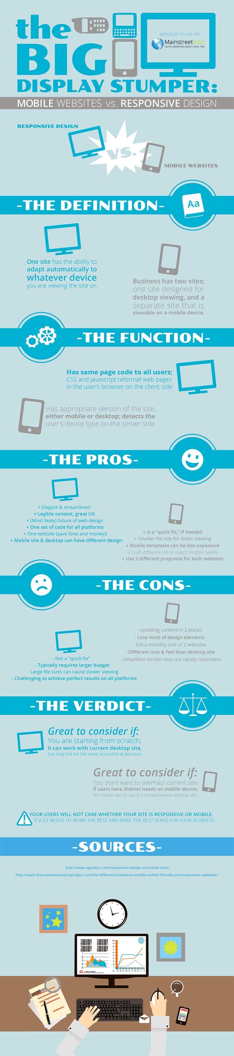
In today’s digital age, having a strong online presence is essential for businesses and individuals alike. With the ever-increasing use of mobile devices for browsing the internet, it’s crucial to ensure that your website is optimized for mobile users. Two common approaches to achieving this optimization are creating a separate mobile website or implementing responsive web design. In this blog post, we’ll explore the advantages and disadvantages of each approach to help you make an informed decision on whether to go for a mobile website or responsive design.
Mobile Website: The Basics
A mobile website is a separate, dedicated website designed specifically for mobile devices. When users access your website from a mobile device, they are redirected to this mobile version. Mobile websites often have a different URL, typically starting with “m” (e.g., m.example.com), making it clear that they are intended for mobile users.
Advantages of Mobile Websites
- Customization: One of the primary advantages of a mobile website is that it allows for a high level of customization. You have complete control over the design and layout, ensuring that the mobile experience is tailored to your specific needs and preferences.
- Performance Optimization: Mobile websites can be optimized for performance on mobile devices. You can design them to load quickly, minimizing the risk of users bouncing due to slow loading times.
- Enhanced User Experience: Because you have control over the design, you can create a user interface that is intuitive and user-friendly for mobile users. This can lead to higher user satisfaction and engagement.
- Specific Features: Mobile websites can include mobile-specific features such as tap-to-call buttons, location-based services, and mobile-optimized forms, enhancing the overall user experience.
Disadvantages of Mobile Websites
- Maintenance: Managing two separate websites (desktop and mobile) can be time-consuming and potentially costly. Any updates or changes to content must be made on both versions.
- SEO Challenges: Mobile websites may face challenges with search engine optimization (SEO) because search engines need to index and rank two different versions of your site. This can affect your search engine rankings.
- User Confusion: Users might find it confusing to switch between the mobile and desktop versions of your site, leading to a less seamless browsing experience.
- Cost: Developing and maintaining a separate mobile website can be expensive, especially if you need to hire a developer to create and manage it.
Responsive Design: The Basics
Responsive web design is an approach where a single website is designed and developed to adapt and respond to different screen sizes and devices. Instead of creating separate mobile and desktop versions, a responsive website automatically adjusts its layout and content to fit the screen it’s viewed on.
Advantages of Responsive Design
- Cost-Efficiency: Responsive design can be more cost-effective in the long run because you only need to maintain one website. Updates and changes are applied universally, ensuring consistency across all devices.
- SEO Benefits: Responsive websites are favored by search engines like Google because they provide a consistent URL and HTML code, making it easier for search engines to crawl, index, and rank your site.
- Better User Experience: Responsive design offers a seamless and consistent user experience across all devices, reducing the risk of user confusion and frustration.
- Future-Proofing: As new devices with varying screen sizes and resolutions emerge, a responsive design can adapt to these changes without the need for a complete website overhaul.
Disadvantages of Responsive Design
- Complexity: Implementing responsive design can be more complex, requiring careful planning and coding to ensure that the website adapts correctly to different screens.
- Performance Challenges: If not optimized correctly, responsive websites can suffer from performance issues on mobile devices, leading to slower loading times.
- Limited Customization: Responsive design may limit your ability to customize the mobile experience extensively, as it relies on a single layout that must cater to a wide range of devices.
- Initial Development Time: Developing a responsive website may take longer initially compared to creating a mobile-specific site, as it involves more intricate design and testing.
Making the Choice
Now that we’ve explored the advantages and disadvantages of both mobile websites and responsive design, how do you decide which approach is right for you? Here are some key factors to consider:
1. Budget
Consider your budget constraints. If you have limited resources, responsive design may be a more cost-effective choice, as it eliminates the need for maintaining two separate websites.
2. User Experience
Think about the kind of user experience you want to provide. If customization and a tailored mobile experience are crucial to your business, a mobile website may be the better option.
3. SEO Goals
If SEO is a top priority, responsive design is generally preferred due to its consistency and search engine-friendly structure.
4. Long-Term Strategy
Consider your long-term goals. Responsive design is more future-proof and adaptable to changing technology trends and screen sizes.
5. Development Complexity
Assess the complexity of your project. If you have a straightforward website and want a quick mobile solution, a mobile website may be sufficient. For more complex projects, responsive design is often the better choice.
6. User Base
Analyze your user base. If the majority of your audience accesses your site via mobile devices, prioritizing a mobile-friendly experience is crucial.
7. Content Management
Think about how you’ll manage content updates. If you prefer a streamlined content management process, responsive design simplifies this by centralizing content management.
8. Performance
Performance matters, especially on mobile devices. Ensure that your chosen approach prioritizes fast loading times and a smooth user experience.
9. Industry Standards
Research industry standards and best practices. Some industries may have specific expectations regarding mobile optimization.
10. Mobile-First Approach
Consider adopting a mobile-first approach, where you prioritize mobile optimization from the outset of your web development project. This can influence your choice between a mobile website and responsive design.
Conclusion
In the mobile-centric world we live in today, optimizing your website for mobile users is no longer an option but a necessity. Choosing between a mobile website and responsive design depends on various factors, including your budget, user experience goals, SEO objectives, and long-term strategy. Ultimately, both approaches have their merits and drawbacks, and the decision should align with your unique needs and priorities.
Remember that the choice you make will have a significant impact on your online presence and user satisfaction. Whether you opt for a dedicated mobile website or responsive design, the key is to ensure that your website offers a seamless and enjoyable experience for all visitors, regardless of the device they use.

Author:
Mark Ford

Mastering the Art of the Landing Page: Design, Copy, and Conversion in Harmony
Are you trying to design a landing page that not only looks great but actually converts visitors into customers? Want to learn how to balance design, copy, and strategy to create landing pages that work in perfect harmony? […]