Do you have a mobile friendly version of your company website? Did you know you need to get one by April 21st?
Google have recently announced that mobile friendliness will become a ranking factor in their search results, so if your site isn’t mobile friendly by April 21st you could start to see your rankings drop.
But what do you need on your mobile friendly site? This infographic from Active Mobi shows you the top 9 features visitors want.
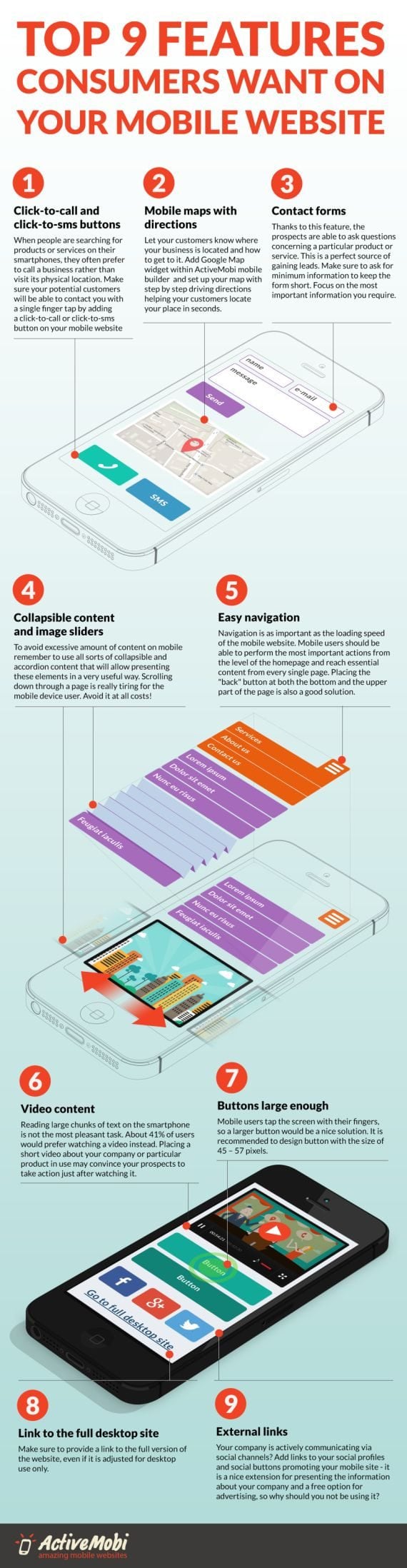
In today’s digital age, mobile devices have become an integral part of our lives. People use their smartphones and tablets for a wide range of tasks, from communication and entertainment to shopping and information gathering. As a result, it’s essential for businesses and website owners to ensure that their websites are optimized for mobile users. In this blog post, we’ll explore the top nine features that your mobile website visitors want to see. By incorporating these elements into your mobile website design, you can enhance user experience, drive engagement, and ultimately, boost conversions.
- Responsive Design
The foundation of a successful mobile website is responsive design. A responsive website automatically adapts its layout and content to fit the screen size of the device being used. Whether your visitors are using a smartphone, tablet, or even a desktop computer, your website should provide a seamless and visually appealing experience. Responsive design ensures that your content is easily accessible, and visitors don’t need to pinch, zoom, or scroll excessively to navigate your site. This feature is not only user-friendly but also helps with search engine optimization (SEO), as Google prioritizes mobile-friendly websites in its search rankings.
- Fast Loading Times
In the fast-paced world of mobile browsing, speed is of the essence. Mobile users expect websites to load quickly, and they won’t hesitate to abandon a site that takes too long to load. To meet these expectations, optimize your mobile website for speed. Compress images, minify code, and leverage browser caching to reduce loading times. Additionally, consider using a content delivery network (CDN) to distribute your site’s content across multiple servers, ensuring that it loads swiftly for users regardless of their location.
- Intuitive Navigation
Navigation is a crucial element of any website, and it becomes even more critical on mobile devices where screen real estate is limited. Visitors should be able to find what they’re looking for with minimal effort. Implement a clear and user-friendly navigation menu that is easily accessible from the homepage. Use a simple, concise menu structure with intuitive labels. Consider incorporating navigation features like sticky menus that remain visible as users scroll down the page, making it convenient for them to explore your site.
- Mobile-Friendly Content
When it comes to content on your mobile website, less is often more. Mobile users have shorter attention spans and are more likely to skim through content. Therefore, prioritize concise and scannable content that gets straight to the point. Break up text with headings, subheadings, and bullet points to make it easier to read. Use high-quality images and videos that are optimized for mobile viewing, and ensure that they enhance the user experience rather than slowing down the site.
- Clickable Call-to-Action Buttons
Mobile users often visit websites with specific goals in mind, such as making a purchase, signing up for a newsletter, or contacting customer support. To facilitate these actions, include prominent and clickable call-to-action (CTA) buttons. Make sure that CTAs are easily distinguishable from the rest of the content, use contrasting colors, and position them strategically within the mobile layout. Whether it’s a “Buy Now” button, “Sign Up” button, or “Contact Us” button, these elements should guide users toward their intended actions.
- Mobile-Friendly Forms
Forms are a common feature on websites, whether for lead generation, contact forms, or user registration. Design your forms with mobile users in mind. Use responsive form fields that adjust to different screen sizes, and minimize the number of required fields to reduce friction. Implement input masks and validation to assist users in entering information correctly. Consider offering alternative methods for input, such as using a date picker or dropdown menus, to simplify the process on mobile devices.
- Search Functionality
In a world where time is of the essence, mobile users appreciate the convenience of a search bar. Implement a prominent and easy-to-find search functionality on your mobile website. This allows visitors to quickly search for specific products, information, or content without the need to navigate through menus or scroll extensively. Additionally, provide auto-suggestions and filters to help users refine their searches and find what they’re looking for efficiently.
- Social Media Integration
Social media plays a significant role in today’s online landscape. Many users access social platforms through their mobile devices, making it crucial to integrate social media elements into your mobile website. Include social sharing buttons on your content to encourage users to share your articles and products with their networks. Display your social media profiles and follow buttons prominently to grow your social following. User-generated content from social platforms can also add authenticity to your mobile site.
- Mobile-Friendly E-commerce Features
If your website includes an e-commerce component, optimizing it for mobile users is paramount. Mobile shopping is on the rise, and customers expect a seamless experience when making purchases on their smartphones. Ensure that your product listings are well-organized and easy to browse. Implement a streamlined and user-friendly checkout process with mobile payment options, such as digital wallets. Provide clear product images, descriptions, and reviews to help users make informed decisions. Additionally, optimize your website for mobile search engines, as mobile shoppers often use search engines to find products.
Conclusion
In today’s mobile-first world, having a mobile-friendly website is no longer an option; it’s a necessity. Mobile users have specific expectations when browsing the web on their smartphones and tablets. By incorporating the top nine features mentioned in this blog post—responsive design, fast loading times, intuitive navigation, mobile-friendly content, clickable call-to-action buttons, mobile-friendly forms, search functionality, social media integration, and mobile-friendly e-commerce features—you can create a mobile website that not only meets these expectations but also delights your visitors. Prioritize user experience, and your mobile website will become a valuable asset in engaging and converting mobile users, ultimately contributing to the success of your online presence.

Author:
Mark Ford