

Are you looking to increase your website click through rates? Want some tips to create a more successful call to action?
Your call to action has just one purpose but if nobody is actually using it then what’s the point in it being there in the first place? You need to make your customers want to click and to do that there’s certain ways to make it more appealing.
Take a look at this infographic that will give you the tips you need to increase more click through success.
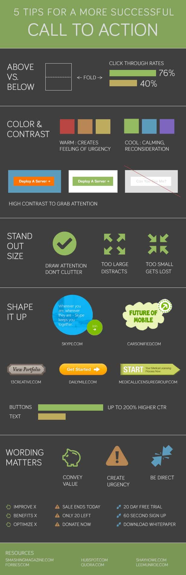
In today’s digital age, having a visually appealing website is essential for attracting and retaining visitors. However, a beautiful website alone is not enough. To drive conversions and achieve your business goals, you need an effective call to action (CTA) strategy. A CTA is a prompt that encourages users to take a specific action, such as signing up for a newsletter, making a purchase, or filling out a contact form. In this blog post, we will explore five essential tips to create a more successful call to action on your website.
1. Make Your CTA Visually Stand Out
One of the most critical aspects of a successful call to action is its visibility. Your CTA should immediately catch the visitor’s attention and stand out from the rest of the content on your website. Here are some design elements to consider:
Color Contrast:
Choose a color for your CTA button that contrasts with the background color of your website. This contrast will make the CTA button pop and draw the user’s eye. Typically, bright and complementary colors work well.
Button Size:
Make sure your CTA button is large enough to be easily clickable but not so large that it overwhelms the page. A good rule of thumb is to ensure that it’s larger than other page elements but not so big that it becomes obtrusive.
White Space:
Surround your CTA with enough white space to separate it from other content on the page. White space helps users focus on the CTA and reduces visual clutter.
Typography:
Use a clear and legible font for your CTA text. The text should be large enough to read comfortably, and the font style should align with your brand’s identity.
Here’s an example of how effective visual design can make a CTA stand out:

In this example, the CTA button’s bright orange color, large size, and ample white space make it impossible to miss.
2. Create Compelling CTA Copy
The text on your CTA button is just as important as its design. Your CTA copy should be concise, action-oriented, and compelling. Here are some tips for crafting effective CTA copy:
Use Action Verbs:
Start your CTA with a strong action verb that clearly tells the user what to do. Examples include “Buy Now,” “Subscribe,” “Get Started,” and “Download Now.”
Be Specific:
Avoid vague or generic phrases like “Click Here” or “Learn More.” Instead, be specific about what the user will get or achieve by clicking the button. For instance, “Get 20% Off Your First Purchase” is more enticing than “Click Here.”
Highlight Benefits:
Explain the benefits of taking the desired action. Will users save time, money, or improve their lives in some way? Communicate these advantages in your CTA copy.
Create a Sense of Urgency:
Encourage immediate action by adding words like “Now” or “Today.” For example, “Claim Your Exclusive Discount Today” implies a limited-time offer, making users more likely to click.
Test and Iterate:
Don’t settle for the first CTA copy that comes to mind. A/B testing different variations of your CTA can help you determine which one resonates best with your audience.
Here’s an example of compelling CTA copy:

In this example, the CTA copy “Unlock Your Potential” suggests that taking action will lead to personal growth and improvement.
3. Place CTAs Strategically
Where you position your CTAs on your website can significantly impact their effectiveness. Consider the following strategic placements:
Above the Fold:
Place a prominent CTA near the top of your website, so visitors see it as soon as they land on your page, without scrolling. This is often the first opportunity to capture their attention.
Throughout the Content:
Incorporate CTAs strategically within your content, especially at key points where users may be ready to take action. For instance, if you’re discussing the benefits of your product or service, include a CTA to encourage a purchase.
At the End of Blog Posts:
If you have a blog, including a CTA at the end of each post is an effective way to convert engaged readers into customers or subscribers.
Exit-Intent Popups:
Consider using exit-intent popups that appear when users show intent to leave your site. These popups can present a last-minute offer or invite users to subscribe before they go.
Sticky Headers or Footers:
A sticky header or footer with a CTA can remain visible as users scroll down the page, ensuring that the CTA is always accessible.
The goal is to make it as convenient as possible for users to take action when they are ready.
4. Offer Incentives or Rewards
People are more likely to take action if they perceive value in doing so. Offering incentives or rewards can be a powerful motivator. Here are some ideas:
Discounts and Promotions:
Provide exclusive discounts or promotional offers to users who click on your CTA. Highlighting savings can be a compelling reason to take action.
Free Resources:
Offer valuable free resources such as ebooks, guides, templates, or whitepapers in exchange for user information or engagement. For example, “Download Our Free Marketing Guide” can be an enticing CTA for marketers.
Limited-Time Offers:
Create a sense of urgency by promoting limited-time offers. Phrases like “Limited Time Offer” or “Act Now for Special Access” can encourage immediate action.
Loyalty Programs:
Reward loyal customers with special offers or access to premium content through CTAs. For example, “Join Our Exclusive Loyalty Program” can attract repeat business.
Incorporating incentives into your CTAs not only drives action but also fosters goodwill with your audience.
5. Mobile Optimization is Crucial
As more users access websites on mobile devices, it’s essential to ensure that your CTAs are mobile-friendly. Here are some mobile optimization tips:
Responsive Design:
Use responsive web design to ensure that your CTAs adapt to different screen sizes and orientations. Test your CTAs on various devices to ensure they display correctly.
Finger-Friendly Buttons:
Make sure your CTA buttons are large enough to be easily tapped with a finger, as touchscreens have smaller precision than mouse pointers.
Minimize Clutter:
Simplify your mobile layout and remove any unnecessary elements to focus users’ attention on the CTA. Mobile users have limited screen space, so make every element count.
Test Load Times:
Optimize your website’s load times for mobile devices. Slow-loading pages can frustrate users and lead to high bounce rates.
Remember that a poor mobile experience can drive users away, so prioritize mobile optimization for your CTAs.
Conclusion
A successful call to action is a critical component of any effective website design. By making your CTA visually stand out, crafting compelling copy, strategically placing CTAs, offering incentives, and optimizing for mobile, you can significantly increase your chances of converting visitors into customers, subscribers, or engaged users. Remember that creating effective CTAs is an ongoing process, and regular testing and optimization are key to achieving the best results. With these tips in mind, you can enhance your website’s performance and achieve your business goals.

Author:
Mark Ford



