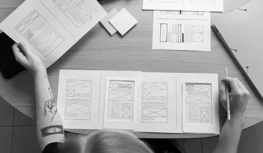
Website design is an ever-evolving field, with trends and techniques constantly shifting to adapt to changing technologies and user preferences.
In 2015, web design saw some exciting developments that shaped the digital landscape for years to come.
In this blog post, we’ll explore the top 5 trends that dominated website design in 2015.
Infographic by Bowen Media.

- Responsive Design
Responsive web design was one of the most significant trends in 2015. As the use of mobile devices continued to surge, designers and developers recognized the importance of creating websites that could adapt seamlessly to various screen sizes and resolutions.
Responsive design involves using flexible grids and layouts, as well as CSS media queries, to ensure that a website looks and functions well on desktops, tablets, and smartphones. This trend not only improved the user experience but also had a positive impact on SEO, as Google started giving preference to mobile-friendly websites in its search results.
By 2015, responsive design had become a standard practice in the web design industry. Businesses and organizations that failed to adopt this trend risked losing a significant portion of their online audience.
- Flat Design
Flat design was another prominent trend that gained momentum in 2015. This design philosophy focused on simplicity, minimalism, and the use of flat colors, devoid of gradients, drop shadows, and other ornamental elements. It aimed to create clean and visually appealing interfaces that were easy to navigate.
Flat design was championed by major tech companies, including Microsoft with its “Metro” design language and Apple with iOS 7’s adoption of flat design principles. This trend had a significant influence on web design, leading to the creation of visually striking websites that loaded faster and offered a more user-friendly experience.
- Parallax Scrolling
Parallax scrolling, which had been around for a few years, became increasingly popular in 2015. This technique involves creating an illusion of depth by moving background and foreground elements at different speeds as the user scrolls down the page. Parallax scrolling added an element of interactivity and storytelling to websites, making them more engaging and memorable.
This trend was used in a variety of creative ways, from single-page scrolling websites to e-commerce product displays. While it added a dynamic element to web design, designers had to strike a balance to avoid overwhelming users with excessive animation and motion.
- Typography as a Design Element
In 2015, typography took center stage as a design element in its own right. Web designers began to pay more attention to selecting fonts and using typography creatively to convey the brand’s personality and message.
With the availability of web fonts and the advent of services like Google Fonts and Adobe Typekit, designers had a vast array of fonts at their disposal. This allowed for more creative and expressive typography choices on websites. Bold headlines, custom fonts, and unique text layouts became common, making websites visually appealing and distinct.
Designers also started experimenting with typography in combination with other design elements, such as images and videos, to create visually stunning web experiences. Typography played a crucial role in establishing brand identity and improving overall website aesthetics.
- Card-Based Design
Card-based design, popularized by platforms like Pinterest, gained prominence in 2015. This approach involves organizing content into small, rectangular cards that can be easily rearranged and reorganized. Each card typically contains a piece of content, such as an image, text, or a combination of both.
Card-based design offered several benefits, including improved content organization, better user engagement, and responsive design compatibility. It was particularly well-suited for mobile devices, where users could swipe through cards to access information or products quickly.
In addition to its functionality, card-based design contributed to a cleaner and more visually appealing web design aesthetic. It also made it easier for designers to update and maintain websites, as content within each card could be modified independently.
Conclusion
In 2015, website design witnessed significant changes driven by the need for mobile responsiveness, the rise of flat design, the adoption of parallax scrolling, the creative use of typography, and the emergence of card-based design. These trends not only improved the user experience but also influenced the aesthetics and functionality of websites for years to come.
Looking back at these trends, it’s clear that they laid the foundation for many of the design principles and techniques we see in web design today. As technology continues to evolve, web designers must stay informed about the latest trends and adapt their approaches to meet the ever-changing needs and expectations of users.
While 2015 may seem like a long time ago in the world of web design, the lessons learned from these trends are still relevant today. As we move forward, it’s essential to continue pushing the boundaries of design while ensuring that websites remain user-friendly, visually appealing, and functional in an ever-expanding digital landscape.

Author:
Mark Ford