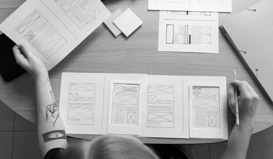
So you’re considering a new website, you’re trying to find ideas for a layout that works well with your content, and you want to ensure it fits in with modern trends too?
Web design is an ever-evolving field, with trends and techniques constantly changing. In 2017, we witnessed a shift towards more innovative and user-centric website layouts. As businesses and designers sought to create more engaging and responsive web experiences, a variety of modern website layouts emerged.
In this blog post, we’ll explore 10 of these layouts that were trending in 2017. While the specific trends and technologies may have evolved since then, the principles behind these layouts remain relevant and can serve as inspiration for your web design projects.
Logo Design Guru share 10 modern layouts to consider in this infographic.

The Hero Header
In 2017, the hero header became a staple in modern web design. This layout features a large, attention-grabbing image or video at the top of the webpage, accompanied by minimal text and navigation elements. The hero header immediately captivates visitors and sets the tone for the rest of the site.
One notable example of the hero header in action is Apple’s website. Their product pages often feature high-quality images of their products, making a bold and impactful statement as soon as you land on the page.
Key Takeaway: The hero header is an excellent way to create a visually striking first impression on your website visitors.
Split Screen Layouts
The split screen layout was another design trend that gained popularity in 2017. This layout divides the screen into two equal halves, each displaying different content. It’s an effective way to showcase two contrasting elements, such as products, services, or ideas.
For instance, a restaurant website might use a split screen layout to display its menu on one side and high-quality images of its dishes on the other. This layout can engage users and simplify their decision-making process.
Key Takeaway: Split screen layouts help to create a visually balanced and engaging website, especially when you want to highlight two distinct aspects of your content.
Card-Based Design
Card-based design, popularized by platforms like Pinterest, was widely adopted in 2017. This layout arranges content into rectangular or square cards, each containing a specific piece of information, image, or link. These cards can be easily rearranged and reorganized, making them perfect for responsive design.
Medium, a popular blogging platform, employs card-based design to present articles in an easily scannable format. Each card represents a different article, complete with a featured image and title.
Key Takeaway: Card-based design is ideal for content-heavy websites and applications, offering a visually appealing and mobile-friendly layout.
Asymmetrical Grids
In 2017, designers began to experiment more with asymmetrical grid layouts, breaking away from the traditional, rigid grid structures. Asymmetry adds a sense of dynamism and uniqueness to websites, capturing users’ attention and encouraging exploration.
A notable example is the website of the film “La La Land.” Its homepage features an asymmetrical grid of vibrant images, creating a sense of movement and excitement.
Key Takeaway: Asymmetrical grids can infuse your website with energy and creativity, making it stand out from the crowd.
Long Scrolling Pages
Long scrolling pages continued to gain traction in 2017, as they offer a natural and immersive user experience, especially on mobile devices. This layout allows designers to tell a story or guide users through a series of content sections as they scroll down the page.
The website for the game “Firewatch” is a prime example of effective long scrolling. As users scroll, they are taken on a journey through the game’s stunning visuals and story.
Key Takeaway: Long scrolling pages are a great way to engage users and lead them through a narrative or content sequence.
Full-Screen Video Backgrounds
Video backgrounds were all the rage in 2017. They add motion and depth to a website, creating a captivating atmosphere that engages visitors. Whether it’s showcasing a product in action or setting the mood for a brand, full-screen video backgrounds make a strong impact.
Airbnb’s homepage in 2017 featured a video background showcasing various destinations, instantly drawing users into the world of travel.
Key Takeaway: Full-screen video backgrounds can convey a powerful message and immerse users in your website’s theme or purpose.
Parallax Scrolling
Parallax scrolling was another popular trend in 2017, offering a visually dynamic experience. This technique involves multiple layers of content that move at different speeds as users scroll, creating a sense of depth and interactivity.
The “Nike Better World” website exemplified parallax scrolling by showcasing the brand’s commitment to sustainability through interactive storytelling.
Key Takeaway: Parallax scrolling can be used to tell a compelling story and provide users with an engaging and interactive journey.
Minimalist Design
Simplicity and minimalism were in vogue in 2017, with many websites embracing clean and clutter-free layouts. Minimalist design emphasizes content and functionality while eliminating unnecessary distractions.
A notable example is the website of Stripe, a payment processing company. Its minimalist design focuses on delivering a clear and concise message to visitors.
Key Takeaway: Minimalist design promotes a user-centric approach, ensuring that your content takes center stage.
Microinteractions
Microinteractions are subtle, user-triggered animations or responses that enhance the overall user experience. They became increasingly prevalent in 2017 as designers sought to add personality and interactivity to websites.
Facebook’s “Like” button is a classic example of a microinteraction. When users click it, the button transforms with a subtle animation, providing feedback and engagement.
Key Takeaway: Incorporating microinteractions into your website can create a more engaging and delightful user experience.
Modular Grids
Modular grids, inspired by print design, gained popularity in 2017. This layout organizes content into a structured grid system, making it easy to read, navigate, and maintain consistency.
The New York Times’ website is a prime example of effective modular grid design. Its layout features a clear hierarchy of content, with articles and multimedia elements neatly organized within the grid.
Key Takeaway: Modular grids offer a structured and organized approach to web design, improving readability and user experience.
Conclusion
In 2017, web design saw a variety of modern layouts that aimed to engage users, deliver content effectively, and create visually appealing websites. While these specific trends have evolved since then, the underlying principles of user-centric design, storytelling, and interactivity remain crucial in today’s web development landscape.
As you embark on your web design projects in 2023 and beyond, consider the lessons learned from these 10 modern website layouts of 2017. Adapt and innovate, keeping in mind the importance of creating an immersive and memorable online experience for your audience.

Author:
Mark Ford