

Are you looking for a way to design web pages that not only look stunning but also persuade visitors to take action? Want to understand how the AIDA model can turn your website into a conversion-focused sales tool rather than just a digital brochure?
You’ll find the key principles of persuasive web design in this post.
Here’s a summary of what’s covered:
- Attention
- Interest
- Desire
- Action
Check out the post below for more.
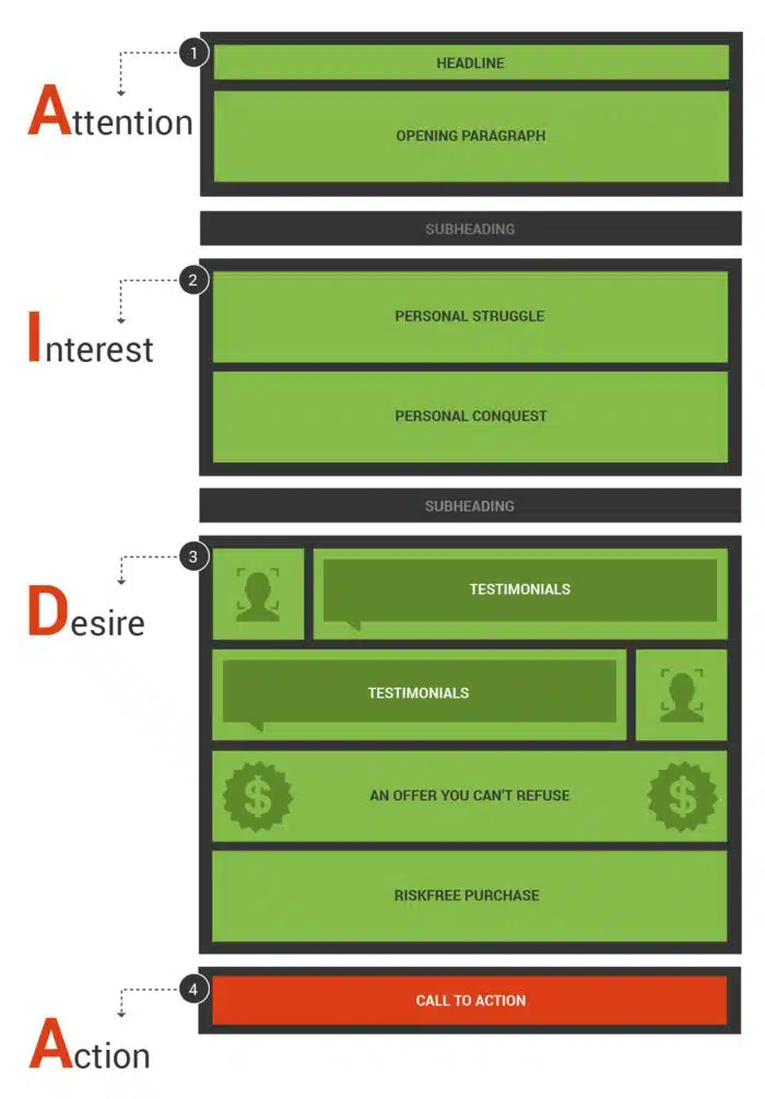
Great web design isn’t just about how a site looks — it’s about how it makes people feel and what it compels them to do. A truly effective website guides visitors along a psychological journey that builds curiosity, trust, and motivation. The AIDA model — Attention, Interest, Desire, and Action — is one of the most reliable frameworks for achieving this.
By structuring your website around AIDA, you can move visitors seamlessly from first impression to final conversion. Every element of your page, from headlines to calls-to-action, works together to attract attention, engage emotion, and inspire action. Let’s break down exactly how this model applies to modern web design and what you can do to make it work for you.
Attention
The first challenge in web design is to stop the scroll. You only have a few seconds to convince a visitor that your site is worth their time. The “Attention” stage is where visuals, copy, and layout come together to make a strong first impression. It’s about clarity, confidence, and emotional pull — the moment that transforms a click into genuine curiosity.
- Use a clean, bold design that prioritises your value proposition above the fold.
- Choose high-quality imagery or video that instantly communicates relevance and mood.
- Keep your colour palette simple but powerful, using contrast to highlight key areas.
- Ensure your most important message is visible without any scrolling or guessing.
Headline
Your headline is the hook that pulls users into your page. It should tell them exactly what they’ll gain by staying — not just what you do, but why it matters to them. In web design, headlines need to be concise, emotionally charged, and visually dominant. Think of it as your one-line elevator pitch for your entire site.
- Write headlines that focus on the visitor’s benefit, not your business features.
- Keep them short — ideally under 10 words — and pair with a clear supporting line.
- Use typography hierarchy to make your headline stand out visually.
- Test multiple headline variations to identify which drives the highest engagement.
Opening Paragraph
After a strong headline, your opening paragraph deepens connection. It explains what your site or offer is about and helps readers feel they’re in the right place. The tone should be conversational and empathetic, balancing emotional appeal with practical value.
- Start with a relatable statement or question that mirrors the visitor’s situation.
- Use plain, confident language to express understanding and authority.
- Avoid long introductions — three to four short sentences are enough to build trust.
- Reinforce your main promise early to maintain alignment between message and design.
Subheading
Subheadings act as stepping stones that guide visitors through your story. A good subheading adds clarity, introduces the next section, and makes your layout more readable. Within the AIDA structure, it’s the bridge from curiosity to genuine engagement.
- Use subheadings to summarise the emotional or informational focus of the next section.
- Keep them consistent in tone, size, and placement to maintain flow.
- Include subtle benefits or action-oriented language to sustain momentum.
- Design subheadings with enough spacing and contrast to make scanning easy.
Interest
Now that you’ve captured attention, you need to hold it. The “Interest” stage transforms intrigue into engagement by speaking directly to your visitor’s challenges and desires. This is where storytelling and empathy shine. You’re no longer trying to impress — you’re showing that you understand.
- Focus your copy around your audience’s pain points and what’s at stake if they don’t act.
- Use real-life examples or scenarios that visitors can instantly relate to.
- Keep paragraphs short and visually broken up with images, icons, or quotes.
- Build tension by describing the problem vividly before presenting your solution.
Personal Struggle
People connect with emotion before logic. Sharing a relatable struggle helps users feel understood and positions your brand as a guide who’s walked in their shoes. It gives your website personality and depth, turning generic marketing into an authentic conversation.
- Tell a short story that mirrors the frustrations or obstacles your audience faces.
- Keep it believable — authenticity builds credibility faster than exaggeration.
- Use imagery, colour, or tone that reflects the mood of the struggle.
- End with a hint of hope or possibility to transition smoothly into the solution.
Personal Conquest
Every struggle needs a resolution. The “Personal Conquest” section is where you show triumph — your or your client’s success story. This part of the page builds authority and shows that your solutions actually work. It bridges the emotional journey from pain to progress.
- Share a brief success story that demonstrates transformation and results.
- Use before-and-after visuals or testimonials for greater impact.
- Keep the tone optimistic but grounded in facts or measurable outcomes.
- Show how your service or design solution made the difference.
Subheading
This subheading should act as a natural transition into desire. It signals that the story is evolving from inspiration to action. Visually, it helps break up text and maintain rhythm while setting up the emotional pivot point of the page.
- Write a subheading that evokes excitement, hope, or anticipation for what’s next.
- Ensure it fits smoothly within the design flow and maintains message continuity.
- Use it to introduce the tangible benefits of your product or service.
- Keep it concise but forward-moving, leading naturally to your value offer.
Desire
Once interest is established, your goal is to build strong emotional motivation. Visitors must not only like what you do but want it. The “Desire” stage combines proof, reassurance, and aspiration. Every design element should make the user feel closer to the transformation you’re promising.
- Use persuasive visuals and testimonials that help visitors picture success.
- Highlight your unique benefits using simple, benefit-led language.
- Create flow with visuals that show real people, products, or experiences.
- Keep your tone positive, empowering, and future-focused.
Testimonials
Social proof is the most persuasive form of marketing. In web design, testimonials reassure visitors that others have taken the same path and succeeded. They build trust and reduce hesitation, especially when placed near key decision points.
- Feature testimonials close to CTAs, forms, or pricing sections.
- Include names, faces, and specific results to increase credibility.
- Use varied formats such as short quotes, video clips, or star ratings.
- Update them regularly to show that your business remains active and relevant.
An Offer You Can’t Refuse
This is where your design and copy come together to make the offer irresistible. The visitor should feel they’re getting extraordinary value — something they can’t afford to miss. A strong offer doesn’t necessarily mean a discount; it could be an added benefit, guarantee, or exclusive opportunity.
- Present your offer in a visually dominant way using colour and contrast.
- Make the value clear — state what’s included and why it matters.
- Add urgency with limited-time or exclusive-language triggers.
- Reinforce the emotional benefit alongside the financial or practical one.
Risk-Free Purchase
Even the best offer can fall flat if there’s uncertainty. The “Risk-Free” element removes fear by ensuring the visitor feels safe making a decision. Transparency, reassurance, and simplicity are key design principles here.
- Include trust badges, SSL icons, or guarantee seals near purchase areas.
- Offer clear refund or cancellation terms to reduce perceived risk.
- Use supportive microcopy like “secure checkout” or “no hidden fees.”
- Keep the tone calm and confident to convey professionalism and reliability.
Action
The final stage of AIDA is where everything comes together. After attention, interest, and desire, it’s time to guide users toward taking the next step. Whether it’s a purchase, enquiry, or signup, the action should feel natural — the logical conclusion to their journey. In web design, this is achieved through clarity, simplicity, and persuasive visual hierarchy.
- Place your primary call-to-action above the fold and repeat it strategically down the page.
- Use active, benefit-driven language like “Start My Free Trial” or “Get Instant Access.”
- Design buttons with high contrast, clear size, and plenty of surrounding space.
- Reduce friction by simplifying forms and clearly explaining the next steps.
Call to Action
A strong call to action (CTA) is the heartbeat of conversion-focused design. It should summarise your entire value proposition in one simple, actionable phrase. When designed well, your CTA becomes the natural conclusion of a persuasive story — the point where emotion meets decision.
- Use first-person language (“Start My Project,” “Claim My Offer”) to increase ownership.
- Align the CTA design (colour, shape, typography) with your overall brand aesthetic.
- Reinforce urgency or exclusivity with supportive microtext like “Today only.”
- Test variations of CTA placement and wording to find what converts best.
Conclusion
The AIDA model remains one of the most effective blueprints for persuasive web design because it mirrors how people think and feel when making decisions. From the instant your visitor lands on the page to the moment they click “Buy Now,” every section plays a psychological role. Attention attracts. Interest engages. Desire persuades. Action converts.
By designing around this structure, you transform your website from a static brochure into a guided experience that builds trust and drives results. Whether you’re selling a product, service, or idea, AIDA gives you a proven framework for turning passive visitors into active customers — and your web pages into powerful sales tools.

Author:
Mark Ford



