

Are you trying to understand what truly makes a website perform instead of just look good? Want to learn the core features that turn a site into a real business asset rather than a digital placeholder?
You’ll find the essential building blocks of an effective website in this guide.
Here’s a summary of what’s covered:
- Clear and Concise Messaging
- User-Friendly Navigation
- Mobile Responsiveness
- High-Quality Content
- Calls-to-Action (CTAs)
- Why These Elements Matter Together
Check out the post below for more.
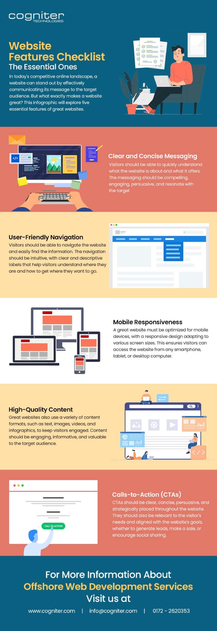
A website is more than a digital brochure. It shapes first impressions, influences trust, and determines whether a visitor becomes a customer or disappears forever. In a world where attention spans are short and competitors sit a click away, your site must combine clarity, usability, and purpose. The most effective websites are built with thoughtful design, strong communication, and user experience at their core.
This guide breaks down the key features that make a website truly perform. Instead of chasing trends or surface-level aesthetics, these elements focus on function and results. They ensure your website attracts visitors, supports them on their journey, and converts interest into meaningful action. When each component works together, your site becomes a dependable engine for business growth.
Clear and Concise Messaging
The strongest websites communicate value instantly. Visitors should understand within seconds who you are, what you offer, and why it matters. Messaging that is short, direct, and relevant gives users confidence and prevents them from leaving due to confusion or uncertainty. Simple language, focused headlines, and clear positioning make the difference between engagement and abandonment.
- State your main value proposition prominently on the homepage so it cannot be missed.
- Use everyday language instead of jargon to ensure clarity and accessibility.
- Make headlines benefit-driven so visitors immediately see how you help them.
- Reinforce key points throughout the site to build consistency and trust.
User-Friendly Navigation
Effective navigation makes information easy to find and journeys effortless. Visitors should move smoothly between sections without guessing or feeling overwhelmed. When menus are clear and intuitive, users feel supported rather than forced to figure things out. Navigation should guide, simplify, and remove friction at every stage.
- Use simple menu labels that clearly reflect the information they lead to.
- Limit the number of top-level menu items to avoid overwhelming visitors.
- Ensure important pages are easy to reach in one or two clicks.
- Maintain consistent navigation design across every page for familiarity.
Mobile Responsiveness
Modern users expect seamless browsing across phones, tablets, and desktops. A website that only works well on one device is no longer acceptable. Responsive design improves usability, readability, and speed, helping visitors stay engaged rather than abandoning pages that feel awkward or slow on smaller screens.
- Test layouts and content on multiple screen sizes to ensure usability everywhere.
- Make buttons large enough to tap easily and ensure text is readable without zooming.
- Remove unnecessary scripts or heavy assets to keep mobile loading fast.
- Prioritise mobile design during development rather than treating it as an afterthought.
High-Quality Content
Content is the substance that informs, persuades, and reassures visitors. When content is clear, relevant, and helpful, users stay longer and view your brand as trustworthy. Great content demonstrates expertise, answers questions, and supports the buying journey. Variety also keeps engagement high, offering multiple ways to absorb information.
- Focus on solving user problems rather than simply listing features.
- Use multiple formats, such as text, video, imagery, and infographics, to add depth.
- Keep content updated so your website reflects current information and standards.
- Write in a tone consistent with your brand and appropriate for your audience.
Calls-to-Action (CTAs)
A website needs to guide visitors towards meaningful action. Whether requesting a quote, downloading a guide, or making a purchase, CTAs lead users to take the next step. Strong CTAs are visible, compelling, and placed where people naturally decide. Without clear direction, visitors browse without converting, wasting traffic and opportunity.
- Use brief, action-focused CTA language that makes the next step obvious.
- Position CTAs in multiple strategic areas rather than relying on one button.
- Align CTA types with the stage of the user journey, from learning to purchasing.
- Ensure CTA buttons stand out visually so users always know where to click.
Why These Elements Matter Together
Each of these features plays a strategic role, but their impact increases when combined. Messaging captures interest, navigation supports movement, mobile design ensures accessibility, content builds trust, and CTAs create action. When all are aligned, the website feels purposeful, professional, and easy to use. Poor performance in any one area weakens the entire experience.
- Review your website as a whole rather than treating each element separately.
- Aim for consistency in tone, layout, and user flow to build confidence.
- Remove obstacles and distractions that slow or confuse the visitor journey.
- Continually refine your site based on performance data and user behaviour.
Conclusion
A truly effective website blends clarity, usability, and strategy. It communicates value quickly, guides visitors with ease, and works flawlessly across devices. Strong content builds authority, while clear calls-to-action turn interest into measurable results. These features are not optional add-ons; they form the backbone of modern digital performance.
When you focus on simplicity, relevance, and user experience, your website becomes a powerful business asset rather than a static online presence. Review your site through this lens, refine what needs improvement, and keep evolving. The most successful websites are built on purpose, improved over time, and always designed with the visitor at the centre.

Author:
Mark Ford



