

Are you wondering how to choose the perfect CTA button colour to boost your website’s conversions? Want to understand what each colour says to your visitors and how it influences their actions?
You’ll find some web design basics in this infographic.
Here’s a summary of what’s covered:
- Yellow: Optimistic and Youthful
- Red: Energy and Urgency
- Blue: Trust and Security
- Green: Wealth and Relaxation
- Orange: Aggressive Calls to Action
- Pink: Romantic and Youthful
- Black: Powerful and Sleek
- Purple: Soothing and Calm
Check out the post below for more.
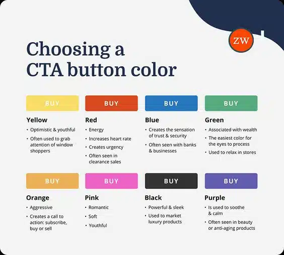
A call-to-action (CTA) button is one of the most influential elements on any website. The right colour can instantly attract attention, evoke the right emotion, and nudge users towards taking the next step.
But choosing that perfect shade is more than just picking what looks nice — it’s about aligning colour psychology with your business goals. In this guide, we’ll explore how each CTA button colour works and how to use it effectively.
Yellow: Optimistic and Youthful
Yellow is a colour that radiates warmth, energy, and positivity. It’s often associated with happiness and optimism, which makes it ideal for brands looking to create a friendly and inviting atmosphere. This colour works especially well when you want to catch the eye of casual visitors or shoppers browsing without intent. Used wisely, yellow can encourage curiosity and engagement.
- Use yellow for introductory offers to grab attention quickly.
- Pair with contrasting text colours for maximum readability.
- Avoid overusing it, as too much yellow can cause visual fatigue.
- Test it on seasonal promotions for a fresh, uplifting feel.
Red: Energy and Urgency
Red is one of the most powerful colours for creating a sense of urgency. It stimulates excitement and can even increase heart rate, making it perfect for time-sensitive offers. Many retailers use red during clearance sales or flash promotions because it prompts quick decision-making. However, it should be used sparingly to avoid overwhelming users.
- Use red for limited-time offers or urgent sales events.
- Combine with strong action words to enhance urgency.
- Keep other surrounding elements neutral to avoid visual overload.
- Monitor performance, as red can sometimes deter risk-averse audiences.
Blue: Trust and Security
Blue is known for creating feelings of trust, reliability, and calm. It’s a popular choice for businesses in finance, technology, and healthcare, where credibility is key. Blue doesn’t just look professional — it reassures users that they’re making a safe and secure choice. It’s a strong option for guiding visitors towards sign-ups or transactions.
- Use blue on high-value forms, such as registrations or checkouts.
- Pair with concise, confident messaging for maximum impact.
- Lighter blues can feel more approachable, while darker tones feel more corporate.
- Avoid combining with too many warm tones to maintain a calm aesthetic.
Green: Wealth and Relaxation
Green is associated with growth, wealth, and harmony, making it versatile for many industries. It’s also one of the easiest colours for the human eye to process, creating a soothing visual experience. Whether you’re selling eco-friendly products or encouraging sign-ups, green can signal positivity and success.
- Use green for environmentally focused products or services.
- Choose deep greens for luxury and premium branding.
- Light, fresh greens can promote health and wellness themes.
- Avoid dull greens that can appear outdated or uninspiring.
Orange: Aggressive Calls to Action
Orange is a bold, energetic colour that demands attention without being as aggressive as red. It’s highly effective for creating strong calls to action that encourage immediate interaction. Orange blends the cheerfulness of yellow with the urgency of red, making it a versatile choice for conversions.
- Use orange for buy-now buttons to create instant impact.
- Pair with clean, simple layouts so it stands out.
- Ideal for e-commerce product pages and subscription prompts.
- Test with black or dark grey text for maximum contrast.
Pink: Romantic and Youthful
Pink is often associated with romance, softness, and youthful energy. It can convey playfulness while still maintaining elegance, depending on the shade you choose. Brands targeting younger demographics or lifestyle niches often use pink to create an approachable, friendly feel.
- Use soft pinks for feminine and lifestyle-focused products.
- Bold pinks can convey confidence and energy.
- Pair with minimalistic designs to avoid looking overly sweet.
- Test different shades to match your audience’s expectations.
Black: Powerful and Sleek
Black is a colour of sophistication, power, and exclusivity. It’s often used by luxury brands to convey elegance and high value. When applied to CTA buttons, black can add a sense of authority, making the action feel important and premium.
- Use black for high-end product launches or VIP offers.
- Pair with white or gold text for a refined, striking look.
- Works well on minimalist websites where contrast is key.
- Avoid overuse to maintain its impact as a special, standout choice.
Purple: Soothing and Calm
Purple blends the stability of blue with the energy of red, creating a sense of calm confidence. It’s often linked with creativity, beauty, and spirituality, making it a great choice for wellness and personal care brands. Purple CTA buttons can invite users to engage without feeling rushed.
- Use purple for beauty, spa, or self-care offers.
- Light lavender tones feel more soothing, while deep purples feel more luxurious.
- Pair with elegant fonts and imagery for a cohesive look.
- Avoid using too close to dark backgrounds to ensure visibility.
Conclusion
The colour of your CTA button is more than a design decision — it’s a strategic choice that can shape user behaviour. By understanding the psychology behind each shade, you can align your website’s visual language with your brand’s goals.
Whether you’re aiming to inspire trust, create urgency, or evoke warmth, there’s a colour that can help you achieve it. Test, measure, and refine your choices to see which hues drive the most engagement, and watch as your clicks turn into conversions.

Author:
Mark Ford



