
Are you struggling to turn website clicks into paying customers? Want to discover the secrets to designing landing pages that actually convert?
You’ll find some web design basics in this infographic.
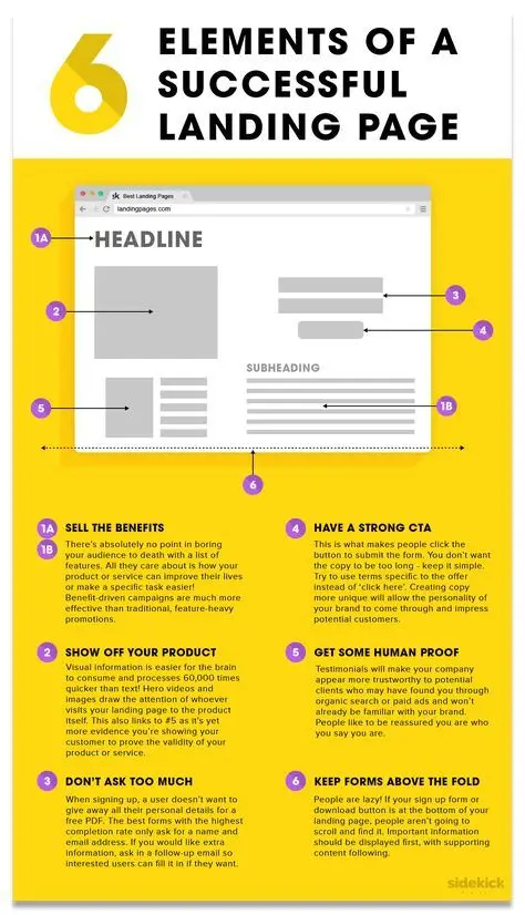
Here’s a summary of what’s covered:
- Focus on Benefits, Not Just Features
- Showcase Your Product or Service
- Keep Forms Simple
- Use a Strong Call-to-Action
- Add Social Proof
- Keep Key Content Above the Fold
Check out the post below for more.
Creating a landing page that turns casual clicks into loyal customers is both an art and a science. The difference between a page that converts and one that falls flat often lies in the small details.
A well-designed landing page guides your visitors smoothly from curiosity to action. In this guide, we’ll explore the essential elements that make a landing page successful and how you can use them to boost conversions.
Focus on Benefits, Not Just Features
The first thing visitors see on your landing page is your headline and subheading, so it’s vital they do the heavy lifting. Rather than listing every feature of your product or service, explain how it can make life easier or better for your customer. Benefits are far more persuasive because they speak to the outcome visitors are looking for. Your messaging should inspire them to stay and learn more.
- Highlight how your product or service solves a problem your audience cares about.
- Use clear, emotionally engaging language that puts benefits first.
- Keep headlines short, impactful, and focused on what the visitor gains.
- Reinforce benefits in your subheading to encourage scrolling and reading.
Showcase Your Product or Service
Visuals play a key role in helping people quickly understand what you’re offering. Humans process images faster than text, which makes photos, videos, and infographics incredibly powerful tools. Show your product or service in action so that visitors can see what they’ll be getting. This builds confidence and keeps their attention on the page.
- Use high-quality, relevant images or videos that clearly display your product.
- Show the product in context so visitors can imagine themselves using it.
- Include short demo videos or animated walkthroughs where appropriate.
- Optimise visual content to load quickly without sacrificing quality.
Keep Forms Simple
A landing page form can make or break your conversion rate. Visitors are often put off by long or complicated forms, so keep the number of fields to a minimum. Only ask for information you absolutely need to complete the next step. A streamlined form removes friction and encourages more people to submit their details.
- Limit fields to essentials such as name and email address for initial contact.
- Use smart forms that expand only if more information is necessary.
- Make sure your form is mobile-friendly and easy to complete on any device.
- Test different form lengths to find the balance between data quality and completion rate.
Use a Strong Call-to-Action
Your call-to-action (CTA) is one of the most important parts of your landing page. It tells visitors what to do next and should be impossible to miss. A strong CTA uses action-oriented language and stands out visually so users feel compelled to click. It should feel like the natural next step in their journey.
- Use direct, persuasive language such as “Get Started” or “Claim Your Offer.”
- Make your CTA button a contrasting colour so it draws the eye immediately.
- Position your CTA prominently and repeat it at key points on the page.
- Ensure the CTA is clear about what happens after clicking to build trust.
Add Social Proof
Visitors want reassurance that your offer is credible and valuable. Social proof, such as testimonials and reviews, helps build trust and reduces hesitation. By showcasing the experiences of other happy customers, you create a sense of confidence and credibility. This is especially important for first-time visitors who may not yet know your brand.
- Include testimonials with names, photos, or company logos to increase authenticity.
- Highlight case studies or real results that demonstrate your success.
- Add third-party reviews or ratings to provide independent validation.
- Position social proof close to your CTA to encourage clicks at the decision moment.
Keep Key Content Above the Fold
When someone lands on your page, they make a split-second decision about whether to stay. Placing the most critical content above the fold helps capture attention quickly. Visitors should immediately see what the page is about, why it matters to them, and what to do next. This reduces bounce rates and improves engagement.
- Place your headline, subheading, and primary CTA where they are instantly visible.
- Include a supporting image or video to create visual interest.
- Keep copy concise and focused on the main value proposition.
- Use clean design and whitespace to avoid overwhelming first-time visitors.
Conclusion
Turning clicks into conversions doesn’t have to be complicated, but it does require a thoughtful approach. By focusing on benefits, using compelling visuals, keeping forms short, and writing strong CTAs, you can dramatically improve your results.
Adding social proof and keeping your key content above the fold ensures visitors have all the information they need to act. With these landing page secrets in place, you can transform casual visitors into loyal customers and maximise the return on every click.

Author:
Mark Ford