Are you looking for ways to improve your paid ads campaigns? Want to learn the anatomy of a successful landing page?
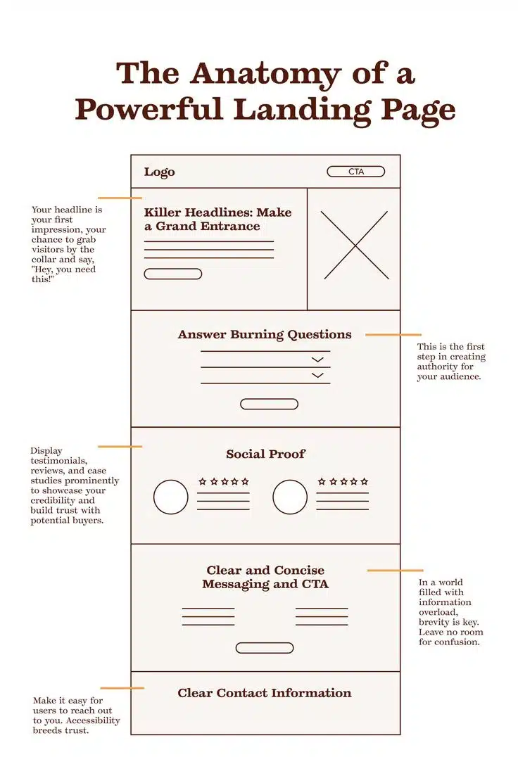
Offset marketing shares its guide to landing page design in this infographic.
Here’s a quick summary of what they cover:
- Header with logo and CTA
- Hero area with a killer headline
- Answer burning questions
- Social proof
- Clear and concise CTA
- Contact information
Check out the infographic for more information.
When running paid advertising campaigns, the success of your ads largely depends on the effectiveness of your landing pages. A well-optimised landing page is essential for converting visitors into customers, and its design, messaging, and functionality can make all the difference in your campaign’s performance.
This blog post will explore the key elements of a powerful landing page that can dramatically improve your paid ad performance.
Header with Logo and CTA
The header of your landing page is the first thing visitors will see once they click on your paid ad. It’s important to make a strong first impression by ensuring that this section is clear, professional, and aligned with your brand.
Here’s how to optimise it:
- Logo Placement: The logo should be placed in a prominent position, usually in the top left corner. It should be visible but not distract from the page’s primary goal. A clean, professional logo ensures that visitors instantly recognise your brand, helping to establish trust.
- Call to Action (CTA): The call to action in the header should be bold and easy to locate. Whether you want your visitors to sign up for a newsletter, request a demo, or purchase a product, the CTA should be highly visible and actionable. Use contrasting colours, clear wording, and actionable language like “Get Started,” “Download Now,” or “Shop Today.” Additionally, consider including a secondary CTA for those who might not be ready to convert immediately, such as “Learn More” or “See How It Works.”
- Consistency: The messaging in your header should align with the ad that brought the user to your page. If your ad promises a discount, a free consultation, or a limited-time offer, this should be reinforced in the header to keep the user’s expectations aligned.
By keeping your header clean and simple, with a logo that communicates trust and a clear CTA that directs users toward the next step, you’re setting the stage for a seamless and engaging user experience.
Hero Area with a Killer Headline
The hero area is the section at the very top of your landing page, just below the header. This is where you get to make your pitch and immediately grab the attention of your visitors.
This section is critical because it can either captivate or lose the user in mere seconds.
- Headline that Grabs Attention: Your headline should be concise, attention-grabbing, and immediately clear about the value your page provides. The headline should speak directly to the visitor’s needs, highlighting the benefit of what they’ll get by taking action. For example, if you’re offering a solution to a common problem, the headline might say, “Say Goodbye to [Problem] in Just 7 Days.”
- Subheadline: A good subheadline should follow the headline and provide additional context. It should support the primary message without overwhelming the reader with too much information. If your headline sparks interest, the subheadline can provide just enough detail to keep them engaged, guiding them toward the next part of the landing page.
- Visual Elements: Along with your headline and subheadline, visuals play an important role in the hero area. A high-quality image or video that directly relates to your offer can increase engagement. For example, if you are promoting a software product, a short video demonstrating its features could be far more effective than static images alone. Keep the visuals clean and relevant, and ensure they don’t distract from the core message.
- Keep it Simple: The hero section should focus on the essentials: an attention-grabbing headline, a concise subheadline, and visuals that directly support the value proposition. Avoid clutter and ensure that the user’s eye is drawn naturally to the key elements that drive conversions.
Answer Burning Questions
Once you’ve captured a visitor’s attention with your headline and hero section, it’s important to continue the conversation by answering the burning questions they likely have. A good landing page doesn’t just present an offer; it also builds trust by addressing concerns and providing transparency.
Here’s how to do that:
- Anticipate Visitor Objections: Think about the reasons why a visitor might hesitate to take action on your landing page. Are they unsure about the cost? Do they need more proof of the product’s effectiveness? Do they want to know how it compares to competitors? Answering these questions directly on your landing page can help remove barriers to conversion.
- Provide Clear Information: If your offer involves a product, explain how it works and how it will benefit the user. For example, if you are promoting a software solution, explain its core features, how it solves specific problems, and why it’s different from alternatives. For services, detail the process step-by-step to help users understand what they will experience.
- Address Common Concerns: Include a FAQ section or a bullet-point list that covers frequently asked questions. For instance, if your product is a subscription service, you might address questions about pricing, cancellations, and the terms of the offer.
- Use Clear, Simple Language: Don’t use jargon that might confuse your visitors. The goal is to make it as easy as possible for them to understand what’s on offer, why it’s valuable, and why it’s the right choice for them.
By answering burning questions and addressing potential concerns upfront, you establish credibility and trust with your visitors, which is crucial for conversion.
Social Proof
In today’s world, people often rely on the experiences of others before making decisions, especially when it comes to online purchases or sign-ups.
Social proof—testimonials, reviews, case studies, and trust badges—can help build credibility and increase the likelihood of conversions.
- Testimonials: Including customer testimonials or success stories on your landing page is a powerful way to build trust. Choose testimonials that address the visitor’s potential concerns, showcase the benefits of your product or service, and highlight customer satisfaction. If possible, include a photo of the person giving the testimonial and their full name, as this increases authenticity.
- Case Studies: If applicable, include case studies that show how your product or service has helped others. Case studies provide real-world examples of how your offering can solve problems, and they help to further establish credibility. Make sure your case studies include measurable results, such as how much time or money a customer saved after using your service.
- Trust Badges: Trust badges, such as security logos, payment processor logos, or industry certifications, can help reinforce your landing page’s credibility. If you have awards, recognitions, or certifications, be sure to highlight them in a way that doesn’t clutter the page but adds to its professional appearance.
- User Reviews: If you sell products, showing reviews from users can be incredibly persuasive. Include ratings or a short snippet from customer feedback to illustrate the quality and satisfaction others have experienced with your offer.
Using social proof to highlight your product’s or service’s effectiveness can drastically increase user confidence, turning hesitant visitors into motivated customers.
Clear and Concise CTA
After you’ve built trust and provided all the necessary information, the next step is to prompt the user to take action.
This is where your call to action (CTA) becomes paramount.
- Make it Stand Out: Your CTA button should be visually distinct from the rest of the page. Use contrasting colours that stand out, and make sure the button is large enough to be noticed but not overpowering. Avoid using multiple CTA buttons throughout the page unless they serve distinct purposes.
- Actionable Text: The text on your CTA button should be clear and action-oriented. Use active language such as “Get Started,” “Sign Up Now,” “Buy Today,” or “Claim Your Free Trial.” This not only directs the user on what to do but also conveys a sense of urgency and excitement.
- Multiple Touchpoints: Depending on the length of your landing page, you may want to include multiple CTA buttons at different stages. Each section should have a CTA that encourages users to take action after they’ve been informed or convinced. However, avoid cluttering the page with too many buttons—focus on guiding the user toward your desired outcome.
- Create Urgency: If applicable, adding a sense of urgency can help prompt users to act quickly. For example, phrases like “Limited Offer,” “Only X Left in Stock,” or “Ends in 24 Hours” can create a sense of urgency, compelling users to act before they miss out.
A clear and concise CTA that stands out on the page and aligns with the user’s intent is one of the most important elements for converting visitors into customers.
Contact Information
While your CTA encourages users to take immediate action, some visitors may still need more time to decide.
Providing contact information is a great way to offer reassurance and build trust.
- Easy to Find Contact Info: Your contact information should be easy to find, ideally in the footer or a dedicated section on the landing page. Include details such as your phone number, email address, and physical address (if applicable). If your business offers support, include links to your help centre or live chat.
- Live Chat: Adding a live chat feature to your landing page can significantly improve user experience by giving visitors a quick way to get answers to their questions. Many users may have last-minute doubts, and a live chat option can resolve them instantly, potentially leading to a higher conversion rate.
- Social Media Links: In addition to traditional contact information, including links to your social media profiles can add a sense of authenticity and accessibility. Social media platforms also give potential customers another way to connect with your brand.
By providing multiple ways for visitors to reach out, you give them the confidence they need to proceed with their decision.
Conclusion
A powerful landing page is the cornerstone of a successful paid advertising campaign.
By incorporating the elements we’ve discussed—such as a clear header with a logo and CTA, an attention-grabbing hero area, answers to burning questions, social proof, a clear CTA, and easily accessible contact information—you can create a landing page that drives conversions and maximises the effectiveness of your paid ads.
Keep testing and optimising your landing page to ensure it resonates with your audience and delivers the results you’re aiming for.

Author:
Mark Ford