Have you heard of Google’s mobile friendly update that comes into force on April 21st? Are you aware it could massively affect your SEO?
If your site is not mobile optimised and doesn’t pass this mobile friendly test by April 21st you could see a drop in your rankings. If you want to avoid this you must get your site mobile optimised now as time is running out!
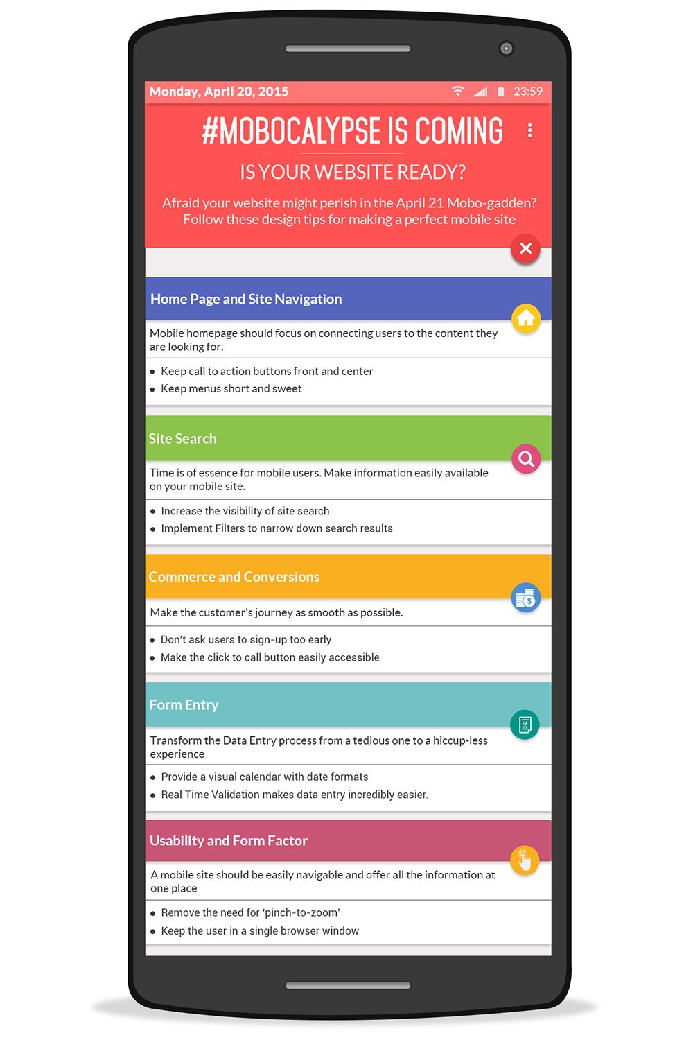
For some mobile website optimisation tips take a look at the infographic below.
In the ever-evolving landscape of digital marketing, search engine optimization (SEO) remains a critical factor in driving organic traffic to websites. Google, being the dominant player in the search engine market, regularly updates its algorithms to provide users with the best possible search experience. One such update that has been making waves in the SEO community is the Google Mobile SEO Update.
In this blog post, we’ll delve deep into the Google Mobile SEO Update, exploring what it is, why it matters, and most importantly, how you can ensure that your website is ready to face this crucial algorithm change head-on.
Understanding the Google Mobile SEO Update
What is the Google Mobile SEO Update?
The Google Mobile SEO Update, often referred to as “Mobile-First Indexing,” is a significant algorithm update that Google rolled out to prioritize mobile-friendly websites in its search results. It’s a response to the growing trend of users accessing the internet via mobile devices, such as smartphones and tablets. Google’s aim with this update is to ensure that the search results it delivers are optimized for the majority of users, who are now searching on mobile devices.
Why Does Mobile-First Indexing Matter?
Mobile-First Indexing matters for several reasons:
- Mobile Dominance: With the increasing use of smartphones, more people are conducting searches on mobile devices. Google recognizes this shift and wants to ensure that users get the best experience when using its search engine on mobile.
- User Experience: Google is committed to delivering the best possible user experience. Websites that are mobile-friendly are more likely to provide a smoother experience on smartphones, which is essential for user satisfaction.
- Ranking Impact: The Google Mobile SEO Update can have a significant impact on your website’s search engine rankings. If your site isn’t mobile-friendly, it may not rank as well in mobile search results, leading to a potential loss in organic traffic.
Now that we understand the significance of the Google Mobile SEO Update, let’s explore how you can prepare your website to thrive in this mobile-centric era.
Preparing Your Website for Mobile-First Indexing
Ensuring that your website is ready for the Google Mobile SEO Update involves a series of steps and considerations. Let’s break them down:
1. Responsive Web Design
Responsive web design is the foundation of mobile-friendliness. A responsive website automatically adjusts its layout and content to fit different screen sizes, ensuring that users have a consistent and optimal experience across all devices. Here are some key elements of responsive web design:
- Flexible Grids: Use relative units like percentages for widths and heights instead of fixed pixels.
- Media Queries: Implement CSS media queries to apply different styles based on the screen size.
- Mobile-First Approach: Design your website with mobile users in mind from the beginning and then progressively enhance for larger screens.
2. Mobile-Friendly Content
Content plays a crucial role in SEO. For mobile-first indexing, make sure your content is mobile-friendly:
- Readable Fonts: Use legible fonts and maintain a reasonable font size to ensure readability on small screens.
- Condensed Content: Avoid excessive long paragraphs. Break content into smaller, easily digestible sections.
- Optimize Images: Compress and optimize images to reduce loading times on mobile devices.
- Clear CTAs: Ensure that your calls-to-action (CTAs) are visible and easy to interact with on mobile screens.
3. Page Loading Speed
Mobile users expect websites to load quickly. Slow-loading pages can lead to higher bounce rates and lower rankings. Here are some tips to improve page loading speed:
- Image Optimization: Compress images, use modern image formats like WebP, and leverage browser caching.
- Minimize Code: Remove unnecessary code, such as unused CSS and JavaScript.
- Content Delivery Network (CDN): Use a CDN to distribute content to users from servers closer to their location, reducing latency.
- Mobile-Focused Hosting: Choose a hosting provider that specializes in mobile performance optimization.
4. Mobile Usability
User experience is paramount for mobile SEO. Ensure that your website is user-friendly on mobile devices:
- Mobile Navigation: Create a user-friendly mobile navigation menu, such as a hamburger menu, for easy access to site sections.
- Touch-Friendly Buttons: Ensure that buttons and links are large enough and well-spaced to be easily clickable on touch screens.
- Avoid Pop-ups: Intrusive pop-ups can frustrate mobile users. Use them sparingly or consider alternatives.
5. Structured Data
Structured data helps search engines understand the content on your site. Make sure your structured data is mobile-friendly:
- Schema Markup: Implement schema markup to provide context and information about your content.
- Testing Tools: Use Google’s Structured Data Testing Tool to check for errors or issues.
6. Mobile SEO Audit
Perform a comprehensive mobile SEO audit to identify areas that need improvement. Google’s Mobile-Friendly Test and PageSpeed Insights can help pinpoint specific issues on your site.
7. Mobile-First Testing
Before the Google Mobile SEO Update fully rolls out, conduct thorough testing of your website on various mobile devices. Ensure that it looks and performs well across different screens, browsers, and operating systems.
Conclusion
The Google Mobile SEO Update, also known as Mobile-First Indexing, is a crucial algorithm change that prioritizes mobile-friendly websites in search results. With the increasing dominance of mobile devices in internet usage, adapting to this change is essential for website owners and digital marketers.
To ensure that your website is ready for Mobile-First Indexing, focus on responsive web design, mobile-friendly content, fast page loading speeds, mobile usability, structured data, and conducting regular mobile SEO audits. By taking these steps, you can not only prepare your site for the impending Google update but also improve the overall user experience and potentially boost your organic search rankings.
Don’t wait until it’s too late—take action now to make your website mobile-friendly and stay ahead in the competitive world of SEO. Your website’s success in the mobile era depends on it!

Author:
Mark Ford