Colors are more than just a visual aspect of your brand; they have the power to convey emotions, establish trust, and leave a lasting impression on your customers. In the world of business, the colors you choose for your company logo, website, and marketing materials can play a pivotal role in shaping how your brand is perceived.
In this blog post, we will explore the psychology of color and how your company colors can influence your business.
What made you pick the colour (s) in your logo and / or website? For me, Red has always been my favourite colour so it was an easy choice.
According to the infographic below from Marketo Red is agressive, energetic, provocative and attention grabbing. What does your colour say about you?
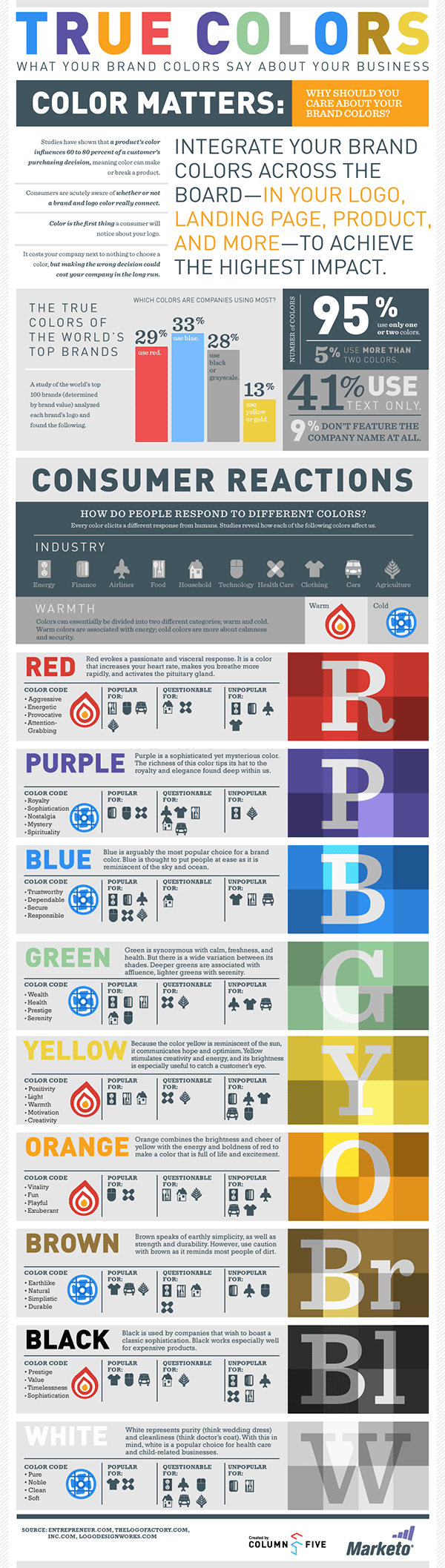
The Psychology of Color
Before delving into the specifics of how different colors impact your brand, it’s essential to understand the psychology behind color. Different colors evoke different emotions and associations, which can have a profound effect on consumer behavior. Here’s a brief overview of the emotions commonly associated with some primary colors:
Red
- Passion: Red is often associated with strong emotions like love, passion, and anger. It can create a sense of urgency and excitement.
- Energy: Red is a high-energy color that can stimulate appetite and grab attention.
Blue
- Trust: Blue is often seen as a trustworthy and dependable color. It’s commonly used in corporate branding to convey professionalism and reliability.
- Calm: Lighter shades of blue can evoke a sense of calm and tranquility.
Green
- Nature: Green is associated with nature, growth, and sustainability. It’s often used by eco-friendly and health-related businesses.
- Freshness: Lighter shades of green can suggest freshness and vitality.
Yellow
- Happiness: Yellow is often associated with happiness, optimism, and warmth. It can grab attention and create a sense of joy.
- Caution: In some contexts, yellow can also signify caution or warning.
Orange
- Creativity: Orange is a creative and energetic color. It’s often used by brands that want to stand out and appear innovative.
- Friendliness: Like yellow, orange can create a sense of warmth and friendliness.
Purple
- Royalty: Purple has long been associated with royalty and luxury. It can convey a sense of elegance and sophistication.
- Creativity: Purple can also represent creativity and imagination.
Black
- Elegance: Black is often used to convey sophistication, elegance, and luxury. It’s commonly used in high-end fashion and technology brands.
- Mystery: Black can also evoke a sense of mystery and intrigue.
White
- Purity: White symbolizes purity, simplicity, and cleanliness. It’s often used in healthcare, beauty, and tech industries.
- Minimalism: White can also represent minimalism and a fresh start.
Choosing the Right Colors for Your Brand
Now that we understand the psychology behind color, let’s explore how you can choose the right colors for your brand and what those colors might say about your business.
1. Industry Matters
Consider your industry and the expectations of your target audience. For example, if you’re in the finance industry, blue might be a suitable choice to convey trust and reliability. If you’re in the food industry, vibrant colors like red or orange can stimulate appetite and excitement.
2. Competitive Analysis
Analyze your competitors’ color choices. While you don’t want to copy them, understanding the colors commonly used in your industry can help you differentiate your brand. If most of your competitors use similar colors, opting for something distinctive can make your brand more memorable.
3. Target Audience
Think about your target audience’s preferences and emotions. Are they looking for a professional and dependable service, or are they seeking a fun and creative experience? Your colors should resonate with your ideal customers.
4. Brand Personality
Consider the personality of your brand. Is it playful and energetic, or is it serious and elegant? Your colors should reflect this personality. For example, a children’s toy brand might use bright and vibrant colors, while a law firm may opt for more subdued and professional tones.
5. Cultural Sensitivity
Be mindful of cultural differences and associations with colors. In some cultures, certain colors may have negative connotations or carry specific meanings. Make sure your color choices are appropriate for your target market.
6. Consistency is Key
Once you’ve chosen your brand colors, be consistent in using them across all your marketing materials. Consistency builds brand recognition and trust.
What Different Colors Convey
Now, let’s dive into what specific colors may convey about your business:
Red
- Passion and Energy: Red is an attention-grabbing color that can convey a sense of passion and urgency. It’s often used by brands that want to evoke excitement and enthusiasm. Examples include Coca-Cola and Netflix.
Blue
- Trust and Professionalism: Blue is a go-to color for businesses that want to establish trust and professionalism. It’s commonly used by banks, tech companies, and healthcare providers. Examples include IBM and Facebook.
Green
- Nature and Sustainability: Green is associated with nature and sustainability. It’s often chosen by eco-friendly and health-conscious brands. Examples include Whole Foods and Starbucks.
Yellow
- Happiness and Optimism: Yellow is a joyful color that can create a sense of happiness and optimism. It’s used by brands that want to appear friendly and approachable. Examples include McDonald’s and IKEA.
Orange
- Creativity and Innovation: Orange is a vibrant and creative color that can make a brand stand out. It’s often used by brands that want to convey innovation and enthusiasm. Examples include Nickelodeon and Fanta.
Purple
- Luxury and Sophistication: Purple has long been associated with royalty and luxury. It can convey a sense of elegance and exclusivity. Examples include Cadbury and Hallmark.
Black
- Elegance and Mystery: Black is often chosen by brands that want to appear sophisticated and mysterious. It’s commonly used in fashion and luxury industries. Examples include Chanel and Apple.
White
- Purity and Simplicity: White symbolizes purity and simplicity. It’s often used in healthcare, beauty, and tech industries to convey cleanliness and minimalism. Examples include Apple and Dove.
Case Studies: How Colors Influence Brand Perception
Let’s explore some real-world examples of how companies have used colors effectively to shape their brand identity and perception.
1. Coca-Cola – Red
Coca-Cola, one of the world’s most recognizable brands, uses the color red to evoke excitement and happiness. The vibrant red of their logo and packaging creates a sense of passion and energy. It’s no coincidence that Coca-Cola’s signature red is associated with joy and celebration, making it a perfect fit for a brand that markets itself as a source of happiness.
2. IBM – Blue
IBM, a global technology and consulting company, relies on the color blue to establish trust and professionalism. Blue is a color often associated with reliability, and IBM’s use of deep blue in its logo and branding conveys a sense of dependability and expertise. This choice aligns with IBM’s mission to provide cutting-edge solutions and services while maintaining a strong sense of trustworthiness.
3. Whole Foods Market – Green
Whole Foods Market, a grocery chain specializing in organic and natural products, uses green to emphasize its commitment to nature and sustainability. The use of various shades of green in their branding conveys a sense of freshness and environmental consciousness. This choice resonates with their target audience, who value healthy and eco-friendly choices.
4. McDonald’s – Yellow
McDonald’s, the fast-food giant, incorporates yellow into its branding to create a sense of happiness and optimism. The bright yellow arches in their logo and the yellow accents in their restaurants aim to make customers feel cheerful and welcomed. This use of color aligns with their mission to provide a fun and friendly dining experience.
5. Apple – Black and White
Apple, known for its sleek and innovative products, utilizes a minimalist color scheme of black and white. This choice reflects the brand’s emphasis on simplicity, elegance, and cutting-edge design. The clean, white packaging and black device frames convey a sense of sophistication and modernity, aligning perfectly with Apple’s brand image.
The Power of Color in Marketing
Beyond logo and branding, the influence of color extends into various aspects of marketing. Here are some key areas where color plays a significant role:
1. Website Design
The colors used in your website design can impact user experience and perception. For instance, a clean and minimalist design with a white background can convey simplicity and ease of use. On the other hand, a colorful and vibrant website might suggest creativity and excitement.
2. Product Packaging
Product packaging is often the first physical interaction a customer has with your brand. The colors and design of the packaging can influence purchasing decisions. For example, food products with green packaging may be perceived as healthier, while black packaging can imply luxury and quality.
3. Marketing Collateral
From brochures to advertisements, the colors used in your marketing collateral should align with your brand identity and messaging. Consistency in color choices across all materials helps reinforce brand recognition.
4. Call to Action (CTA) Buttons
The color of CTA buttons on your website can significantly impact click-through rates. For example, a red or orange CTA button can create a sense of urgency and encourage immediate action, while a green button might suggest a positive decision.
Rebranding and Color Changes
Sometimes, companies undergo rebranding efforts that include a change in color scheme. Rebranding can be a strategic move to reposition a company in the market or to modernize its image. However, it’s essential to approach color changes with caution, as they can confuse existing customers and disrupt brand loyalty.
If considering a color change for your brand, thoroughly research and test the new colors to ensure they align with your updated brand identity and resonate with your target audience. Gradual transitions and clear communication can help ease the transition for your customers.
Conclusion
In the world of business, the colors you choose for your company branding are far from arbitrary. They are powerful tools that can shape how your brand is perceived by customers and the emotions they associate with your business. Understanding the psychology of color and making informed color choices can help you create a brand that resonates with your target audience, builds trust, and leaves a lasting impression. So, the next time you’re designing your logo, website, or marketing materials, remember that your company colors are speaking volumes about your business, even before a single word is read or heard.

Author:
Mark Ford