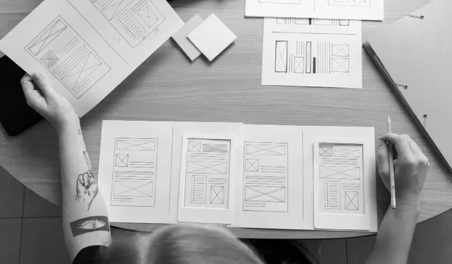
Are you about to embark on a new website design project for your business? Need some basic design knowledge to help you along the way?
In today’s digital age, having a visually appealing and user-friendly website is crucial for success. Whether you’re a business owner looking to establish an online presence or an individual creating a personal blog, the design of your website plays a significant role in attracting and retaining visitors.
To achieve a well-designed website, it’s essential to understand and apply the basic elements of design. In this blog post, we will explore ten fundamental design principles that you and your website designer should adhere to for a polished and effective website.
Creative Market share the basic elements of design you should stick to in this infographic.

Layout and Composition
The layout and composition of your website are the foundation of its design. It determines how all the elements on your page are organized and presented. A well-structured layout ensures that your content is easily readable and navigable. Consider the following aspects when planning your layout:
- Grid System: Utilize a grid system to create a balanced and organized structure for your website. Grids help maintain consistency in the placement of elements, making it easier for users to navigate.
- Whitespace: Embrace whitespace to give your content room to breathe. Adequate spacing between text, images, and other elements enhances readability and aesthetics.
- Hierarchy: Establish a clear hierarchy for your content. Use typography, color, and size to emphasize important information and guide users through your site.
Color Scheme
Choosing the right color scheme is a crucial aspect of web design. Colors evoke emotions, convey messages, and influence user behavior. When selecting a color scheme for your website, consider the following:
- Branding: Ensure that your chosen colors align with your brand identity. Consistency in color reinforces brand recognition.
- Contrast: Use contrasting colors for text and background to enhance readability. High contrast between elements also draws attention to specific content.
- Color Psychology: Familiarize yourself with color psychology to understand how different colors can evoke specific emotions or associations in your audience.
Typography
Typography refers to the selection and arrangement of fonts on your website. The right typography can greatly enhance the readability and overall aesthetic of your site. Here are some typography principles to follow:
- Font Pairing: Choose complementary fonts for headings and body text. Mixing serif and sans-serif fonts can create an appealing contrast.
- Font Size: Ensure that text is easy to read by selecting an appropriate font size for different elements. Headers should be larger than body text, and maintain consistency in size.
- Line Spacing: Appropriate line spacing (line height) improves legibility. Avoid cramped or overly spaced text.
Navigation
Navigation is a critical component of web design. An intuitive and user-friendly navigation system ensures that visitors can easily find the information they seek. Consider these navigation principles:
- Clear Menu: Place your navigation menu prominently, usually at the top of the page or in a sidebar. Use concise and descriptive labels for menu items.
- Breadcrumbs: Implement breadcrumb navigation to help users understand their location within your site’s hierarchy and provide an easy way to backtrack.
- Call-to-Action (CTA) Buttons: Use clear and visually distinct CTA buttons to guide users toward specific actions, such as signing up, making a purchase, or contacting you.
Images and Graphics
Visual content, including images and graphics, is a powerful tool in web design. High-quality visuals can engage visitors and convey information effectively. Consider the following tips when incorporating images and graphics:
- Optimization: Ensure that images are properly optimized for web use to reduce load times and maintain site performance.
- Consistency: Use images that align with your brand and messaging. Consistency in style and tone enhances the overall look of your website.
- Alt Text: Always include descriptive alt text for images to improve accessibility and provide context for visually impaired users.
Responsive Design
With the increasing use of mobile devices, it’s essential to design your website to be responsive. Responsive design ensures that your site adapts to different screen sizes and resolutions, providing a seamless user experience on all devices. Key considerations for responsive design include:
- Mobile-First Approach: Start designing for mobile devices and then scale up to larger screens. This approach prioritizes mobile users, who often have limited screen space.
- Fluid Layouts: Use flexible grids and elements that can expand or contract based on the screen size.
- Testing: Regularly test your website on various devices and browsers to ensure it functions correctly and looks good everywhere.
Loading Speed
Fast loading times are crucial for retaining visitors and improving search engine rankings. Slow-loading websites can lead to user frustration and high bounce rates. To optimize loading speed:
- Image Compression: Compress images without compromising quality to reduce file sizes.
- Minimize Code: Use clean and efficient code to reduce unnecessary scripts and elements that can slow down your website.
- Content Delivery Networks (CDNs): Consider using CDNs to distribute your content across multiple servers for faster loading times.
Accessibility
Web accessibility ensures that your website is usable by individuals with disabilities. It’s not only a legal requirement in many places but also a moral obligation. To make your website more accessible:
- Alt Text: Provide descriptive alt text for images and graphics.
- Keyboard Navigation: Ensure that all interactive elements can be accessed and used with a keyboard.
- Semantic HTML: Use semantic HTML tags to structure your content, making it easier for screen readers to interpret.
Consistency
Consistency in design elements and content presentation creates a cohesive and professional look for your website. To achieve consistency:
- Style Guide: Create a style guide that outlines color palettes, typography choices, and design elements to maintain uniformity throughout your site.
- Templates: If using a content management system (CMS), develop templates for different types of pages (e.g., blog posts, product pages) to ensure consistency.
- Content Style: Maintain a consistent writing style and tone across your website to reinforce your brand’s voice.
User Testing and Feedback
Finally, user testing and feedback are invaluable in improving your website’s design. What might seem intuitive to you may not be the same for your visitors. Conduct usability testing and gather feedback to identify areas for improvement.
- A/B Testing: Experiment with different design elements, such as button colors or layout variations, to determine which performs best with your audience.
- User Surveys: Collect feedback from your visitors through surveys or feedback forms to understand their needs and preferences.
Conclusion
Creating a well-designed website is a collaborative effort between you and your website designer. By adhering to these ten basic elements of design, you can create a website that not only looks great but also delivers an exceptional user experience. Remember that web design is an ongoing process, and regular updates and improvements are essential to stay relevant and meet the evolving needs of your audience. Invest time and effort in your website’s design, and it will become a valuable asset in achieving your online goals.

Author:
Mark Ford