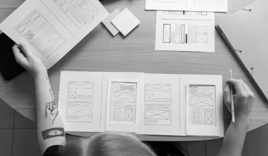
Are you in the process of creating a new website for your business? Want to know the modern trends you and your designer should consider?
In the fast-paced world of web development, staying ahead of the curve is crucial. With technology constantly evolving and user expectations rising, creating a new website that captures attention and keeps visitors engaged is no small feat. Whether you’re building a personal blog, an e-commerce platform, or a corporate website, you need to be aware of the latest trends to ensure your online presence is not only visually appealing but also functional and user-friendly.
In this blog post, we’ll explore six modern trends to consider when creating a new website. By incorporating these trends into your web design and development process, you can increase the chances of success and provide a better experience for your visitors.
Plugin Group share 6 web design trends for 2017 in this infographic.

1. Mobile-First Design
With the majority of internet traffic coming from mobile devices, it’s no longer sufficient to design for desktop users and then adapt for smaller screens. Mobile-first design is a fundamental approach that prioritizes designing and developing websites for mobile devices before addressing desktop screens.
Mobile-first design focuses on simplicity and usability. Here are some key principles to keep in mind:
- Responsive Design: Ensure your website layout adjusts seamlessly to various screen sizes and orientations. Use CSS media queries to create flexible grids and typography.
- Thumb-Friendly Navigation: Consider the ease of navigation on touch screens. Buttons and interactive elements should be large enough to tap with a thumb.
- Performance Optimization: Mobile users often have slower connections. Minimize the use of large images and optimize code and assets for faster loading times.
By embracing a mobile-first approach, you not only cater to the growing mobile audience but also improve your website’s overall performance and accessibility.
2. Minimalist and Clean Design
Simplicity is a timeless design principle that continues to gain popularity in modern web design. A minimalist and clean design focuses on removing clutter, unnecessary elements, and distractions, allowing users to focus on the essential content.
Here are some elements of minimalist web design:
- Whitespace: Use whitespace generously to create breathing room between elements and enhance readability.
- Limited Color Palette: Choose a limited color scheme to maintain visual coherence. Often, a few complementary colors are more effective than a multitude of options.
- Typography: Select clean and legible fonts that align with your brand and message.
- Flat Design: Embrace flat design principles, including simple icons and buttons, to create a sleek and contemporary look.
A minimalist design not only enhances user experience but also conveys a sense of sophistication and professionalism.
3. Dark Mode
Dark mode, also known as night mode, has become a prominent trend in recent years. This feature allows users to switch the color scheme of a website from light to dark, which can be easier on the eyes in low-light conditions and extend battery life on mobile devices with OLED screens.
Implementing dark mode in your website offers several advantages:
- User Choice: It provides users with a choice to customize their viewing experience, increasing user satisfaction.
- Accessibility: Dark mode can improve accessibility for users with visual impairments, reducing eye strain.
- Aesthetic Appeal: Many users find dark mode visually appealing, and it can make your website stand out.
When implementing dark mode, ensure that the transition is seamless and that all content remains readable and accessible in both light and dark modes.
4. Microinteractions
Microinteractions are small, subtle animations or responses that occur when a user interacts with a website. These interactions can be as simple as a button changing color when hovered over or more complex, such as a progress indicator during a file upload.
Here are some benefits of incorporating microinteractions into your website:
- Engagement: Microinteractions provide feedback and make interactions feel more responsive and engaging.
- User Guidance: They can guide users through a process or indicate the status of an action.
- Delight: Well-designed microinteractions can add an element of delight to the user experience, making your website memorable.
When using microinteractions, keep them unobtrusive and ensure they enhance the overall user experience rather than distracting from it.
5. Voice Search Optimization
As voice-activated virtual assistants like Siri, Google Assistant, and Alexa become increasingly popular, optimizing your website for voice search is a modern trend that shouldn’t be ignored.
Here are some strategies for voice search optimization:
- Natural Language Content: Create content that answers natural language queries. Voice search users often ask questions conversationally.
- Structured Data: Implement schema markup to provide context to search engines about your content, making it more suitable for voice search results.
- Local SEO: Optimize for local searches, as many voice searches are location-based queries.
- Page Speed: Ensure your website loads quickly, as voice search users expect fast results.
By considering voice search optimization, you can tap into a growing segment of internet users and improve the discoverability of your content.
6. Accessibility and Inclusivity
Web accessibility, which involves designing websites to be usable by people with disabilities, is not just a trend but a moral and legal imperative. In many countries, there are laws and regulations mandating accessible web design. However, beyond compliance, creating an inclusive website is the right thing to do.
Here are some key aspects of web accessibility to consider:
- Semantic HTML: Use semantic HTML tags to provide proper structure and meaning to your content. This helps screen readers and other assistive technologies interpret your content accurately.
- Alt Text for Images: Always include descriptive alt text for images to ensure that users with visual impairments can understand the content.
- Keyboard Navigation: Ensure that all interactive elements on your website are accessible and usable via keyboard navigation.
- Testing with Assistive Technologies: Regularly test your website with screen readers and other assistive technologies to identify and fix accessibility issues.
Creating an accessible and inclusive website not only broadens your audience but also demonstrates your commitment to social responsibility and inclusivity.
In conclusion, building a modern website involves keeping up with the latest trends and technologies while also prioritizing user experience, accessibility, and inclusivity. By embracing mobile-first design, adopting a minimalist approach, incorporating dark mode, using microinteractions, optimizing for voice search, and ensuring accessibility, you can create a website that not only looks great but also performs exceptionally well and serves a diverse audience. Remember that web design is an ongoing process, and staying current with trends and user expectations is essential to the long-term success of your website.

Author:
Mark Ford