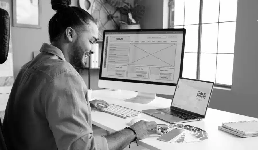
Are you ready to turn your homepage into a powerful tool that drives real results for your business? Want to learn the key design elements that make visitors stay, engage, and convert?
You’ll find some web design basics in this infographic.
- Logo
- Site Menu
- Hero Shot
- Headline
- Call to Action
- Blog
- Introduction
- Portfolio
- Content Blocks
- Social Proof
- Subscription
- Features and Benefits
- Search Function
- Keywords
- Footer
Check out the post below for more.

Your homepage is the digital front door of your business — the place where first impressions are made and buying decisions begin. A well-designed homepage doesn’t just look good; it guides visitors smoothly towards taking action.
Whether that’s making a purchase, filling out a form, or learning more about your services, the goal is to inspire trust and clarity from the moment someone arrives. In this guide, we’ll walk through every essential section of a high-performing homepage and show you how to design one that truly converts.
Logo
Your logo is the visual anchor of your brand and one of the first elements visitors notice. It should represent professionalism and consistency while sitting naturally within the overall design. The placement, size, and presentation all influence how users perceive your business identity. Keep it simple, purposeful, and aligned with your overall visual message.
- Place your logo in the top left corner for intuitive navigation and brand recall.
- Keep it visually distinct with clear space around it to avoid clutter.
- Avoid making your logo oversized; it should complement, not dominate, the header.
- Consider subtle animations or reveals to make your logo presentation memorable.
Site Menu
A clear and intuitive site menu helps users understand where to go next without confusion. The navigation should feature your most important pages, guiding visitors effortlessly toward key information or actions. Overly complex or crowded menus can cause friction and lead to higher bounce rates. Aim for simplicity and structure that reflects user intent.
- Limit menu items to five to seven essential links to keep navigation clean.
- Use descriptive, benefit-led labels rather than vague words like “Stuff” or “Info.”
- Always include a clear path back to the homepage, either through a link or logo.
- Avoid hamburger menus on desktop — visible navigation encourages exploration.
Hero Shot
Your hero shot is the visual introduction to your business, often the first thing visitors see. It needs to capture attention instantly and communicate your brand message clearly. A strong hero section combines imagery, text, and a call to action that work together to convey purpose. It’s the moment where design meets storytelling.
- Choose authentic, high-quality visuals that reflect your product or service accurately.
- Keep the design uncluttered to ensure your message stands out.
- Align the image with your headline and CTA for a unified first impression.
- Avoid generic stock photos — real imagery creates credibility and connection.
Headline
The headline is the voice of your homepage. It needs to be concise, direct, and written with your audience in mind. This short piece of text determines whether visitors stay or leave within seconds. Use language that speaks to their needs and makes it instantly clear what you do and who you do it for.
- Lead with benefits rather than features to show what your visitors gain.
- Write in plain language that’s easy to understand and impossible to misinterpret.
- Use emotional cues to create connection — confidence, belonging, or relief.
- Avoid cleverness for its own sake; clarity and purpose always outperform puns.
Call to Action
Your call to action (CTA) is where design becomes conversion. It’s not enough for users to like your site — they need to be guided toward taking the next step. Effective CTAs are persuasive, visible, and value-driven. Think of them as small conversations between your brand and your visitor, encouraging action through clarity and benefit.
- Begin with strong action verbs like “Start,” “Get,” or “Book” to drive response.
- Use first-person phrasing such as “Show me how” to create a personal connection.
- Highlight the value of taking action — for example, “Get my free quote.”
- Make CTAs stand out visually with contrasting colours and sufficient spacing.
Blog
A blog brings your homepage to life by showing expertise, personality, and regular updates. It’s not only great for SEO, but it also builds credibility by providing value upfront. Displaying recent or featured articles on your homepage shows visitors that your business is active and knowledgeable. Done well, it keeps users engaged and returning for more.
- Showcase two or three recent posts to keep your homepage fresh and dynamic.
- Use images and short summaries to make posts easy to scan.
- Include links to category pages or related articles to encourage deeper browsing.
- Keep post titles clear and benefit-led to spark curiosity and clicks.
Introduction
An introduction section tells visitors who you are and what makes you different. It should appear near the top of your homepage and set the tone for everything that follows. The goal is to humanise your brand while establishing professionalism and trust. Keep it short but meaningful — around 80 to 100 words is ideal.
- Explain what you do in simple, jargon-free language.
- Include one sentence that highlights your unique selling point.
- Reinforce your brand values or mission briefly to show credibility.
- Add a friendly image or visual cue to make the section feel personal.
Portfolio
A portfolio or showcase section helps prove what you can do through real examples. It’s where visual proof replaces marketing claims, helping potential clients picture results for themselves. Whether you’re a designer, builder, or consultant, showing your work validates your promises.
- Include images or case studies with short descriptive captions.
- Focus on quality over quantity — choose your strongest examples.
- Use consistent formatting to make the portfolio easy to browse.
- Link to detailed project pages for visitors who want to learn more.
Content Blocks
Content blocks break up your homepage and help structure information visually. They can be used to highlight services, testimonials, or featured products in digestible sections. These modular areas make your layout more dynamic and easier to navigate while maintaining a visual rhythm.
- Use alternating background colours to separate each section clearly.
- Highlight key categories such as “Services,” “About,” or “News.”
- Keep text concise — use bullet points or short sentences for clarity.
- Maintain consistent spacing and alignment across all blocks.
Social Proof
Social proof builds trust by showing that others believe in your brand. It reassures new visitors that choosing your business is a safe and smart decision. Featuring real feedback, numbers, or recognisable logos can dramatically improve credibility and conversion rates.
- Include short testimonials from satisfied clients or customers.
- Display logos of brands or partners you’ve worked with.
- Showcase review ratings or social media follower counts.
- Add badges, awards, or accreditations that prove credibility.
Subscription
If building a subscriber base is part of your strategy, your homepage should make it easy. A simple subscription form or call to action helps capture interest before visitors leave. This section is ideal for newsletters, lead magnets, or ongoing updates that add value beyond the first visit.
- Keep the form short — ask only for essential information like a name and email.
- Use a clear incentive such as “Get exclusive tips” or “Receive monthly updates.”
- Place the sign-up area near your blog or mid-page for visibility.
- Add reassurance about privacy to build confidence in subscribing.
Features and Benefits
A homepage should clearly explain what you offer and why it matters. Listing your features is important, but pairing them with benefits makes the message persuasive. This section is where you connect what you do to the real-world outcomes users care about most.
- Present each feature alongside its direct benefit to the customer.
- Use short, skimmable paragraphs or icons for readability.
- Focus on solving pain points rather than listing technical details.
- Reinforce the idea that your product or service improves their life or work.
Search Function
For larger websites, a search function is a small feature that has a big impact. It helps visitors find what they need instantly, reducing frustration and keeping them on your site longer. A visible, well-designed search bar signals that you value usability and accessibility.
- Position the search bar prominently near the top right of your homepage.
- Include placeholder text like “Search services or articles” for clarity.
- Ensure results load quickly and are relevant to user intent.
- Style the search box to match your site’s design while remaining distinct.
Keywords
Keywords ensure your homepage performs well in search engines and reaches the right audience. Integrating them naturally into your content, headings, and metadata improves visibility without sacrificing readability. It’s a quiet but powerful factor in driving organic traffic to your site.
- Include primary keywords in your title tag, headline, and meta description.
- Use secondary keywords within body text and image alt tags.
- Keep keyword use natural — avoid over-optimising or stuffing phrases.
- Review performance regularly and adjust based on search analytics.
Footer
Your footer acts as the anchor of your homepage — the final place visitors look for key information. It should reinforce trust and provide practical navigation options. A well-structured footer helps users feel confident about contacting you, exploring further, or completing a conversion.
- Include essential details like contact info, address, and opening hours.
- Add navigation links to key pages such as Privacy Policy or Services.
- Feature social media icons and newsletter sign-up forms for engagement.
- Maintain consistent branding to close the page with professionalism.
Conclusion
A homepage isn’t just a design exercise — it’s a strategy in action. Every section, from the logo to the footer, serves a purpose in leading visitors toward trust, engagement, and conversion. By combining clarity, structure, and visual harmony, your homepage becomes more than a landing page; it becomes a business tool that works 24/7.
Follow this blueprint and you’ll not only impress visitors but guide them effortlessly from curiosity to commitment.

Author:
Mark Ford