Has your website been optimised for mobile search? Did you know that Google shows different results to mobile users?
With Google introducing mobile friendliness as a ranking factor, mobile SEO is something all website owners need to consider. Just having a mobile website may not be enough, there are some additional technical features that may require attention.
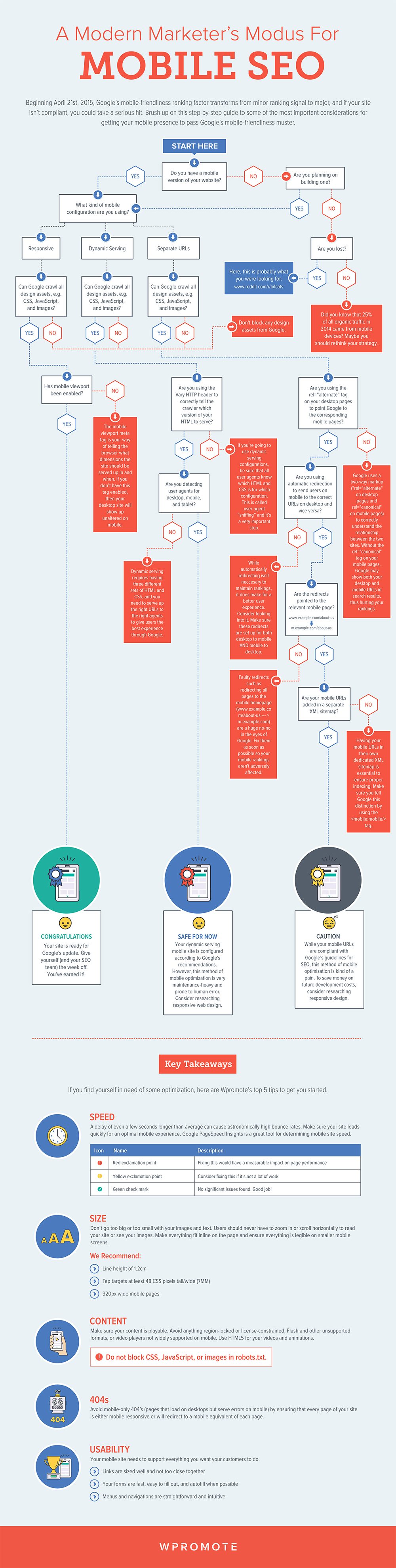
For some guidance on what to look for take a look at this infographic guide from Wpromote.
In today’s digital age, mobile devices have become an integral part of our lives. We use our smartphones and tablets for everything from checking emails to shopping online, and of course, for searching the web. With the increasing reliance on mobile devices, it’s crucial for businesses and website owners to optimize their online presence for mobile users. This is where Mobile SEO (Search Engine Optimization) comes into play.
In this comprehensive guide, we will delve into the world of Mobile SEO and explore the best practices and strategies to ensure that your website gets found by mobile users. We’ll cover everything from the importance of mobile optimization to practical tips and techniques that you can implement to improve your website’s mobile visibility. So, let’s get started!
The Importance of Mobile SEO
Before we dive into the nitty-gritty of Mobile SEO, let’s first understand why it’s essential for your website.
1. Mobile-First Indexing
In the past, Google primarily used the desktop version of a website to determine its ranking in search results. However, with the increasing prevalence of mobile devices, Google has shifted its focus to mobile-first indexing. This means that Google predominantly uses the mobile version of a website for ranking and indexing. If your website isn’t optimized for mobile, it could negatively impact your search engine rankings.
2. User Experience Matters
Mobile users have different expectations and behaviors compared to desktop users. They often want quick access to information and a seamless browsing experience. If your website is not mobile-friendly, visitors are more likely to bounce off, leading to higher bounce rates and lower rankings in search results. Mobile SEO helps enhance the user experience, keeping visitors engaged and on your site.
3. Mobile Traffic is on the Rise
Mobile traffic has been steadily increasing over the years and is now a significant portion of all internet traffic. Ignoring mobile users means missing out on a large and valuable audience. By optimizing your website for mobile, you can tap into this growing user base and potentially increase your site’s traffic and conversions.
Now that we’ve established the importance of Mobile SEO let’s move on to the practical steps you can take to ensure your website gets found by mobile users.
Mobile-Friendly Design
The foundation of Mobile SEO is a mobile-friendly design. Here are some key elements to consider:
1. Responsive Design
A responsive web design ensures that your website adapts to various screen sizes and devices. This means that whether a user is accessing your site on a smartphone, tablet, or desktop computer, the layout and content adjust to provide an optimal viewing experience. Google favors responsive designs because they make it easier for its bots to crawl and index content.
2. Mobile-First Design
Consider adopting a mobile-first design approach. Instead of designing for desktop users first and then adapting for mobile, start with the mobile version. This ensures that your website is well-optimized for mobile users from the outset.
3. Fast Loading Speed
Mobile users are often on the go and have limited patience for slow-loading websites. Google also considers page speed as a ranking factor. To cater to mobile users, optimize your site’s loading speed. Compress images, reduce unnecessary code, and leverage browser caching to make your pages load quickly on mobile devices.
Mobile-Friendly Content
Content is king in the world of SEO, and it’s no different for Mobile SEO. However, the way you present and structure your content matters when it comes to mobile users.
1. Short and Snappy Headlines
Mobile users typically skim content, so make sure your headlines are concise and attention-grabbing. Use relevant keywords to make it clear what your content is about.
2. Use Subheadings
Breaking up your content with subheadings not only improves readability but also helps mobile users quickly find the information they’re looking for. Search engines also use subheadings to understand the structure of your content.
3. Mobile-Friendly Fonts
Choose legible fonts and font sizes that are easy to read on smaller screens. Avoid tiny fonts that require users to zoom in to read your content.
4. Short Paragraphs and Bulleted Lists
Keep paragraphs short and use bulleted or numbered lists to present information in a scannable format. Mobile users appreciate content that is easy to skim.
Optimize Images and Media
Images and multimedia elements can enhance your content, but they can also slow down your website if not optimized correctly.
1. Compress Images
Use image compression tools to reduce the file size of your images without compromising quality. Smaller image files load faster on mobile devices.
2. Implement Lazy Loading
Lazy loading is a technique that loads images and other media elements as the user scrolls down the page. This can significantly improve page loading speed for mobile users.
3. Use Mobile-Friendly Formats
Ensure that videos and other multimedia elements are in formats that are compatible with mobile devices. Consider using HTML5 for videos and responsive design for embedded content.
Mobile-Friendly Navigation
Navigation is a critical aspect of mobile user experience. A well-structured and easy-to-navigate website keeps users engaged and encourages them to explore further.
1. Simplify Menus
On mobile devices, screen real estate is limited. Simplify your website’s menus and navigation to make it easy for users to find what they’re looking for. Consider using collapsible or hamburger menus for a cleaner look.
2. Use Breadcrumbs
Breadcrumbs are a navigational aid that helps users understand their position within your website’s hierarchy. They are particularly useful on mobile devices where space is limited.
3. Implement Click-to-Call and Maps
If your business has a physical location, make it easy for mobile users to contact you or find your place using click-to-call buttons and embedded maps.
Mobile-Friendly Forms
If your website includes forms, such as contact forms or signup forms, make sure they are mobile-friendly.
1. Keep Forms Simple
Mobile users are less likely to fill out lengthy forms on their devices. Keep your forms as simple and concise as possible. Only collect essential information.
2. Use Mobile-Friendly Input Fields
Make sure that input fields are large enough for users to tap accurately. Use input types that are optimized for mobile, such as number pads for phone number input.
3. Implement Auto-fill and Auto-correct
Enable auto-fill and auto-correct features on your forms to make it easier for mobile users to complete them.
Mobile SEO Technical Considerations
In addition to design and content optimization, there are technical aspects of Mobile SEO that you need to address.
1. Mobile-Friendly URLs
Ensure that your website’s URLs are mobile-friendly. Avoid long and complex URLs that are difficult to type on a mobile keyboard. Use clear and concise URLs that reflect the content of the page.
2. Mobile Sitemaps
Create and submit a mobile sitemap to search engines. This helps search engines discover and index your mobile content more efficiently.
3. Mobile-Friendly Structured Data
If you use structured data (schema markup) on your website, make sure it is mobile-friendly. Structured data helps search engines understand the content of your pages and can enhance your visibility in search results.
4. Test Mobile-Friendliness
Use tools like Google’s Mobile-Friendly Test to check if your website meets Google’s mobile-friendly criteria. Address any issues that are identified during the testing process.
Local SEO for Mobile
If your business has a physical location or serves a local audience, optimizing for local search is crucial for Mobile SEO.
1. Claim Your Google My Business Listing
Claiming and optimizing your Google My Business listing is essential for local SEO. Make sure your business name, address, and phone number (NAP) are consistent across all online listings.
2. Encourage Reviews
Positive reviews from customers can improve your local search rankings. Encourage satisfied customers to leave reviews on Google and other relevant review platforms.
3. Use Local Keywords
Incorporate local keywords into your content and meta tags. This helps search engines connect your website with local search queries.
Monitor Mobile Performance
Once you’ve implemented Mobile SEO strategies, it’s essential to monitor your website’s performance and make adjustments as needed.
1. Google Analytics
Use Google Analytics to track mobile traffic, user behavior, and conversion rates. Identify areas where mobile users may be facing issues and address them.
2. Mobile Usability Reports
Regularly check Google’s Mobile Usability reports in Google Search Console. This tool provides insights into mobile-specific issues that may affect your website’s visibility.
3. Page Speed Insights
Continuously monitor your website’s page speed using tools like Google’s PageSpeed Insights. Address any speed-related issues promptly.
Conclusion
Mobile SEO is not just an option; it’s a necessity in today’s mobile-centric world. By optimizing your website for mobile users, you can improve your search engine rankings, enhance user experience, and tap into the growing mobile audience. Remember that Mobile SEO is an ongoing process, and staying updated with the latest trends and best practices is key to maintaining and improving your mobile visibility.
Start by ensuring that your website has a responsive design, mobile-friendly content, optimized images, and user-friendly navigation. Pay attention to technical aspects like mobile-friendly URLs and structured data. If you have a local business, don’t forget to optimize for local search.
Regularly monitor your website’s mobile performance and make necessary adjustments to stay ahead in the competitive world of mobile search. By following these Mobile SEO best practices, you’ll increase your chances of getting found by mobile users and driving more traffic to your website.

Author:
Mark Ford